Wednesday, October 01, 2008

Nor'Easter


My series is trees and just days before the challenge was issued we had a
Nor'Easter blow through that was bending the one tall pine in the back
yard unbelieveably! As soon as the challenge was announced I started
sketching to try to recapture the wind driving that pine over.

Composition is intended to be diagonal for the main image, and
horizontal in the background.

Judy Whitehead

Fusible strip piecing, shiva painsticks for toning, glitter thread and
beads for the rain.

Untitled and Undecided

In August, I started a new job with the local university and boy has that cut into my quilting time! It's intense and fun and good money and very stable in this crazy economy, but I'm wiped out at the end of the day! So my quilting is confined to weekends now.... and the rare days I get done on time and get home right after work.

Last Sunday, I just stayed home. It was heaven! Since I haven't decided on a series, I just grabbed my complementary colors (lime green and red/purple) and started random strip piecing... no plan, no goal, just playing. Lots of linear quilting to emphasize the lines. I have no idea what it means or signifies, except a nice Sunday home alone! So its untitled and I'm still undecided for a series.... but here it is. Comments of course are welcome!

Tuesday, September 30, 2008

CROW TAKES A VACATION


CROW TAKES A VACATION, 14" x 21"
commercial and hand dyed cottons
My plan is to do a series of abstracts since my work almost always is quasi-realistic. As you can see I couldn't leave the abstract piece alone and turned it into a background for a tree and crow. Maybe abstract just isn't in me! But I'm going to keep trying until I made something none of us can identify as a tree or animal. As always, I had a grand time quilting the piece. I just received a sample pack of variegated threads from Superior and they behaved beautifully.
I will appreciate any comments. Thanks.
Roberta


Spirit Renewed


My series for this challenge – and a few of the next ones will be based on the concept of “spirit”. I like to draw abstract images, and thought I would try to capture rather abstract concepts in this series. My sketch was made before the challenge was announced, but that was a very good thing, since I just had until today to complete the piece as we are packing for a trip tomorrow. I chose to use the vertical orientation and the color scheme of yellow-orange/ purple-violet. I’ve been going broke on fusible webbing lately so I have tried to develop a method of getting what I want – free flowing designs, without fusing. I made my design on freezer paper labeled it and cut out the pieces. Then I ironed the cut pieces onto fabrics that I intended to use. Leaving a liberal seam allowance I cut out the fabric pieces. Using the batting as my background I just raw edge pieced them into place. After trimming the fabric to the stitch line I used machine embroidery to give a finished look to the piece. My piece is now partially quilted, I added the backing and proceeded to add detail quilting which is not yet finished in this piece. I hope to add the remaining quilting, some embellishment and the binding (a dark purple) to the quilt when we get back from our trip. The quilt measures 20” x 31.5”. I would love to hear any ideas on embellishments for this quilt (a weak point for me). I have been amazed at the depth of really good work coming out of this group on this challenge especially – we really ought to have a FFFC show.

Monday, September 29, 2008

Zipper

The theme for my series is "Simplify". I am trying to do this on so many levels. One thing I found over the last year of challenges was that my ideas were often too complicated to achieve a finished project in a week. So for this series I decided to depict everyday objects in an abstracted or simplified manner. I am trying to get back to basics and concentrate on shape, movement, techniques, machine quilting and, of course, color. This piece is called "zipper" and it is a diagonal emphasis in a yellow-green: purple-red color scheme. It was a lot of fun to make. My original intention was to use an actual zipper in the center but I didn't have one in my stash that would work. Just driving to the store to get something is not an option in the remote area where I live so I looked for alternative solutions. I found a piece of painted aluminum chain that reminded me of a metal zipper so I used that. The two sides of the quilt were each constructed, quilted and finished separately and then connected by hand sewing the chain in the middle.
The purplish zipper is needle turn applique and the background is pieced.

"Pueblos Bonitos"

I have chosen to do 'shapes' for my series. A couple of years ago Idid a series of postcards using shapes as the theme. I've always intended to do a real series...now is my chance :)

For this challenge I am using squares..."Pueblos Bonitos"...

My complimentary colors are orange-yellow and blue (as on JoenWolfrom's color cards #11 and #23).

My quilt is mainly horizontal, with a little diagonal thrown in. The background is organza fused over hand dyed cotton then randomly cut and pieced back together with two different colored hand dyed strips inserted. The squares are cotton with organza and chiffon overlays. Variegated rayon threads.

Comments welcomed :) as always

Cherie

Sunday, September 28, 2008

Rhoda Ch#25


I have my right hand in a cast for another month...so no new work...but my series will be women at work and since this piece that Ive donee fits with this months challenge I have decided to use it.
I have used the complimentary colors of orange-blue, have tried to follow the principles of design. I look forward to your comments .
Many of you will recognize this gal.

Saturday, September 27, 2008

Mossy Delight

So I decided my series is going to be "Branching Out"

I've posted my piece Mossy Delight - I took the yellow-green/red-violet complementary color scheme. I pieced my signature background. Then added a vertical tree - I played around with the tree texture - in the past I've done primarily couched yarn this time I did more fabric pieced tree then added the yarn as an accent with thread work for the branches.

The finished size is 11 1/2 x 19 1/2.

I must admit - it's kind of psychedelic as a tree. Not what one would find in reality. But kind of working on the abstraction rather than a reality. It may be fun to try a few more of the compliments.

Lisa
In Sunny Seattle

Dreamscape 2....City Limits

My series will be called Dreamscapes. My inspiration was the piece i did for challenge 15; Dreamscape...Moonrise.
I love the full moon and it affects me deeply.
Through this series i want to work through some personal feelings; and some weird dreams.
The piece is bound and quilted.
Any critiques/ suggestions are appreciated.
Thanks for looking.
Anna K.

Hide n Seek


I strayed a tiny bit from the challenge by adding the circle, originally it was just the undersea part, but then the series inspiration struck and this was perfect for the first one, I just needed to add a porthole!
My series is going to be *Through My Windows* and each will use blue and orange somewhere outside the windows.
This is 23x19 and still needs to be quilted

Thursday, September 25, 2008

Challenge # 25

Challenge # 25 - Friday, September 26, 2008

Guest Hostess – Cynthia Ann Morgan

Working in Series: Choose an idea from an art quilt you have completed in the past or start with a new idea. What is the idea, what is intriguing about it, and what do you want to do with it? Brainstorm possibilities with thumbnail sketches or descriptive lists. Choose the one you like the most.

Color Concept: Complementary color scheme is made up of two colors that are opposite each other on the color wheel.

The complements we think of first because they contain one of the primary colors, red, blue or yellow are:

Purple and Yellow,
Red and Green,
Orange and Blue

But we also have the more sophisticated complementary color combinations using the secondary colors:

Red-violet and Yellow-green,
Red-orange and Blue-green,
Yellow-orange and Blue-violet.

Choose a complementary color scheme to work with on your piece. These will be the main colors. To add depth, richness and interest, be sure to use variations of the color:

different values (light, medium, dark)
shades (blackened color),
tones (grayed color),
tints (pale, whitened color)
pure hues (color without black, gray or white).

It is fine to use some neutrals (black, white, cream, gray or beige), but otherwise try to stick to your main colors.

Composition Concept: Vertical, Horizontal or Diagonal layout


Vertical design is strong (think of a pole), horizontal design is relaxing (think of lying down) while diagonal design is dynamic (think of a river flowing). Choose one for your design layout. If you’re really brave, try a combination.

Monday, September 08, 2008

Clam Cove II

I have wanted to create another piece based on this photo I took while vacationing in New England. Is it too much of a stretch to call this a water garden on a grander scale? Anyway, I've decided to use this photo again. I originally used it as the inspiration photo for the 2004 Grab Bag Challenge.

My initial attempt with this piece was rather lifeless with no focal point. I think I remedied that by adding some very dark fabrics in the foreground and near the horizon.
I have been reminded again how important contrast is to the success of a piece. I seem to be learning this lesson over and over again.

Update September 24, 2008:

I decided to act on the suggestion to add some dark to the water area. I’m not sure about how this affected the balance, but I think it has added some dimension to the middle section and unified it more with the rest of the piece.

Thursday, September 04, 2008

A Quilt in a Day... I had too


Hi all.. when I heard what the last challenge I had to try it. I have only been a member for a few days but, I think I am going to love this group. I love flowers and love abstract. I did this piece in a hurry I guess just to see if I could.. Now that it is done I can be my worst critique.. The flowers got lost in the background fabric and really don't pop... It was fun to practice my free motion quilting and boy do I need the practice. But, all in all it was just fun to make a smaller quilt.. The quilt is 15x11....thanks.. Laura

Wednesday, September 03, 2008

Jeepers Creepers - Reworked


Here's a blast from the past - I reworked my unnamed challenge piece from Challenge 7. I never did finish the first challenge piece - the challenge was to use an unusual piece of fabric. I had used some upholstery fabric. The one comment I had was to put a focal point on it - so I put on a beaded caterpillar that looked more like a centipede. So it sat for well over a year waiting to see what would happen next - after Challenge 21 -deconstruction my answer awaited. So I slashed and slashed some more. The first slash I put in the light brown - but that didn't work so I slashed again with the dark brown. Now I don't hate the piece and have even named it - Jeepers Creepers - finished size 9 x 28 1/2.

Monday, September 01, 2008

Fuchsia

I seem to find fuchsias endlessly fascinating. I have taken many, many photos of them and used one of these as an inspiration for this piece. I rarely choose to do anything "abstract" but in the sense that this is not a close replica of the photo and I did lots of editing, this is about as close I get.


I cut the shapes freehand and changed the composition somewhat. I tried to work mostly from scraps from my scrap bin. I fused the shapes to the background using Misty Fuse. I really enjoyed this challenge and the opportunity to work a little looser than I often do.

The main image of my quilt is a scan because I am having trouble getting crisp images with my camera(s). The scanner cut off the borders because this is just a little too large. But I love the edge treatment, so at right, there is a scan of it, too. I inserted a folded purple piece of fabric for a piping effect.

I invite all comments and critiques.

Sunday, August 31, 2008

Alaska Garden

I'm not a gardener. I live in a condo and the flowers are tended by the pros, not me with a purple thumb! So I was on a hunt for a good photo of a garden. Among the 2000 images that I took on a journey to Alaska, I found this shot of ornamental cabbage and petunias that bordered a building at one of the resorts we visited.

The long sumner days in our 49th state help vegetation to grow to enormous proportions. These ornamental cabbages are larger than my head! And of course, the resorts pride themselves in beautiful landscaping.

To try to abstract this image, I wanted to concentrate on the shapes of the cabbages and petunias, as well as the lines in the wood and the sense of perspective.

The background is foundation pieced, the cabbages and petunias are fused and stitched. I'm not crazy about it but its done! Critiques are welcome! I need a class on perspective and shape... any suggestions? Thanks!

Saturday, August 30, 2008

Midnight Dreams of Summer Flowers


It's the last day of winter here and i am desperate for some colour. My real garden is just a pile of twigs poking out of the ground. So i imagined this piece and i hope that it fulfills the criteria of this challenge.

Background fabric dyed in attempt to represent the garden in the starlight.

Flowers appliqued with metallic thread and made up of scraps of dyed silk.

Flower in the upper left (representing night) consists of machine embroidered stars and free motion embroidery.

Anny comments welcome.

Anna.

Barrel Cactus (#24)

9 1/2" x 12 1/2"
Commercial fabrics

This project began as a photograph of a barrel cactus in my garden. I printed the photo on both cotton and organza fabrics. I liked the effect when I overlaid the organza on the cotton photo and then offset the two photos. The two photos were secured together with some thread painting then it was sliced into four parts.

The original intention was to use all four parts. After adding the green fabric (extending out at least 3" from the cut edges) and playing around with various arrangements, I decided to use only two of the photo quarters.

The piece needed more than a plain border. There was a slight hint of maroon in the batik separating the dark green sections. I added a small (1/8") eyelash border.

Comments always welcome!

-- Joanna Strohn in Tucson, Arizona
Posted by Picasa

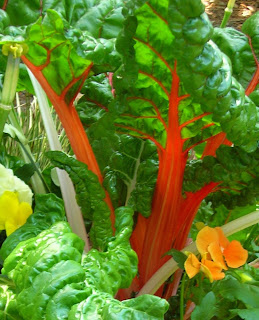
Chard


This was a challenge I had a good time with---not a fast piece to do, but learned a lot and like what I've done. The quAdd Videoilt is not completely finished---some of the "background" still needs quilting.

I am posting the original photo, original cropped, and Photoshopped photo. The full shot and a close-up of the quilt are also posted. The photo is of a large pot of red and white chard with small flowers and ivy. It was taken at the Elizabethan Gardens in Manteo, NC. I'd never seen chard planted with flowers before and it was a wonderful sight!

The quilt was done by layering pieces of fabric onto the batt with backing underneath. The fabrics are batiks and other cottons. I placed a layer of pale blue tulle over it all and did a lot of pinning. The quilting is not only the decoration but the "glue" for the quilt.

Comments welcome.


Friday, August 29, 2008

Leaning toward Abstract

The idea of making anything abstract scares the dickens out of me (what is a "dickens" anyway?) As I went back through my photos of vegetation, I decided to take a liberal interpretation of the garden concept and opted to work with a photo I took a few months ago of three cottonwood trees sculpted by beavers.

I worked in Photo Shop to posterize, intensify, saturate and otherwise manipulate the image that I then printed out on cotton. The tree photo has batting under it and that is then quilted onto an upholstery fabric sample as background. The extra "leaves" to the sides of the photo are scraps of green fabric under tulle. The extended tree trunks are crumpled black fabric that has been dry brushed with blue Lumiere paint. The photo has an inner frame of couched yarns. The binding is an earth tone dupioni silk. I expected the end result to be less identifiable than it is. I am not sure I have really abstracted the image or if I have just manipulated it to a different form.


Summer's End 14"x16"


As you can see by the photo of my garden, my sunflowers don't resemble the real thing, but it still doesn't seem like an abstract to me. It is difficult to abstract a real scene, isn't it?

I was trying to get the feel of the end of summer, with the browning leaves of my tomatoes (yep, mine are also fungus-ridden), and the still sunny disposition of the sunflowers.

The green background is a piece of silk that I dyed with a sewn shibori method, but which didn't end up working for what I had in mind originally. The sunflowers are hand-dyed silks (some vintage kimono fabrics); they are fused and then the whole thing is under a layer of black tulle, except for the brown cotton centers of the sunflowers, which I may still add beading to, and I do realize now from seeing the photo that they are not very neat (ack). May have to redo those altogether. I was originally thinking just beads, but was in a hurry to finish, as this one also meets my local group's challenge theme, and I just dropped it off for a show today.

Anyway, I welcome any comments and suggestions, as I'm not sure this one really works very well.

Thanks, Lisa. This was a great challenge idea.

Brenda Jennings

Hummingbird Breakfast


OK - so I'm finally done with the challenge - and it was a challenge - I don't usually work in abstract to it was kind of a push for me. I took a photograph of some crocosmia from my garden - this plant the hummingbirds love to munch on - they are nice and bright and very red and green - so I tried to make it not look like Christmas. I used red spirals for the flowers. I used a spectrum of greens so it wouldn't look too much like Christmas. The background is a hand dyed blue green. I then put on borders because without it just seemed to hang there. I quilted the piece in diamonds to represent the chain link fence.

So the name is Hummingbird Breakfast finished size 23x29.

Thanks for letting me host the challenge - it has been fun to see how far people can take abstract.

Lisa
In Rainy Seattle

Thursday, August 28, 2008

Cold Hands by Penny Irwin


9"X12"
pieced using freezer paper and glue stick.

One January there was a wet snow during the night and no wind to drift it.
By morning mounds of snow had covered every surface it had touched.

This is a very old gate post. My yard and home are beyond.

ren's non-challenge #24


Well....this is as far as I got: choosing the photo. Maybe, just maybe, I'll get to it next week. But it's not going to happen before the end of tomorrow. Sigh.

Wednesday, August 27, 2008

Neighbor's Garden


This is taken in our neighbor's garden. I am not sure even what kind of flowers they are. I liked the color and the shadows. I don't know how well I captured all that,this was a very new experience for me. I am rather pleased with it. I did not use as much dark as the photo shows because it looked too blotchy.
I am eager, in fact, anxious to know what you think...... did I get it? The concept of what we were to do?
Carole

Tuesday, August 26, 2008

Breaking Free

by laura west kong
approx. 18" x 14"

I wanted to work from a life drawing rather than a photo for this challenge, and chose a single element that might be found in a garden, one not so scorchingly hot as my own ... a pine cone. First I made a rough sketch of the pine cone, focusing only on the triangular tips of the scales that seemed to jump out from the shadows, then stylized my drawing slightly.

While fusing the scales to the piney background fabric, I accidentally laid one upside down and fused it to my iron. Instead of fusing it back into its original spot, I set it free above the pine cone and found a new direction for my piece: setting myself free from the quilt police and any of my own inhibitions about quilting.
Here are some of the things I freed myself from on this piece:
<1.> Laser sharp precision. I tore fabric (makes a great soft raw edge), cut freehand with the rotary cutter, left the appliqué edges very raw and left threads hanging. (btw, its actually more work than I expected to jag up those edges, they don't just happen on their own!).

<2.> Quilt sandwich conventions. I laid the quilt top on a larger piece of wool felt, added a few straight pins and quilted away. I started near the edges and machine quilted towards the middle. I decided to try a large stipple and do it fearlessly. (Usually machine quilting stresses me out. I really enjoyed it this time and didn't cross over my lines once even though I wasn't being very careful.)

<3.> Over-planning syndrome. (Sometimes when I plan out a piece too completely before I begin I can't bring myself to actually complete it because in my head its already finished.) Making this quilt was like doing a puzzle because I didn't know ahead of time what it would end up to be. I loved the surprises at every turn working on this piece.
I always enjoy a bit of hand work mixed in so I hand embroidered the path of the free pine cone scale, tying the knot on the front and leaving the tail free flowing.
Finally, I snapped a picture of the pine cone. Its not the same angle I was sketching and I have no idea which side I sketched from, but if you look at the top half of the pine cone you can still see the way the triangular tips of the scales stand out from the dark inside.

You can read some more musings about this quilt on my blog.

Garden Abstract


I started with a picture I took in Denver's Larimer Square last summer. With help from a QA member, I enlarged the picture and printed it on plain paper in 4 sections so it measured 16" x 20." Then I used it for templates. Using hand-dyed fabrics, I tried to recreate the general feeling of the wavy shapes in the photo. My goal was to make the quilt totally abstract, but it wanted to be a landscape. At least I managed to keep the actual flowers out of the quilt . The hanging threads represent the weeds in my own garden.

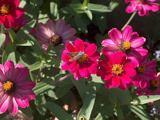
Well, I took it to "unabstract" by adding the original photo. I also added a computer-manipulated phot of magenta petunias. I'm also considering cutting the quilt off just below the original photo and only using the bottom 2/3rds. Am I making it better, or worse? Comments are always welcome - I learn so much here!