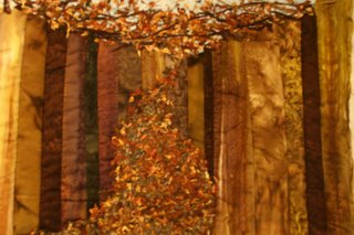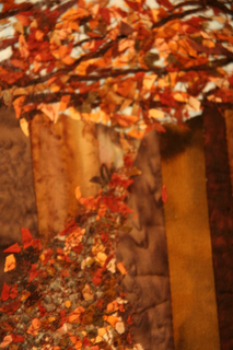

I wasn't going to post here. I know this piece has a lot of problems and it seemed silly to bother you guys with it. Then I realized that you may be able to see other things I could have done differently that would help, so here I am. The whole thing is pieced on a longarm, the tree trunks are a quilt as you kind of thing. The trunks in the foreground have more wadding in them so are very three dimensional in the flesh. Sadly that doesn't show in the photographs. The leaves are tiny scraps of fabrics from my other fall quilt 'Golden Storm'. I think this design could work but it needs more contrast. If I were doing it again I would also make the tree trunks thinner, to me they look too chunky. I quite like the way it looks like the leaves are pouring down a funnel. It wasn't what I was aiming for though, it is supposed to be a path through a very dense forest. Would the path look more path like if I moved the vanishing point lower? I put it up high because it seemed to make the trees look taller, but now I am not so sure. I was also looking for a dark almost claustrophobic atmosphere, again I think that sort of works but not as well as it could.
I love the contrast of textures on this one. The fallen leaves just look like they would be crunchy like real ones.
ReplyDeleteI know it wasn't intended, but the leaves look like the canopy of the trees meeting the vanishing point of the path. I'm not sure I would have seen the 'path' without you saying that's what it was though, since the width of the path seems out of proportion to the size of the trees. Maybe narrower without such a sharp angle to the decrease? Long and thin with a gradual taper. And the leaves across the top STILL look like the tree canopy to me. Maybe a narrow slice of the sky between the vanishing point of the path and the swath of leaves across the top?
I love it! From the picture it looks like the brown pieced background is in a half circle and the tree is in the middle away from the background. From your description I am guessing it is a flat piece, but you have used the most beautiful fabrics and created such a wonderful quilt.
ReplyDeleteThe tree and all the leaves is amazing! I love your quilt and wouldn't change a thing!
Thanks guys, I am so pleased I did post it. I was hoping that the leaves on the trees would give the impression of canopy. As I remember the woods I knew as I child the canopy did seem to meet the earth. Maybe I got cloder that I thought. I think you have a very good point, Delta, the path does taper too much. Funny it is so obvious now you've said it, but I didn't notice.
ReplyDeleteI like this piece as an abstract/impressionistic view of the fall forest. The color and fabric choices really give a strong feeling of a dappled woods scene with the falling leaves. There is also a strong sense of movement across the piece, always something I like. The only thing I would say is that the central placement of the leaf pile is more static and detracts from that feel of flow. I'm not sure what to do to change that - what if you cropped the piece to make it less centrally placed? Or added more to the canopy or the leaf pile to accentuate the sense of movement and make it a bit more asymetrical? A very nice piece!
ReplyDeleteThis is a very rich looking piece with all those lovely golds,oranges and browns. I see alot of luminescence, too..it just glows! It feels like a magical forest to me. I think you're onto something when you said the vanishing point may be too high to look like a path. But that adds to the magical feel
ReplyDeleteCynthia
I like the idea of cropping this piece to move the vanishing point arround. I think I will cut a couple of bits of card to make an adjustable frame and have a play.
ReplyDeleteYou guys are great at providing some insight. Thank you so much
Hi Ferret - You are right - it looks as if the leaves are pouring right out of the trees through a funnel. Even though that wasn't what you were aiming to do it is very engaging to me. The variety of colors in the tree background recede and give a real sense of depth and the falling leaves look like a three-dimensional mass. This is another of those quilts that make me want to touch them.
ReplyDeleteI'm glad you shared this with the group.
Roberta
A lower vanishing point and more gradual reduction in size would add to the path effect, as well as cutting off parts of the path behind some of the trees as the path winds back and forth.
ReplyDeleteIt's very lovely as abstract art. It would also look nice hanging vertically as well, with all those great tree trunks becoming horizontal bars/stripes, cropped just a little so the leaves are more off-center.
Isn't it great the amazing things that happen even when it's not what we intended?