 The book I chose was "Goodnight, Moon" by Margaret Wise Brown.
First line: "In the great green room there was a telephone..."
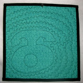
By Laura West Kong, size: 8 5/8" x 8 3/4", pieced and appliqued.
My mind was mush after the holiday rush so I chose something simple and fun. My inspiration was the stylish old telephone on the nightstand in the book, and the quilt project "Oak Leaves" in American Quilter, Winter 2006.
I changed the block from rectangle to square and replaced the leaf with the phone. Then I mixed up the squares to be random rather than in diagonal rows. I chose warm greens for the front because I thought they would contrast better with the black than cool greens. I wanted the fabric mostly to have good contrast, but with a little low contrast thrown in (the two darker value greens). In the book everything is all shadowy and moonlit. The lighter green star print is actually very similar to Clement Hurd's illustrations.
 Everything is from my stash. I originally wanted to tilt the squares at an angle to add interest, but that was way too much math for my tired brain, so I offset the phone instead.
I tried out a variety of borders, but they all competed with the focal point so I opted for a fused black binding instead. I was also considering ways to include that fun curly telephone cord, but in the end chose to leave it off for simplicity's sake.
 The quilting is done with my machine scallop stitch echoed around the phone. It is meant to be reminiscent of those curly telephone cords, as well as suggestive of a ringing phone. For the hanger I sewed a large jump ring to the back.
Hi Laura,
ReplyDeleteI can't believe it, but I think this must be the only childrens book written that I haven't read to either my kids, grandkids, or great grandkids. (LOL) I love your choice of fabrics. They really pop. And your choice of quilting is perfect...you can almost hear that phone ringing!
Cherie
Hi Laura - What a delightful little quilt. The old fashioned phone is just right to illustrate this wonderful little book. I read this book to my son every night for a couple of years. We loved to watch the mouse move through the pages.
ReplyDeleteI like the simplicity of this piece and the rich contrast between the black and the greens.
I hope you will save this to give to your first grandchild along with a copy of the book.
Roberta
Hi Laura, Well, this is fun...you interpreted both the contrast and book line challenge wonderfully. I like the "white space" on the left, it balances the piece nicely.
ReplyDeleteI like the clean, crispness of your pieces very much. I wouldn't be giving my all if I didn't ask you this, though. Have you given any thought to trying something that is not so perfect, and more edgy? Do you know Laura Wasilowski's work? She does crisp and clean, too but there's always some quirkiness to it that pushs the interest level up. http://www.artfabrik.com/galleryone.htm
I hope this is taken as I intented...to give you something to think about (and it is only my own opinion!)
Cynthia
Thank you everyone for your comments! Roberta--we do have the book, that's a neat idea to save them together.
ReplyDeleteCynthia--Yes, I do know Laura Wasilowski's work. I've been considering your comments (thank you btw) and had a revelation: The mathematical side of me is trying to impose some order on the chaos that is in my studio and all around me, and that order comes out in my artwork because I can technically manage it. I am particularly attracted to sashiko because it is visibly hand-crafted, yet mathematical and orderly. In fact last night I spent several hours charting out a pictoral design in sashiko on the computer.
I'm at a loss on how to let the chaos into my art. For the next challenge I'll try to jump right in rather than work it all out in my mind and my sketchpad ahead of time.
laura