A gallery of the quilts created for the Fast Friday Fabric Challenges. The quilt artists display their work here to give and receive constructive critiques. Only blog members may comment.
Thursday, April 30, 2009
Fragility
I LOVED doing this one and just may be off on a new tangent.
Shopping for the fabric was fun, putting it together was even more fun.
I hope I got the 'GRID' part of this challenge. I used Joen Wolfram's
Color tool and used the 7 colors. My main color was 'yellow' and I went from there.
I used threads in the same color and the beads pretty much fit as well.
I used a yellow poplin for the background, it only shows in small bits. I drew a 2" grid all through it. From there, I tore my Dupioni silk into approximate squares and laid them out on the grid. I added over top , etc... all along the grid line drawn underneath. I hand stitched using a 'ladder' stitch. I also tore organza into 'bite-size' pieces and laid them out in an overlapping diagonal toward the bottom.
I used stitches, a button, loose threads and beads to embellish. As you know, Dupioni silk frays like crazy, so in straightening my fabric, I pulled the fraying threads toward the selvage. I cut that off, rolled it into organza squares, letting the threads hang down. I wrapped the 'tubes' in embroidery floss, tied into the top knot a 4 stone Svaroski crystal pendant [green] and stitched them on with a bead at the top. It is bound with a sheer.. also torn and see through edges. Beads embellish the edges in the binding.
I called it 'Fragile', I think because of the fragile system we live in.. re: swine flu, faltering economies, age and the frailties associated there. Add to that the incredible 'show' of support for Virginia Spiegel's Cancer fund-raiser.... me remembering my own asleep in death.... just made me think FRAGILE. That is why I like the torn edges, the threads and see-through frays.
I look forward to your comments..... and your 'what-if's'...
Carole
Lollypops
Grasses
Wednesday, April 29, 2009
Green Mile Squared
I was in the process of making this quilt for something else and it pretty much fits this challenge so I'll post it. The analogous colors are lime green, yellow, and orange with the compliment of purple. You have to look to find the yellow which is yarn wrapped around the 3 middle pieces and the purple and green are the dominant colors. I call it Green Mile Squared since the green cuts through the middle of dark and light purple and it is definitely a grid pattern.
I pieced together the green and purple squares going from dark in the lower left to lighter in the upper right. Orange squares were scattered around to give it some 'oomph'. I splattered paint around after the quilting which is also in a grid pattern. It seemed to need something in the middle so I wrapped a yellow and purple yarn around wooden skewers found in the grocery store and stitched them in the middle of the quilt.
THE REASON I WAS IN THE PROCESS OF MAKING THIS IS BECAUSE I JUST FINISHED A BOOK STUDY OF KATIE PASQUINI MASOPAUST'S BOOK "COLOR AND COMPOSITION FOR THE CREATIIVE QUILTER". IT MADE FOR A VERY GOOD STUDY AND LOTS OF LESSONS INVOLVING JUST WHAT THIS CHALLENGE WAS ABOUT. I'D RECOMMEND IT FOR ANYONE.
Sunday, April 26, 2009
Yards and Masts
Thursday, April 23, 2009
Challenge #32
Hostess – Joni Feddersen
Color Concept: Analogous colors with a complementary color
An analogous- complementary scheme utilizes related hues lying adjacent on the color wheel with a hue directly opposite to these. Why is this an effective color scheme? An analogous color scheme is calming and pleasing, but can be unexciting. Adding a complementary color can add excitement, tension and emphasis as well as move the eye around the piece. Analogous with complementary can be less jarring than using just a straight complementary color scheme. It’s the best of both color schemes: the beauty of analogous with the drama of complementary.
Composition Concept: Using grids/frames
This is a broad composition concept and can be taken various ways. As in traditional quilting, grids (blocks) and frames (borders) have been used for years to add structure and unity to the quilts, but that is just one way to interpret this challenge.
There is a diagram of framed and grid composition in Katie Pasquini Masapust’s book Design Exploration for the Creative Quilter. See it here: http://tinyurl.com/d7vhmn
The famous artist Piet Mondrian introduced grids to the art world as a simplification of the relationships between color, size and shape.
Works by Piet Mondrian can be seen: http://www.artlex.com/ArtLex/d/destijl.html
Adding structure with the use of grids can have several benefits. It makes the eye move in a controlled manner and can draw the viewer to a particular focal point. Grids can be used in many ways as we will see in some of our quilt examples.
http://www.eleanormccain.net/Pages/GalleriesGrids.html
http://triciamckellar.com/art/grid_collages.php
http://www.quiltsbyvalerie.com/archgallery1A.html
http://quiltart.com/gallery/colsh.html
http://www.yde.dk/charlotte/english This is another example of both our composition and our color concepts for this challenge.
Setting your masterpiece in a frame is another way to interpret this challenge. Just as an artist frames their painting, an art quilt can utilize this concept to enhance the design. Framed examples:
http://www.davidwalker.us/Pages/QG_MonolithSeries.html Look at “Monolith 1”
http://www.davidwalker.us/Pages/Q_SelectedWorks3.html Look at “Anja’s Choice”
http://www.jilljensenart.com/Gallery-Nature.html Look at “Scarab IV”
http://www.lyrickinard.com/abstract.html Look at “Gold Leaf”
Examples of subtle framing used as part of the design:
http://www.artfabrik.com/galleryone.htm
http://www.barbaratriton.com/fiber3.htm
http://www.ruthbmcdowell.com/clients/rbm/recent.cfm
Don’t forget to have fun with this challenge!
Saturday, April 11, 2009
Untitled
I began this piece in late March when the challenge was first issued. It was the end of winter and it seemed as if spring would never arrive. This quilt reflects my state of mind at the time, but became a bit hard to finish once the wisteria started to bloom. The March challenge was two-fold: to use bright colors in contrast to dull, grayed colors in order to achieve the effect of luminosity and secondly, to convey the idea of masses and planes.
I drew a small sketch of a scene that I remembered from seeing part of a remake of the movie, Dr. Zhivago. I decided to try some two-point perspective on this piece in order to best work with the masses and planes component of the challenge.
I finally finished this last night (05/06/09) with the addition of the quilting and the shadows, which are made with layers of tulle. I have had a hard time with a title for this one, so it remains untitled.
I welcome any comments on the piece.
Friday, April 10, 2009
Small One - The Magical Elephant (Dragon)
At first I wondered how I could do this saturated/planes thing with a dragon. I might have gone with him being in an ancient ruin as I have all sorts of photos I have taken of that type of scene. But because I am also going with the 6x12 size of the Contemporary Quilt Group, I wasn't sure I could do it without being so small it would be hard to read. And somehow, thoughts led to other thoughts and he ended up being adopted by the elephants.
Yes, I know. My brain is a bit different than most people's.
I thought I better look up exactly what elephant legs look like, and there was a photo taken of an elephants legs through the bushes. So, I thought I would adapt that concept to create the planes and masses part, and then use the dragon and bright surrounding to do the saturated part. The bushes behind him aren't as anchored as I'd like, but they will do.
Let me know what you think.
Thursday, April 09, 2009
I finally found a day I could work on this months challange. Sometimes life just gets in the way of having fun. I guess better late than never so here I am very very late. This 20x 13 inch piece is a picture from the Nature Conservancy calander. I felt it had everything for this challange. I had a great time threadpainting the trees and layering the sheers to create the sunset sky. There is a minimum of quilting in the sky because I felt it would break it up too much and it needed the unbroken expanse. This is only the second landscape I have ever attempted so it is an amazing challange to me. I love all comments and any suggestions you may have. Thank you so much for a great challange.
Pat Havey
Monday, April 06, 2009
Crocus
I believe this quilt fits the challenge. There are some highly saturated colors combined with tones. There is also light and shadow--both in the two flowers and in the ground (bark, dirt, dead leaves, etc.). Size is approximately 9.5" x 14".
Sunday, April 05, 2009
Wupatki
And the quilt:
It's about 9 x 12" with lots of little pieces fused to the background, heavily stitched. What I like: the shadows worked great, the colors are pleasing. What I don't like: I should have done the floor with longer skinnier pieces or larger interlocking pieces (altho its really sandy there). But overall, I'm pleased. Comments of course, are welcome!
Chili
This is not what I originally intended to make for this challenge. In fact I pulled the fabric today for an entirely different piece, but this has been calling to me and calling to me and wouldn't shut up or let me work on anything else until it was done!
Not sure if I met the challenge with it and I am almost embarrassed to put it on here with all the wonderful pieces that are posted already, but I actually like it more than I thought I would...lol. I still plan on doing the other piece now that this one has gotten what it wanted, though it isn't quilted yet. I can do both at the same time when I finish the next one.
It is as you can see, done in reds, with pale pink as the *shine*, the shadow was done using a black fabric crayon. Size is 12x20.
Comments, as always, are welcome :-)
Walking The Dog on A Parisian Windy Day
Here it is, late and still not finished. I need to do a bit more stitching and bind it. It is measures 24x30.
Continuing with my women theme I have a lovely gal taking her dog for a walk. The inspiration for the background buildings came from a painting by Edouard Toudoze. I love the buildings and thought I could portray the planes, the strollers in the distance have shadows and I've used many muted colors and saturated colors in the flowers and foliage. I should mention that I used oil pastels for shadows, bricks etc. and it worked very well. I let them cure overnight and than heat set them.
I didn't start with a sketch for as I usually do, but used Pamela Allan's scissor cutting for it, which was fun and challenging too. I worked hard to incorporate the woman into the scene, and tried many things before she found her spot.
I'm trying to think of a name for my style and guess you could call it embroidery applique, there are a lot of embroidery stitches in it.
Susan I hope I've met this challenge, and it was a great challenge. I enjoyed every aspect of it albeit my fingers are sore.
I look forward to critique from my peers.
Rice Fields by Cynthia Ann Morgan
Saturday, April 04, 2009
Mother Earth 11.5"x19"
"Cistern I" (16" x 18")
I feel I succeeded on the composition part of the challenge calling for planes and masses. The cylinder takes form with soft shadows. The cast shadow of the roof called for a hard-edged shadow. However, I have fallen short on the color concept - achieving luminosity with saturated and toned colors. Thank you Susan for a great challenge and the helpful references. The image is drawn from a water tower located in Old Town, Temecula, CA - I did this in drawing class on Tuesday. This is a whole cloth quilt. The base silk fabric was stitched then dyed with Procion dyes. Inks were used to define the tower. Comments welcome.
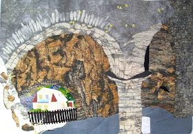
This is a composite photoshopped to merge two photos that I took 15 years ago in Visby, Gotland, which is an island off the coast of Sweden. One photo had the house framed in the arch, and the other had the double arches. I have been meaning to paint this view for a long time...now I have...with fabric :-)
Cherie
Thursday, April 02, 2009
Approaching Storm
I finished Challenge #31 tonight and decided to post it since it won't get quilted for awhile yet. It's not quite as I'd hoped but acceptable. I even managed to stick with my theme of birds albeit a very small one. I decided to depict an approaching storm with the dark clouds forming but with the sun somewhere above making some of the clouds very bright and other parts not receiving the sun's direct light dark. It seems that when this happens the Swallows are always soaring high above catching the last remaining insects before the storm's fury strikes and drives them to cover.