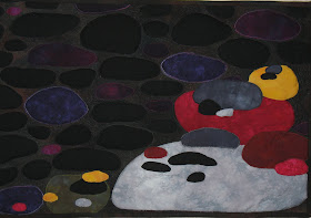
A gallery of the quilts created for the Fast Friday Fabric Challenges. The quilt artists display their work here to give and receive constructive critiques. Only blog members may comment.
Friday, December 31, 2010
Circles
Although the photo is cropped, I have not actually bound the edges yet. Today was a holiday and so I spent most of it working on this challenge. I had the idea for awhile and my sewing room was recently decluttered for its other use as a guest room over the holidays, so finding stuff and actually sewing was amazingly easy and quite satisfying!
The circles done by Kenneth Noland appealed to me and I did a lot of quilting on this even though his works seem quite flat because I needed some practice. I like the way the turquoise silk pops out. The edges of it are raw and already fraying so they are "softened." I didn't fuse everything down. I cut open rings to avoid having so much bulk to stitch through. I just used a few dots of glue to hold them until I quilted. The center circle is more greenish yellow that it appears on my monitor. I'm tired after a full day of sewing, but it was really fun to do something so different.
I look forward to your comments.
:Diane - yarngoddess
Amorphous by Cynthia Ann Morgan
Playing The Field
This will be around 8.5 X 11" when bound.
Seamed fabric creates a hard edge. One thing I did to mask this was to cut the edges free hand and slightly curved. The edges are still "hard" but not ruler straight. Another thing I did was to use matching colors. The yellow is there to create "vibration" between the two colors.
There were several things I considered experimenting with to give the illusion of painted edges.
Due to the time restraint I settled on painted fusible bond. There were actually two colors of yellow painted onto the glue but the lighter seems to have totally dominated the darker yellow.
The weather did not cooperate. I gave up on the paint drying before Spring, tacked the glue down with the iron and scanned it. For quilting I am thinking putting this over a deep, spongy bat and creating little dimples here and there. I am thinking that will add spots of light and shadow. What do you think?
This was a fun experiment.
Thursday, December 30, 2010
Untitled by Pat f in Winnipeg
Color Fields
I responded to the paintings of Clyfford Still with his very irregular shapes. I used the back side of a hand painted fabric and some of my hand dyed fabrics. I ironed the background fabric to decobond to make a stiff surface-which I've decided is a pain to use because the bond does not hold well. A few lines of stitching were done on the background to make sure it stayed together. The shapes were cut without planning and moved around on the background fabric to make a composition. The thin purple strips in the large shapes were just left over strips of fabric that got tossed into the waste paper basket, fished out again, cut in narrow strips and glued on. A few lines of stitching were done on the shapes too. I haven't bound this and will probably not do anything more with it. I like the way the colors play with each other but I'm not 100% pleased with the composition. A good practice piece of something I will continue to pursue. The size is 18 1/2" by 19".
I liked the idea of cropping the piece via a photo so here is one result. Any thoughts on whether or not this is am improvement?
Fourth and Final Attempt
Thank you Betty, for a very, very, challenging challenge! Somewhere in the reading material I noticed a comment: Bad color fields are easy to do, good colorfields are hard to do. How true!
The piece measures 14" x 17". Three previous attempts, which in no way resemble this piece, have fallen by the wayside.
I started with a piece of wet, white cotton. I painted/globbed lumeiere green and bronze paint in two bands across the middle of the fabric. I then smooshed it around and let it drip in two directions. It was intresting that the green paint separated into gold and green while it dripped. Once it was sort of dry I painted a wash of setacolor paint at the top and bottom.
Even though color fields are traditionally flat I decided to free-motion quilt it. After all, it IS a quilt!
"Marriage?"
Here is my piece called "Marriage?" I guess other than binding, it is done. I was fascinated to read about and learn about color field painting and the various artists that worked in the style. I enjoyed very spontaneously creating this piece by arriving at a general idea then cutting the pieces freehand. I liked the batik textures because they has some similarities to the depth and texture of paint on canvas. I frayed the edges of the fabric to make them less hard-edged.
All that said, I'm not thrilled with the end result. It was a fun and informative process, but I don't feel a lot of love for this finished quilt. I wonder if I should do more quilting on the color forms? It seems that the plain flat fabric is more in the color field style. The shape of the pink piece is annoying me, and I also would like to make the blue fabric in the middle darker, but don't know how to do that without making a big mess.
I forgot to mention, this is 23" x 20."
Comments and suggestions welcome - Sharon
Wednesday, December 29, 2010
Bloc de couleur
R.E.M.
Bucket died fabric cut with wavy rotary cutter. Back ground from Carol Bryer Fallert fabric.
Challenge 52: Lava
Challenge 52: Passion/Heat
This is a small piece measuring only 5 1/2 X 10 1/2 inches. I began by layering different combinations and patterns of fabric dyes onto a variety of silk scraps to attempt to represent my understanding of color field (ie. I wanted smooth color transitions and a sense of glowing). Once I picked my favorite of the group, I wanted to continue the idea of smooth color transitions using thread painting over the dye base. However, to me, the dye transitions were more successful than the thread overlays, so I decided to leave the piece half thread and half dyes. Lastly, I decided to overlay the silk onto both a black and a white background fabric to try to further the idea of subtle color transitions. Thank you Betty. For me, this was a great challenge educationally and artistically. I appreciate your comments.
Tuesday, December 28, 2010
Challenge 52 - Chasing Rainbows
Lisa
In Rainy Seattle
Falling Colors
Challenge 52 Orcas by Silvia Dell'Aere
Monday, December 27, 2010
Visions of Chaotic Butterflies
For this I chose the colors I wanted to use, the 2 oranges and the blue and just cut and arranged until something spoke to me. When I thought it was done I spotted the lime green fabric and just knew I had to add it to that corner.
As usual it needs quilting, right now it is just fused together, quilting will more than likely be echo quilting in each shape and possibly a simple linear quilting for the background. I wanted to get this posted now though since I have a mystery quilt that needs to be cut out in the next 3 days.
After finishing this I was looking for a title so decided to see what each color meant.
Oddly they all represent aspects of ME...so this has become an abstracted self portrait, no wonder I had to use these colors!
After the Storm
however I did study the links and the works presented therein. I have to say, that not having a totally clear idea of this challenge, I went with the images that formed in my mind as I looked, cogitated and drew conclusions.
I definitely look forward to your comments on this one.
This is a real departure for me.. not just the Color challenge, but this is done with newspaper on batting, then adhered to a 'texturized' canvas.
A question has been asked... did I consider not having the two strips across the top.... yes, I did, and in fact, left it for 2 days trying to decide. Yellow is very intense and hard to work with... something I have thought about.... maybe someone will comment on.. is should I make those two at the top paler... should I whiten them. Since this is an encaustic type of piece, it would be easy to do.
Fields of Tulips & Morning Sun
I tried two different pieces. The first I call Field of Tulips, tried to depict the colors of the field and the sky ( I think this would be much easier to do with paint than with fabric ). I am ok with this one, it does represent a field of tulips to me but, perhaps it is too 'landscapey'.. The second is Morning Sun, I tried to depict the sun coming through the window ( wouldn't a figure in a chair add more to it?) with a shadow on one wall?
I haven't done any quilting on these as to me they aren't finished. I also noticed that a lot of the samples I looked at were color field and abstract together, which I think would be something that I could achieve. However, that being said I did give Color Field a go and enjoyed the process. I look forward to your comments, and am sure these two pieces will both change greatly in the next few days :-)
Thursday, December 23, 2010
Challenge 52 - Color Field
Challenge #52 December 2010/ due January 1
Guest Hostess: Betty Warner, Simsbury, CT
Theme or Technique: Express something using Color Field concepts
Design Concept: Color Field
Color Field Description and information:
Color Field is a style of abstract painting that came in to prominence in the 1940’s and 1950’s and extended into the 1960’s. It was a departure from the recognized forms of abstract painting and was influenced by European modernism. However, it came into full bloom in New York City. It took Abstract Expressionism in a new direction. The colors and shapes became more important on their own. Many who observe the color field paintings will have the ‘Why I can do that’ or ‘My child can do that’ or ‘A monkey can do that’ sort of reaction. However, it is very difficult to accomplish. Below in the references is one that gives instruction on creating a color field painting.
I have always been drawn to abstract paintings. They make me think and wonder. Standing in front of one, I always find myself drawn in and mesmerized by its affect on me without always understanding why. The color field artists have reduced a painting to its essence. You can only take in the whole while finding it difficult to identify its parts. Even the canvas does not feel separate and distinct. Can you tell I find it fascinating? I hope that you will find it as interesting to explore as I do.
I have read that the key characteristics of Color Field painting are:
· The bright colors are in specific shapes that can be either amorphous or geometic, but not very straight-edged.
· The work emphasizes the flatness of the canvas, because it is what a painting is about.
· The subject, and thus the excitement, of the work is the tension set up between the colors and shapes.
· The lines between figure and ground are blurred to the point there is almost no distinction.
· The works have usually been very large which allows the viewer to experience the color as a vast expanse – or a field of color.
Here is some useful information and history from Wikepedia. :
http://en.wikipedia.org/wiki/Color_Field
More to inform you (this article has wonderful links to specific artist information):
http://www.theartstory.org/movement-color-field-painting.htm
Here are some examples:
http://popartmachine.com/blog/color-field-painting-examples-and-colorfield-theory.html
Here is an interesting ‘how to’:
http://painting.about.com/od/abstractart/ss/color_field.htm
Jackson Pollock, Adolph Gottlieb, Hans Hofmann, Barnett Newman, Clyfford Still, Mark Rothko, Robert Motherwell, Ad Reinhardt, Arshile Gorky (last works), Kenneth Noland, Helen Frankenthaler, Frank Stella, Morris Louis
Some more examples:
http://www.nytimes.com/slideshow/2008/03/06/arts/0307-COLO_index.html
http://www.huliq.com/50865/smithsonian-museum-exhibits-color-field-painting
http://arthistory.about.com/od/modernarthistory/a/color_field_10one.htm
Color Field and Art Quilters
It is my opinion that there are a number of quilt artists who exemplify the Color Field approach. I am not sure that they would describe themselves in that way. However, in my view, some of their works are evocative of ‘color field painting’.
Judith Plotner
http://www.judithplotner.com/zenphoto/landscape/afallday_50.5hx33w.jpg.php
Judith Larzelere
http://www.judithlarzelere.com/gallery.htm
Judith Content
http://www.lindagass.com/IntimateApparel/Artists/JudithContent.html
http://www.cnch.org/cnchnet/winter-2010/dye-for-judith/
http://www.kentuckyarts.org/landscapes/Judith%20Content.htm
http://www.saqa.com/gallery-detail.php?ID=295
Margaret Anderson
http://www.mandersonart.com/gallery/index.htm
Elizabeth Barton
http://elizabethbarton.blogspot.com/2009/08/craftsmanship-and-color-field.html
Dorothy Caldwell
http://www.civilization.ca/cmc/exhibitions/arts/bronfman/traeng11.shtml
http://dearada.typepad.com/dear_ada/2008/04/dorothy-caldwel.html
http://www.velvethighway.com/joomla/index.php?option=com_content&task=view&id=133&Itemid=92
Emily Richardson
http://www.grossmccleaf.com/artistpages/richardsonpage.htm
http://elizabethbarton.blogspot.com/2010/01/emily-richardson-work-is-where-head-is.html
Elizabeth Busch http://www.elizabethbusch.com/a_gallery.htm
Ann Brauer http://www.annbrauer.com/Ann_Brauer_Quilt_Studio/Most_recent_quilts.html
Bonnie J. Smith http://bonniesmith.vpweb.com/Gallery-of--Art.html
Wednesday, December 22, 2010
Fractured, Challenge 51
I am adding this here even though it is totally late, at least it will be on the blog with the rest of the Challenge entries. This is my take on Challenge 51, my choice of a repetitive unit was the triangle. Course my triangles are not the same, not the same size, nor actually the same shape. I did use the same fabric more then once to provide repetition within the design. This is a small quilt only 11.5 inches square. What took so long was the other things I needed to get finished before Christmas, then the hand stitching I was doing on the triangles, and finally the need to finish another project before I could finally finish this one. Fabrics used are all hand dyed, though not by me, I prefer to purchase my fabrics. The background was machine quilted, and all of the triangles hand quilted. For additional information on how I put this together you can visit my blog, and see in-process photographs.
Kathy Walker
http://katwalkdesigns.blogspot.com/2011/01/fractured-fffc-51.html
Challenge 51 rothequilter
I really got into this challenge. I already posted a quilt made of squares. My daughter suggested spheres for this challenge, and I decided to do a second one. I don't like fusing or machine applique very much, so I needle turned all the circles. I quilted with 2 strands of embroidery floss, all circles, except for the border. It seemed to need some straight lines mimicking the design in the fabric. I had beaded some disks and turquoise seed beds, but after I finished beading, I decided that the disks took away from the effect I wanted. I am posting one picture of the finished quilt, and a detail. ro the quilter
Tuesday, December 21, 2010
Rectangles
My choice of shapes was rectangles. I randomly cut them from quilter's lame and either layered them on top of or underneath florist's organdy ribbon in gold. I left the edges raw because I wanted to add in the texture of the fraying edges. I'm not convinced that that was a good idea and I might try to upload a photo tomorrow that shows that better.
The entire piece measures 29" (w) x 26 1/2" (h).
I wondered how beads would look in it...and I laid these rectangular pieces of imitation tiger's eye on top. I think I like it, but I'm not convinced.
I made this smaller version, 13" w x 12" tall to make sure that my tension and choice of quilting elements were what I wanted. I quilted it by coming down in two lines in the center of the rectangle then splitting out and outlining it....sort of like a paddle, and coming back in again at the bottom of the rectangle. I quilted it using Valdani hand dyed thread in a variegated color called "Volcano" which is cherry red, gold and a lighter shade of gold.
After quilting it, I wondered again about beads. I started beading around the edge of the smaller one to see how I liked it. I like it a lot on the small one, but I think it wouldn't look as well on the larger piece. The smaller beads work well on the smaller piece to give it extra interest and texture, but I think they would be distracting on the larger piece.
This is way out of the box for me as I usually do realistic images and I rarely bead. I took a class with Mary Stori and liked it, but I haven't done much with it.
Critques are always welcome. And next time, when I'm working with 100% silk, I'll zigzag the edges before I start working on it!
Lisa Broberg Quintana (Michigoose)
Thursday, December 16, 2010
Savor Every Second
Sunday, December 12, 2010
With the Flow by Madalene Murphy
I came up with a shape I wanted to play with, printed it in a variety of sizes, and then began laying them out in various configurations, trying to keep the final design abstract. I machine appliqued the shapes, machine quilted the background, and used pearl cotton on the shapes themselves. I may play more with the quilting and I need to finish the edges. I'm not sure about the final result, which is about 32 x 20".
It's probably too late--and too near the holidays--to get many critiques, but am appreciative of anyone who takes the time to comment.
Thursday, December 09, 2010
Triangles
I would appreciate any comments concerning the issues I have mentioned, plus any that a fresh eye may see that I have missed.
Wednesday, December 08, 2010
Trangles Blowing in the Wind
Sunday, December 05, 2010
Convergence
21" x 21"
I knew that I did not want a traditional shape for this one; I used Photoshop to create a rounded star shape out of ovals, and then printed it in a wide range of sizes. Initially I had thought of overlapping the shape to get a vortex shading from bright red to yellow, but did not like the low contrast between contiguous shapes. I then went to alternate contrasting colors, added a black/white/gray series and a brown series. This just reminded me of what I called my mother-in-law's "world's worst quilt" which was a random overlapping of flowers made from circles of all sorts of fabric types and colors. However, with raw edge satin stitching, I managed to get more delineation between the shapes.
I then added black stitching to tie the five series of shapes together, added another stitching with a different stitch, and it still needed more. Finally I hit on using the black rick-rack, which echoes the shape, and that pulled it all together.
I welcome your comments on this piece.
Saturday, December 04, 2010
Challenge 51: "In and Out" by Sue from NC
Using a square as my shape, I wanted to explore color perception for this challenge.
Proportional Harmony - by Sharon Robinson
Squares Squared
Using squares seemed popular in this challenge, but I had a bag of silk sample squares that I had been sent when I was a Bernina Fashion Show designer in 2003 and this challenge seemed a great time to use some of them. I spray basted the black background fabric to a piece of timtex and drew lines on the timtex to form a grid. I then stitched the lines with metallic thread in the bobbin so it showed on the black fabric. All the silk squares were fused inside the lines, then a second layer was fused on over the intersections, and a third layer over the intersections of the second layer. Even the square beads, a wonderful find at Joann's, were glued on. I stitched a straight line with metallic thread around the silk squares and may do another straight line after I add a felt back to the piece.I enjoyed seeing the interactions between the colors of the fabrics as I layered them. Photographing the piece was a challenge with all the different values and shine of the silk. Best place turned out to be the porch floor on the north side of the house!
The size is 24" x 12".
Comments welcome-great to see so much variety in this challenge.
Nancy Schlegel
One shape...
Any comments or.. yes... greetings are appreciated.
Stones by Cynthia Ann Morgan
Fair Ribbons Quilt
It took the first two days to sort the ribbons. I started sewing the day after Thanksgiving. I still have to tack down the tops.
The ribbons are from 1990 thru 1993. One of the fairs had a 50th anniversary in 1992 and all their ribbons that year were gold.
I used a piece of quilted fabric for the backing and attached the ribbons with a serpentine stitch and also considered that to be the quilting.
My husband thought I should use all red, white, and blue or just do the 1st and 2nd prizes. I like the variety of colors.
I don't like the white streak going through the picture but I guess it must be the way the light hits it.
Shake it up! - Life in the Snowglobe
When I began quilting, my intention was to use layered and repeated hexagons throughout the piece, as I did in the foreground, but it didn't look right in the sky or on the tree. So for the sky I settled on snow lines coming down with hexagons for the flakes. The tree received a garland.
Finally, I used an edge finish that I had not tried before and bound the edge with a zigzag stitch and a specialty yarn to give the illusion of more snow.
This was a really interesting challenge and I enjoyed working with the one shape.
Ticia Wicks
Waves
Friday, December 03, 2010
Moon Bouquet
I started by cleaning them up (cranky edges and whatnot), then spray basted them to a piece of stabilizer, re-arranging until I had circles going in a spiral design. Did some trimming and then sewed them to the stablizer. The back is a random piece of fabric from the discard pile and this really is the shape... its hanging on my white design wall. The edges are overcast in matching colors (the one I don't like is the brown on the cream colored circle at the top, but maybe that sort of contains it!). Machine quilts with lots of different threads. I'm thinking it might be a nice table topper for my dining table.
Great fun... and ladies, you have done a fabulous job on this challenge! I'm really happy with the results!
And now to go finish holiday gifts!