18" x 21"
While late, this was a fast project nonetheless, started Wednesday June 11th, finished Wednesday June 18th.
I had just gotten back on the 10th from two weeks away, and found a packet of purple fat quarters, so I added them to my bag o' fabric which I brought to the guild room for "Open Paint" day Wednesday. A friend had a photo of a seaside sunset which caught my eye, and I set out to try to recreate that scene.
I rearranged elements a bit, and put the sailboat closer to center rather enlarged -- which then meant that I needed to put in a larger building than the little one I had inserted. Then the tree at left didn't feel right, and it got overlaid with a larger tree with just a bit of outlining. The yellow part of the sunset was then overlaid with just a bit of Angelina fiber, and it was done! I took it the evening after I finished it to the meeting of the Framingham Artists Guild, where it won the "Art of the Month" award!
I look forward to your comments.
Showing posts with label Challenge 93. Show all posts
Thursday, June 19, 2014
Wednesday, June 11, 2014
French Lilacs
Cotton, seed beads, twine and fusible
Tuesday, June 10, 2014
Matisse's Rex Begonia
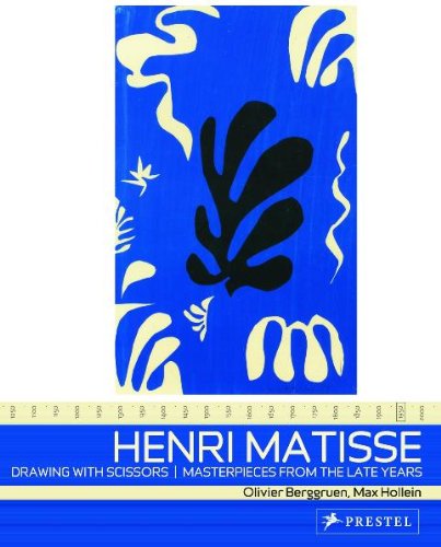
I was fortunate to see a lot of the cut-out works of Matisse in Washington DC with my Mom in about 1977. They had been on my mind again, so in early May I tracked this book down at the public library (ISBN 9783791334738).
| Drawing with Scissors book cover |
I was thinking that begonias, which I love, could be a good candidate for cutout treatment. I grow other varieties of begonias (there are hundreds), because I always kill Rex Begonias. So I made a quilt!
| Rex begonia, from Rhode Island Begonia |
I chose the 'Royal' association for purple, and then I used the Pantone app, which is fun, to come up with a split complementary color scheme. It's one I've never consciously worked with, and I'm glad I tried it!
The initial layout was representational - pot at bottom, leaves coming out, and it looked awful. So I pulled the book out and came up with this layout, and the title.
Thanks for looking and for your critiques. - Lisa
The initial layout was representational - pot at bottom, leaves coming out, and it looked awful. So I pulled the book out and came up with this layout, and the title.
Thanks for looking and for your critiques. - Lisa
Labels:
Challenge 93,
Lisa at DippyDyes
Saturday, May 31, 2014
The Colour Purple
I had an entirely different idea when I sat down with this last Sunday, but that went south really fast, so Monday morning I started painting the fabric and Tyvek. Tuesday I had it on the frame, and late Tuesday started the beading. It has been quite awhile ( years) since I did a Tyvek piece and I had forgotten how elegant they can be. The fused glass cabochon was commissioned from a local glass worker, June Derksen, for an entirely different design, but works very well here. The beads include fresh water pearls and amethyst, as well as a variety of glass beads, and even a couple of sequins.
Purple because of its symbolism as being rich and rare. I chose an analogous colour scheme, and painted in Seta-Color Parma Purple, Fuschia, and Cobalt Blue. I generally use a cool palette, and analogous schemes are my preference. But when the painting was done, I really felt I had to add the gold, which turned this into a split complement. The piece will be mounted and framed
Labels:
Challenge 93,
Pat f in Winnipeg
Thursday, May 22, 2014
Challenge 93: The Colour Purple
Host: Pat Findlay
Title: The Colour Purple
Theme: Exploring colour theory
Technique: Use of the Colour
Wheel
Due date: May 31, 2014
Did
you know that purple was the colour chosen to represent the Suffragette
Movement? Or that Feminism adopted
purple, as a theme colour, in honour of that association?
The
challenge will be to create a piece that uses the colour purple in a symbolic
way.
Technique: use the colour wheel to create a specific colour
arrangement,( i.e.complementary. analogous, split complement etc.) one that must
include the colour purple. Tell
us a bit of how you decided which colours to use, and how the symbolism
associated with the colour purple influenced your choice.
Resources:
Symbolism and psychology surrounding the
colour purple. Everything you ever
wanted to know about the colour purple, and more: http://tinyurl.com/FFFC93-1
or http://www.sensationalcolor.com/color-meaning/color-meaning-symbolism-psychology/all-about-the-color-purple-4329#.UrObEPRDsw4
The Color Purple: Understand
Its Hidden Meaning for Art & Design: http://tinyurl.com/FFFC93-2
or www.finearttips.com/2010/09the-color-purple-understand-its-hidden-meaning-for-art-design
A
quick reference of the use of purple in fashion and art since the Renaissance: en.wikipedia.org/wiki/purple#the_middle_ages_and-the-renaissance
Symbolism
associated with the colour purple: www.colormatters.com/purple
How
to use a colour wheel: http://tinyurl.com/FFFC93-3
or tympanus.net/codrops/2012/02/28/principles-of-color-and-the-color-wheel
The
Many Meanings of Violet / Purple: http://www.color-wheel-artist.com/meanings-of-violet.html
Examples of purple in art work:
Monet:
http://tinyurl.com/FFFC93-4 or http://fineartamerica.com/featured/a-pathway-in-monets-garden-giverny-claude-monet.html
The
Purple Cat -- quilted art work: http://stegart.blogspot.com/2010/07/purple-cat.html
Quilts
and Color: http://tinyurl.com/FFFC93-5
or http://www.mfa.org/exhibitions/quilts-and-color?gclid=COWzj_nuv74CFdF9OgodsSYAOA
And one more thing: have fun with this! :)
Subscribe to:
Posts (Atom)