Showing posts with label Challenge 52. Show all posts

Sunday, January 23, 2011

Challenge #51 and #52

I decided to combine 51 and 52. I sort of kept the idea I had for 51 and changed the fabrics to be better suited for 52. There is no story behind it. No meaning to any of the squiggly shapes. Just what I felt like doing as I went along with no explanation as to why I did any of it, except that I do make a lot of things using the hexagon shape. If you click on the hexagon label on my blog, most of them should come up.


Sunday, January 09, 2011

Challenge 52 River

When I first read this challenge, I knew I wanted to do something because I love so much of this kind of art.  I immediately went to my sheers but didn't have enough of the colors I needed and so let the holiday activities take precedence for a while but I kept coming back to the idea that nature was a theme for many of the color field artists. So I started looking for colors among my hand-dyed fabrics and playing with shapes until a piece emerged that also fit in with a current theme in my work:  connections in nature.  I think my edges are too hard to fit into the color field category, but I decided to post this anyway.  It's about 21" x 29".


It is not quilted or faced yet.  Yesterday I finally had to accept that something is seriously wrong with my sewing machine and it will have to be repaired so this would be ridiculously late if I waited for its return.

Any comments will be appreciated.

Friday, January 07, 2011

Challenge 52: "Border Crossings"

After a VERY long absence (sorry--I don't know what happened to me last year) I'm back in full force! I loved this challenge; it was very educational, made me really think, and inspired me to create something. I don't know how well I succeeded in meeting the goal of creating a "color field" piece, since I'm not sure I fully understand the concept, but I thoroughly enjoyed working on this wall quilt that I'm calling "Border Crossings."

I couldn't figure out how to make the blocks of color seem "blended," so I gave up on that and tried to sort of confuse the eye instead. I had to REALLY fight myself not to quilt this piece to death (my usual MO) because of the "flat texture" look of color fields. Since there's not a lot of quilting, some of the fabric looks a little "loose" (I'm not really sure how to describe it--you know that slight wrinkly effect you get between quilting lines?) so I'm going to starch and iron it as soon as I find my spray starch (long story).

Your comments are greatly appreciated! Michele

Wednesday, January 05, 2011

Late and Still Uncertain!


This has been a great challenge, in an area I knew nothing about. There have been so many examples and so much to study about color fields and I still, like many others, don't feel I have a true understanding of color field. However, that also gives us the opportunity to interpret the challenge with our best guess!
I am so late and also so unfinished with this, but I'm hoping for a few helpful hints from you wonderful critique-ers. My leaves are semi-sheer and fused and I usually would just plop on some yarns and maybe some crystals, quilt the jeepers out of it and call it good! I think I want to aim at a little more sophistication this time, though. My first dilemna is that I can't even decide if I want it round or square!


I added a detail of the leaves, too, to show a little of the overlapping sheers and the little bit of sewing I have added already.


You have all done such inspiring work on this challenge...thanks for helping me to expand myself!

Fast Friday Fabric Challene 52

What If? Do you ever wonder - are there other worlds - what are all the
stars we gaze upon, that hang in the sky and seem to stare down on us?
I wonder do they know us, who we are,what we do?


"Other Worlds 2" started with the wrong side of an upholsters scrap. I
painted the fabric with a faux metal and patina glaze. Using fabric
paints and pigmented acrylic ink I followed my vision toward a portion
of the universe. ( strictly using my imagination) Free motion
embroidery with the help of some copper fibers ( which I was able to melt) completed my challenge 52. Comments would be appreciated.
This was an excellent challenge . Working with the color fields while
attempting to create an abstract with depth and reason. TY Betty great choice for the challenge:)


Susan Ward
Quilting in Kentucky

Sunset on Emerald Lake


I was out of town until last Sat. night (our due date) and had no internet for two weeks, so a very late start on this one.


I have attempted to achieve the feeling of broad brush strokes blending into one another using all sheers (again :-)). I layered two pieces of each sheer slightly shifted on each other to blur the lines...gold, red, blue-green and dark green and the center strip is a sort of variegated metallic fabric with all the colors shifting with the light. The "batting" is off white organza and the backing is black chiffon (to deepen the colors).

There is no machine stitching and no fusible used. I layered all the pieces, basted in place, then quilted the pieces in place using matching metallic threads and a loosely, sort of organic, uneven running stitch to represent the individual fibers from a paint brush.

It was really hard to get a good picture due to the light reflecting on the ripples created by the stitching and the shiny materials. This one also looks great backlit.

The piece measures 25"x30"


This was a real thought provoking challenge and I hope I got it right. Thanks Betty for introducing us to a new (to me) concept. I think I will try to do more.

Any comments and especially your thoughts on what if any emotion experienced would be greatly appreciated...

Cherie


Sunday, January 02, 2011

Challenge #52 Color Field


Color Field #1-1000

This was so named because it will cover me for any color field quilt from now ‘till #1000!!! Let’s just say that this is not my art love. Everything I read seemed to contradict the last thing read----so finally just made a stab at it without looking at what anyone else had done. It is not quilted—rectangles and “spear” were ironed on and then machine appliqued down. Also not finished.

It measures 6" x 11.5".

Happy New Year to all--Sally

I looked at the comments from members and decided to try to remedy the poor little thing. I'm not sure it was successful. I do like turning it 90°. The quilting does not add anything to the Color Field---but did give me a chance to try some new things. I got a wonderful new thread stand for Christmas and can now use some threads that were just impossible before. The satin stitch on the edges is truly terrible. Nothing I tried made it better. So---it will just have to be. The size is the same. Onward and upward! Sally


Saturday, January 01, 2011

Color Field Your Guess is as Good as Mine

When this challenge was posted, I thought I understood what the pieces were...and I started working on two pieces. However, when some of the FFFC'ers started saying that they were confused...I started looking a little further and decided that I wasn't doing it properly.

The definition I took was one put out in Art History Basics, stating that color field paintings were abstract, not based on nature, treat the canvas or paper as a "field" of vision without a central focus; emphasize the flatness of the surface, and reveal the artists emotional state of mine or his or her expression.

One of the things I found interesting is that it could be "amorphous or clearly geometric, but is about the tension created by overlapping and interacting areas of flat color."


This sort of bothered me....How can one show have the overlapping and softness without using brushwork? And that then became my challenge. How to translate this into quilting. Obviously, I couldn't piece as it would create the sharp edge.

That's when I hit upon using Angelina and foils. The coppery/gold area you see in the center "stripe" and the white-ish stripe are both areas which have been foiled, one with copper foil and the other with a opalescent one I think of as being gasoline on water. I then put pieces of Angelina down (the pink and the sort of reddish on the far left. The red is much redder in this light that it is in reality as I mixed a bright plum with "rusty nail."

The next problem was how to quilt it....If color field painting were all about flatness, then I didn't really want to have any texture, but quilting is ALL about texture. Even when we are quilting a piece and trying to make it flat, there is texture. So, I used a copper metallic thread and a pearl Sliver thread by Sulky for the quilting in the colored areas. The blue, I just quilted in long wavy lines in a blue rayon.

This is WAY out of the box for me as I don't usually do abstracts. I liked how the angelina and the foil gave the colors and soft edges similar to brushwork.

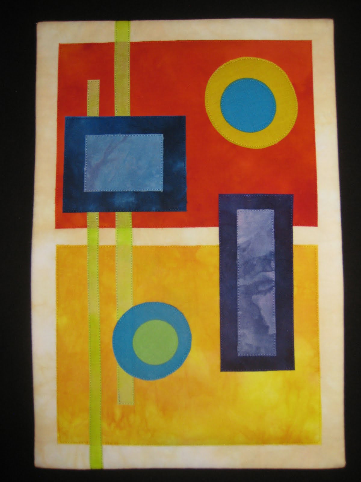
The piece measures 33 1/4" high x 19" wide. I don't have a name for it and would be happy to take suggestions as well as critiques.

Lisa Quintana aka Michigoose

Color Field

Setacolor was used to sunprint the fabric that the 3" squares were cut from. I used a variety of plants, wooden hoops, washers, needlepoint canvas, and plastic doilies. I tried many background colors, but when I auditioned this piece of orange, it began to sing.

I used Setacolor with a little pearlescent paint added on this gorgeous Haroati Silk. I love it the way it is and will probably keep it whole.
Both pieces are approximately 18" x 24" and neither have been quilted yet. Although one has very hard, straight edges and the other is soft and flowing, both are all about the interaction of color.
Fun challenge.

Challenge 52 - "Spinal Dance"

This is a quilt top I started in a workshop last spring. When this challenge was announced, I thought of a few ideas. I found this subject very hard to grasp.

This quilt is totally out of my realm. I rather like the begining rough, but felt it was too small. First I added paint to the workshop piece to try and 'square it up' for quilting. I still felt it was too small, so I added irregular borders. This looked to stark. So I painted and painted and painted some more.

Today I quilted. Not totally happy with the result. However, I am thrilled to have this finished. My first quilt of 2011.

Spinal Dance
18" x 29.5"

FFFC 52 "Endless Summer"

Okay, this group is really pushing my boundaries, but in a good way. I was going to use the holidays and travel as an excuse to not complete this challenge. The real reason being that abstract quilts are a new venue for me and understanding the colorfield concept was difficult for me. But hey, I am three for three for these challenges, so I forged ahead! A post a couple of days ago cleared the waters a little for me, so I went ahead and attempted a piece.

I have titled my adventure "Endless Summer" which is what I am wishing for in the subzero temperatures of Spokane, WA. I chose the colors of blue (for the sky), green (for the plants), and yellow (for the sun). I pulled out a piece of white silk and used my dyes to paint it, which is another first for me. Once the foundation was done, I struggled with what to add to it. I have been reading some posts about lutradur and it's transparency, so I decided to paint it with the same colors. After it was dry, I sliced it and diced it and then rearranged the pieces into a grid pattern. I think that if I had diluted my dyes more, the grid would have blended more into the background, but I didn't really consider this until everything was already put together. I then quilted it with vines and leaves, and yes, those are the sun's rays peeking out of the squares! I echo quilted around the grid and am thinking that I will add more rays on the outside of the grid. I believe that it loosely fits what I understand to be the colorfield style. It is okay if I didn't hit it on all levels, because I love my piece and it brightened my otherwise very cool day!

Colors


I began to be very worried that, once again, I would not have time to complete the challenge I hosted. But here we go. This photograph does not represent the actual colors very well. It was interesting to work through this process - the study, the planning, the reality check about what you can actually accomplish in a week - both more and less than I thought. After many iterations of oh so wonderful plans, I decided to work with some handdyes I created in October. There are actually six fabrics from a two color gradation from fuschia to yellow with the addition of the high contrast black. I like the decisions I made about the placement of colors. I fear that it is a boring piece even though it is what I was after and I actually like it - the simplicity, the colors, the contrast.

Any comments or suggestions for improvement are very welcome.

Challenge 52 "Undulating Colors", Pam Clark


After studying all the links, I remembered that I had some blocks that I had created in a class taught by Scott Murkins on strata quilting. I felt that these blocks met many of the requirements of Color Fields. I saw some samples that were divided into squares, and I felt this quilt needed that. I tried to arrange the blocks so that colors were grouped together to give a feeling that the colors are flowing across the piece and running off the edge. Not being an art major, I'm not sure if my piece qualifies as a typical Color Field quilt, but I certainly did learn about a new type of art that I had never studied before, and it broadened my horizons in quilting. Thank you, Betty, for the great challenge and I applaud all the quilters who have already submitted their beautiful works of art.

Series of Twos


9 X 14
Thank you, Betty, for introducing us to the technique and history of Color Fields. I enjoyed all your examples and those some of the members provided. This challenge has produced a great variety of quilts/techniques and I suspect a good learning experience for most, if not all of us. I’m not sure I met the challenge but I had a good time working with shapes and bright colors. Comments/Critiques are welcomed. Thanks, Pam

Four Spirits

I wasn't sure if I've have time to do a challlenge this month. Holidays, of course, plus work and the usual stuff. Then we had an 18" snowfall starting on Wednesday, which closed most of the town including my clinic for 2 days. Nice. Perfect snow dyeing weather! And my deck had 18" of fresh powder that was perfect for the project. I've only done ice dyeing before (using pellet ice), but the idea is the same. The first batch (yesterday) was fine, altho pale. So I mixed up fresh dye this morning and did another. This piece was fan folded, then folded in half. Instead of placing it on a draining screen (which I did yesterday), I just put 4 FQ's in a bin (some twisted, some scrunched, this one folded), and loaded the bin with snow and poured on the dye. I used fire red, cerulean blue, moss green and golden yellow, and had no idea what piece was under which part of the snow.
Then, of course, the hard part is waiting for the snow to melt! It was a pretty muddy mess when it was all melted, but I rinsed and washed and dried, and this is what appeared. I think it's color field!
I immediately saw 4 spirit figures (or dancers...). It's not quilted .... I might just put it on stretcher bars and hang it.
Comments of course, are welcome!
Wendy in very cold Flagstaff on New Year's Eve

Friday, December 31, 2010

Circles


Although the photo is cropped, I have not actually bound the edges yet. Today was a holiday and so I spent most of it working on this challenge. I had the idea for awhile and my sewing room was recently decluttered for its other use as a guest room over the holidays, so finding stuff and actually sewing was amazingly easy and quite satisfying!

The circles done by Kenneth Noland appealed to me and I did a lot of quilting on this even though his works seem quite flat because I needed some practice. I like the way the turquoise silk pops out. The edges of it are raw and already fraying so they are "softened." I didn't fuse everything down. I cut open rings to avoid having so much bulk to stitch through. I just used a few dots of glue to hold them until I quilted. The center circle is more greenish yellow that it appears on my monitor. I'm tired after a full day of sewing, but it was really fun to do something so different.


I look forward to your comments.
:Diane - yarngoddess

Amorphous by Cynthia Ann Morgan


Here's my Challenge 52 Color Field piece. I've been awed and inspired by the work of Clyfford Still ever since I saw an exhibit of his work at the Denver Art Museum a few years ago. I love his organically shaped color fields and I tried to use that feel when I free cut the color pieces and fused them to the blotchy hand dyed background. Lot of quilting to add texture, which isn't a color field concept since they emphasized the flat surface....but then again, they didn't have the glorious quilting stitch in their toolbox!


Comments and greetings welcome

Cynthia

Playing The Field


This will be around 8.5 X 11" when bound.
Seamed fabric creates a hard edge. One thing I did to mask this was to cut the edges free hand and slightly curved. The edges are still "hard" but not ruler straight. Another thing I did was to use matching colors. The yellow is there to create "vibration" between the two colors.
There were several things I considered experimenting with to give the illusion of painted edges.
Due to the time restraint I settled on painted fusible bond. There were actually two colors of yellow painted onto the glue but the lighter seems to have totally dominated the darker yellow.
The weather did not cooperate. I gave up on the paint drying before Spring, tacked the glue down with the iron and scanned it. For quilting I am thinking putting this over a deep, spongy bat and creating little dimples here and there. I am thinking that will add spots of light and shadow. What do you think?
This was a fun experiment.

Thursday, December 30, 2010

Untitled by Pat f in Winnipeg

Or maybe I should call it "More trouble Than it was Worth". When I first saw the challenge and looked at the references, I thought that it either had to be layered transparent fabrics or paint. Since I had no transparent fabric, I chose paint. This is a gelatin mono-print on polyester satin. I was given the satin and it's not something I would normally use. I used Seta-color for the printing. It was then FMQ'd and satin stitched around the edge. I actually love the print, and think that the satin is an effective background. Putting it through my machine was another issue--one that involved a hurried trip to the repair shop on the other side of the city. Considering that this is a holiday weekend, and he had no parts in stock, he was nice enough to lend me the part off one of his floor models. Whe-e-ew! I had visions of not being able to use my machine for a week or more, as it was my throat plate mechanism that fell into pieces--yes pieces. Anyway, it's finished and before deadline. Now I have to try to get it into the album.

Color Fields


I responded to the paintings of Clyfford Still with his very irregular shapes. I used the back side of a hand painted fabric and some of my hand dyed fabrics. I ironed the background fabric to decobond to make a stiff surface-which I've decided is a pain to use because the bond does not hold well. A few lines of stitching were done on the background to make sure it stayed together. The shapes were cut without planning and moved around on the background fabric to make a composition. The thin purple strips in the large shapes were just left over strips of fabric that got tossed into the waste paper basket, fished out again, cut in narrow strips and glued on. A few lines of stitching were done on the shapes too. I haven't bound this and will probably not do anything more with it. I like the way the colors play with each other but I'm not 100% pleased with the composition. A good practice piece of something I will continue to pursue. The size is 18 1/2" by 19".

I liked the idea of cropping the piece via a photo so here is one result. Any thoughts on whether or not this is am improvement?