Showing posts with label Pat f in Winnipeg. Show all posts

Saturday, May 31, 2014

The Colour Purple


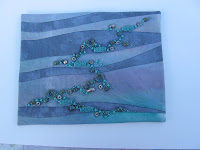
I had an entirely different idea when I sat down with this last Sunday, but that went south really fast, so Monday morning I started painting the fabric and Tyvek.  Tuesday I had it on the frame, and late Tuesday started the beading.  It  has been quite awhile ( years) since I did a Tyvek piece and I had forgotten how elegant they can be.  The fused glass cabochon was commissioned from a local glass worker, June Derksen, for an entirely different design, but works very well here.  The beads include fresh water pearls and amethyst, as well as a variety of glass beads, and even a couple of sequins.

Purple because of its symbolism as being rich and rare.  I chose an analogous colour scheme, and painted in Seta-Color Parma Purple, Fuschia, and Cobalt Blue.  I generally use a cool palette, and analogous schemes are my preference.  But when the painting was done, I really felt I had to add the gold, which turned this into a split complement.  The piece will be mounted and framed

Wednesday, April 02, 2014

In Focus


When I first read this challenge, I immediately thought that it would require a gradation dyeing, but knew that one week just wouldn't give me enough time to set up the wet studio that only exists around here in summer. ( We still have huge amounts of snow and freezing temperatures).  Then I remembered that I had some remnants from grey and black gradation dyeing I did a few years back.  However, I could only come up with a range of three that worked together.  So, I added black and white, even though neither is really part of a true grey scale.  However, it still needed more.  Since the grey I had, appeared to have a very slight shaded teal undertone, I used the red-orange as a complement, and think it works fairly well together. 
 The piece is 12" by 12"

Saturday, February 01, 2014

Ori-Nui Shibori


When this challenge was announced, I immediately thought of all of the wonderful Shibori fabric I have created over the past couple of years.  While I've used many colours, a fair bit of it was done in blues.  Looking through the various fabrics, I found this table centre that I started working on a couple of years ago.  This was during a time that my arthritis was making itself known.  When I saw this, I had to accept the reality that it is unlikely that I will ever start any other hand stitched project. I am no longer capable, but --I could finish this!  A sort of "last Hurrah".

While I can't really call this "art", I did create the  dyeing design on the fabric, and then used that as a basis for the stitching design. I used a fairly coarse running stitch, using Coton a Broder--somewhat reminiscent of Sashiko.  My days of 20+ stitches to  the inch are long gone. :(

I feel a great sense of accomplishment with this, and welcome any comments.
Pat Findlay
aka fndlmous

Wednesday, January 01, 2014

Winter Ditch


Here is the full view, followed by two close-ups

This is my impression of a dried grasses in a snow filled winter ditch.  I started with white fabric and added colour using coloured pencils, because snow is very rarely seen as pure white.. The actual FMQ'g was done with three different colours of thread.  I used one of my own photos as inspiration.  I have been fascinated with the effect of wind and water, on snow and sand, for years and collect photos whenever I can.  Comments are welcome.
Pat f in Winnipeg

Friday, November 29, 2013

Butterfly trio

I tried a couple of things before finally settling on this little trio.  I was inspired by the article on the presence of butterflies  in the belief system of  Pre-Columbian Central Americans.  I was also taken by the description of the use of stamps to embed butterfly images in pottery.  I created a stamp using Craftfoam and matt board.  The image was taken from the breast plate shown on a statue.  First I stamped the black out line and then painted in the coloured areas.  The entire piece was free-motion echo quilted ( Boy, does my FMQ'g ever need practice!) I felt that the binding needed to be black to frame the images.  Despite a couple of paint blobs and smears, I have become quite attached to these little critters,and hope to use the motif in other work in the future.  Any comments would be welcome.

Pat F in Winnipeg
www.mousefactorydesigns.blogspot.com

Saturday, May 05, 2012

Waterworld


I wish I could interpret these challenges a little less than literally, but here it is.  I wanted to experiment with Lutradur and coloured a large piece with Tee-Juice markers. When put on the dark background the colour was lost so I fused two pieces of Lutradur together and then cut out the shapes with an electric needle that I bought years ago to cut templates ( Yeah, that long ago! LOL) Each individual piece is fused to the background and then sewn with a narrow free-motion zig-zag stitch.  The background is narrowly machine echo quilted.  The entire piece is only about 16" square.

Friday, April 06, 2012

Untitled and unfinished

I have really struggled with this challenge. In the end, I decided that I would paint, and then quilt a seascape. The painting didn't go so well. My last attempt looked perfect while it was wet but faded into nothing as it dried. The sailboat was added in an effort to bring it to life. And then I realized that there is too much wind in the sails for such a quiet sea. Perhaps it's a ghost ship, and sails along without benefit of wind.

Certainly not one of my best efforts, but I plan to persevere with it and see what happens.

Pat F in Winnipeg
aka fndlmous

Friday, December 02, 2011

Shadowed Grapes


Here is my finished challenge.  I wanted to use only fabric etc that I had on hand, so chose to use some of my LWI hand-dyed fabric, in this case cotton Damask.  The background is LWI-dyed muslin.  I had hoped to use the shading of the fabric as the shading on  the grapes but it wasn't quite enough, so I added a bit of coloured pencil  I love the effect of LWI on the cotton Damask.  The weave gives the finished result a kind of "glow" that you don't get with any other fabric. The weave also presents special problems when using a raw-edge applique.  Since I was limited to what I had on hand, the colours could have been better, but overall, I think they work quite well.
Pat f in Winnipeg
aka fndlmous

Thursday, September 01, 2011

Joy!

While doing some sunprinting with my granddaughters ( 3 and 6years) last weekend, we found the strangest thing in the bush near our cabin. It is a battery-operated light contained in a square block about 11" by 11" by about 2" thick. It is a bas relief of a sunflower. With my last piece of fabric we took an impression of it using wet fabric and thin paint. As the piece dried the paint settled into the grooves resulting in the background of this. The colours were so cheerful and happy that I knew it would be perfect for this challenge. I FMQ'd it with bright yellow rayon thread, but it didn't show up very well, so I added some bright green around the edge of the image. The edge is finished with satin stitch over twisted perle cotton.
Great fun, and I'm very happy with it, and have made two more ( without the grandchildren's help-lol), with a little more care and attention, that have much greater detail.
I certainly can't take credit for the design, but neither can I give credit where due, as I have no idea where the original object came from or who made it.
Pat f in Winnipeg
aka fndlmous

Wednesday, April 27, 2011

Snowflowers

Here are pictures of my response to this challenge. In response to the request for a representation of nature, and the suggestion of some sort of pieced background, the background is inspired by a picture I took of the contours that can develop as an effect of wind action on snow. It is made of muslin and a second piece of muslin that has been stamped with three different stamps and three different colours of fabric paint. The background was then FMQ'd to reinforce the contour effect, in response to the request for rhythm and repetition. The piece needed a focalpoint, so the gold leaves were screen printed. A contour quilted background does NOT make a good surface for screen printing, so I attempted to camoflage the leaves a bit with the ribbons and beads.

Here they are.
Pat F in Winnipeg

Thursday, December 30, 2010

Untitled by Pat f in Winnipeg

Or maybe I should call it "More trouble Than it was Worth". When I first saw the challenge and looked at the references, I thought that it either had to be layered transparent fabrics or paint. Since I had no transparent fabric, I chose paint. This is a gelatin mono-print on polyester satin. I was given the satin and it's not something I would normally use. I used Seta-color for the printing. It was then FMQ'd and satin stitched around the edge. I actually love the print, and think that the satin is an effective background. Putting it through my machine was another issue--one that involved a hurried trip to the repair shop on the other side of the city. Considering that this is a holiday weekend, and he had no parts in stock, he was nice enough to lend me the part off one of his floor models. Whe-e-ew! I had visions of not being able to use my machine for a week or more, as it was my throat plate mechanism that fell into pieces--yes pieces. Anyway, it's finished and before deadline. Now I have to try to get it into the album.

Monday, June 28, 2010

Strata

This is my piece called Strata. It is pieced with a curved piecing method, the seams are emphasized with metallic thread in a triple stitch. Each bead is attached individually by hand. The colour is not great, and I had a difficult time up loading the picture. Somehow I got into Picasa, and then it refused to upload the close-up. My colour choices include turquoise and purple with some touches of pink. The piece is faced rather than bound and is 11 1/2" by 10".
Pat f in Winnipeg
aka fndlmous