Showing posts with label Challenge 51. Show all posts

Sunday, January 23, 2011

Challenge #51 and #52

I decided to combine 51 and 52. I sort of kept the idea I had for 51 and changed the fabrics to be better suited for 52. There is no story behind it. No meaning to any of the squiggly shapes. Just what I felt like doing as I went along with no explanation as to why I did any of it, except that I do make a lot of things using the hexagon shape. If you click on the hexagon label on my blog, most of them should come up.


Wednesday, December 22, 2010

Fractured, Challenge 51


I am adding this here even though it is totally late, at least it will be on the blog with the rest of the Challenge entries. This is my take on Challenge 51, my choice of a repetitive unit was the triangle. Course my triangles are not the same, not the same size, nor actually the same shape. I did use the same fabric more then once to provide repetition within the design. This is a small quilt only 11.5 inches square. What took so long was the other things I needed to get finished before Christmas, then the hand stitching I was doing on the triangles, and finally the need to finish another project before I could finally finish this one. Fabrics used are all hand dyed, though not by me, I prefer to purchase my fabrics. The background was machine quilted, and all of the triangles hand quilted. For additional information on how I put this together you can visit my blog, and see in-process photographs.
Kathy Walker
http://katwalkdesigns.blogspot.com/2011/01/fractured-fffc-51.html

Challenge 51 rothequilter


I really got into this challenge. I already posted a quilt made of squares. My daughter suggested spheres for this challenge, and I decided to do a second one. I don't like fusing or machine applique very much, so I needle turned all the circles. I quilted with 2 strands of embroidery floss, all circles, except for the border. It seemed to need some straight lines mimicking the design in the fabric. I had beaded some disks and turquoise seed beds, but after I finished beading, I decided that the disks took away from the effect I wanted. I am posting one picture of the finished quilt, and a detail. ro the quilter

Tuesday, December 21, 2010

Rectangles

I apologize for these being so late, but I thought I had better get them up. I actually finished the bigger one at left (as far as the quilting and the stitching goes) in time...but I found myself playing that "what if" game. I seem to think that I am wonder woman and can do it all.

My choice of shapes was rectangles. I randomly cut them from quilter's lame and either layered them on top of or underneath florist's organdy ribbon in gold. I left the edges raw because I wanted to add in the texture of the fraying edges. I'm not convinced that that was a good idea and I might try to upload a photo tomorrow that shows that better.

The entire piece measures 29" (w) x 26 1/2" (h).

I wondered how beads would look in it...and I laid these rectangular pieces of imitation tiger's eye on top. I think I like it, but I'm not convinced.

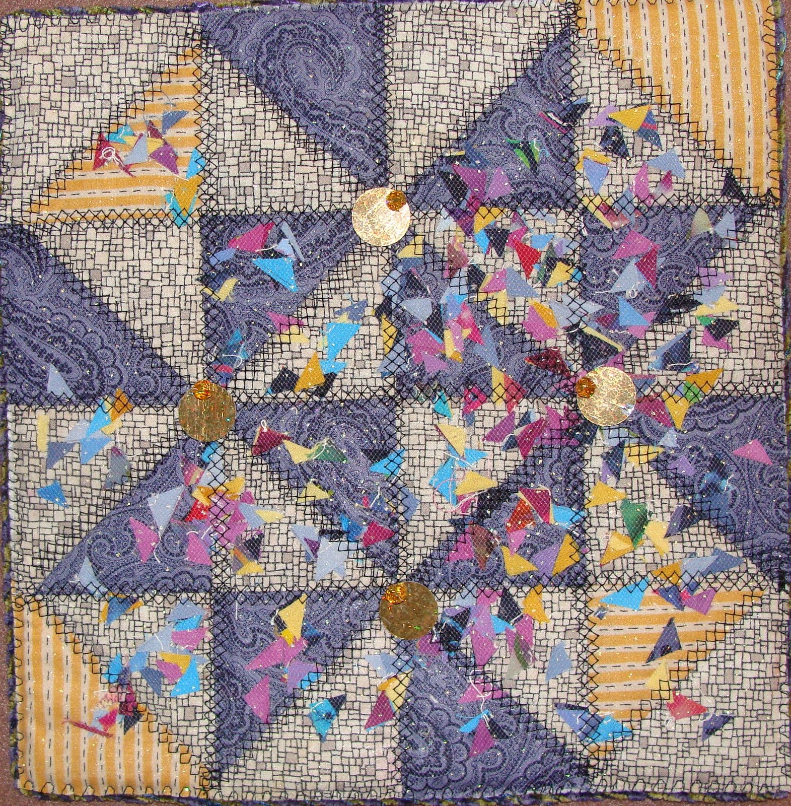
I made this smaller version, 13" w x 12" tall to make sure that my tension and choice of quilting elements were what I wanted. I quilted it by coming down in two lines in the center of the rectangle then splitting out and outlining it....sort of like a paddle, and coming back in again at the bottom of the rectangle. I quilted it using Valdani hand dyed thread in a variegated color called "Volcano" which is cherry red, gold and a lighter shade of gold.

After quilting it, I wondered again about beads. I started beading around the edge of the smaller one to see how I liked it. I like it a lot on the small one, but I think it wouldn't look as well on the larger piece. The smaller beads work well on the smaller piece to give it extra interest and texture, but I think they would be distracting on the larger piece.

This is way out of the box for me as I usually do realistic images and I rarely bead. I took a class with Mary Stori and liked it, but I haven't done much with it.
Critques are always welcome. And next time, when I'm working with 100% silk, I'll zigzag the edges before I start working on it!

Lisa Broberg Quintana (Michigoose)

Thursday, December 16, 2010

Savor Every Second


I painted and quilted circles to form a color vision test that emphasizes 86400, the number of seconds in a day.


Meena

Sunday, December 12, 2010

With the Flow by Madalene Murphy

I am very late with this.  I shouldn't have read the challenge in the midst of preparing for a show and for the holidays, but I was intrigued and I hadn't entered a challenge for a while.  So I started working on it between all the other things that needed to be done.

I came up with a shape I wanted to play with, printed it in a variety of sizes, and then began laying them out in various configurations, trying to keep the final design abstract.   I machine appliqued the shapes, machine quilted the background, and used pearl cotton on the shapes themselves.  I may play more with the quilting and I need to finish the edges.  I'm not sure about the final result, which is about 32 x 20".

It's probably too late--and too near the holidays--to get many critiques, but am appreciative of anyone who takes the time to comment.

Thursday, December 09, 2010

Triangles


My shape is a triangle. Design Size - 14 X 16 with the triangle edges. The lines are illusionary, because each triangle is double layered with the top layer a bit smaller than the bottom to allow the bottom layer to show through.
I added the edging triangles because the thing looked silly as a rectangle. I'll consider how to construct the edges when I finalize that part of the design. Right now my feeling is to keep the irregular edges but without a fabric background.
This is just the design created in Corel. One concern is balance, and whether the (illusionary) diagonal lines on the right side should point in toward the center lines , or whether, as an abstract design, it works as it is. Actually, it's a matter of the direction of the light triangles more than the lines.
I feel the darks & lights balance themselves, but other comments are appreciated.
My other concern is the lack of a focal point. I’ve just finished 2 Quilt University classes; Elizabeth Barton’s Inspired To Design, and Lyric Kinard’s Artist Toolbox, so focal point is very much on my mind. There definitely is no place for the eye to rest, but I have no idea what would constitute a focal point in this design, unless it would be the center of the crossed diagonal lines just above the center of the piece.
I really like the serendipity-ness of the secondary design formed by the light and dark lines, but they also create the problem - if that makes sense.
The color scheme is yellow-green and violet. I was trying for a split complementary scheme, but the yellow-orange just doesn’t seem to work too well. I also tried yellow-green and red-violet complements, and that’s sort of iffy but might work.
Using a grayscale as a reference for the values, the only other color scheme that highlights the secondary design seems to be the red/black with white. I have some tone on tone red prints that might be interesting, but the over-all look of the piece would lose its more delicate look. I’m not sure that would be a bad thing, it’s just an analytical statement.
This design is sooooo much fun to play with. There are too many new secondary designs formed by rotating the triangles that it’s hard to stop.
I would appreciate any comments concerning the issues I have mentioned, plus any that a fresh eye may see that I have missed.

Wednesday, December 08, 2010

Trangles Blowing in the Wind


I am late!! Charter my server's new modem had problems and kept crashing my computer...between a computer tech and charter repair... I was finally back on line on the due date for this challenge.


I found this small block all triangles and since I was late... decided to use it for the one shape


challenge. a little box of "dog-ears" (tiny triangles) saved for a future use :) A piece of misty-fuse..sprinkled with the "dog-ears"...covered with sparkled net and ironed down and quilted with triangle embroidery stitches. The edge finish I used the one I use for my fabric post cards ...yarn held next to the edge and stitched with embroidery stitches. The post cards have a stiff interfacing and the finish also worked well with the softer edges. Light and dark windmills on the piece... I added some beads and sequins in the center of the windmills. I'm thinking I didn't need them..they are not triangles!

Sunday, December 05, 2010

Convergence


21" x 21"

I knew that I did not want a traditional shape for this one; I used Photoshop to create a rounded star shape out of ovals, and then printed it in a wide range of sizes.  Initially I had thought of overlapping the shape to get a vortex shading from bright red to yellow, but did not like the low contrast between contiguous shapes.  I then went to alternate contrasting colors, added a black/white/gray series and a brown series.  This just reminded me of what I called my mother-in-law's "world's worst quilt" which was a random overlapping of flowers made from circles of all sorts of fabric types and colors.  However, with raw edge satin stitching, I managed to get more delineation between the shapes.

I then added black stitching to tie the five series of shapes together, added another stitching with a different stitch, and it still needed more.  Finally I hit on using the black rick-rack, which echoes the shape, and that pulled it all together.

I welcome your comments on this piece.

Saturday, December 04, 2010

Challenge 51: "In and Out" by Sue from NC


Using a square as my shape, I wanted to explore color perception for this challenge.

I used an acrylic painting by Frank Stella "Double Scramble: Value Scales, Yellow & Spectrum" reproduced and discussed in the book "Color in Contemporary Painting" by Charles Le Clair as my starting point.


My original design using mid to dark value purple squares to complete the larger square seemed to diminish the optical illusion of spatial depth. (see photo below).


My revised design (top) uses implied squares to maximize the color effect. There are no quilting lines through any of the blocks. The apparent "lines" are optical illusions.

Great challenge.

Comments welcome.

Proportional Harmony - by Sharon Robinson

I knew as soon as I saw the challenge that I wanted to do something with a “golden section” rectangle. Our company’s logo is based on this proportion and was designed by our senior partner, who founded the firm 50 years ago. He passed away earlier this month. He was a strong advocate for “proportional harmony” so this piece is dedicated to him. I’m not sure he would have liked it much, he was also a a big advocate of simple elegance, something I have yet to master.


I’ve always been fascinated with geometric patterns and the various ways they can repeat, so I took a “golden section” rectangle and started arranging it in different patterns. I claim it still meets the intent of the challenge because the red squares are really just negative spaces left between the rectangles. Sorry that it’s unfinished as usual, but I wanted to share while everyone is still looking.

I wanted to piece instead of fusing this time because I'm interested in exploring that overlap of "art" vs "traditional" piecing with blocks. The repeating block for this piece is simply a gray plus a black rectangle.
My intent is to quilt the rectangular construction lines in black, and couch a bright red cord over the spiral, but I've never couched anything, so I need to see if my technical skill is sufficient for that before I ruin the piece. I already learned one new technique on this piece - using my ink jet printer on fabric. The faint construction lines for the quilting were printed on the gray fabric before I cut it out.

I'd be happy to hear thoughts or suggestions for quilting and finishing.


Squares Squared


Using squares seemed popular in this challenge, but I had a bag of silk sample squares that I had been sent when I was a Bernina Fashion Show designer in 2003 and this challenge seemed a great time to use some of them. I spray basted the black background fabric to a piece of timtex and drew lines on the timtex to form a grid. I then stitched the lines with metallic thread in the bobbin so it showed on the black fabric. All the silk squares were fused inside the lines, then a second layer was fused on over the intersections, and a third layer over the intersections of the second layer. Even the square beads, a wonderful find at Joann's, were glued on. I stitched a straight line with metallic thread around the silk squares and may do another straight line after I add a felt back to the piece.I enjoyed seeing the interactions between the colors of the fabrics as I layered them. Photographing the piece was a challenge with all the different values and shine of the silk. Best place turned out to be the porch floor on the north side of the house!

The size is 24" x 12".

Comments welcome-great to see so much variety in this challenge.

Nancy Schlegel

One shape...

Wanting to do something other than a 'normal' shape... I decided on a tessellation of some kind. It reminds me of a waterfall... tears.. or? I haven't quite finished it, I am using some black floss in hand quilting the outer area. The design itself is one piece, layered with batting, then placed on the black fabric. I was going to cut again around the shape leaving a quarter inch border, but I think the weight of the design needs the extra 3 layers to support it... what do you think? I love the sheen of rayon thread so all the threadwork is rayon.
Any comments or.. yes... greetings are appreciated.

Stones by Cynthia Ann Morgan


Here's my one shape piece. I used the shape of a rock in various sizes and colors. I was dying to add some round shapes in there too...might do that later.

Comments and greetings welcome!

Cynthia

Fair Ribbons Quilt


This is something I've been wanting to do for awhile and when I read the rules that all pieces had to be the same shape I figured this is the time to do it. It is much larger than my usual Fast Fridays.

It took the first two days to sort the ribbons. I started sewing the day after Thanksgiving. I still have to tack down the tops.

The ribbons are from 1990 thru 1993. One of the fairs had a 50th anniversary in 1992 and all their ribbons that year were gold.

I used a piece of quilted fabric for the backing and attached the ribbons with a serpentine stitch and also considered that to be the quilting.

My husband thought I should use all red, white, and blue or just do the 1st and 2nd prizes. I like the variety of colors.

I don't like the white streak going through the picture but I guess it must be the way the light hits it.

Shake it up! - Life in the Snowglobe


My challenge was working with hexagons. I started off abstract and thinking about piecing them, but they just didn't want to go that direction. The tree is made up of about 300 hexagons cut out of the scrap pieces in my stash and then layered on top of each other. The snow and snowmen are also made completely of hexagons, together with the ornaments and all their accessories.

When I began quilting, my intention was to use layered and repeated hexagons throughout the piece, as I did in the foreground, but it didn't look right in the sky or on the tree. So for the sky I settled on snow lines coming down with hexagons for the flakes. The tree received a garland.

Finally, I used an edge finish that I had not tried before and bound the edge with a zigzag stitch and a specialty yarn to give the illusion of more snow.

This was a really interesting challenge and I enjoyed working with the one shape.

Ticia Wicks

Waves

My shape is a wave shape. I used it horizontally and vertically to give it an abstract landscape scene. The quilt is approximately 19" X 27-1/2". The quilt is mostly monochromatic (black/white), but used a gray piece of fabric to give the illusion of trees or bushes. I used beads along the furrows and the moon is from the underside of a yogurt top. There are some hot crystals for the stars, but I think they are hard to see.

Friday, December 03, 2010

Moon Bouquet

One of my personal challenges for FFC is to use what I have (cuz I have a lot of stash!) As I was cleaning out bins this fall, I found a set of circles from another project and that really was the starting point for the whole challenge. I literally threw them on the design wall and got an idea....
I started by cleaning them up (cranky edges and whatnot), then spray basted them to a piece of stabilizer, re-arranging until I had circles going in a spiral design. Did some trimming and then sewed them to the stablizer. The back is a random piece of fabric from the discard pile and this really is the shape... its hanging on my white design wall. The edges are overcast in matching colors (the one I don't like is the brown on the cream colored circle at the top, but maybe that sort of contains it!). Machine quilts with lots of different threads. I'm thinking it might be a nice table topper for my dining table.
Great fun... and ladies, you have done a fabulous job on this challenge! I'm really happy with the results!
And now to go finish holiday gifts!

Challenge 51 - Hip to be Square

My piece Hip to be Square measures 18 x 18 inches. It has the rainbow dancing squares on a black and white checkerboard. Not too much to say about but it is squares within squares within a square.

Lisa in Sunny Cool Seattle

a square deal challenge 51


My quilt Square Deal was made for a class I am taking with Jude Hill. Tyhe quilt is woven, and 2 areas have smaller squares woven into the base. I'm probably fudging a bit, as some of my squares are rectangles, but--isn't a square a rectangle? Rosemary in St Louis