Showing posts with label Sharon Robinson. Show all posts

Monday, March 05, 2012

Line


Here's my entry, slightly late, needing a little straightening, ironing and quilting, but "done."  I have never been a good one for following directions, so after reading the basic challenge and looking at some of the links, I just jumped  in and started my own project, and only noticed this morning that you had actual directions and a step by step example!  Oh well,  I was really excited about jumping in because the challenge seemed to relate really well to a workshop I attended last week in which we worked on using line in compositions as well as working with color families and values. 
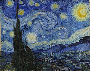
I used the colors from Van Gogh’s Starry Night as my color inspiration. 


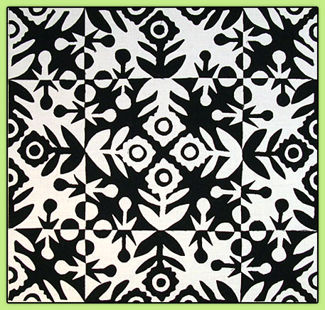
My inspiration source for “line” was not a photo but generalized from the motif of repeated units, usually squares, containing lines.   There are many abstract quilt artists who work with this idea, and I’ve always been intrigued by it, so I thought this was a good time to try it out.  I first thought I would use curves to hint at the curving shapes in Starry Night, but realized I didn’t even know how to do straight lines yet! Maybe I can incorporate the curving lines in the quilting.  Here are some links to a few art quilters who use lines that I was especially inspired by :  Nelda Warkentin, Cory Volkert, Paula Kovarik, Catherine Whall Smith, and Lisa Call.  I especially love the way Lisa Call treats lines in her work.  I saw this piece at Quilt National last year and was spellbound by it.  It’s hard to see in the photos but the light objects are done with quilted lines and the rest of the piece is very heavily quilted as well.

Looking forward to thoughts and comments.  This was a fun learning experience for me, thanks Cynthia, for such a creative challenge idea!

Sharon 


Monday, October 31, 2011

Notan

This has been one of my favorite challenges.  I had never heard of the Notan concept but was fascinated with it as soon as I started researching.  I found this great example by Lynn Ticotsky and knew that I wanted to try something similar.  With the aid of CAD drafting software I tried out several different ideas for a repeating pattern.  (Some that I didn't choose are in this blog post.)  I created a freezer paper template and cut the chosen pattern out of black fabric with fusible web on the back eight times.  The resulting 16-square block reads more like an irregular 9-patch to me, but it is made up of just the eight cut-outs and their "leftovers".   I'm not a very precise person, so this definitely looks better from a distance where you can't see all the fuzz, but I really like it.

Right now it's just fused to white fabric, but I would really appreciate some advice on whether to add a black border, and what sort of quilting pattern to use.  I don't want to distract from the design, but I'm not sure that just tracing it with quilting lines would add much.  Input greatly appreciated!
(dimensions are 24" x 24")

(Cutting out Notan shapes is perfect activity to do while joining hubby watching football!)

Saturday, July 02, 2011

Celtic Knot

Here is my piece for the Celtic Quilt challenge. It's about 14" x 14". I've always been fascinated by Celtic knots, so I was happy to have this chance to study one closely enough to replicate it. I'd thought I might be able to do this with bias tape, but soon learned that wasn't possible, so I cut out and fused the pieces to the background. The knot pattern was hard to see in the dark fabric, so I decided to quilt the outline in light lavender thread (Lots of starts and stops!). I've quilted in the ditch of the border, but I think I might try to do a small Celtic motif in each corner before I bind it. Thanks for giving me the opportunity to put this fun little piece together!

Sharon

Friday, June 03, 2011

Challenge 57 DECOration

DECOration
This was a really fun challenge for me.  I have always loved the Art Deco style, so the hardest part was selecting a single subject.   I recently did an art quilt featuring an Art Deco building, so for this one I decided to focus more on ornament than architecture. One photo that kept catching my attention was this one of the Chrysler Building elevator doors. I selected a complementary color scheme of orange and blue, which seemed to evoke the posters and graphics of that era.

Once again my ideas exceeded my skills.  I quickly had to give up on the curved piecing for the background and fall back on fusing, but as it turned out most of the background seams were covered anyway.  After creating the two-tone background I added decoration using fountain, waterfall and zigzag motifs.   As usual, I still need to add quilting, but I wanted to be on time.  It is 10 " x 17"

Since it's so relevant to the challenge, I hope it's okay to also share my previous Art Deco quilt, "Beacon in the Darkness" which I made for a show here in my  hometown -the theme was local buildings created by the WPA. (A depression era building program). 

I look forward to any and all comments and suggestions.


Sunday, April 24, 2011

Challenge 56 - Ephemeral Landscape: Spring


I've missed the last three challenges, and will be away three days this week, but I didn't want to let another one go by, so I jumped in with a real FAST Friday attitude.   I decided I wanted to take the Goldsworthy challenge literally.   I had an image in my mind of sewing a range of colored leaves onto fabric in a pattern or rhythm, but when I wandered around my yard, I didn't see any interesting leaves.  Instead I was drawn to the feathery nature of the fennel, and the way it contrasts with the lamb's ears.  Once I collected a handful of materials, a real sense of urgency came over me, knowing I had a limited time until they would wilt and fall apart.   The two batik fabrics came to mind immediately as contrasts to the plants.  So I set out to improvisationally arrange and stitch them.  The idea was that they would be gradually "springing" up from the horizon line on each layer.  But the reality of holding plants in place while running the piece through the sewing machine made that tricky.


I definitely realized how Goldsworthy must feel when he arranges leaves on water...  "Get the Camera, Quick!"  The piece is actually sandwiched with batting and backing, but I don't think it will survive a quilting or binding process.  It's probably already wilted away while I've been editing photos and posting.  Anyway, thank you for challenging me to go w-a-y outside my box.  This was fun.    

Thursday, December 30, 2010

"Marriage?"

Here is the finished version of this piece, at least as finished as it's going to get.   I tried to incorporate as many of the critique suggestions as I could, and I definitely think that cropping off the left side helped the composition.  All of the areas are quilted now, although the thread I used on the dark and light purplish areas does not show up well in the photo.  This won't be one of my all time favorites, but I am glad that I learned more about this art movement, and I enjoyed seeing the many different interpretations.   


Here is my piece called "Marriage?" I guess other than binding, it is done. I was fascinated to read about and learn about color field painting and the various artists that worked in the style. I enjoyed very spontaneously creating this piece by arriving at a general idea then cutting the pieces freehand. I liked the batik textures because they has some similarities to the depth and texture of paint on canvas. I frayed the edges of the fabric to make them less hard-edged.

All that said, I'm not thrilled with the end result. It was a fun and informative process, but I don't feel a lot of love for this finished quilt. I wonder if I should do more quilting on the color forms? It seems that the plain flat fabric is more in the color field style. The shape of the pink piece is annoying me, and I also would like to make the blue fabric in the middle darker, but don't know how to do that without making a big mess.

I forgot to mention, this is 23" x 20."

Comments and suggestions welcome - Sharon

Saturday, December 04, 2010

Proportional Harmony - by Sharon Robinson

I knew as soon as I saw the challenge that I wanted to do something with a “golden section” rectangle. Our company’s logo is based on this proportion and was designed by our senior partner, who founded the firm 50 years ago. He passed away earlier this month. He was a strong advocate for “proportional harmony” so this piece is dedicated to him. I’m not sure he would have liked it much, he was also a a big advocate of simple elegance, something I have yet to master.


I’ve always been fascinated with geometric patterns and the various ways they can repeat, so I took a “golden section” rectangle and started arranging it in different patterns. I claim it still meets the intent of the challenge because the red squares are really just negative spaces left between the rectangles. Sorry that it’s unfinished as usual, but I wanted to share while everyone is still looking.

I wanted to piece instead of fusing this time because I'm interested in exploring that overlap of "art" vs "traditional" piecing with blocks. The repeating block for this piece is simply a gray plus a black rectangle.
My intent is to quilt the rectangular construction lines in black, and couch a bright red cord over the spiral, but I've never couched anything, so I need to see if my technical skill is sufficient for that before I ruin the piece. I already learned one new technique on this piece - using my ink jet printer on fabric. The faint construction lines for the quilting were printed on the gray fabric before I cut it out.

I'd be happy to hear thoughts or suggestions for quilting and finishing.


Sunday, October 31, 2010

Ice, by Sharon Robinson


sky painfully blue  
icicle piercing my heart
his disdain for me

This piece is 12" x 16."  I like my haiku, and I sort of like the quilt, but I'm not sure that it illustrates the poem.   The poem is about emotional coldness as well as seasonal cold.  I think that the icicle might not have been the best metaphor to represent that, because mental images of happy "winter wonderlands" are evoked by the icicle image.   


I really enjoyed thinking up haiku.  As others have said, I'd like to do more of these interpretations.  I started out wanting to work more abstractly, but I didn't like where that took me, so I cut out some realistic icicles.  Then it really seemed to want a horizon line.  Something was still missing, so I added the moon. That was the first thing I quilted, in a radial pattern.  It looked like a big blue grapefruit slice, so that had to go!  This was my first attempt at using metallic thread and I had a lot of fun using it for the free-motion quilting on the icicles.  I thought it would add perspective to have some horizontal lines on the snow, but the thread and I stopped getting along at that point.   So I reverted back to straight lines for the sky area.  Now I wish I'd just left it plain, but I thought they would help with the vertical emphasis of the icicles.  There were a few other technical glitches, but overall I am glad that I was able to finish it this weekend. (Except binding, which will happen this afternoon during the football game!)


Here's a detail shot:

I learned a lot on this challenge, and I'm eager to hear your comments.  

Thanks for a fun challenge, Kathy!

Friday, October 01, 2010

"Cloister" - Updated


Here is the quilted version of Cloister.  Overall I'm happy with it, considering it's my first real art quilt, and my first attempt to work from a photograph.  I really wanted to try to incorporate some of the great suggestions in the critiques, but I also knew I could dicker around with it forever, so in the spirit of Fast FFC, I set tonight as my deadline.  I think the quilting lines improved it, but I thought there were too many lines, and they were overcoming the small piece, so I didn't do any quilting in the central tan area.  I used a pillowcase binding/backing because it was quick and unobtrusive, but I'm not happy about the lumpy corners.  But it's done and I'm ready for the next challenge!
Here is my first entry to FFFC.   It is 12" x 12" with a mixture of commercial cottons, batiks and overdyed wool fabric.  Fused and soon-to-be-machine-quilted.
 I had a lot of fun with this, and learned so much.  I was overly optimistic about how much I could do in one week. I ended up doing much more fusing and less piecing, and my idea turned out to be much more time consuming than I expected, so I have not quilted it yet.

I based (with permission) it on this photo that a friend took of a palace in Barcelona.
I thought that the contrast between the  sun shining on the leaves and white stone with the dark recesses of the archway addressed the challenge, but I was also trying to illustrate a contrast between the ephemeral light emanating from inside the stained glass and the everyday word of bricks and mortar.  
I plan to use lines of quilting to represent the courses of stone and brick.   I hope that will give it a little more finesse.  

I'm eager to hear comments, this is the first time I've put my work out in "public."