
Showing posts with label Challenge 66. Show all posts
Showing posts with label Challenge 66. Show all posts
Monday, March 05, 2012


Line

Here's my entry, slightly late, needing a little straightening, ironing and quilting, but "done." I have never been a good one for following directions, so
after reading the basic challenge and looking at some of the links, I just
jumped in and started my own project,
and only noticed this morning that you had actual directions and a step by step
example! Oh well, I was really excited about jumping in because
the challenge seemed to relate really well to a workshop I attended last week in
which we worked on using line in compositions as well as working with color
families and values.
I used the colors from Van Gogh’s Starry Night as my color
inspiration.
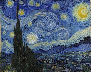
My inspiration source for “line” was not a photo but generalized
from the motif of repeated units, usually squares, containing lines. There are many abstract quilt artists who
work with this idea, and I’ve always been intrigued by it, so I thought this
was a good time to try it out. I first
thought I would use curves to hint at the curving shapes in Starry Night, but
realized I didn’t even know how to do straight lines yet! Maybe I can incorporate the curving lines in the quilting. Here are some links
to a few art quilters who use lines that I was especially inspired by : Nelda Warkentin, Cory Volkert, Paula Kovarik, Catherine Whall Smith, and Lisa Call. I especially love the way Lisa Call treats lines in her work. I saw this piece at Quilt National last year
and was spellbound by it. It’s hard to
see in the photos but the light objects are done with quilted lines and the
rest of the piece is very heavily quilted as well.
Looking forward to thoughts and comments. This was a fun learning experience for me, thanks Cynthia, for such a creative challenge idea!
Sharon
Saturday, March 03, 2012
Topography

Fused pieces on black (to reflect the changes in elevation) are quilted and stitched at the same time with a narrow zig zag. I want to go back and do some detail lines in each segment for the topographic lines and will just do some background quilting in the black.
Great challenge, Cynthia! Comments of course are welcome and appreciated!
Line & Color Challenge

Cynthia
Friday, March 02, 2012
Eucalyptus Rainbow Tree
I have finally finished this challenge which I began in February of this year. I trapuntoed the colored pieces of bark and then quilted them with black metallic thread. I then quilted the background bark using a pattern which mimicked the shape of the colored pieces. I added a light coating of Shiva Paint Stick to the dark bark to add dimension and interest. I am very happy with the finished product and will probably explore it more in future projects.


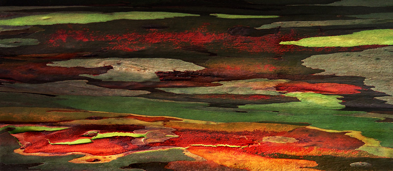
Okay, I decided to come out and play after many months of inactivity. It wasn't that I didn't follow the challenges and map out a plan, but I just didn't get any farther than the planning stage. Oh well, that is water under the bridge now and I choose to move forward rather than dwell in the past.
For my line reference I chose the beautiful bark of the Eucalyptus Rainbow Tree. I must admit to taking artistic license in interpreting the bark, but I am more of an organic line person than geometric. My color scheme was taken from a photo of the tree bark. I cut my pieces and then fused them to the background foundation piece attempting to leave interesting negative shapes. I will eventually trapunto the bark and densely quilt the background to complete the piece. I just wanted to get the piece to this point before the week ended. Thank you Cynthia for the nudge towards completion rather than perfection!
Line & Color
 After reading the two comments, I went back and added a lot more thread work to my little quilt. Thanks for the comments---this IS much better.


I had a really good time with this. The line is from one of my walls---we live in a log home so there were a lot of possibilities. The color is a sunset picture I took one evening while on our boat. Fabrics were just not working out--so I used thread on one piece of fabric. Comments welcomed.
Brick and Mortar
 This was a really exciting challenge for me, and I found myself pushing to try combinations that I wouldn't normally do.
I took this picture used for the lines in my piece while on vacation last year. I loved the texture and the strong architectural lines along with the starkness of the color scheme.
Just a few blocks away, I took
 my color inspiration photo at a local farmers' market.
 I found it really challenging to try to incorporate the brigh t reds and greens into the strong lines from the other photo. This piece became much more abstract than my usual work although I tried to incorporate much of the feel of the original photo, it is also greatly changed. The mortar for the bricks and the stones is actually a sage green tone, although against the brighter colors it appears to be gray. The quilting is done in a very fine thread in the same sage green as the mortar. It is intended to simply emphasize the textural difference between the bricks and stones and the mortar.
 t reds and greens into the strong lines from the other photo. This piece became much more abstract than my usual work although I tried to incorporate much of the feel of the original photo, it is also greatly changed. The mortar for the bricks and the stones is actually a sage green tone, although against the brighter colors it appears to be gray. The quilting is done in a very fine thread in the same sage green as the mortar. It is intended to simply emphasize the textural difference between the bricks and stones and the mortar.
I would welcome your comments, including where I may have missed the mark or could have improved the concept. Thank you!
Ticia
Tuesday, February 28, 2012
Window Study 1

Window Study 1
10" x 10"
The edge is gold lame. It is very difficult to photograph because of the sheen. If I made it more yellow, as it really is, all the other colors would be distorted. My final choice of fabrics was limited to what I call "lush". Those are fabrics like satin, velvet, textural upholstery, recycled ties, etc.

Photo Inspiration and Tracing
I originally did 7 panels. Hated one; into the circular file. I made each one individually as a separate little piece. When I finished, I re-arranged the panels because I like them better this way.

Color Evaluation
Color Inspiration was from a photo of fireworks over a body of water. Because I did not have rights to this photo, I'm just showing my color study. Obviously LOTS of bright colors.

Left Overs
My process was to get out my scraps and pick out those I thought might work. This is the pile of pieces that I picked out of my bags. I do think I should do something with this HUGE pile of bits and pieces. Found fabric scraps I had forgotten about. Lots of memories in this pile.
Monday, February 27, 2012
unnamed

 I took the lines from a piece of tin cieling tile. I used a hand dyed cotton and embellished with rickrack and yarn adding buttons for the dots on the centers
Pat Havey
Sunday, February 26, 2012
Western Landscape


I too did what Cynthia told us-don't overthink and better done than perfect. It also helped that my sewing machine is broken, it was a lousy day Friday and Saturday, and my husband was busy yelling at the tax program on the computer. I walked by the calendar after reading the challenge and took the Feb photo from that to do my line drawing. Then I picked up the first picture book I found in the living room and found a photo of Seville with colors I liked. Figuring out tones and shades and tints took some experimentation and I'm still not sure if I got colors in all three. What is brown? From Cynthia's color samples, it could be a shade of orange or a tone of red. White was in the color photo, so I wanted to use it as a zinger but am ambivalent about it being too dominant. Anyway, the fabrics are fused onto muslin and will await finishing until my machine visits the repair shop on Tuesday.
Photos in order are: line drawing photo, color choice photo, colors choosen, and finished quilt.

After reading comments and looking at this quilt, I added more "mountains" and changed the white zingers to light yellow. The sky was quilted in an allover pattern. The mountains were quilted in straight lines with curvy lines added in mettalic gold thread for the dark mountain. I think the additional fabrics and shapes help give more interest to the piece and I now give it about a B+. This is a technique that I hope will lead to more abstract pieces than this one turned out to be. I enjoyed the challenge Cynthia.
View


Thank you Cynthia for an interesting challenge. At first I wanted to moan and pull my hair, but your statement about not over-thinking it and just doing it struck home. I found an image in a travel mag that had great lines, then went to a color design book I've had for many years and use frequently. My palette was yellow, blue, purple and blue-green. Though I'm not sure I've hit all the values and done them in the correct proportions, I am happy with the outcome. The quilt is 5"x7".
Ann In Fallbrook, CA
Thursday, February 23, 2012
Challenge 66- Line and Color
Fast Friday Fabric Challenge #66 Due: March 3rd
Elements of Color and Line Host: Cynthia Morgan
Challenge: Use the element of Line and the 3 elements of Color (Hue, Value, Intensity) in a design study piece. You will need 2 inspiration sources: one for line, another for color
Definitions:
· Line: the basic element that refers to the continuous movement of a point along a surface, there are curved, horizontal, vertical, diagonal, zigzag, wavy, parallel, dash, and dotted lines. The edges of shapes and forms also create lines.
· Hue: the name of the color, also known as the color family. There are 12 colors/hues/color families on the color wheel : red, red-orange, orange, yellow-orange, yellow, yellow-green, green, blue-green, blue, blue-violet, violet (purple), and red-violet
· Value: the relative darkness or lightness of a color: light, medium, dark and everything in between
· Intensity (or Saturation): the relative brightness or dullness of a color: tints, tones, shades and pure hues
Tints – white added to pure hue Tones – grayed hues Shades – blackened hues
For more on Intensity see here: http://resources.quiltwoman.com/blockmo.html
For more on Intensity see here: http://resources.quiltwoman.com/blockmo.html
 |
| Tints with white added to pure hue |
 |
| Shades with black added to pure hue |
 |
| Tones with gray added to pure hue |
Challenge Instructions:
Step 1: Design with Lines. Find an image with appealing lines (architectural, nature, textures). Trace the lines. Use a viewfinder/paper window to select an interesting portion of the traced lines. Trace the selection and enlarge if needed
Step 1: Design with Lines. Find an image with appealing lines (architectural, nature, textures). Trace the lines. Use a viewfinder/paper window to select an interesting portion of the traced lines. Trace the selection and enlarge if needed
Step 2: Color Study. Find an image/source with an appealing color scheme (photos, art, magazines, fabric, nature, etc). Identify the color families. Add a zinger color if needed. Make color chart with colored pencils, crayons, watercolor, fabric swatches or paper from magazines. Arrange colors from light to dark. Evaluate to make sure you have some of all of the values and intensities – light/medium/dark/pure hue/tint/tone and shade. Add colors as needed to get the variety of values and intensities. Decide on the proportions of colors to use. Avoid equal amounts of colors. Zinger amount should be no more than 10%
Step 3: Make your small art quilt using the line design with the colors, values and intensities from the color study.
Remember this important rule: better done than perfect! Don’t agonize about which image or color scheme to use, just choose one. Make a small piece and/or use quick fusing techniques if you don’t have much time. This is a design study and exercise meant for experimenting with line and color. Don’t worry about how it will come out, just play with the line and color, don’t try to make a masterpiece or even a good piece…just do it!
References:
· Look at some of these texture websites for line images – the wood grains are especially interesting http://www.cgtextures.com/ http://www.texturewarehouse.com/gallery/ www.mayang.com/textures
· Look at some of these websites for possible color schemes http://decoratinggallery.bhg.com/ http://www.colourlovers.com/trends http://www.nationalgeographic.com/ http://www.gettyimages.com/CreativeImages
· Look at some of these design websites for understanding the element of Line http://www.slideshare.net/ebrosnan/the-element-of-line http://char.txa.cornell.edu/language/element/element.htm
· This challenge is based on the Design Process exercise found in Jean Wells’ book, Intuitive Color & Design – page 68. Here’s a trailer for the book http://www.youtube.com/watch?v=3GtHr6_qHg0 You don’t need to buy the book to do this challenge…all the info you need is above, but it’s a great book for design and also construction techniques and edge finishing.
Here’s my step by step example of this exercise :
 |
| Line Inspiration (Back cover of book) |
 |
| Tracing of some of the lines |
 |
| Color Inspiration (a piece of fabric) |
 |
| Identification of Colors, Values & Intensities |
 |
| Decision on proportions of each color family |
 |
| The quilt |
Subscribe to:
Posts (Atom)

 Posts
Posts


