Thursday, December 31, 2009

Putting on the Ritz


What a challenge this has been! I had a hard time getting my mind around this concept, but once I saw some of the other entries it became clear. The colors used in packaging are very eye catching and pleasing so “oh Yeah” it is a great place to look for a color theme for a quilt. Since I was so late in getting started, I kept my project down to a manageable size. When going through my pantry I found that I buy a lot of products with this primary color scheme. I liked the ritz box for it’s simplicity and the flow of the crackers swirling about. My composition is an attempt to re-create the general feel of the ritz box. I enjoyed playing with this, and will try it again on a larger project, my quilt is journal size, and has not yet been bound. Any suggestions? Would love your comments as well. Thanks Rhoda for a great challenge.

GRAPES


27" x 35"

I decided a few weeks ago to make a quilt featuring a cluster of grapes. I appliqued grapes, countour quilted grapes, and finally I painted grapes. The painted ones were what I wanted but I tossed them all together and added some grape leaves. Then I couldn't figure out where to go from there. I took this glob of grapes and leaves to a couple of quilt shops and tried out lots of backgrounds but didn't like anything. I set it aside and then along came the Fast Friday Challenge! Ah ha! Froot Loops to the rescue. Somehow looking at the box and the various colored cereal bits reminded me of my grapes. The black outlines around the letters led me toward the black and white polka dots and the red from the box led to the border. The red and green in my piece are more vivid than the photo shows. Thanks a lot for this challenge - it kept my grapes from oblivion!

As always, your comments are welcome and appreciated.


extended rest


My husband always wears an apron like this when he works around the house. One day after a weeks rest he found morning glory growing over everything. Too bad the work isn't as quick as the morning glory. This challange really made me think out of the box. Thank you Rhoda.
Pat Havey

Wednesday, December 30, 2009

Challenge #40


"Black Tie and Tails" Tulip in Still Life 17"x21"


In leafing through my magazines I quickly pulled out all ads that caught my attention either by color, composition or both. I was surprised to find that at least 75% of them were red, black and white and some silver. What does that say about me?
I used alot of different fabrics, including seven different textures of white. I especially had fun trying many new to me quilting designs.
I am pleased with the result and my hubby loves it.
I would love to 'hear' your comments :-)
Thanks Rhoda for a fun, thought provoking challenge!
Cherie

Tuesday, December 29, 2009

Jolly Time


Here is my product quilt. I called the quilt 'Jolly Time' for the product. The little figurine is a Willow Tree piece titled 'Happiness' that was a gift from a student several years ago. She had 3 bluebirds on her arms but I colored one red. That way I was able to include both the small amounts of red and blue on the product package. I was going to individually cut out petals for the sunflowers and then while digging in my stash I found fabric that had these huge sunflowers all ready to go so I put fusible under it and put them down. The leaves I cut freehand from a multi-colored green fabric. I couldn't figure out what else to put with the figurine for a still life so I opted to add petals dropping from the flowers. This little quiltlet is a mere 8" x 10" in size.

The first product I had chosen was for Ice Mountain water. It was all blue and white and I couldn't for the life of me come up with a fitting quilt. If I could have done a nature piece rather than still life it would have worked perfectly with the 2 feet of fresh snow that just fell here. So I searched more and found this box of microwave popcorn. Another challenge it turned out for me were the colors since I rarely use orange and yellow much even though I like them.

And, I'm sorry to say the popcorn box didn't reproduce in actual colors. The wild stripes waving across the background are actually yellow and orange and not red like they appear.

This is one of my favorite FFFC quiltlets that I've done over the years. Please comment!

Monday, December 28, 2009

Challenge 40 - The Lone Carrot

Ok - so here it goes - The Lone Carrot - finished size 6 1/2 by 17 inches.

I took a book of Barbara's Puffins - Original. I pieced the back ground in turquoise ranging from dark to light. Then rather than doing a still life - because I didn't have any plants or in my case carrots - I did a gestural drawing of a carrot - couched just a bit of orange yarn for the carrot (kind of like the beak of the puffin) and just a hint of lime green for the leaves. So it probably doesn't quite fall in the still life category but I like the overall results.

Lisa
In Sunny Seattle

Thursday, December 24, 2009

Challenge #40

FFFC Challenge #40
Dec.25 Due: Jan. 2 Hostess: Rhoda Forbes

Introduction:
I thought it would be fun to explore why certain colors are used in product packaging. Advertising is a very interesting world of color and perhaps can lead us on another color journey. The question we will answer in this exercise is the ‘why’ of certain colors, and the ‘amount’ of certain colors in product packaging. Please submit a picture of your chosen package along with your finished piece. Tell us a bit about why the colors attract the buyer and how it evokes different moods. Most of all have fun with it.

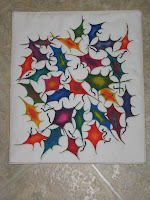
Color Scheme: Product Packaging
A cereal box is a great place to start. Or perhaps you have a favorite chocolate box, cookie box etc. For this challengewe will use the color scheme from a product package.

Nature Theme: Plants
Use any type of plants in your composition, be it alive or dried. Choose the type of plant that will fit the color scheme you have chosen, or take a ride on the wild side and choose a plant that would not be those colors at all.

Technique: Still Life
Still life can also be mood evoking, and your color scheme and how you use it will reinforce this. Does your package have a lot of one color? Would you use it for the background? Or you can try the opposite and use less of the main color of the package, does it give the same message as the original?

References:
Color Scheme:
Listed below are some websites that give information on why certain color schemes are used. It is all about selling
product. I found them all very interesting. This is a subject I had never gave much thought to until I started researching for this challenge.

How color effects us
http://www.colormatters.com/color_trademark.html

Psychology of Color; Color Psychology and Marketing
http://www.precisionintermedia.com/color.html

How do colors effect our mood
http://iit.bloomu.edu/vthc/design/psychology.htm

Great article on color and placement of cereal boxes, Google your favorite cereal with color scheme following, ie;
Kellogg’s fruit loops color scheme http://tinyurl.com/yemh3yg

General Requirement of colors that sell
http://tinyurl.com/yefzac4

How to use coloring in packaging. There is some great reading here, how Pepsi’s Crystal packaging failed, a good
paragraph on how cereal popularity depends on color.
http://tinyurl.com/y9ez9bc

Why food companies use red.
http://tinyurl.com/ye4oyo6

A very good article on the importance of color in advertising. Print is small so use the magnifier so you can read it.
http://tinyurl.com/ye35wmt

Technique: Still Life
What makes a good composition. When planning a still life this may be the first area we need to review.
This is a very good article on this subject, by Ken Gilliland
http://www.empken.com/tutorials/composition.pdf

How to balance a still life.
http://tinyurl.com/yd2donu

A rather nice article on Paul Cezanne and one of his still life's.
http://maryadamart.com/cezanne_essay.htm

Everything you might want to know about still life compositions. There are a lot of interesting links.
http://www.squidoo.com/still-life

Jean Louis Mireault’s Silk painting Still Life.
http://www.absolutearts.com/portfolios/m/mireault/

Very Modern Textile Still Life
http://srutlandwatercolor.com/galleries/textile-still/cara_mia_dance.html

Still Life of Textile artist Marcia Stein , many versions of a teapot and bowl, very interesting how the backgrounds
site for variations in colors.
http://www.marciastein.com/html/student_work_sla3.html

Pamela Allan, one of my favorite Textile Still Life artists. I took this course with Pamela, my first introduction to
still life. Scroll way down the page to ‘Still Life Is Boring Not’ and view a sampling of Pamela’s Still life
http://pamelart2.homestead.com/newquilts.html

Pamela’s take on Still Life. Scroll down the page to ‘I am offering a new workshop called ‘Still Life….”
She has a neat take on still life. Still life in Pamela’s world is definitely not boring.
http://pamed.homestead.com/home.html

This page has a series of Still Life that I did under Pamela’s tutelage.
http://www.gourdsbyrhoda.com/stillife.html

If you type ‘still life’ into Google and click on images you will come up with many pages.

I hope you have fun with this challenge.
Rhoda

Blue Agate

At last, got to the microphotography.
Sometime back I did some design work based on images of Agates like this. So when the challenge came up, I thought the concept would work here.

This time I used a Blue Agate we have and worked it up as if there had been microphotography work done on it.

At first I layered torn tissue adhering the layers with acrylic wax. Then I fused it to silk organza with Misty Fuse and did the thread work. I touched it up with paint stick and then painted the rim of the agate slice using craft acrylic paints. The whole piece was then fused to white silk dupion and layered and quilted to blend it in on the edges and so on.

The piece is approx. 13" x 14".

Challenge #39: Tequila Sunrise


I was intrigued by a set of photos of cocktails under the microscope and decided to try a "Tequila Sunrise" quilt, thinking it would be fun art for our condo in Mexico, and I just liked the colors and shapes I saw in the photo from the linked website, Molecular Expressions: The Cocktail Collection.

I used ProChemical H Fiber Reactive dyes to paint fabric for the background. It was my first time dye-painting at home since completing a Sue Benner workshop in October. I used fabric that was soda-soaked in October, knowing it might not be fresh enough. I mixed the yellows and magenta with more print paste than I should have, so they came out less intense than I'd wished. Sorry, I didn't take a photo at that step. This is all about learning, so that's OK!

I used acrylic paints to brighten up the background yellows and oranges, but I didn't have fuschia, and didn't have enough time to mix the "just right" colors. Compromise, limits, affect our art! I made stamps by cutting out shapes from rubber floor tiles, painted and stamped on the blue "V" shapes. I set the photo aside and began working more from an inspiration rather than trying to make a realistic image of what the photo showed.

I tried cropping various ways to improve the composition, considered how to create a focal point with stitching and/or embellishments, and wondered how to move the eye around without having the arrowheads lead it off the page. I also wondered about borders. I then selected a special Carol Taylor yarn for embellishing.

At this point, I stopped and meditated on what to do and, boy, did I get some surprising spiritual input! It made the rest of the work really teach me and allow me to purge some negative stuff and get more optimistic! I quilted it over the Christmas holidays, and then added a little sparkly teal paint to the three V's that I emphasized, trying to create a focal point. I don't know if they're still a focal point after the couching.

I should have photographed what it looked like on January 3rd with all the quilting done but no embellishments on it. I had a several ideas of how to place that fancy yarn. I consulted with my artist-daughter and my husband for ideas, but none struck me as "right." I'm getting ready to leave on a trip, so I was cramming in lots of other work and had little time to give this project . . . another insight goes with that! So, I printed out five copies of a photo of the painted fabric laid onto the border fabric and started playing with multi-colored cording to test how it might be laid on top. I used the cording because the photocopies were a smaller scale, and the cording was thinner than the yarn. Of the five designs, the one I liked best happened when my husband stood up and dropped some cording onto a photocopy from arm's height. It puddled onto the paper in an interesting mess, very organic. Aha! I then did something similar onto the quilt itself, liked what I saw, and used masking tape to secure the cording into its random, organic, landing places. And I decided to use the cording instead of the beautiful yarn, because the yellow did something important. It looks more biological to me now.

It was a challenge to couch on the cording with it taped in place, or to follow marked lines when I gave up on the masking tape, so this is a version that evolved from my first "dropped design."

Not exactly a FAST challenge quilt but I'm glad it's done and I learned a lot.

Comments welcome, as always!
Happy New Year,
Chris

www.ReapAsYouSew.com

Wednesday, December 23, 2009

Diatom and cells

True to form, I was a little late getting started on this, although it is a subject I was interested in pursuing prior to getting the challenge. The odd thing is that over two years ago, I had the idea and started collecting images to do a series on wood....but I didn't do it for this challenge.
This piece is based on a photomicrograph of a fossil marine diatom Actinoptychus heliopelta found in diatomaceous earth, Dunkirk, Maryland, by Stephen S. Nagy.". I intend to put some beads on the center of it and also on the orange bits which go into the center. It measures about 17" in diameter.
You can see Dr. Nagy's original image here
I have never done a circular (or roughly circular) piece before. I also did a lot of multiple layer machine quilting in order to make the veining in the middle (the part that looks roughly like aligator skin). While I have had Shiva paintstiks for about 4 years, I've never used them until now.
I must admit, the quilting, and the fact that I fused all those little yellow triangles down, then satin stitched around each and every one, as well as satin stitched the area on the inside of the tooth, took me far longer than I had ever anticipated.
While waiting for the Shiva to dry, I quickly did this piece since the first one was being a "slow Friday Fabric Challenge". This is a rendition of a tight Cellular Junction. A cellular junction is the structure in a multi-celled organism.
I saw the matte acrylic beads and wanted to use them. The body of the piece is made from two different colors of polar fleece with a "pillow" in between to give it depth.

Because I didn't think it looked finished, I added this fringe on the bottom. The piece measures 10" x 14 1/2"

Lisa Broberg Quintana (aka Michigoose)

Friday, December 11, 2009

Microscopic Leaf by Cynthia Ann Morgan


Here's my challenge #39 piece. It's inspired by a 500 x microscopic view of a cross section of a leaf showing all the cell structure. Made with hand dyed fabrics with painted highlights after it was quilted. Comments welcome!

Cynthia

Tuesday, December 08, 2009

Floating Chromozomes


Sponge painted paper under black chiffon form the sea for my Floating Chromozomes. Yarn is couched over painted fabric on one siide and free-otion quilting over dark green satin on the other side. Yarn is couched onto the surface and a fiber wrapped plastic straw is added to the free-motion surface. My third challenge and I am learning so much from my endeavors and those of my quilting peers. Jane Stricker

Sunday, December 06, 2009

Mermaid Study - 38


I believe mermaids are related to dolphins and whales. They do not have scales, but thick skin. If you look closely, this mermaid is working hard to get off the beach. She was visiting land for the night, but obviously didn't make it back before she changed, once again, from a human to a sea mammal. As the sun is only a thread on the horizon, no shadows exist. It is that special time between moon glow and sun shine. Although the mermaid seems in peril, the tide is rising. Do not fear, she will be OK.

I used commercial fabrics + paint. The mermaid is stuffed then appliqued onto the quilt. This is a first for me. I added the mermaid before quilting; wish I had done it after. It would have made the quilting a lot easier. The tail is fused velvet and is only attached at the base. The fins are totally free. Her hair is a bit of trim that seemed appropriate. The 'stone fabric' is enhanced with heavy dark green stitching as if covered with sea moss.

As simple as it now looks, it was technically very difficult for me. I call it a study, because at first I planned on a much larger one. That would probably be done next summer. Instead I decided to do something that I could actually finish. This is 14.75" x 16.75".

Saturday, December 05, 2009

Blood Clot


I enjoyed making this piece once I found a royalty free photo of a blood clot online that I could use for my inspiration. I certainly never imagined that a blood clot would be this interesting! After discharging the background fabric, I found a coral/pink solid that I thought would do for the blood cells. I painted dark pink shadows and white highlights, fused my shapes and added them to the background. I liked well enough the bright coral against the mottled black, but when I added the pale green and yellow strings, this piece came alive. it was fun to do, and taught or reminded me of several things. 1) The effect of your discharging liquid may not be visible until you rinse your piece. 2) Adding some paint can transform any fabric into just what you want. 3) Complimentary colors work wonders. 4) Getting out of your rut once in awhile is good for you.
Suzanne Sanger

Challenge 39 - Pat F


Here is my piece, but I haven't a name for it. I used my 40year old memory of neurons as the basis for it, but enjoyed using every colour of Seta-Color fabric paint I own to hand paint the cell bodies. I then FMQ'd around the cells to accent them a bit. At that point I had thought to emphasize the green in the cell bodies with the beading, but found an iridescent black bead that worked much better. It's been along time since I completed one of these challenges. It's good to get back at it. Please forgive the poor photography. Comments are always welcome.

Pat F in Winnipeg
(fndlmous)

Friday, December 04, 2009

Microscopic Cells


My inspiration for this was bone tumor cells.


The bone is real with painted cells. On the background some cells were painted and somer were sequins and beads. I'm sorry the painted cells don't show up very well.


The dark areas on the background were painted


The blood vessel was couched yarn with painted off shoots.


I asked my sister for the largest turkey bone. Her husband saw it and asked if she was saving it for a purpose. When she told him it was for me he said "I'm not even going to ask"

So is That What It Looks Like?


Cellular view of Dis-Ease, I was amazed when I looked up a condition I have and found out that on a cellular level it was kind of pretty.

Lots of layers of started with deconstructed screen print, enhanced with stencil and fabric paint touched it off with minimal free motion and some puff paint to get the 3 d effect of the cellular changes occurring. finished is 8.5 x 11
comments welcome
Rita Legere

Stairstep Twinning


I tried something new for me with this one. First I drew the design on white Swiss Batiste, then I sandwiched and quilted all the lines. Next I painted the whole cloth using acrylic and metallic paints. It took forever!

The quilt measures 14"x24".

Cherie

Thursday, December 03, 2009

Hyphae

This month has been totally insane with the end of the semester, Christmas commissions to finish, and getting ready to produce a play on our campus (yes, I do that too!). But I couldn't miss a challenge....
I have done a fair amount of painting so I just grabbed the paints and inks and decided to play with an inkblot technique... wet the fabric and squish some pain on one side then fold it and see what came out.... no planning, just playing....
After I smushed the copper around, it started to look like a yeast bud or hyphae.... so that's what I ran with.
Comments of course are welcome....

Onion Cells


The was a really great challenge. When I saw the theme I immediately thought of high school biology class where an onion was one of the first things we learned to examine under the microscope. The background is a hand dyed fabric I made several years ago and was just waiting for the perfect project. After stitching tulle around the free-form cell shapes, I added the black portion. It is a fabric paint made by Tulip that puffs slightly and changes texture when heated. The green onions are layered and fused, then highlighted with watercolor pencils and Pigma pens. The edgres are uneven and jagged, just as a specimen would appear under the microscope. Any and all critiques are always welcome.

Microbial Bliss


This challenge excited me alot. I have degrees in biology and medical technology. I had no real plan in operation and just went with what ever is in my head. I love microbes!!!!! And cells and anything to do with cellukar biology.
I used some piecing, reverse applique and fusing. I used a sponge to paint on the fabric and then the loudest threads that I could fine.
Comments and critiques are very welcome.
The piece is 23 x 25 .
Sea Ranch Carol

polymer strands

This quilt is 12'x17". I started by fusing several different sheers together to achieve the right colors then I cut the strips and fused them onto the black. I painted in all the shadows and accent spaces with seta color, shiva, and sharpie pens. I am a very very beginning painter and was very shaky about trying this. I almost quit at one point and was ready to throw the whole thing away but persevered and this is the result. Finally I covered the entire thing with illusion net and quilted on all the lines to accentuate the strands. It was a real pressing challange for me but I am glad I stuck with it and finished.

Pat Havey

Prayer Plant

What fun I had with this challenge! I don't have a microscope and didn't really want to use an image off the web so instead decided to attach my macro lens to the camera and go searching through my house for something that had an obvious pattern when viewed close up.

I took several photos which I liked but decided to go with one of the more graphic in the leaf of a prayer plant. The actual size ratio is 10:1 with the finished quilt being 20" high by 13" wide.
The photo on the left is the one I started with. The piece is actually a painted wholecloth with a background of cheap ($2 a yard) muslin from Dharma.

I think I may go back in with some paint to add highlights on the right side of the quilt. I like the way it accentuates the curve of the leaf in the photo.

As always, comments are welcome!

Tuesday, December 01, 2009

Challenge 39, Amoebas Play, 16" w x 15" h


This piece was an experiment that I have been wanting to do for some time. I started with a piece of batik fabric, outlined areas that I wanted to thread paint with designs from microscope slides and set some rules. 1) I would just get one shot at my thread painting - if it didn't work I would enhance with paint or whatever, 2) I would use only one color of thread in each area, 3) I would try to create a balanced composition, 4) I would use only thread and paint, and 5) I would use only what I have.


I outlined the areas with 30wt black thread stitched around twice. Stitched inside each with varying degrees of success which was dependent on the color used. Some areas, where I actually liked the stitching the most, were barely visible. I added additional color with Fabrico Markers.


Today I read somewhere that "there are no mistakes, there are only things learned". I think that applies here. Imposing rules helps to stop the 'paralysis of analysis' for me. So here are the things I learned. First, another time I would look for a fabric with a greater amount of light value colors. Second, I would then be able to find more higher contrast threads to use. Third, with higher contrast thread a possibility I would be able to make the more complex designs I had imagined and they would show up.
In spite of the fact that this piece does not match my imagined piece, I have had fun with it and am happy that I was presented with this challenge. I have not spent much time in my studio over the last three months. It's good to be back.
Any comments are welcome!

FFFC-39 Sea Foam

This challenge was a joy for me. I started by painting an aged piece of fabric that had been naturally rusted. The dyes I painted with started to bleed into the fabric in a big way, but rather than get upset I decided to go with the flow. I ended up with an intriguing background fabric which lent itself to drawing with pens the design that was floating around in my head. After completing the drawing, borders were added and the whole thing was taken to the sewing machine for quilting. This was my first whole cloth quilt, but it certainly won’t be my last. I loved the process of bringing out the design with the quilting. After all the drawn elements were highlighted, I used disappearing ink to make my guide lines for the background quilting. This was really fun for me and I’m already working on my next quilt using this process. As always any comments or suggestions would be appreciated.

Monday, November 30, 2009

Challenge 39, Grass


"Grass" is 9 1/2" x 11".
This piece shows my favorite grasses, Blue grama and Indian ricegrass, with their natural growth patterns, and various views of the florets and seeds, as well as a microscopic view of the grass remains in the soil (opal phytoliths).

The white PFD fabric was colored by laying strips of red, yellow, and green bleeding tissue paper down and rolling the fabric up and wetting it. I left it wet overnight to absorb the colors.

The images were photo transferred and then quilted.  Touches of ink (instead of paint, as I had the right color) were applied here and there for emphasis.  A close up of the microscopic view will be posted to the Yahoo site.


The opal phytolith images were taken through a microscope at 100 power (part of my Master’s thesis many years ago).  I am glad to make use of that research again after all these years.  I will add additional quilting in the background later (after the Christmas rush).  I always look forward to your comments and critique.  Linda Mac in WY

Sunday, November 29, 2009

Challenge 39 - Micro Leaf


Here is my Micro Leaf. Finished size is 10.5 x 17.

I used acrylic paints - red and green - red and green mixed make lovely shades of brown. I painted the skeleton. As always - the acrylic paints loose their vibrancy - it had to be saved with the quilting - I had done a similar quilt like this with small circles - then I bead the circles - this time I changed the scale of the circles. I used yellow, red, maroon, two shades of green and brown threads. After is was quilted - I didn't feel the quilt needed an additional beading.

Lisa
In Cool and Sunny Seattle

Cloned Embryonic Stem Cells


I'm going to do some "recycling" this month and use a piece I made last year for another challenge.

My Monday Night group was challenged to do something with circles, and after a few false tries, I decided on Cloned Embryonic Stem Cells.


It was my first experience using Angelina, and that was fun. I also put in hundreds of strands of yellow silk thread, and finished it with a few pearl beads.

I know virtually nothing about microbiology, but I worked from photographs and used my imagination.


Many years ago, I saw a show of photographs by Roman Vishniac, at the Jewish Museum in New York. The images are amazing, and some are what I call "quilts waiting to happen."

Marilyn Foulke
Louisville, KY
marilynfoulke@gmail.com

Saturday, November 28, 2009

Beneath the Surface

A real lesson here, never photograph white against white or cream......

Here is my challenge piece for this month. At first I thought 'yikes'!! Then, as I did some research, I thought it could be interesting. I had a piece of fabric paper that didn't have a focal point that I could find,satisfactorily...but it did have some good texture elements that could work with this theme, so I started to play. My paper fabric has inclusions under the paper, then stitching and paint. After it dried I added more paint. Cut some into squares leaving a large piece on which I could add and define the microbes. I added some painted dryer sheets, embellishments and free motion threadwork. Then I hand-stitched [quilted] the piece using hand dyed thread [received from Laura Wasilowski].
Because it is all on a pastel theme, I hope my 'microbial' findings are definitive enough. I had a great day doing this yesterday and finished it this morning.
I have also posted a 'closer look'.  [I am having trouble getting the color correct on the large piece, I can't figure out why it is so pink when it is white!]
I look forward to your comments....
thank you in advance.

Thursday, November 26, 2009

Challenge 39 - Microbiology

FFFC-39 November 2009
Theme - Microbiology
Composition and technique - Exaggerated Scale and Paint effects
Hostess: Joni Feddersen

Let’s get up close and personal in this challenge, and I mean REALLY up close – like under the microscope. When we study things at a really enlarged scale and move in for a detailed look, we see beauty in a whole new way. Textures and patterns become visible that at first glance are missed when viewed from a distance. Items under the microscope are teaming with life and have an organic feel and colors can be incredible. This can be a very liberating and satisfying experience.

For this month’s challenge technique, let’s try to get some of those paints and dyes (that you have been wanting to try) out of the drawers and onto your fabric. You can do it!

We are fortunate to have many accomplished quilt and other artists who have already done this. Take a look at the links provided below and get inspired.

Under the Microscope – photos
http://micro.magnet.fsu.edu/micro/gallery.html
http://www.nikonsmallworld.com/gallery/year/2007/1
http://tinyurl.com/bcd6lj


Micro inspired Art:
http://www.microbo.com/paintings01.html
http://tinyurl.com/ykcx6qr
http://tinyurl.com/ylpslee

Examples in Quilts:
http://www.karenkamenetzky.com/
http://www.pat-dolan.com/Pages/OrganicSeries.html
http://tinyurl.com/yz599vj
http://www.jofitsell.com/gallery.html
http://www.cynthiastcharles.com/detail.php?recordID=36
http://www.janelloydtextiles.co.uk/clockwise_circ.htm

Paint Effects
http://tinyurl.com/ygwrymp
http://www.lindakemshall.com/linda_kemshall_laura_gallery.htm
http://www.salume.org/artquilts.htm

Remember to have fun! Due on December 5th (or whenever!)

Monday, November 23, 2009

Logan: Queen of My Animal Kingdom

New to this, I don't know if I should write something different here than I e-mailed to the list. I find it so hard to look at the albums without comments . . . or vice versa.

I did this 10" x 12" study over a few days. I went for a realistic portrait of my little 6-year-old Cavalier King Charles Spaniel's head--something fun and fast to do for a first challenge in this rather intimidating group. I began with trapunto: two extra layers of Warm & Natural under the nose, and one extra layer under the white muzzle area and the eyes. However, I was using Wonder Under instead of appliqué (to be FAST), which made the trapunto somewhat less effective. After layering the pieces and doing some quilting, I did something new for me--I painted on the top with Jacquard Textile Paints to add some highlights, give some fur texture, and to put metallic turquoise sparkle highlights in the eyes. Once quilted, I edged the piece with satin stitching. I'm glad to have participated, learned a few things, and now have gotten my feet wet!

Some issues this raised for me (besides how I'd rather be less trite and realistic), are: whether trapunto ever works well with fusing; whether the muzzle comes forward with a few contour lines of quilting, but not so many as to flatten that whole area; and what I could add to make the black of the eyeballs shinier. Also, I wonder whether working with a photograph distorts the outcome compared to what the eye and brain might register when looking directly at the subject. For example, the photograph I worked from was not head on, so the left and right sides of her face weren't as symmetrical as they are "live," and in the finished piece, perhaps the viewer gets the impression this is a straight-on view of a very lopsided face. Also, some of the areas that appear tan are actually white fur with shadows that reflected in the photo as tan (below her mouth and her neck), and I don't think that's apparent in my finished piece. Photographing without getting edge distortion is another issue (this really is perfectly rectangular). Finally, I think this might be improved if I cropped an inch off the left, leaving a more rectangular format and leaving the left eye, etc., more to the viewer to complete.

I invite your critiques and suggestions.

Thank you!
Chris

P. S. I was sorely tempted to just post a photo of my Jellies quilt -- it fits the theme and has depth created with a little perspective, value gradations of the dark "water fabric," and layers with embellishments including beading, couching, and fuzzy yarn. And I feel pretty good about it because it was juried into Images in Lowell, Mass. However, that's not the point, right? I want to try to do FAST CHALLENGES.

Thursday, November 19, 2009

Juvenile Sandhill Crane


I have just joined this group, and want to show my juvenile sandhill crane, based on a photo a friend sent me from Florida...
Here is the photo, outlined to help make my pattern.
I have been doing fused "feathered friends" for several years now. It is a great project for fabric play, and a wonderful way to use scraps in a creative way.
Every feather is applied individually, and they are only attached at the base, so the feathers fluff out and add dimension to the piece.
I loved the way this bird was just striding along, and it seemed like he needed a pair of flip-flops. It is Florida, after all.
The fishin' pole is a piece of bamboo, tucked under his wing.
The piece is about 14" x 21"
I am really happy to be in this group. I love challenges, and really enjoy seeing what everyone else creates.
Marilyn Foulke
marilynfoulke@gmail.com


Wednesday, November 18, 2009

Moonlight on the Goldfish Pond

I joined this group hoping that I would teach myself just to jump right in and quickly do a small project. I'm afraid this one took me a while longer because I had to figure out how to accomplish it....and I had so many ideas, it was very hard to pick just one.

Quite some time ago, I was a Chinese watercolor painting showing the moon reflecting on a goldfish pond. When I lived in Connecticut, I saw the moon reflected perfectly on our swimming pool. I thought I'd try to recreate this in a small quilt, using the shots I took of my goldfish prior to May 13 of this year.

At first, I thought I'd use the metallic lame sheer, the one which reflects irridescent. That didn't really work very well, so I tried a number of things and finally chose the sheet form of Angelina (the name for this product escapes me at the moment). I discovered that if I did it completely round, it really didn't give the feeling, so I added some Angelina fibers sticking out around it.

I originally was going to use a piece of blue organza over the top to darken it to make it look like night on the water. However, the organza and other dress sheers were too opaque. I finally settled on two layers of navy tulle. That alone seemed a little flat, so I ripped up pieces of sparkle illusion in a turquoise color and layered these underneath.

The water plants are made from eyelash yarn. The goldfish are fused and painted with Dyna-flo paints and their fins are a silk organza which I stitched over.

One of the fun things about this piece is that I realized that it can be viewed from any direction, so I am going to put hanging pockets on all sides.

I can't decide how I'm going to bind this. I usually like to use a traditional binding. I have only done one facing, and I wasn't pleased how it looked on the back of the quilt. Any suggestions or discussion of which would be better (faced, bound, or even satin stitched) is especially welcome. The measurement of this piece is 18 3/4" H x 13 5/8".

Thanks! Lisa Broberg Quintana