Saturday, December 31, 2011

Winter Storm


The snow is batting and the sleet is metallic thread

19-3/4" x 17-3/4"

Friday, December 30, 2011

Wind Blown


12 X 16

We have had a series of storms accompanied by high winds that blew the snow onto the vertical surface of the fence.

Snow is cheesecloth that was washed in a lingerie bag. Fence posts are the repetition. The background surrounding the quilt is carpeting and not part of the quilt. I should have hung it on the wall.

Thanks Tobi for an interesting challenge. I hear there are some interesting ice formations at one of the marshes in town so plan a trip to check them out for future inspiration.

Comments or suggestions appreciated.
Pam Harris

How Many Wannabee Snowbirds Are There?

Certainly not the snowwoman who is tired of shoveling the snow but fears she may end up like the melting snowman.
Answer: just one...The bird with the scarf represents me..I am the winter wannabe escapee ...   
The quilt was designed with Make the Cut software and  cut with my digital cutter.

Desert Sunset

My son lives in the high desert of Utah. He took a photo on his way home from work and sent it to me to use for this dramatic sky. The roads there are really this deserted alot of the time.
This measures 30x23. The sky is painted, overlayed with an orange sheer and quilted. The rest is pieced and quilted. It was a good lesson on perspective s well as weather. Thanks Tobi.

Thursday, December 29, 2011

Here Comes the Rain


Finally I've finished a challenge on time.  Actually I have quite a few challenges I haven't yet posted so better catch up.

Here Comes the Rain, since I do live in Seattle,  it has been cold and rainy this week, I figured I had to do rain.  It's a very abstract rain piece about 9 x 16 inches.  The repetition is the linear rain lines.

My new years resolution is to do every challenge, or at the very least get in to comment.

Lisa
In dark and raining Seattle

SNOWY NIGHT - WINTER DELIGHT

For Snowy Night I choose a black piece of fabric, and used bleach to draw trees. The trees were then stitched using various threads, and quilted. Snowflake beads were added last. Size 17" x 21".

Thanks, Tobi, for this fun challenge, and thank you all for commenting. I have missed the last few challenges due to having company and then a shoulder injury. I am getting back to normal now, and hope to catch up on some past challenges.

LindaMac in WY

Wednesday, December 28, 2011

CALIFORNIA WIND


This is a photo I took through my RV window as we drove by. It was just starting to sprinkle and it looked sort of surreal. I am fascinated by these wind turbines. I think they're graceful and beautiful, and so useful too!

It measures 17"x2o"

This was a fun challenge...thanks Tobi!

Comments are appreciated
Cherie

Sunday, December 25, 2011

Winter from the Window

16" x 20"

6/4/12 -- This piece just won Third Prize in the Framingham Artists Guild art show!
---------------

While I am thrilled that this piece actually came together so fast, I admit to being embarrassed to post first, since I am this month's host. Yet I swear, I did absolutely no planning of this before Friday! On reading the actual challenge post, my eyes hit the "look out the window" line (a late addition to my write-up of the challenge) and that was my starting point; it had to be a view from a window.

It's an imagined view. The trees are made from black yarn with eyelash yarn for the twiggy ends and the "repetition" part of the challenge. There is a bit of leafy silver on white tulle in the lower part of the window. A layer of white tulle serves as "glass" to slightly mute the scene and add a more wintry touch, and my husband insisted I needed to add cross bars to indicate window panes.

I welcome your comments, and hope you enjoy this challenge.

Thursday, December 22, 2011

Challenge 64 - Weather

Fast Friday Fabric Challenge #64                           Due: 12/31/11
Whether the Weather is Wetter or Whiter             Host: Tobi Hoffman

At the time that I was asked to host a challenge, we in New England were awaiting the onset of Hurricane Irene, and although it had “calmed down” to a tropical storm by the time it reached us, it was still a big storm, and it got me thinking about portraying weather in art.  So, look out the window!  What’s the weather in your part of the world?  If you prefer, you may pull out a memory of another day or another place, when the weather was more dramatic, but weather is weather even if it’s bright and sunny, and so would be fair game for this challenge.  Accentuate the weather aspect so that you can imagine being out in the rain, snow, wind (or lack of wind), sun, cold or heat, sunny or overcast. All styles, traditional, representational, non representational, realistic, stylized or abstract, are acceptable of course!

And since I have come up with such an alliterative theme for this challenge, try to embody a rhythmic element to your work, a repetition of form, or shape, or line, or color, but not exact repetition – after all, no two snowflakes are the same!

Weather and art
Not a quilt, but the weather is the basis for the complexity of this art:
Nathalie Miebach: Art made of storms        http://www.youtube.com/watch?v=MbhNaj88uL4
Historic weather art: http://www.history.noaa.gov/art/weather_gallery.html

Joy Garnett: http://www.firstpulseprojects.net/jg_2005/Strange-Weather2.html

Children’s Weather Quilt project: http://www.crayola.com/lesson-plans/detail/weather-quilt-lesson-plan/

Painting Like Pro: How to Paint Weather Elements:
http://www.paintinglikepro.com/how-to-paint-weather-elements

Weather in Quilt Art
I used this piece as a sample in the first challenge I hosted, but it is certainly relevant to a weather-related challenge: http://www.tobicollage.com/collages-water/tropical-storm.htm
Exhibition: A Change in the Weather  http://www.quiltgallery.co.nz/exhibitions/achangeintheweather.php

Any of these quilts could qualify for this challenge! Hand/Eye: Weather Quilts – Clare Brett Smith:
http://handeyemagazine.com/content/weather-quilts

Elizabeth Barton: http://ebarton.myweb.uga.edu/watercityscapes.htm

Projects due December 31! And one final word: Have fun with this!

Monday, December 19, 2011

Double PinWheels

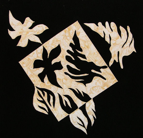
The piece is 14-1/2" X 14-1/2". All I got done after all this time was the quilt top. Too many things going on all at once, but still wanted to participate in the challenge. After putting this together, it resembled, to me, a Coat of Arms type emblem. All criticisms, critiques and comments welcome.

Sunday, December 18, 2011

Calla Lily


I finally finished this challenge. I am taking a class taught by Annette Kennedy on Craftsy and this is her pattern, but I feel that it fits the parameters of the challenge. This was the first time that I had ever painted using pebeo Setacolor fabric paints, and I was happy with the results. Your comments are welcome.

Monday, December 05, 2011

Rose


I enjoyed this challenge. This little piece is 10 1/2" wide by 7 3/4" long. It was done from a photo I took a couple years ago. It is fused but not yet quilted. Still trying out this method. Thanks to Susan Brittingham for the class I took earlier this year. Working this small was a challenge but I needed to see if I could do it---and I did!!

Sunday, December 04, 2011

The Wizard

As requested here is a close up -I used some metallic thread  the light makes it blur. Thank you for commenting


My inspiration was "Dorothy Discovers The Emerald City," an oil painting
by Thomas Kincade. However my character is simply a magical Wizard
that appears on the horizon. I used a stamp as a start pattern and lots
of thread painting. He is holding a book of wisdom and a crystal ball.
While quilting I enhanced the upper right corner with a shadowed sun
( I hope it shows up ) there is also a quarter moon.. The path was
painted with a copper gloss. My goal was to have him just appear onto the quilt

I still have some finishing work to do - I do not like being late so
here he is. Your comments will be appreciated.
Thank YOU

Susan Ward
Quilting in Kentucky
http://artquiltssusanpi.blogspot.com/

Saturday, December 03, 2011

Santa Fe Courtyard


As usual, I thought too long about what to do. After a week of procrastination, I started this on Thursday. It needs some finishing work and is not yet quilted.

I like the strong contrasts and the large shapes. I found it was a bit of a departure and a challenge for me, different from my typical subject matter.

Comments and critiques are most welcome.

Rembrandt's Bird by Cynthia Ann Morgan

Rembrandt's Bird by Cynthia Ann Morgan
Here's my piece for the high contrast with color challenge.  I used Rembrandt's Samson painting for inspiration for the color palette.  http://www.wga.hu/html/r/rembran/painting/biblic1/samson.html
Good thing I'm a hand dyer...I had lots of value choices on hand.
Comments and greetings welcome!
Thanks,
Cynthia

Friday, December 02, 2011

Shadowed Grapes


Here is my finished challenge.  I wanted to use only fabric etc that I had on hand, so chose to use some of my LWI hand-dyed fabric, in this case cotton Damask.  The background is LWI-dyed muslin.  I had hoped to use the shading of the fabric as the shading on  the grapes but it wasn't quite enough, so I added a bit of coloured pencil  I love the effect of LWI on the cotton Damask.  The weave gives the finished result a kind of "glow" that you don't get with any other fabric. The weave also presents special problems when using a raw-edge applique.  Since I was limited to what I had on hand, the colours could have been better, but overall, I think they work quite well.
Pat f in Winnipeg
aka fndlmous

Thursday, December 01, 2011

Under the Sea

I haven't finished this piece, it still needs stitched and quilted.
I really admire the work of Jo Diggs so tried my first 'underwater' scene.   I am hoping I have achieved contrast between the dark and the light area of the 'reef'. Thanks for the great challenge Susan.

dahlia

I took a picture of a flower in my garden because it had one white petal amongst all the red. The light gave interesting color variations to the petals so I felt it fit the challenge. It is 20x20. Machine quilted and raw edge appliqued

Leaf in the Fountain


Here is my small project in response to this challenge to create something in the chiaroscuro style. I used a photo of the fountain at the Cheesecake Factory as inspiration. I wish the green receded more into the background. The photo has more depth and mystery. This is not quite finished… not trimmed or bound or even signed yet.

Enjoyed the challenge, thanks for hosting, Susan. As usual, I'm enjoying the posts and comments - always learning something new.


When Life Gives You Lemons...


The tree trunk represents my hand that wants to turn it around instead. The symbolic landscape was designed in Make the Cut Software and cut with my digital cutter.  
Meena

Wednesday, November 30, 2011

Water Lily


I wanted to do a flower for this challenge and I started with this photo (below) that I took last summer. I edited the photo (in Photoshop and Corel Painter) to boost the value contrast and then printed it on fabric and added the quilting. The size of the quilt is about 9 inches by 12 inches.

Thanks for this challenge.
Jean

Saturday, November 26, 2011

Onion Peel


The Art Piece

As I started this design, I had in mind that it eventually would become a purse. I was given a gorgeous piece of burgundy velvet [my friend Alex bought it at an estate sale for 50cents], I had some tiny cones of silk yarn, some iridescent seed beads and an idea. I had never done any couching before, but this silk begged to be put with this velvet.  I also felt it really fit this challenge.

Velvet seems to have a life of its own as it slides and frays all over the place.   I stay stitched the velvet to the stabilizer. That seem to keep the velvet in place.   As I began to couch the silk yarn to the velvet I loved the look. It is lush! I had absolutely no idea I was stitching the shape of an onion cut pole-to-pole; I just liked the shape. It wasn't until I took a break for a dinner of my Oven Roasted Onion Soup, http://designerann.blogspot.com/2009/05/oven-roasted-onionsoup.html , that I realized after peeling and cutting over 4 pounds of onions, that shape was definitely in my mind.

After dinner I added the seed beads to bring out the dimensions of the velvet-polyester batting-satin layers. I used the polyester batting because I wanted it to be  very 'lumpy'; it is.  It is also very rich, lush, glowing and invites touch.  The beads are dark, but just the right tiny glow to fulfill the challenge. Today I finished making this work of art into an Arty Purse. I plan to use it New Years Eve at a wedding rehearsal dinner.  I often make things do not materialize into my inner vision.  It is so nice to make something I really like.

The Arty Purse Hanging on My Design Wall


The Arty Purse Sitting on a Table


Mesmerized

This is my first attempt at using value to do portraits.  I am happy with everything except the choice of fabrics.  I think there is too big of a jump between the two lightest and the next fabric.  Thus, I haven't stitched it.  The most challenging part was the eyes.  I am happy with the way they turned out.  I used a white colored pencil to get the white dots that make the eyes come alive. I just wish the fabrics had a better gradation.  Please let me know what you think.   Should I toss it and start over or stitch it???

Lindabn from Louisiana

Friday, November 25, 2011

Flower


Not much to say about this. Probably the easiest one I have ever done.

I used the applibond method for the flower and the leaves are from a silk flower bouquet.

Tuesday, November 22, 2011

Challenge 63 - High Value Contrast

FFFC Challenge # 63
November 2011

Theme: Contrast
Hostess: Susan Brittingham

Experiments in Contrast and Color: Use strong value contrast in a dramatic way

In September we looked at the colors of the Old Masters. In October, we used Notan to explore positive and negative space using high contrast. This month, we continue our explorations of contrast and revisit Rembrandt‘s use of chiaroscuro.

For November, I ask you to use strong value contrast in a dramatic way. To paraphrase one of the articles below: “use chiaroscuro to achieve a dramatic intensification of
action or mood“.  I am also going to stipulate that using exclusively black and white is off limits. You must use some color in your work.

You may have seen some of these articles on chiaroscuro from previous challenges. We return to the Old Masters again and again as examples of great art.  

·         This first article focuses on the psychological effects achieved by Rembrandt’s use of light and shadow: http://www.nettonet.org/Nettonet/101%20Painting/Studies/Chiroscuro.htm
·         The next article speaks of the difference between high contrast chiaroscuro and low contrast sfumato: http://painting.about.com/od/oldmastertechniques/a/sfmuato_chiaros.htm
·         Although not specifically known for chiaroscuro, I am also sending you off to visit one of my favorite artists, Vermeer, who uses strong contrasts to paint his domestic scenes: http://www.essentialvermeer.com/
·         As you explore Rembrandt and the Old Masters once again, note their color palettes.
·         The next article examines what is known as Rembrandt Lighting, used for dramatic effect in photography and film: http://www.kuriositas.com/2011/08/chiaroscuro-and-rembrandt-lighting.html

In the world of art quilts,
·         some of the best examples I found are the works of Kate Themel The examples on her Gallery entrance page of slices of her quilts show her skillful use of strong value contrasts: http://www.katethemel.com/gallery.htm
·         Denise LaBadie has a Portal Series that shows how the use of contrast creates both depth and drama. http://www.labadiefiberart.com/Galleries/Portals/page22/Trinity_Church.html
·         Take a look at the dramatic lighting in some of Jo Diggs’ landscapes:  http://jodiggs.com/jodiggs/Gallery.html
·         The following two quilt artists have several examples each among their works,  http://www.sueholdaway-heys.com/gallery.html, check out  The Stable, and some of her higher contrast landscapes for examples 
·         http://www.lenorecrawford.com/gallery.html check out her dogwoods and On Winter’s Coming, plus some of her architectural pieces

So try using some high contrast, with color, to create a strong dramatic effect and have fun!

Susan Brittingham
www.susanbrittingham.com
Faculty Member at www.QuiltUniversity.com

Sunday, November 13, 2011

Untitled

Although, I am posting last this was done the week of the challenge deadline. I just never got around to the posting part of it. This was a fun challenge. I'd like to do three more and put them together. I think it would give it a totally different effect. Critiques, criticisms and comments always welcome.

Tuesday, November 08, 2011

Tails of a Phoenix


I had just made a trip to Nepenthe Restaurant in Big Sur and was inspired by the Phoenix image. This piece used two tails of my imaginary Phoenix and in the Notan style, created two more tails from the pieces I cut. I really enjoyed this challenge and the piece I created.

The size is 17 ½ by 17 ½

Jeanne Holmes

Monday, November 07, 2011

Sea Notan Art

I Have posted my Quilt to the blog and FFFCC 62 Thank you for such a great challenge.
This was a fun project. I "think" this represents Notan Art. I am not the best cutting and trimming person. So I made it simple:) I could not resist the seaweed.
 Susan Ward aka SusanPI2   


"Imagination What a Wonderful Thing"
Quilting In Kentucky
http://artquiltssusanpi.blogspot.com/
 

Saturday, November 05, 2011

Notan Snowflake


I started with a circle and cut the pattern to look like a snowflake. One side of the white fabric had some sparkles on it. I realized that since everything was symmetrical, I did not have to recut the cut out pieces to get the right side up. Big time saver. I'm really pleased with how this turned out (except for the top point that isn't quite straight. It 15" x 15" and right now unquilted. I'm trying to decide if it needs to be or just frame it. I know have my snowflake for our Embroiderers Guild challenge too!

Nancy Schlegel

Three Studies


Here are three that I like. I haven't had time to convert to fabric yet...too many irons in the fire right now...LOL

This is fun and a valuable lesson in positive/negative, light/dark interaction. Thanks Wendy!

Cherie

Notan.....

You have all done a great job!  Notan is such fun and with so few rules, its easy to just keep it going!  I did a bunch over the summer... here are just a few:
     
Lotus Petals

Jack in the Box

Simple Hearts

Simple Trees


Friday, November 04, 2011

Butterfly and Flower


This must be a first. Nearly on time. I cut several experimental Notan images, most of them symmetrical. Then I decided to try something more representational and asymmetrical. This is the one I decided to try in fabric. There is something I like about it, but think it lacks balance. I have uploaded two views, the smaller one is rotated 90 degrees right.

I liked this challenge so much, that I am going to take the idea of paper cutting positive and negative shapes to my guild for a fun activity at our next meeting.

I am eager to do some more. This is such a welcome break from my usual work. Much more immediate gratification. I say that, but I did take the time to applique the shapes, fused and stitched.

Comments/critiques welcome.

Cards Notan


This was designed in Make the Cut software and cut with an electronic cutter. The great thing about it is that I got 2 for 1 . I loved this challenge!

Meena

Thursday, November 03, 2011

Notan


This was a lot of fun.

If you cannot enlarge this, go to my Flickr site and click on action and then view sizes.

Monday, October 31, 2011

Notan

This has been one of my favorite challenges.  I had never heard of the Notan concept but was fascinated with it as soon as I started researching.  I found this great example by Lynn Ticotsky and knew that I wanted to try something similar.  With the aid of CAD drafting software I tried out several different ideas for a repeating pattern.  (Some that I didn't choose are in this blog post.)  I created a freezer paper template and cut the chosen pattern out of black fabric with fusible web on the back eight times.  The resulting 16-square block reads more like an irregular 9-patch to me, but it is made up of just the eight cut-outs and their "leftovers".   I'm not a very precise person, so this definitely looks better from a distance where you can't see all the fuzz, but I really like it.

Right now it's just fused to white fabric, but I would really appreciate some advice on whether to add a black border, and what sort of quilting pattern to use.  I don't want to distract from the design, but I'm not sure that just tracing it with quilting lines would add much.  Input greatly appreciated!
(dimensions are 24" x 24")

(Cutting out Notan shapes is perfect activity to do while joining hubby watching football!)

Trees


Whoever said Notan is addicting is right! I did a second Notan of trees and decided to just flip the paper to one side, rather than all four sides. I also did not make the image symmetrical. I liked the way it looked and proceeded to make a small quilt which measures 10" x 21". Instead of using the method of flipping and gluing (like I did on my previous quilt - post is below this one) I traced the paper pattern onto wonder under and fused it to each fabric and then cut out and fused each piece down (the orange on the dark brown and visa versa). This was far neater and simpler and faster than trying to flip the actual fabric and glue it down. I sort of wish I had reversed the dark and light so that there was more of the light background showing within the trees. The quilt has very little quilting - I just stitched along the edge of the fused fabric. Comments welcome.