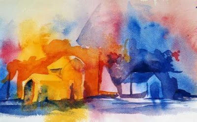
I took a photo last year in Arizona at sunset of the adobe house next to our condo. The little bird sitting on the top was what attracted my attention. The trees lined along the horizon line let the sunset show through their limbs.
It was interesting cutting out the trees for this as I concentrated on just cutting out the negative space. After I finished I wondered if this was really a good representation of negative space or a silhouette. What do you think?
Monday, September 30, 2013
I Love Detroit
Using negative space, the
key emphasizes the Detroit skyline, including the Renaissance Center, the
Penobscot building and the Ambassador Bridge among others.
It was designed in Make
the Cut software cut out with my electronic cutter.
I would love suggestions on how to quilt it.
I designed it with two versions. One has a circle for the keyhole and one with a heart...which one do u think would work better?
Feedback would be very much appreciated.
Thanks
Labels:
Challenge 85,
Meena Schaldenbrand
Sunday, September 29, 2013
Lady in Heels
We have been on the road a lot recently, and I spotted a lady in heels, filling her tank. Snapped a quick reference photo, and tackled this using negative shapes. This was quite a challenge, but I like how she is turning out. No telling when it will all get appliqued and quilted, so I am posting another pinned piece. I hope everyone sticks with this challenge, even if it gets difficult. I am excited to see what we all come up with!!
Thursday, September 26, 2013
Challenge 85 September 2013
Karol Kusmaul,
hostess
 Here is the same idea in a small watercolor study. If you paint the negative shapes, then the
positive ones appear.
Theme: Negative Space
Due Date: October 5, 2013
When I was in college, our drawing instructor stacked up an
odd assortment of stools, old chairs, manikins, and wadded up newsprint. We had several assignments using this mountain
of stuff as our subject matter. One day,
our assignment was to draw the air around the objects, NOT the objects
themselves. In other words, we were to
focus on the shape of the spaces between the objects.
This is a technique recommended by Betty Edwards in her well
known Drawing on the Right Side of the Brain books. Betty tells about Bugs Bunny running through a
door and leaving a rabbit shaped hole in the door. If you were to draw the shape of the door (or
the negative space), you will have drawn the shape of the rabbit. It is amazing
how well this technique can improve the way you see and draw.
Try it with
fabrics! You can use real objects or
photographs you have taken. You can use
any subject matter that has interesting shapes or openings.
Having taught this technique in my high school art classes,
I was always impressed with the resulting drawings. Give it a shot!!! You might try a quick fabric study of a chair
that has interesting open spaces. Don’t
cut out a chair shape, instead, cut out the shapes of the air around the chair.
Negative space, in art, is the space around
and between the subject(s) of an image. Negative space may be most evident when
the space around a subject, and not the subject itself, forms an interesting or
artistically relevant shape, and such space is occasionally used to artistic
effect as the "real" subject of an image. The use of negative space
is a key element of artistic composition.
Here are some examples:
This is an image of a drummer. As in the one with my son on a stool, I
started with some wild fabrics as a
background, then added shapes for the negative spaces. The wild fabrics became my positive
shapes. You may want to simplify and use
solids or more tame fabrics.
Here are two paintings by Hessam Abrishami where negative
space is emphasized. It really is as
important as the positive figures!!
 Here is the same idea in a small watercolor study. If you paint the negative shapes, then the
positive ones appear.
Finally, a student piece that plays with positive and
negative shapes, as well as implied shapes, where your eye completes the tank
top on the right, even if it is not delineated.
And one last word: have fun with this!
Wednesday, September 25, 2013
Boysenberry Fog
Challenge #84 finally!
I put this together tonight. It is made of a variety of materials in circular and oblong shapes. Comments welcome!
I put this together tonight. It is made of a variety of materials in circular and oblong shapes. Comments welcome!
Tuesday, September 24, 2013
Six Sonner Suns
I have (finally) finished my circle-themed quilt. Six Sonner Suns is about our recent trip to Germany to visit my husband's aunt and uncle. We are all Sonners (4 by birth, 2 by marriage). We traveled around the green countryside and enjoyed lots of sunshine with blue skies and some clouds. We even found a strawberry farm run by Sonners. It was fun recreating the colors of the trip and adding happy family photos. This quilt is part of my family history series, which is evolving into family travel.
Friday, September 20, 2013
A Jungle of Tomatoes
25" x 17½"
Last year I came up with A Neighborhood of Zucchini so this year it's back to the garden with a Jungle of Tomatoes, and I couldn't even keep it contained within the original space I had started with! And that's also what made me take more time in completing it, I'm afraid. The leaves aren't quite right for tomatoes, but the jungle aspect certainly comes through! What doesn't show as much are the bits of highlight I put on the tomatoes.
Later is better than never! Your comments are always welcome.
Sunday, September 15, 2013
Road Racer
This is a portrait of a ten year old girl as she was about to begin her first motorcycle road race of the day. She was dressed in all pink from her helmet to shirt, pants, boots, and gloves. She was as determined as the predominantly male contestants. While not exactly just circles, there are a lot of circles in this piece. It is destined for the SAQA trunk show in 2014.
I've written a bit more about it on my blog--sylviaweirart.wordpress.com
Subscribe to:
Comments (Atom)


