Saturday, April 28, 2012

Find Your Own Path


I played with several of the gestalt principles using fabric paint and some of my homemade stencils.  None of the samples thrilled me but found I was drawn to the similarity/anamoly principle.  I came up with the idea of individuality and went to posemaniacs.com to create the figures.  Since they are small (entire quilt is only 17 x 21) I used faux suede for the figures to keep the intricate details from unraveling.  I dug the border out of my stash and found a piece of my hand dyed fabric that went well with the rust color in the border.  I finished the edges of the quilt using the pillowcase method.  The only thing I have left to do is quilt it.  I plan to use echo quilting.  I just need to go to the store to find a muted rust thread.

I haven't posted in a while.  Between work and my husband's health, anything creative has been on the back burner.  However, finals are coming up next week and I hope to have some time to play this summer.  This was a really great challenge and I may make another one using one of the other principles.

LindaBN from Louisiana

Wednesday, April 25, 2012

Challenge 68 - Gestalt Art

Challenge 68:  Gestalt in Art
Gestalt Theory holds that “the whole is other than the sum of its parts”. Kurt Koffka (the whole exists independently from its parts).   Parts identified individually have different characteristics to the whole;
e.g. describing a tree,-its parts are trunk, branches, leaves, perhaps blossoms or fruit.  But when you look at an entire tree, you are not conscious of the parts, you are aware of the overall object-the tree.  Parts are of secondary importance even though they can be clearly seen.
When your first impression of a design is positive, when you instinctively see it as good, it’s likely because one or more “Gestalt Principles of Perception” are at play.
The challenge:  Create your piece using one or more of the Gestalt Principles as described below:

I hope you will find these ideas fascinating, as I do.  Have fun and I’m really looking forward to your ideas!
Cherie


The Gestalt Principles
 Gestalt is a psychology term which means "unified whole". It refers to theories of visual perception developed by German psychologists in the 1920s. These theories attempt to describe how people tend to organize visual elements into groups or unified wholes when certain principles are applied. These principles are:
Similarity
Similarity occurs when objects look similar to one another. People often perceive them as a group or pattern.

The example above (containing 11 distinct objects) appears as as single unit because all of the shapes have similarity.
Unity occurs because the triangular shapes at the bottom of the eagle symbol look similar to the shapes that form the sunburst.
 When similarity occurs, an object can be emphasized if it is dissimilar to the others. This is called anomaly.

The figure on the far right becomes a focal point because it is dissimilar to the other shapes.
Continuation 

Continuation occurs when the eye is compelled to move through one object and continue to another object.


Continuation occurs in the example above, because the viewer's eye will naturally follow a line or curve. The smooth flowing crossbar of the "H" leads the eye directly to the maple leaf.

Closure
Closure occurs when an object is incomplete or a space is not completely enclosed. If enough of the shape is indicated, people percieve the whole by filling in the missing infomation.

 Although the panda above is not complete, enough is present for the eye to complete the shape. When the viewer's perception completes a shape, closure occurs.

 Proximity
Proximity occurs when elements are placed close together. They tend to be perceived as a group.


The nine squares above are placed without proximity. They are perceived as separate shapes.


 When the squares are given close proximity, unity occurs. While they continue to be separate shapes, they are now perceived as one group.


The fifteen figures above form a unified whole (the shape of a tree) because of their proximity.

Figure and Ground
The eye differentiates an object form its surrounding area. a form, silhouette, or shape is naturrally perceived as figure(object), while the surrounding area is perceived as ground(background).
Balancing figure and ground can make the perceived image more clear. Using unusual figure/ground relationships can add interest and sublety to an image.
  
Figure
The word above is clearly perceived as figure with the surrounding white space ground.
 
 In this image, the figure and ground relationships change as the eye perceives the the form of a shade or the silhouette of a face.
 This image uses complex figure/ground relationships which change upon perceiving leaves, water and tree trunk.


.Here is a wonderful little video with Bobby McFerrin demonstrating the theory with music…I love it!
Here are some terrific resources for learning about the Gestalt Theory:
Seven principles of design:

Monday, April 23, 2012

Dawn on Sea - Silvia Dell'Aere

Hi :)
I've used this challenge as guideline to make my last piece. I've made it for my solo show I've had last week, and it's a piece that talks about my love for sea.

Measures: 86x39 inches
Technique: hand dyed cotton and machine quilting
Title: (the title is a short poetry I've written, I'll try to translate it for you in english)
A sea ​​stirs in me / foaming, flashing, / then comes the dawn

Full:

Details: waves on bottom left corner, sun rays in top right corner and 3 seagulls from top left to bottom right corners

Every comment's welcome :)

Thursday, April 12, 2012

Friday, April 06, 2012

Untitled and unfinished

I have really struggled with this challenge. In the end, I decided that I would paint, and then quilt a seascape. The painting didn't go so well. My last attempt looked perfect while it was wet but faded into nothing as it dried. The sailboat was added in an effort to bring it to life. And then I realized that there is too much wind in the sails for such a quiet sea. Perhaps it's a ghost ship, and sails along without benefit of wind.

Certainly not one of my best efforts, but I plan to persevere with it and see what happens.

Pat F in Winnipeg
aka fndlmous

Tuesday, April 03, 2012

Monday, April 02, 2012

Sunrise at the Dock

20" x 19"

When looking at Turner's work, the first thing I thought of was using Angelina fiber, and it shows in the rising sun, the reflection in the water and the clouds in the sky. The dock is a wood-grain fabric in pink, and I put a couple crates on it, with some rocky fabric behind the boxes and across the channel. These were all a bit too dark for my liking, and I used decolorant to bleach them to a lighter shade, which gave the boxes a weathered look. I decided not to use the decolorant on the border pieces of the rocky fabric to pull that forward a bit.

The piece is mounted on foam core, and it was at the stage of sewing it down that I noticed the big box extends a bit beyond the dock!

Your comments are welcome!

Poppies in the Moonlight


Another challenge finished! I finished the quilting on this and it will be framed for my daughter. Only one more to go.
This piece began as fabric which I had ice dyed. In looking at it my eyes piced out the poppie shapes immediately and I decided to make them the focal point. I first stitched/quilted around them and the light green areas in the fabric. After that was done, I used fabric paint to highlight the shapes and to darken the blue areas so that the poppies and green areas would come forward. I am in the process of doing denser quilting in the blue areas and will add some beadwork when the quilting is complete. Then I will mount it on a canvas.

Louise Page

Sunday, April 01, 2012

nature at peace

When doing a general dying of some fabric one piece came out looking to me like a swamp so I decided to take advantage of it and make it into a wall quilt. With stitching, roving, rawedge applique, and decolorant for the birds I brought it to life. The sun shining through the trees is stitched in hologram thread and is very shiny but doesn't show in the photo.
This piece measures 36x42.

Pat Havey

Friday, March 30, 2012

Colin's Leaves


This is the first challenge I've actually completed and posted since joining the FFFC group. Took almost a year!
My inspiration was a photo that a friend of mine, Colin, took of three leaves on the hood of his car. When I saw the pic on Facebook, I asked if I could use the photo as inspiration for this challenge calling for high contrast. He agreed, and waited several months for me to actually make it!
This is the first art quilt I've done in a long time, and I like it.
It was made with raw silk and silk crepe, quilted with metallic silver and black thread and marked with silver paint pen.
Critiques welcome!

Costa Rica Sunset by Cynthia Morgan


Here's my little study of light inspired by a photo of a sunset in Costa Rica

Spiral Galaxy M101


I have always been interested in space, so now with all the breathtaking photos coming from Hubble, I knew exactly what I wanted to portray in my challenge piece. I chose M101, one of my favorite galaxies, but creating it was another story! I chose a marbled cotton overlayed with a "party" organza to simulate stars in space. Then I layered several cutouts of dryer sheets to achieve the general outline and glowing center of light. These I "feathered" to soften the lines, and finally overlayed them with teased white fuzzy yarn. VOILA! However, I realized that there was no way for me to "use" it or quilt it. One sneeze and the galaxy would be gone. Overlaying tulle, white or darker, would spoil the effect, so I just took a picture of it as is. Anyone have a suggestion as to how I might preserve this? Comments and suggestions more than welcome. LOVED doing this challenge, Susan, thank you.

silk setting sun


Hand dyed silk, cut into small fragments and fused to create color gradations. The final measurement of this piece is only 6" x 8". After construction, I am not sure about adding stitching.
Great challenge. Comments welcome.

Monday, March 26, 2012

Maine Sunset


This is from a photo I took in Maine in late November. The sky was a translucent gold and gray. The actual quilt is gold metallic fabric, but will not translate in my picture...darn! The fabrics are all sheers, metallics, and lace netting with gold threads...no cotton in the whole piece. The trees are thread painted over antique gold metallic mesh.This was a wonderful challenge...finally got me out of my funk.

Thank you Susan for a thought provoking challenge!

Your comments are welcome!

Cherie

Golden Sunrise

Golden Sunrise, redone

Not happy with the quilted sky, I ripped it out.  I was not happy with it when done.  However, when someone commented on it, I knew I had to change it.  Now it is tied with gold metallic thread in a circular pattern around the sun.  I like this much better.  Luckily, I have an ergonomic seam ripper.  I've used it a lot.  However, ripping our clear poly thread is the most difficult.


Golden Sunrise
10" x 10"

This is my third try.  I was really happy with it before quilting.  I think the sun would have been better not quilted.  What I really enjoy about all of these challenges [besides the challeng] is looking at all of the wonderful art references.  I do remember a Turner titled 'Fire at Sea' or something resembling that.  I could not find it online, but it is still in my mind after 20+ years.  I think art is like that; it grips you and holds you.

Thursday, March 22, 2012

Challenge 67 - Turner's Light

Fast Friday Fabric Challenge #67                           Due:  3/31/2012
Turner’s Light                                                           Host: Susan Sleisinger

J.M.W.Turner's use of light and subtle color have fascinated me ever since I was a child and went on school holiday programmes at London's National and Tate galleries, so I chose him as the topic for this month's challenge.

John Mallford William Turner (1775-1851) was a romantic-era British painter known for his seascapes, and use of light as a dramatic element in his art.

Turner tended to use the sun or moon, his light source, as the centerpiece of his paintings and artistic language, and the paintings were developed around the light source. In his later works he often minimized the appearance of solid objects, using transparency, shimmering light and subtle colors to evoke a mood.  By the end of his life, his main artistic focus was the effect of light. He was a precursor to the Impressionists.  Monet is known to have studied his works.


The timing of this challenge is very auspicious for our British members as the National Gallery in London is holding an exhibition called Turner Inspired in the Light of Claude.  
In his twenties, Turner is reported to have seen Claude's "Seaport with the Embarkation of the Queen of Sheba" and burst into tears because he feared he could never paint anything like that picture.  Turner bequeathed much of his work and his sketchbook to Britain and insisted that two of his works be displayed alongside Claude's painting


Other examples of his works can be found by following the links at the end of http://www.artchive.com/artchive/T/turner.html and at http://tinyurl.com/83blec5

Contemporary artists influenced by Turner include Henrietta Stuart and Anne Stahl http://www.henriettastuart.com/     http://www.annestahl.com/paintings/

In the quilt world, Katie Pasquini sometimes uses his concept of transparency and light in works such as “Cheers" and "Friends"  http://www.katiepm.com/quiltsale.html

British Quilter Pauline Barnes occasionally shows his influence in works such as "Rainbow" "Chichen Itza", and "Silence is Golden” http://www.paulinebarnesquilts.co.uk/

Eileen Doughty has made use of different types of light to draw in the viewer in "You can see the Tree for the Forest" and "Welcome Communication http://tinyurl.com/7y572mu    http://tinyurl.com/7decwaz

Australian quilter Gloria Loughman also makes light integral in her quilt "Canopy".   http://www.glorialoughman.com/

This month's challenge is to create a somewhat abstract seascape or landscape featuring a prominent, visible light source, subtle coloring and "misty realism" such as those displayed in Turner's "Margate from the Sea,"  "The Evening Star", and "Snowstorm"  


Have fun playing with light now we are past the spring equinox.       Susan

Friday, March 16, 2012

Challenge 65


Abstract Rooster with Zentangles for feather


This is my first challenge  (#65, Childhood Memories) and I would appreciate your critiques.  When I was a child growing up in West Virginia, I lived on a farm.  We had all kinds of farm animals, but the rooster ruled the chicken coop and farm yard.  We had all kinds of roosters.  Some roosters had beautiful feathers, others were down right mean.  I was really glad I was young and could run fast when the mean ones were showing their-selves.  I did this abstract rooster in watercolor pencils with Zentangles for feathers.  Patty Mayfield

Posted by LindaMac for Patty Mayfield

Monday, March 05, 2012

Challenge 66


Line


Here's my entry, slightly late, needing a little straightening, ironing and quilting, but "done."  I have never been a good one for following directions, so after reading the basic challenge and looking at some of the links, I just jumped  in and started my own project, and only noticed this morning that you had actual directions and a step by step example!  Oh well,  I was really excited about jumping in because the challenge seemed to relate really well to a workshop I attended last week in which we worked on using line in compositions as well as working with color families and values. 
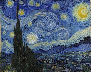
I used the colors from Van Gogh’s Starry Night as my color inspiration. 


My inspiration source for “line” was not a photo but generalized from the motif of repeated units, usually squares, containing lines.   There are many abstract quilt artists who work with this idea, and I’ve always been intrigued by it, so I thought this was a good time to try it out.  I first thought I would use curves to hint at the curving shapes in Starry Night, but realized I didn’t even know how to do straight lines yet! Maybe I can incorporate the curving lines in the quilting.  Here are some links to a few art quilters who use lines that I was especially inspired by :  Nelda Warkentin, Cory Volkert, Paula Kovarik, Catherine Whall Smith, and Lisa Call.  I especially love the way Lisa Call treats lines in her work.  I saw this piece at Quilt National last year and was spellbound by it.  It’s hard to see in the photos but the light objects are done with quilted lines and the rest of the piece is very heavily quilted as well.

Looking forward to thoughts and comments.  This was a fun learning experience for me, thanks Cynthia, for such a creative challenge idea!

Sharon 


Saturday, March 03, 2012

Topography

OK, its not done, but I ran outa time (work, etc, you all know the drill).  But I hope to have the stitching done by tonight.  My inspiration was a topographic map that I had in my sketch book and the fabric on my table (as usual).  These are fabrics from the Japa Mala (Buddhist Prayer Beads) quilt that is still in progress.

Fused pieces on black (to reflect the changes in elevation) are quilted and stitched at the same time with a narrow zig zag.  I want to go back and do some detail lines in each segment for the topographic lines and will just do some background quilting in the black. 

Great challenge, Cynthia!  Comments of course are welcome and appreciated!

Line & Color Challenge

Well, I didn't have much time to work on a piece this week...but wanted to follow my own advice of better done than perfect.  So here it is.  I used a photo of a hallwall in an abandoned building for the line and a photo of bright wildflowers for the color.  I didn't get the effect of the gloomy hallway because of the cheery colors.  I should have used more shades and tones.  Since I didn't really love the piece, I also experimented with the quilting.  After quilting it like I usually do, I "overquilted" it by quilting vertical lines in black thread and horizontal lines in white thread.  I've always wanted to do this to see if the neutral thread blended the colors of the quilt, as well as how much quilting can you get into a small piece and  still see the composition.  (the answers are a little bit and a lot)
Cynthia

Friday, March 02, 2012

Eucalyptus Rainbow Tree

I have finally finished this challenge which I began in February of this year.  I trapuntoed the colored pieces of bark and then quilted them with black metallic thread.  I then quilted the background bark using a pattern which mimicked the shape of the colored pieces.  I added a light coating of Shiva Paint Stick to the dark bark to add dimension and interest.  I am very happy with the finished product and will probably explore it more in future projects.


Okay, I decided to come out and play after many months of inactivity. It wasn't that I didn't follow the challenges and map out a plan, but I just didn't get any farther than the planning stage. Oh well, that is water under the bridge now and I choose to move forward rather than dwell in the past.

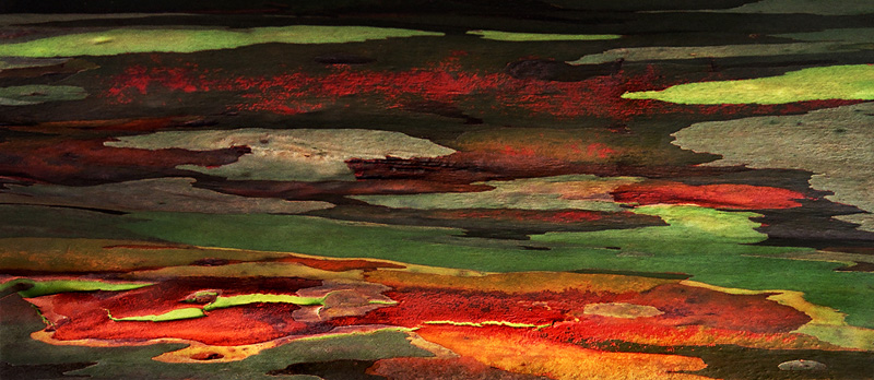
For my line reference I chose the beautiful bark of the Eucalyptus Rainbow Tree. I must admit to taking artistic license in interpreting the bark, but I am more of an organic line person than geometric. My color scheme was taken from a photo of the tree bark. I cut my pieces and then fused them to the background foundation piece attempting to leave interesting negative shapes. I will eventually trapunto the bark and densely quilt the background to complete the piece. I just wanted to get the piece to this point before the week ended. Thank you Cynthia for the nudge towards completion rather than perfection!

Line & Color

After reading the two comments, I went back and added a lot more thread work to my little quilt. Thanks for the comments---this IS much better.


I had a really good time with this. The line is from one of my walls---we live in a log home so there were a lot of possibilities. The color is a sunset picture I took one evening while on our boat. Fabrics were just not working out--so I used thread on one piece of fabric. Comments welcomed.

Brick and Mortar

This was a really exciting challenge for me, and I found myself pushing to try combinations that I wouldn't normally do.
I took this picture used for the lines in my piece while on vacation last year. I loved the texture and the strong architectural lines along with the starkness of the color scheme.
Just a few blocks away, I took
my color inspiration photo at a local farmers' market.
I found it really challenging to try to incorporate the bright reds and greens into the strong lines from the other photo. This piece became much more abstract than my usual work although I tried to incorporate much of the feel of the original photo, it is also greatly changed. The mortar for the bricks and the stones is actually a sage green tone, although against the brighter colors it appears to be gray. The quilting is done in a very fine thread in the same sage green as the mortar. It is intended to simply emphasize the textural difference between the bricks and stones and the mortar.
I would welcome your comments, including where I may have missed the mark or could have improved the concept. Thank you!
Ticia