Friday, March 30, 2012

Colin's Leaves


This is the first challenge I've actually completed and posted since joining the FFFC group. Took almost a year!
My inspiration was a photo that a friend of mine, Colin, took of three leaves on the hood of his car. When I saw the pic on Facebook, I asked if I could use the photo as inspiration for this challenge calling for high contrast. He agreed, and waited several months for me to actually make it!
This is the first art quilt I've done in a long time, and I like it.
It was made with raw silk and silk crepe, quilted with metallic silver and black thread and marked with silver paint pen.
Critiques welcome!

Costa Rica Sunset by Cynthia Morgan


Here's my little study of light inspired by a photo of a sunset in Costa Rica

Spiral Galaxy M101


I have always been interested in space, so now with all the breathtaking photos coming from Hubble, I knew exactly what I wanted to portray in my challenge piece. I chose M101, one of my favorite galaxies, but creating it was another story! I chose a marbled cotton overlayed with a "party" organza to simulate stars in space. Then I layered several cutouts of dryer sheets to achieve the general outline and glowing center of light. These I "feathered" to soften the lines, and finally overlayed them with teased white fuzzy yarn. VOILA! However, I realized that there was no way for me to "use" it or quilt it. One sneeze and the galaxy would be gone. Overlaying tulle, white or darker, would spoil the effect, so I just took a picture of it as is. Anyone have a suggestion as to how I might preserve this? Comments and suggestions more than welcome. LOVED doing this challenge, Susan, thank you.

silk setting sun


Hand dyed silk, cut into small fragments and fused to create color gradations. The final measurement of this piece is only 6" x 8". After construction, I am not sure about adding stitching.
Great challenge. Comments welcome.

Monday, March 26, 2012

Maine Sunset


This is from a photo I took in Maine in late November. The sky was a translucent gold and gray. The actual quilt is gold metallic fabric, but will not translate in my picture...darn! The fabrics are all sheers, metallics, and lace netting with gold threads...no cotton in the whole piece. The trees are thread painted over antique gold metallic mesh.This was a wonderful challenge...finally got me out of my funk.

Thank you Susan for a thought provoking challenge!

Your comments are welcome!

Cherie

Golden Sunrise

Golden Sunrise, redone

Not happy with the quilted sky, I ripped it out.  I was not happy with it when done.  However, when someone commented on it, I knew I had to change it.  Now it is tied with gold metallic thread in a circular pattern around the sun.  I like this much better.  Luckily, I have an ergonomic seam ripper.  I've used it a lot.  However, ripping our clear poly thread is the most difficult.


Golden Sunrise
10" x 10"

This is my third try.  I was really happy with it before quilting.  I think the sun would have been better not quilted.  What I really enjoy about all of these challenges [besides the challeng] is looking at all of the wonderful art references.  I do remember a Turner titled 'Fire at Sea' or something resembling that.  I could not find it online, but it is still in my mind after 20+ years.  I think art is like that; it grips you and holds you.

Thursday, March 22, 2012

Challenge 67 - Turner's Light

Fast Friday Fabric Challenge #67                           Due:  3/31/2012
Turner’s Light                                                           Host: Susan Sleisinger

J.M.W.Turner's use of light and subtle color have fascinated me ever since I was a child and went on school holiday programmes at London's National and Tate galleries, so I chose him as the topic for this month's challenge.

John Mallford William Turner (1775-1851) was a romantic-era British painter known for his seascapes, and use of light as a dramatic element in his art.

Turner tended to use the sun or moon, his light source, as the centerpiece of his paintings and artistic language, and the paintings were developed around the light source. In his later works he often minimized the appearance of solid objects, using transparency, shimmering light and subtle colors to evoke a mood.  By the end of his life, his main artistic focus was the effect of light. He was a precursor to the Impressionists.  Monet is known to have studied his works.


The timing of this challenge is very auspicious for our British members as the National Gallery in London is holding an exhibition called Turner Inspired in the Light of Claude.  
In his twenties, Turner is reported to have seen Claude's "Seaport with the Embarkation of the Queen of Sheba" and burst into tears because he feared he could never paint anything like that picture.  Turner bequeathed much of his work and his sketchbook to Britain and insisted that two of his works be displayed alongside Claude's painting


Other examples of his works can be found by following the links at the end of http://www.artchive.com/artchive/T/turner.html and at http://tinyurl.com/83blec5

Contemporary artists influenced by Turner include Henrietta Stuart and Anne Stahl http://www.henriettastuart.com/     http://www.annestahl.com/paintings/

In the quilt world, Katie Pasquini sometimes uses his concept of transparency and light in works such as “Cheers" and "Friends"  http://www.katiepm.com/quiltsale.html

British Quilter Pauline Barnes occasionally shows his influence in works such as "Rainbow" "Chichen Itza", and "Silence is Golden” http://www.paulinebarnesquilts.co.uk/

Eileen Doughty has made use of different types of light to draw in the viewer in "You can see the Tree for the Forest" and "Welcome Communication http://tinyurl.com/7y572mu    http://tinyurl.com/7decwaz

Australian quilter Gloria Loughman also makes light integral in her quilt "Canopy".   http://www.glorialoughman.com/

This month's challenge is to create a somewhat abstract seascape or landscape featuring a prominent, visible light source, subtle coloring and "misty realism" such as those displayed in Turner's "Margate from the Sea,"  "The Evening Star", and "Snowstorm"  


Have fun playing with light now we are past the spring equinox.       Susan

Friday, March 16, 2012

Challenge 65


Abstract Rooster with Zentangles for feather


This is my first challenge  (#65, Childhood Memories) and I would appreciate your critiques.  When I was a child growing up in West Virginia, I lived on a farm.  We had all kinds of farm animals, but the rooster ruled the chicken coop and farm yard.  We had all kinds of roosters.  Some roosters had beautiful feathers, others were down right mean.  I was really glad I was young and could run fast when the mean ones were showing their-selves.  I did this abstract rooster in watercolor pencils with Zentangles for feathers.  Patty Mayfield

Posted by LindaMac for Patty Mayfield

Monday, March 05, 2012

Challenge 66


Line


Here's my entry, slightly late, needing a little straightening, ironing and quilting, but "done."  I have never been a good one for following directions, so after reading the basic challenge and looking at some of the links, I just jumped  in and started my own project, and only noticed this morning that you had actual directions and a step by step example!  Oh well,  I was really excited about jumping in because the challenge seemed to relate really well to a workshop I attended last week in which we worked on using line in compositions as well as working with color families and values. 
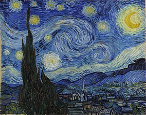
I used the colors from Van Gogh’s Starry Night as my color inspiration. 


My inspiration source for “line” was not a photo but generalized from the motif of repeated units, usually squares, containing lines.   There are many abstract quilt artists who work with this idea, and I’ve always been intrigued by it, so I thought this was a good time to try it out.  I first thought I would use curves to hint at the curving shapes in Starry Night, but realized I didn’t even know how to do straight lines yet! Maybe I can incorporate the curving lines in the quilting.  Here are some links to a few art quilters who use lines that I was especially inspired by :  Nelda Warkentin, Cory Volkert, Paula Kovarik, Catherine Whall Smith, and Lisa Call.  I especially love the way Lisa Call treats lines in her work.  I saw this piece at Quilt National last year and was spellbound by it.  It’s hard to see in the photos but the light objects are done with quilted lines and the rest of the piece is very heavily quilted as well.

Looking forward to thoughts and comments.  This was a fun learning experience for me, thanks Cynthia, for such a creative challenge idea!

Sharon 


Saturday, March 03, 2012

Topography

OK, its not done, but I ran outa time (work, etc, you all know the drill).  But I hope to have the stitching done by tonight.  My inspiration was a topographic map that I had in my sketch book and the fabric on my table (as usual).  These are fabrics from the Japa Mala (Buddhist Prayer Beads) quilt that is still in progress.

Fused pieces on black (to reflect the changes in elevation) are quilted and stitched at the same time with a narrow zig zag.  I want to go back and do some detail lines in each segment for the topographic lines and will just do some background quilting in the black. 

Great challenge, Cynthia!  Comments of course are welcome and appreciated!

Line & Color Challenge

Well, I didn't have much time to work on a piece this week...but wanted to follow my own advice of better done than perfect.  So here it is.  I used a photo of a hallwall in an abandoned building for the line and a photo of bright wildflowers for the color.  I didn't get the effect of the gloomy hallway because of the cheery colors.  I should have used more shades and tones.  Since I didn't really love the piece, I also experimented with the quilting.  After quilting it like I usually do, I "overquilted" it by quilting vertical lines in black thread and horizontal lines in white thread.  I've always wanted to do this to see if the neutral thread blended the colors of the quilt, as well as how much quilting can you get into a small piece and  still see the composition.  (the answers are a little bit and a lot)
Cynthia

Friday, March 02, 2012

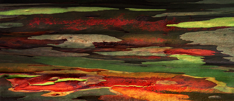
Eucalyptus Rainbow Tree

I have finally finished this challenge which I began in February of this year.  I trapuntoed the colored pieces of bark and then quilted them with black metallic thread.  I then quilted the background bark using a pattern which mimicked the shape of the colored pieces.  I added a light coating of Shiva Paint Stick to the dark bark to add dimension and interest.  I am very happy with the finished product and will probably explore it more in future projects.


Okay, I decided to come out and play after many months of inactivity. It wasn't that I didn't follow the challenges and map out a plan, but I just didn't get any farther than the planning stage. Oh well, that is water under the bridge now and I choose to move forward rather than dwell in the past.

For my line reference I chose the beautiful bark of the Eucalyptus Rainbow Tree. I must admit to taking artistic license in interpreting the bark, but I am more of an organic line person than geometric. My color scheme was taken from a photo of the tree bark. I cut my pieces and then fused them to the background foundation piece attempting to leave interesting negative shapes. I will eventually trapunto the bark and densely quilt the background to complete the piece. I just wanted to get the piece to this point before the week ended. Thank you Cynthia for the nudge towards completion rather than perfection!

Line & Color

After reading the two comments, I went back and added a lot more thread work to my little quilt. Thanks for the comments---this IS much better.


I had a really good time with this. The line is from one of my walls---we live in a log home so there were a lot of possibilities. The color is a sunset picture I took one evening while on our boat. Fabrics were just not working out--so I used thread on one piece of fabric. Comments welcomed.

Brick and Mortar

This was a really exciting challenge for me, and I found myself pushing to try combinations that I wouldn't normally do.
I took this picture used for the lines in my piece while on vacation last year. I loved the texture and the strong architectural lines along with the starkness of the color scheme.
Just a few blocks away, I took
my color inspiration photo at a local farmers' market.
I found it really challenging to try to incorporate the bright reds and greens into the strong lines from the other photo. This piece became much more abstract than my usual work although I tried to incorporate much of the feel of the original photo, it is also greatly changed. The mortar for the bricks and the stones is actually a sage green tone, although against the brighter colors it appears to be gray. The quilting is done in a very fine thread in the same sage green as the mortar. It is intended to simply emphasize the textural difference between the bricks and stones and the mortar.
I would welcome your comments, including where I may have missed the mark or could have improved the concept. Thank you!
Ticia

Tuesday, February 28, 2012

Window Study 1

Window Study 1
10" x 10"

The edge is gold lame. It is very difficult to photograph because of the sheen. If I made it more yellow, as it really is, all the other colors would be distorted. My final choice of fabrics was limited to what I call "lush". Those are fabrics like satin, velvet, textural upholstery, recycled ties, etc.

Photo Inspiration and Tracing

I originally did 7 panels. Hated one; into the circular file. I made each one individually as a separate little piece. When I finished, I re-arranged the panels because I like them better this way.


Color Evaluation

Color Inspiration was from a photo of fireworks over a body of water. Because I did not have rights to this photo, I'm just showing my color study. Obviously LOTS of bright colors.

Left Overs

My process was to get out my scraps and pick out those I thought might work. This is the pile of pieces that I picked out of my bags. I do think I should do something with this HUGE pile of bits and pieces. Found fabric scraps I had forgotten about. Lots of memories in this pile.

Monday, February 27, 2012

unnamed


I took the lines from a piece of tin cieling tile. I used a hand dyed cotton and embellished with rickrack and yarn adding buttons for the dots on the centers


Pat Havey

Design decisions

As I was going through these steps, I had a couple stumbling blocks, aka design questions & decisions, I thought I'd share with you in case they are meaningful to your process.
  • . Do I need to include all the lines from my line inspiration?
Absolutely not! I will chose the lines that look interesting to me and ignore the rest.

  • . Do I need to make my piece realistic and look like my line inspiration and have my colors placed in logical or realistic form?
Absolutely not! You can if you choose to do that, but I guarantee more fun if you mix it up. And you'll get out of the color mindset that the sky is blue.  And if you use a texture like tree bark or wrinkles for your line inspriation, you'll get a unique abstract piece when you put color to it!

  • . Do I need to stick to my lines or colors exactly from my inspiration?
Absolutely not! They are for inspiration, a starting point. If I think purple looks better in my piece than the blue-violet I selected from my inspiration piece, then I will use purple. Same for the lines, If I don't like it I'll move the line, eliminate it or change it. Do what the piece needs rather than stick strictly to the exercise.  You can add, substract, change as needed,
  • Do I need light/medium/dark and pure hue/tint/tone/shade of each color in the color scheme?
No, but if you get as much variety in value and intensity in the various color families as your stash allows...the piece will be much more interesting!

Sunday, February 26, 2012

Western Landscape


I too did what Cynthia told us-don't overthink and better done than perfect. It also helped that my sewing machine is broken, it was a lousy day Friday and Saturday, and my husband was busy yelling at the tax program on the computer. I walked by the calendar after reading the challenge and took the Feb photo from that to do my line drawing. Then I picked up the first picture book I found in the living room and found a photo of Seville with colors I liked. Figuring out tones and shades and tints took some experimentation and I'm still not sure if I got colors in all three. What is brown? From Cynthia's color samples, it could be a shade of orange or a tone of red. White was in the color photo, so I wanted to use it as a zinger but am ambivalent about it being too dominant. Anyway, the fabrics are fused onto muslin and will await finishing until my machine visits the repair shop on Tuesday.

Photos in order are: line drawing photo, color choice photo, colors choosen, and finished quilt.


After reading comments and looking at this quilt, I added more "mountains" and changed the white zingers to light yellow. The sky was quilted in an allover pattern. The mountains were quilted in straight lines with curvy lines added in mettalic gold thread for the dark mountain. I think the additional fabrics and shapes help give more interest to the piece and I now give it about a B+. This is a technique that I hope will lead to more abstract pieces than this one turned out to be. I enjoyed the challenge Cynthia.

View


Thank you Cynthia for an interesting challenge. At first I wanted to moan and pull my hair, but your statement about not over-thinking it and just doing it struck home. I found an image in a travel mag that had great lines, then went to a color design book I've had for many years and use frequently. My palette was yellow, blue, purple and blue-green. Though I'm not sure I've hit all the values and done them in the correct proportions, I am happy with the outcome. The quilt is 5"x7".
Ann In Fallbrook, CA

Thursday, February 23, 2012

Challenge 66- Line and Color

Fast Friday Fabric Challenge #66                                       Due:   March 3rd              
Elements of Color and Line                                                        Host:  Cynthia Morgan
Challenge:  Use the element of Line and the 3 elements of Color (Hue, Value, Intensity) in a design study piece.  You will need 2 inspiration sources:  one for line, another for color
Definitions: 
·         Line:  the basic element that refers to the continuous movement of a point along a surface, there are curved, horizontal, vertical, diagonal, zigzag, wavy, parallel, dash, and dotted lines. The edges of shapes and forms also create lines.
·         Hue:  the name of the color, also known as the color family.  There are 12 colors/hues/color families on the color wheel :  red, red-orange, orange, yellow-orange, yellow, yellow-green, green, blue-green, blue, blue-violet, violet (purple), and red-violet
·         Value:  the relative darkness or lightness of a color: light, medium, dark and everything in between
·         Intensity (or Saturation):  the relative brightness or dullness of a color: tints, tones, shades and pure hues
         Tints – white added to pure hue   Tones – grayed hues    Shades – blackened hues
         For more on Intensity see here:  http://resources.quiltwoman.com/blockmo.html


Tints with white added to pure hue
  
Shades with black added to pure hue


Tones with gray added to pure hue
Challenge Instructions:


Step 1:  Design with Lines.  Find an image with appealing lines (architectural, nature, textures).  Trace the lines.  Use a viewfinder/paper window to select an interesting portion of the traced lines. Trace the selection and enlarge if needed

Step 2:  Color Study. Find an image/source with an appealing color scheme (photos, art, magazines, fabric, nature, etc).  Identify the color families.  Add a zinger color if needed.  Make color chart with colored pencils, crayons, watercolor, fabric swatches or paper from magazines.  Arrange colors from light to dark.  Evaluate to make sure you have some of all of the values and intensities – light/medium/dark/pure hue/tint/tone and shade.  Add colors as needed to get the variety of values and intensities.  Decide on the proportions of colors to use.  Avoid equal amounts of colors.  Zinger amount should be no more than 10%

Step 3:  Make your small art quilt using the line design with the colors, values and intensities from the color study. 

Remember this important rule:  better done than perfect!    Don’t agonize about which image or color scheme to use, just choose one.   Make a small piece and/or use quick fusing techniques if you don’t have much time.  This is a design study and exercise meant for experimenting with line and color.  Don’t worry about how it will come out, just play with the line and color, don’t try to make a masterpiece or even a good piece…just do it!


References:
·         Look at some of these texture websites for line images – the wood grains are especially interesting  http://www.cgtextures.com/    http://www.texturewarehouse.com/gallery/ www.mayang.com/textures
·         Look at some of these websites for possible color schemes  http://decoratinggallery.bhg.com/   http://www.colourlovers.com/trends http://www.nationalgeographic.com/  http://www.gettyimages.com/CreativeImages                                                                                                
·         Look at some of these design websites for  understanding the element of Line http://www.slideshare.net/ebrosnan/the-element-of-line http://char.txa.cornell.edu/language/element/element.htm
·         This challenge is based on the Design Process exercise found in Jean Wells’ book, Intuitive Color & Design – page 68.  Here’s a trailer for the book   http://www.youtube.com/watch?v=3GtHr6_qHg0    You don’t need to buy the book to do this challenge…all the info you need is above, but it’s a great book for design and also construction techniques and edge finishing.

Here’s my step by step example of this exercise :

Line Inspiration (Back cover of book)

Tracing of some of the lines


Color Inspiration (a piece of fabric)

Identification of Colors, Values & Intensities   

Decision on proportions of each color family


The quilt


Monday, February 13, 2012

Swinging

"Swinging" is from a childhood memory of a tree-house my brothers built in the back yard. We were having our home re-roofed, and the roofers put tar-paper on the tree-house roof and porch. The little girl is sitting on the tree-house porch, patiently waiting for her turn on the swing.

The background fabric is hand dyed, and then woven to represent how blurred the sky and ground get when you have been spinning on the hanging tire. The tree is commercial batik, and the tree house and children are from commercial fabrics. The leaves are more hand dyes. Size 16" x 21".