Monday, December 31, 2007
Polar Ice
This emerged as I gathered my 'icy' bits.... I had a totally different
idea in mind when I started. I absolutely hate the cold, always feel like I am at the North Pole even if it is just at freezing. I did the mental thing Tina suggested, I saw ice cubes, with those hairline fracture lines. So... with some felting on felt to batting I made a polar bear, used three 'icy', definitely cold, fabrics, did some machine quilting on the fabric, trying to make it look cold. Then I added some shiny wired ribbon over the Arctic water, quilted that for a watery texture. Next, the organza on the actual ice. Shards of ice around the outer edges, 'fur'... my parka hood....to actually finish the piece. [Tina, I borrowed this finish from you], sewed on my polar bear, called it Polar Ice and here we are. I wanted it to look as tho' the bear was encapsulated in an ice cube.
Size 9" x 8"
Comments are always welcome.
Fractured Fire
My challenge piece is 13" x 26". The red/yellow fabric is painted with watercolor dyes. I stitched with #8 perle cotton to add some more color and then dotted on some irridescent paint. I also found a gold Sharpie pen and added some marks here and there. This is my 4th in a series of quilts using this fractured technique. I will appreciate any comments.
Labels:
Challenge 16,
Roberta Ranney
Ice
I thought I would include organza to give a layered look, and used a stencil with blue and white acrylic fabric paint to add some texture to it. While I was at it, I added white paint to some bluish green cheesecloth.
I piece the background in gentle curves, layered the organza and cheesecloth over the top, and anchored everything down with some free-motion quilting.
I like the layered textures that I have ended up with, but something is missing. This could be a great background for something else, not sure what. And I'm not sure I have achieved "ice", doesn't seem solid enough.
Stepping Out Side the Box
I wanted to think outside the box on this challenge. So it took me several days to come up with a concept. For the Fire part I focused on red fire-y hot peppers, and for the Ice part I focused on frozen on the vine peppers that got caught in an ice storm. My husband didn't understand my piece and suggested that "I might want to stay in my box that I was trying to crawl out of. He was afraid that no one would get my piece. We laughed about it, and I thought about not sharing it all. But the more I looked at it ...I saw what I was trying to express so...am warning you now...look at it for awhile before thinking..."What was she trying to do."
There are two layers to the piece....the back layer is the ice layer. It is done in icey blues, pretty clever hun? The top layer represent the fire layer....and it is done in bright reds. (Another clever move on my part, don't you think?)
I used my Shiva sticks and watercolor crayons to shadow areas on the piece. All stitching was done with free motion.
Ann Morrell
AND NOW FOR THE PIECE.......
Icy Fire or Fiery Ice
16" diameter
Since I could not decide on either Fire or Ice, I combined them in a Yin/Yang mandala. The fire side is a gold satin, and the ice a metallic silver weave. I used Angelina fiber, cutting the pieces in curves for fire, angular for ice, and quilted the piece in a spiral. I added beads in the "tail" on each side, seed beads in warm colors for fire, silver bugle beads for ice, partly to help anchor the Angelina where the quilting left loose edges.
The binding is a flat black to make the whole design pop, a little over an inch wide, pulled over the edge of a circle of foam core.
ICE
didn't photograph well. I painted misty fuse with PearlEx paints, added some ultrafine glitter and fused it to a batik. Then I quilted with a metallic thread, and added a border of "cracked ice", which really is not green/gold, but holographic.
FIRE
was a block waiting to be quilted. I left the edges unfinsihed, and let the battening stick out to symblize the ashes of the fallen trees.
Both blocks are 12.5 inches square.
Katherine McNeese
Labels:
Challenge 16,
Katherine McNeese
Sunday, December 30, 2007
From Fire Comes Life
With Tucson having our coldest nights of the winter (in the upper 20s .... brrrrrr!) I might have taken ice as the subject, but my thoughts went to fires ... the devastating fire we had on Mount Lemmon several years ago and the San Diego fires this fall. Fire consumes and then gives life.
One of my resolutions for 2007 was to get better at machine quilting (and I have the same resolution for 2008!). I've been working on some of the thread painting techniques taught by Ann Faul. The leaves were leftovers from a project for a class I'll be teaching in the new year. The background fabric suggested fire's intense heat.
Size is 9" x 19 3/4". Fabrics are batik. Thread painting and quilting were done with varigated King Tut threads by Superior Threads.
Comments most welcome!
-- Joanna Strohn in Tucson, Arizona
Saturday, December 29, 2007
Lava Flow by Joni Feddersen
What fun I had on this challenge! I closed my eyes and saw lava seeping out of a charred cracking earthy crust. You could smell the smoke and feel the heat. You can't see the fire, but it is eminent. This piece is 16.5 x 13 and is heavily quilted to attempt a flowing bubbly feeling. I almost burnt my hands on this one. Comments appreciated.
Icy in Nebraska
Fire and Ice is an interesting challenge and as much as I wanted to do something with fire it's hard to think along the heat line right now in Nebraska. I wish you could all look out my window to see the lovely white snow and gorgeous trees covered with frost from all the fog we've had. It's COLD, too, so ice was easy to come up with something. I decided to make a small postcard size quilt this round so that I can put it away and use it for a Christmas card next year. It simply shows the white and blue of all the snow with ice cicles hanging from the roof eaves.
Jan Johnson
Friday, December 28, 2007
Baby, It's Cold Outside
When I saw the rules last night I thought "This is impossible". When I woke up this morning I knew exactly what I wanted to do.
The trees are thread painted with beads for ice pellets. The snow is batting.
The man out for a walk was fused on and the sleet pelting the walker is the quilting done with silver thread.
It is 10-1/4" x 14-1/4".
Labels:
Betty Donahue,
Challenge 16
Challenge 16: Fire or Ice
Guest
Hostess
- Tina Marie Rey
Theme or Technique - You will use the following design concept to create one of two quilts (or two for those with extra time on their hands!) Based on these two words - FIRE or ICE.
Design Concept - Your design concept is a very simple one, it is IMAGINATION.
You
are to use your imagination to create a quilt that looks like fire or ice
without actually looking like flames or ice cubes. Sound confusing???
Well, I want you to get the feeling of what these words stir up in your head -
fire is hot, what supplies do you have that look hot? Like it could burn
you... And Ice is so cold; also cold enough to burn but yet isn’t there a crisp
beauty to it too?
Here
are some simple steps to help your imagination along to interpret a word into
an abstract feeling.
1.
Close your eyes. (Wait till you are finished reading the directions
first) Then see a fire in your head, or an ice cube or ice floating on
the water - what do you see? Think of colors, shapes and lines. How do
you feel = what emotions does it evoke?
2.
Get a piece of paper and write down all the words that you can think of that
help describe the fire or ice. Write down all the words that you can
think of at all about your word.
3.
Check out the following artwork to see what it brings out in you.
4.
Just run into your sewing room and without thinking too much about how to
assemble it (that is the last step in imagination) just think about what
fabrics, embellishments and such fit into your vision of the word you have
selected.
Now
you can start putting it all together to create that vision you have IMAGINED
in your head!
Due - Saturday, Noon
EST, 5 January 2008
Discussion - The following is included for informational purposes only:
Many
artists take a word and abstract it. They draw on a feeling they get from
that word. I wanted to help you all use your imagination to think hard about
how you think about the words we hear and the things we look at on a daily basis.
http://1972music.com/2007/12/17/abstract-painting-abstract-what-does-the-word-mean/
--- A little discussion on abstract art and interpretation.
Sample
Artwork:
John
Bennington - http://www.johnbennington.com/PAINTINGS/blue_caves.html
Steven
Dix - http://www.stevendix.com/images/paintings/bt.jpg
Carolyn
S. Goodridge - http://www.abstractpaintings.com/images/Wayfarer-The-Journey-Begins.jpg
Elizabeth
Hack - http://www.elizabethhack.com/wavex10panel.html
Paula
Militaru - http://pws.cablespeed.com/paulamilis/art3.html
Lastly: I just wanted to explain why I chose to only give you a choice between two themes, fire or ice - because sometimes we just overcomplicated a simple thing. You now only have a choice to make between two objects, and these two objects are the eternal opposite of each other. You will be drawn instantly to one image over the other. They other reason I gave you only one of two choices is so that you can see how many different artists can approach the same word, and come up with many different pieces of art, but yet be a cohesive body of work as well. Good luck and have fun!
Sunday, December 09, 2007
I contemplated what I would do for the perspective scale thing. I really like the different mindset for the Gimme piece of work posted previously. I took a recent visitor to the Museum in Reading, near us, where there is a Victorian copy of the Bayeaux Tapestry. http://www.bayeuxtapestry.org.uk/ At sometime in the past I had thought of using early medieval (anglo-saxon etc) art style in my work, as I am not confident about drawing people. I figured the style was so archaic, any mistakes in my stuff would just blend in!!
Anyway, I never did any of that at the time. But when I saw the tapestry, I realised the archaic style was actually a different way of depicting scale and perspective! For instance, the horses are bigger than the castles and churches. Men setting a building alight are as tall as the house.
When my visitor went, I got out my books with medieval history. I sketched Lady Sew-Forth by looking at a picture of a king being crowned. He had a church in his hands...that became a sewing machine. The sceptre became a rotary cutter, the crown was decorated with needles as big as the scissors also on it. The throne became a cutting table with drawers overflowing with fabric and thread, and so on. I had a lot of fun with it.
Then I realised it was similar colours to a cheater panel someone had given me years ago, knowing I like history. They are prints from the book of hours of Richard Duc de Barry. However, having seen a modern copy of the book of hours, these fabric panels really looked bad! Sooo, what I have done is cover the main print with a thin layer of this stuff like angel paper, which knocks the colour back a bit and pushes the people you can still see on either side, into the background. Then I used other pieces from parts of the cheater panel and placed them here and there to pull the whole thing together. Then I did free motion embroidery. I think using black for the Lady, and grey for the table helped to give a better perspective, too.
I will probably do a black binding, but I actually may make this into a cushion.
Sandy in the UK
Christine's Evening in Sherwood Forest
Finally I have my challenge done. It was done a few days ago but my scanner was on the blink. Somehow it fixed itself. This challenge really had me perplexed; I started 2 others before deciding to go with this one. I have to admit that this was an older JQ that I never finished. I couldn't figure out how to do the leaves so it has sat in a file since the summer. I got the idea after watching the "New Adventures of Robin Hood" on BBC America, I wanted to show the magic of Sherwood forest. I don't know if I got the challenge right but I am pleased with the overall result.
I am looking forward to your comments.
Sunday, December 02, 2007
Lake Onalaska by Lisa Konkel
I didn't even get started on this one. I've been too busy trying to get Christmas gifts done. I have thought about it, though, and I immediately thought about a postcard I made last summer.
The card is done in watercolor crayons and pencils, with hand-sewn details. The tree leaves are black tulle fused with misty-fuse and caught with more hand stitching. It is bound with a sheer black ribbon.
I will still try to do this challenge properly, when I'm a bit more caught up with life.
Saturday, December 01, 2007
Blue Door by Penny Irwin
Blue Door
8.5" X 11"
I chose to work with the landscape photo.
My pattern was drawn onto freezer paper. This was pieced together with the aid of a glue stick.
Different values define the areas in the photo. The door is meant to be the focal point and was given a larger scale than in the photo.
The blue and red "door" colors are repeated in a couple of the prints. Vertical lines are repeated in both print and quilting.
Garden Benches
I started with a photo that I took in Hamilton Gardens in New Zealand, where I was standing under a trellis structure built over an intersection of walkways. I planned to put that structure in last, and found that I could not get that effect because of the scale and point of view that I had established in the picture -- not to mention misinterpreting the design of the bricks in the intersection. So I have three posts of a structure, and trying to create the part that would connect to the fourth one, behind the viewer so to speak, just didn't work.
I added the shadows last, partly because I was also adding shading beneath the benches, and also shaded the farthest post and part of the trellis, and that at least created some dimensionality to the piece.
The benches are Etal, a kind of metallic paper, my first use of that, though I've had it around for a while. And next time, I'll just glue it on; it kept breaking the thread as I tried to sew it!
Afternoon Snack
(20 x 16)
When I began this quilt, I thought I might cut checks from fabric in perspective to match the photo. Then I spotted the perfect fabric that had checks on it already, and angled it similarly to the table cloth in the original photo and forgot all about perspective. When the top was nearly completed (before I started the quilting), I realized there was no perspective on the tablecloth. I am looking down at the top of the tablecloth, but sideways at the bowl. I left it that way, because I liked the overall composition, and the distorted perspective wasn’t bothering me. So I decided this was a case where “You are allowed to break the rules, after you have learned to do it right.” It bothers me a bit that I didn’t realize I was breaking the rules until it was nearly done. Your comments are welcome.
Labels:
Challenge 15,
Linda Cline
Welcome to the Neighborhood
I decided to sacrifice the process for the design. I hope I met the challenge. I used very simplistic shapes to portray the proportion and the scale as the house got farther away.
Karen Markley
Labels:
Challenge 15,
Karen Markley
Friday, November 30, 2007
Old Fence Posts
This old corner fence post across the road from my farm house has always fascinated me. I've taken countless photos of it and decided to use one in a quilt for Challenge 15. The fence post is formost with the old barbed wire wrapped around. They catch the drifts of the winter snows which pile in front of them. In the distance there is another fence row moving horizontally just below the horizon line and a grove of trees beyond that. The stormy sky looms overhead. I machine stitched the barbed wire roll and the weeds growing around the posts and below them and closer yet to the viewer. I also used prismacolor pencils to shade the drifts of snow.
Jan Johnson
The photo I used for this challenge is an old one I took in 1981. I have kept it all these years because the angles of the cactus against the old mission have always intrigued me. When Cynthia asked that I hostess one of our challenges I immediately knew that it would involve this picture. So now that I had the chance to use it, it presented a few challenges for me as well as everyone else! Finding the correct angles of the door and windows kept me busy, and figuring out how to represent the ornamentation above them was fun. I ended up dissecting an old crocheted doily for that. This is just the top and needs to be backed and quilted. I am thinking of beading the cactus a little bit to give it more detail.
Labels:
annturley,
Challenge 15
Thursday, November 29, 2007
Santa's Coming!
Santa detail
.Santa is appliquéd, I used velvet, felt , a smidge of satin for the boots, batting for his beard, and cotton fabrics.
The snow is painted using fabric paint, *sparkly silver* mixed with white, the sky is also hand painted, it is a bit bluer in person, with white and grey highlights for cloudiness , doesn't show too well. The tree trunks were done with Tsukinek inks, as were the shadows. I made the foliage with fabric paints and a stencil brush by pouncing and then drew additional branches with the inks.
The cabin was hand drawn on a pice of fabric and then detailed using pigma pens and fabric crayons, originally Santa was going to be much larger, but my daughter said he was WAY too big for the scene so I changed him. The smoke coming from the cabin's chimney is batting.
I'm not quite sure if this met the challenge or not, but I had fun making it and experimenting with different things ,of course I realized after that the sky should have been a night one, but oh well! Comments welcome...
Wednesday, November 28, 2007
Challenge 15 'She Dances Alone'
The inspiration for this piece comes from the women in South Africa who spend their lives providing for their families sans men. So many of them are looking after their children their grandchildren etc. The scene, the moon is shining down on the village and she dances alone. I hope I have achieved scale and proportion with the large size of the dancer and the smallness of the hut. I could have put in a larger moon, but I wanted the light from the moon shining on her as well as the huts.
I used silver thread to luminate the dancer and the huts.
Thanks for the great challenge.
Labels:
Challenge 15,
Rhoda Forbes
Two Moons in My Window - November Challenge
What a challenge! I've done so many realistic landscapes that I really didn't want to do anything that I've done before.... so on the night of the full moon, I glanced out my kitchen window. The moon was rising in all her fullness over the roof line of my neighbor's home. I saw an interesting play going on as I also saw the driftwood and obsidian wind chime that hangs above the window. It was one of those images that stuck in my head. So I took a pix of it the next day, and then played with the image in a editing program until I got a fun image that resembled a charcoal sketch... and then the true inspiration came... it's all thread painted on muslin. No piecing, no applique, just 5 hours of thread painting, which I finally completed last night. Whew. Threads used include wool, rayon, cotton, and I tried to use a variety of patterns to add texture. I think the sky is a bit bright, altho I was trying to go for a night sky rather than a pale one. And I could have layered the greens more to show the mountains in the distance.
I think I'm going to mount it on stretcher bars rather than bind it.... could be a nice addition to the house!
Critiques of course are welcome!
Wendy in Flagstaff
I think I'm going to mount it on stretcher bars rather than bind it.... could be a nice addition to the house!
Critiques of course are welcome!
Wendy in Flagstaff
Chroma-zone
This is a doodle that has been floating around in my brain for a couple of weeks. It has be coming out in my sketchbook, on napkins, and on the back of envelopes and just about anywhere I am hanging around with a pencil or pen in my hand. I thought it might be an example of scale since the basic shape varies in size as it moves along. I sketched this first onto the background fabric, spent a good bit of time adding pastel shading to the "cells" and then added a shiney net-like fabric over the whole design before outlining all my lines with thread. I like the effect of the overlay, but it totally irradicated my shading. I cut away some of the net fabric and exposed the background as the rainbow effect of the net fabric over the whole piece was overwhelming. I enjoyed working on this, totally immersing myself in the project since I had such a short time to get it done. This will probably be just the start of my "chroma-zone" series since I really enjoy drawing these shapes. Any comments would be appreciated.
Just posted my attempt at scale/proportion. In my estimation, it's not
very successful. I decided to work in black/gray/white. I sketched out
the building and tried to eliminate a lot of the detail and stick to
just the shapes. Using a photocopy of the picture, I looked at the
grayscale and cut shapes without using any patterns. The best part is
the lower left corner where you can see some distance through the
curved openings. The rest leaves a lot to be desired.
I learned:
- abstracting from a photo is difficult - I tend to want to put in
more detail
- although I had an idea of what I wanted to do and had thought about
it during the week, I really didn't have enough time to execute it.
But then I'm not sure if I'd had more time, it would have looked any
better.
- this exercise was probably not the best one to do in a monochromatic
color scheme.
- don't attempt this when you're tired!
Kathy Angel Lee
Labels:
Challenge 15,
Kathy Angel Lee
Scale and Proportion
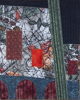
My first thought after reading this challenge was to look at my son's photos because I remembered a great photo of a huge Egyptian temple with large figures carved into the side and tiny humans at the bottom. Then I decided that there was no point in just reproducing an image that I already had. But I put this photo onto the yahoo website so you could see it. So back to the drawing board. I've been wanting to do more abstract, collage pieces and thought this was a perfect place to start. So I did a drawing of the basic outlines of the shapes in Anne's photo of the building and the cactus, then grabbed some fabric that I had used previously in an "ugly" fabric challenge (the white fabric-not really ugly at all!). I had also read on the first link in Anne's challenge that "large scale objects create obvious visual weight. We automatically perceive larger objects as closer and more important than small ones". I was trying to see how true this was by including the bright orange rectangle and using the large white fabric more as a background fabric. Certainly the orange is eye-catching but the large white area still dominates the piece. Over all it's not a top ten piece but I did learn something about abstracting and using different fabrics in one quilt.
Labels:
Challenge 15,
Nancy Schlegel
Dreamscape - Moonrise
Tuesday, November 27, 2007
Hangers On
Scale and porportion..It trully was a Challenge. Most of us really know what that means but when used in 'artistic jargon' we tend to second guess ourselves. Me, too!!
Anyway, with a needle and thread, and my Embellisher I set out to accomplish that which I wasn't sure I could do. Why is no one surprised I used leaves for this? The only thing I brought with me on this trip in the way of something to work with was this leaf imprint. [It would have had to work no matter what the theme!!].
I had a lot of fun shopping for the 'ingredients' and this is what I came up with.
I started with black felt, layered some cheesecloth and texturized with the felting needles.Then I layered some Fun Fur yarn to resemble branches on a HUGE tree. I hand
stitched in a large stitch to mark out the branch lines. Then I felted again. One the leaf, [check the 6th picture in the Misc. photo album] I colored with Prismacolor pencils where the copper paint didn't fill in. Then I added sparkle tulle and felted like crazy to a white felt. I cut it out, hand stitched down the center and texturized the veins with the felting needles, then went around the edge to secure. I hand sewed the smaller leaves and beads on. The top piece of fabric is felted on as well.
It is my intent to leave the fraying parts beyond the felt when I can properly finish it.
I heard there was a new snowfall overnight where I live, so hence the white and those few leaves that 'hang on'. It measures about 8 x 7 or so.
Looking forward to your comments.
Monday, November 26, 2007
Kathy Lichtendahl - Scale
Here is my entry to Challenge 15. I just couldn't resist the play on words. The finished piece is about 10" x 14" and includes beading, hand embroidery, metallic threads, fabric painting and more.
Labels:
Challenge 15,
Kathy Lichtendahl
Challenge 15 Autumn Leaves
As many have noted, this challenge was quite, um, challenging! I chose to take the idea of exaggerated scale in the foreground. The background is a photo transfer on silk from a photo I took in NY a few weeks ago. The leaves are fused from some silk I dyed this summer and free motion quilted with gold silk thread.
I think I was heading in the right direction, but I am not totally satisfied with the results. I never know what to do with a photo transfer (as in how to quilt it, etc.). I quilted some texture on the background leaves but left the water alone. I also think the placement or size of the larger leaves is a little off somehow.
But, totally unintended, I think I somewhat captured the effect of backlighting that I have been wanting to portray in a quilt for the longest time! Thanks, Ann, for a great challenge idea! As always I welcome any comments or suggestions.
Brenda Jennings
Mountain Roses
Size: 19.5" x 13.5"
I had been thinking of using this particular photo to make a quilt for some time. I thought it was a good one for this challenge because it had a somewhat exaggerated perspective, with large objects in the foreground. I tried to emphasize the perspective even more. I think the result is an extreme 3-D effect.I further challenged myself not to draw things out or use patterns, but just to cut my fabric freehand and use collage techniques. I did use a rotary cutter for the fence posts but no measuring! The pieces were pinned to the batting and backing and I thread painted and quilted at once. This really speeded up the process for me.
All comments and critiques will be very welcome. Susan Brittingham
Sunday, November 25, 2007
King Kitty
Here it is.
Techniques used: photo transfer, raw edge applique, machine blanket stitch, machine embroidery, and free motion machine quilting.
Size 19-1/4" x 18-1/2"
My first idea was a land scape but when I found the fabric with the big kitties everything changed.
It looks more like it should have been done for #6-monochromatic.
Labels:
Betty Donahue,
Challenge 15
ren's falling leaves
Gimme, Gimme, Gimme
I like to work from my imagination, so instead of starting with the 2 photos which were offered, I tried to imagine a scene where, because of the chosen viewpoint, the scale of the subjects was perverted in some way. The grasping hand that reaches forward is huge in relation to the body behind it. Once I got thinking about seeing things from weird angles, lots of ideas came up. This piece was great fun to create and it went together quickly. It is about 5 x 6 inches and the practical side of my personality is making it into a book to hold my grocery store coupons. The title "Gimme, Gimme, Gimme" seemed entirely appropriate in that context. :)
Labels:
Challenge 15,
Cheryl Coville
Challenge 15- Ann Morrell
This challenge was a real challenge for me...I decided that I would take the original photo into Painter 4 and crop it and alter the colors...I eliminated certain features and emphasized other features. Then I printed it out on cloth. I then got out my watercolor crayons and pencils and started adding shadows and colors. I then layered it on batting and did free motioning stitching all over. The piece is the size of a journal quilt.
Here is a close up:
Saturday, November 24, 2007
Hanging out with Van Gogh
I roamed around on one of the poster sites until I came upon "The Sower" by Van Gogh. I love the contrast of the size of the tree and the sun so I made my imitation Van Gogh. My little work (approx. 7" x 9") was fun to put together. After some thread-painting and quilting I added some hints of clouds and the circle around the sun with watercolor crayons. As always, I welcome your comments.
Labels:
Challenge 15,
Roberta Ranney
#15: ren's "walk in the woods"
I took the cactus photo's proportions as the starting point and went from there. I was interested in using the Fibonnaci sequence so just about all the measurements started as 1, 2, 3, 5, 8, or 13 inches; then things happened and the end result isn't exactly those, but are what looked good to my eye.
I didn't think too much about scale, however, and have another piece in mind to focus on that. But I was able to work on this and finish it (REALLY finish it, binding and all!) yesterday. So here it is.
Grass is Greenest in Winter
Here is my piece - Grass is Greenest in Winter. In Seattle the grass is greenest in winter - all that rain and mild temperatures makes the grass greenest in the winter. I took the photo with the cactus - I must confess since I don't live in the Southwest - I don't own the landscape so I don't relate to cactus and deserts. I decided to take the proportions of the cactus and put it in a piece with a more northwest background. I found my photo which was taken on December 26 a few years ago and worked with those backgrounds - Puget Sound and the Olympic mountains - I couched the background trees with black yarn - and then couched the foreground tree with gray yarn. The final measurement is about 10x13. I kept two sides wavy and straighted the other two -to add some additional interest.
Lisa
In Sunny and Cold Seattle
Friday, November 23, 2007
Challenge 15
Challenge 15 - Friday, 23 November 2007
Guest Hostess - Ann Turley
Theme or Technique - Work from one of the two supplied photographs. Both are copyright-free and from my own collection. Interpret one or both of the supplied photographs in your chosen style, or you may select any other photo with a similar layout.
Guest Hostess - Ann Turley
Theme or Technique - Work from one of the two supplied photographs. Both are copyright-free and from my own collection. Interpret one or both of the supplied photographs in your chosen style, or you may select any other photo with a similar layout.
Design Concept - Scale and Proportion
A sometimes-misunderstood principle of design, scale and proportion are nonetheless important concepts that help in the creation of believable works of art. Scale is the size of a given element in relation to the overall piece. Proportion refers to the relationship between each individual element in the overall piece. Both are interconnected in overall visual appeal and are what makes your art quilt visually exciting.To maximize the relationship between design elements, proportion and scale are typically used. Scale controls object size while proportion manages size ratio. Both make sure everything is well balanced and ensure a smooth and eye-catching design.
Due - Saturday, Noon EST, 1 December 2007
One final requirement - HAVE FUN WITH THIS!
Labels:
Challenge 15,
Challenge Themes
Thursday, November 22, 2007
Movement
This is a skateboarder. I think it is more like stop-motion than motion, but it was an interesting exercise. I decided to use the background fabric, as it expresses the tension I wanted to convey better than motion lines...Which way will she go now? (tis a she! I looked into female skaters a few years ago for a project I was doing.) I also chose vibrant fabrics to stand out from the background to express a bit of the excitement. I haven't backed it, but would appreciate advice for edge finishing.
Sandy in the UK
Subscribe to:
Posts (Atom)