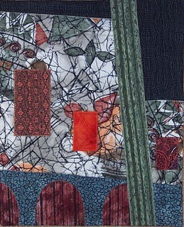
My first thought after reading this challenge was to look at my son's photos because I remembered a great photo of a huge Egyptian temple with large figures carved into the side and tiny humans at the bottom. Then I decided that there was no point in just reproducing an image that I already had. But I put this photo onto the yahoo website so you could see it. So back to the drawing board. I've been wanting to do more abstract, collage pieces and thought this was a perfect place to start. So I did a drawing of the basic outlines of the shapes in Anne's photo of the building and the cactus, then grabbed some fabric that I had used previously in an "ugly" fabric challenge (the white fabric-not really ugly at all!). I had also read on the first link in Anne's challenge that "large scale objects create obvious visual weight. We automatically perceive larger objects as closer and more important than small ones". I was trying to see how true this was by including the bright orange rectangle and using the large white fabric more as a background fabric. Certainly the orange is eye-catching but the large white area still dominates the piece. Over all it's not a top ten piece but I did learn something about abstracting and using different fabrics in one quilt.


4 comments:
Nancy,
You did a great job abstracting out the elements of the photo. I tried the same thing but was less successful. Using the variety of fabrics helps the piece a lot.
Kathy Angel Lee
Hi Nancy, a great attempt at using the photo provided. In looking at it, it is very pleasing, but I am wondering if your background fabric is too busy to really make the scale impact you were looking for? Just a thought.
Carole
Nancy,
the piece certainly does show that you are able to abstract.
Well done,
Anna.
Hi Nancy - Your piece came out really well in my opinion. The way you abstracted the photo is amazing to me - not something I have much success with like you do.
As soon as I saw this work my mind said "church". I couldn't figure that out until I realized that the white fabric in the background has all the black lines that seem like the leading in stained glass windows. Even though that fabric is busy the effect of the whole is very calm to me.
Nice work.
Roberta
Post a Comment