GILDED........

Here it is with the 'gilding' done.
I used Lumiere Metallic Bronze.
No comment from me at this point, I would like to see what you think.
Trying the torn pieces of paper in the actual fabric piece does not work...
there is really no where to put them, it looks messy..IMHO..
 I thought I might try cutting some metal, like an aluminum can, but it was too sharp and that really isn't me anyway.
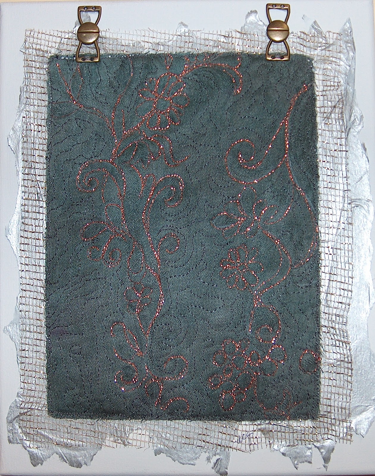
I had dyed a damask tablecloth a couple of weeks ago and I am making a jacket from it. I am at the quilting stage, and now this challenge comes along.
So, I took a piece of that damask... which by the way is dyed
'Nickel'... placed it on some batting, and used copper metallic to follow the design in the damask. I placed that on a gold metal grid fabric and stitched it
down. I had some grey/silver looking wrapping paper, I placed my piece on it,stitched it down, ragged the edges and used gesso to glue it to an 8x10
frame. I used hinges to add some other metallic interest.I have been wanting to
do something with a frame, so now I have.
The optimism is the fact that I believed I could put all this together and have it look good...and it does.
By the way, I used copper Sliver in the top and Invisafil in the bobbin. A 90 Metallic needle and I had no thread breakage. Click on the photo to get a proper view of the metallic thread at work.
Thank you, Sandy for a great challenge!
I do look forward to your comments....


10 comments:
Hi Carole,
Great ideas! I do like the edging concept. I like the contrast of the stitching colour on the fabric colour, too.
I think it looks like a great practice piece for now. I think it would make a good over all look on the cloth for the jacket. For the art work, do you think you would be willing to take it one step further?
I am thinking that if you try to colour in the flower petals with gel pen or metallic paint (lightly) that it might give you a bit of a composition in a sort of stretched S curve way, leading the eye around. I have used those silver and gold pens for signing Christmas cards before for similar reasons. You might want to try it on a scrap first.
What I think it might also help it to do is to pull the colours from the border into the centre.
I do like the fact that you only did some of the stitching in copper and the rest in a toning thread. It makes it just enough of the copper.
Sandy in the UK
I like the overall design of this piece and the torn, uneven background piece. The tablecloth overlay seems to almost be floating on top of this. I'm wondering if you took some of the torn background and somehow had it going diagonally across the tablecloth if it wouldn't bring the two pieces together more? Nice quilting and design elements!
Oh yes!!! It makes the biggest difference! And now the edging becomes a support for the centre stage. I don't think you need to worry about making it blend any further. also, I think in person,the gold of the grid probably features a bit more than you can see in the photo. So, I am sure it looks amazing! Well done!
I never did say how much I like the hinges to hang it. good idea!
Sandy in the UK
Thank you Sandy and Jan...
It actually does look quite amazing in person. I liked it alot before and even better now.
What a great difference!
Wow. Adding the color to the flower petals made a huge difference! I love the hinges and the layers.
Yes, the colored flowers makes it really pretty.
I already liked this piece, but Oh my! The gilding really made it pop!
I think the jagged grid and silver paper background is brilliant. So creative...excellent work Carole
Cherie
Great work. Love the gilded additions. Very interesting piece. Your eyes wander around it trying to take in everything.
Lovely! The edge is fascinating. Your quilting really make the piece
Pat Havey
Post a Comment