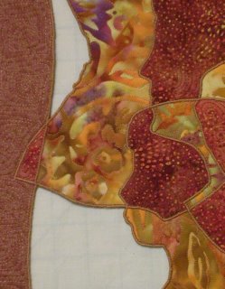
17 x 14, fused appliqué, free motion quilting, edge finished with free motion satin stitch.
The idea was inspired by "The Shape of Me and Other Stuff" by Dr. Seuss, and the title is a quote from the book. I traced photos of my family to create the composition for this quilt. I used Robbi Joy Eklow’s “Puzzle Quilt” technique to construct the quilt. The white areas are holes that have been cut out. Both the top and the back have been fused to the batting with wonder under. I think this helped with keeping the edges where they should be when I finished the edges, and it made it stiff enough that I won’t worry about it sagging. I will have to get a narrower bar for hanging than I usually use, so it won’t be visible behind the top border.

I like this quilt for the subject and the interesting way I have interpreted it, but haven’t been able to form any objective opinions. So let me pose some questions. What was your first impression? Did you recognize the subject at first glance, or did you do a double take when you saw the faces? Did you like it less before you realized the subject? I like it for the subject, but apart from the subject does the composition have any merit? Is the fragmenting of each face interesting or distracting? Any other comments or suggestions?


8 comments:
Linda I think your quilt is amazing! I instantly saw the faces, and then my eye was drawn all around the piece to see the graceful juxtaposition of the figures. The colors are beautiful, and I just want to keep looking and studying it. It definitely has merit as a composition and is added to by the subject. I love it!
Cherie
I recognized the faces immediately and really like the composition. Thanks so much for sharing such an inspirational piece!
Hi Linda,
This is a beautifully constructed piece and so graceful looking. It's unique and fascinating...I've never seen anything like it. I think most people would see the faces right away (probably not from across the room though)and be fascinated too.
My only comment is the color scheme/constrast. What would this piece be like with less subdued coloring, more value constrast, more variety of color/fabrics? I think if the piece had more graphic appeal, it would be a real show stopper.
Great job, again!
Cynthia
Given that it was your posting of the Dr. Seuss poem that gave me a visual image- I'm fascinated by how you interpreted it. I see the faces immediately, and think the flowing lines of the 'frame' add to the composition. It has a very graceful, flowing feel to it. It kept my eye moving around, I wanted to make sure I didn't miss anything!
Hi Linda,
This is a beautiful piece; unusual, striking, and obviously very personal. I really like the subdued color scheme, but perhaps a little contrast would have made the shapes "pop" better, such as a darker or contrasting satin stitch edge?
I absolutely love the frame, and the open areas within the piece. Great job.
Brenda
I too saw the faces immediately. You did an exquisite job on the cutouts. The wavy rectangle border is my favorite part, it's so lively. The darker parts of the burgundy batik stand out more effectively than the two pieces that were cut from a lighter section of the fabric.
I would really like to see this piece in person to really be able to see your choices of fabric and how you put it together. It is really incredible how you melded the three faces into one form.
Jacque
Hi Linda - I first saw the faces and then a double take to figure out how many faces I was actually seeing. Wow.
The curved yet symmetrical border also grabbed me. It enhances the subject without taking over.
I think fragmenting the faces is very interesting and adds a lot to the piece.
I think your choice of fabrics adds interest also.
Roberta
Post a Comment