Wednesday, December 31, 2008

ren's #28

Sunrise
12 inches wide x 16 inches high

This isn't finished yet; it needs a backing and a binding. I'm thinking of pillowcasing it so that the edges are just as they are here.
The emotion I was trying to get at is serenity. I wanted something calming for the start of the new year. And although the zinger is not really bright, I think it zings enough. Comments welcome, of course.

Tuesday, December 30, 2008

frustration


This piece demonstrates my anger and frustrtion with my husbands illness this holiday sesAon.He has copd and has been very ill. My frustration comes with my inability to help him. My anger is with the stupid disease. The lungs(green background) handdyed fabric is quilted to show the stretched and swollen avioli. The sword is the pain coughing causes him. Not a very pleasant subject but one that needed to be expressed. Thank you for making me face it. Size 12"x.14"
All comments and critiques most welcome

Pat Havey

"Just a Pawn in this confusing, sometimes crazy, game called Life"


Not quite sure I have met this month's challenge, but this is the piece that wanted to be made so I had to go with it!
And for once I have actually managed to finish one completely, even to the quilting, which is just a stipple.
It is 21" square, middle section is pieced from 16 of my brightest, craziest fabrics that all have the same colors in them. I like how the diagonal going down to the right bottom has black as the background, seems to cut a path through and ties in well to the border fabric, which also has tiny specks of the same colors in it.
I guess my zinger color would be white.
My son said I should have made the "chessboard" with the right amount of squares, I think it's 64? I thought of that but then they would have been so small and I wanted to show the tiny pawn (me) next to the bigger squares (life)
I think the title says what feelings I was trying to show here...confusion, (the many different patterns) although this could also show joy (all the colors), sadness (the black), and hope (the white) surrounding all the other emotions.
Am I making any sense???? LOL

Monday, December 29, 2008

Freedom

I've posted my piece entitled Freedom. I'm not sure if one would consider freedom an emotion but there are times that freedom is emotional - such as this past election.

So when I started doing sketches I thirded my thumbnail - hum - how interesting to have a nine patch - so my background consists of wonky nine patches done in my hand-dyed grays.

Continuing my branching out - I constructed my tree using fabric and wool yarn - this I've done before but continue to like it. My zinger is a yellow leaf breaking free in the black beaded breeze. The final size is 13 x 18 1/2 inches.

Lisa
In Windy Seattle

BROKEN CONNECTIONS


I knew instantly what I wanted to depict with this challenge. The emotions reigning in my life now and for the past year are sorrow and rage. I am watching my dear sister's mind disintegrate with Alzheimer's. The words get lost, the memories are off or absent. The personality begins to change. A brilliant woman watches her ability to reason fall away. As I tried to show my feelings all I could manage was to picture the connections in the brain decreasing after the lightning strike of this disease. I got so furious trying to do this piece that it was difficult not to take the rotary cutter and slice it to ribbons - which may happen yet.


This was probably a healthy exercise for me, a bit of catharsis. Thank you Tobi for this month's challenge. I hope I didn't depress everyone during this season of hope.


"Different"

"Different" is the title of this piece and it starts a different series dealing with abstractions.
I tried to depict the emotion of "not quite fitting in" whatever the correct word is!
?Disconnectedness?Alienation. That feeling where you are trying to blend in with the crowd and don't really achieve it...you stand out like a "sore thumb"!
Handdyed muslin and silks. I chose lime green as my zinger.
Any comments/suggestions are welcome.
Thanks,
Anna K.

Sunday, December 28, 2008


“Spirit of Passion” - Journal size

Returning to my "spirit" series, I tried a new technique on this fast Friday, putting (3) layers of fabric down, stitching the shapes and then cutting away layers to reveal layers below. I enjoyed the process as well as the results. I then dressed up my quilt with some decorative stitches and added some quilting. My zinger is the yellow/gold fabric, however it probably would have been more effective if the other colors were more subdued. However, how subdued can passion be? Thank you Tobi for a fun Challenge. Comments are always welcome. Joni

Thursday, December 25, 2008

Challenge 28 - Emotion/Zingers

Challenge #28 – December 2008 Zing me your zingers, with feeling!

Guest hostess: Tobi Hoffman

Working in Series: Continue working with the theme that you have chosen, or you may decide to work with another theme. Whatever works for you is fine; as long as you are enjoying the journey.

Color Concept: Zingers!

In quilting terms, a zinger is a bright or unusual contrasting color to be used in small amounts as an accent color in a quilt. You can use colors like red, lime green, hot pink, bright yellow; a bit of any color that is very noticeable next to the other colors. Zinger colors add accents, and capture the eye. Zingers add interest and can be used to enhance the focal point or move the eye around the quilt.

Composition concept: Create or illustrate a mood or emotion with your piece. While love, joy or anger would seem natural topics to enhance with zingers, you could explore grief, hope, silliness, confusion, anger, humor, innocence (or guilt!), fright, or compassion. You can attempt to capture the bliss of solitude, the security of inclusion, the triumph of accomplishment or the apprehension about taking an exam at school. No list like this could be complete, so as we always say, have fun with it!

Tuesday, December 23, 2008

Challenge 27


Finally caught up with making Christmas gifts, and had time to work on Challenge 27. I got the lights and darks I think, but couldn't decide on a close up or far view, so my Desert Garden (part of my garden series) has both, though that was not the concept suggested. I had a lot of fun making this. Comments and suggestions are welcome. Happy Holidays from LindaMac in Wyo.

Sunday, December 21, 2008

New Moonwalker


Here is the piece with some adjustments made....
Darker actually, tried highlighting the moon but very difficult
after the fact.
What do you think now?

Tuesday, December 16, 2008

Moon Walker


Here is my late and work in progress piece for this Challenge.
I spray dyed a piece of warm and natural batt as well as a piece of scrim. I laid the scrim on top ,spread around some rovings [after blending them into something I liked] to match my 'moon' minds eye. I felted them down adding just a bit of lighter color and light across the top... in an afterglow effect.
I painted and generally had fun with the 'moon' fabric, cut it into 1/2" strips and wove them together.I ironed that onto a fusible pellon, cut out the circle, started laying things out,stitching ala Pamela Allen [what would I have done if I hadn't taken her class??]
What is it you say......remember the last full moon? Well, it was closer to the earth than it has been all year, and so... was 14% bigger. As we sat outside, enjoying the moonrise and the sun set, the moon was all dappled, very close and the after glow from the sunset spun across the quickly darkening sky. In my imagination, why I saw a Moon Walker.......do you see him in my moon?

There is my story..... now I need your input.
Did I get the dark.... ok, I know I did, but what about the light? Linda will likely be the best judge on that because she knows what she was after in this challenge.
I remember somewhere it said the light and the dark should each tell a story, do they?
I tried it in Black and White in my newly purchased Photoshop [something else to learn] an I thought I did.

Your comments are more than welcome [needed].

Sunday, December 14, 2008

Spinners


I am calling this spinners, the photo isn't the best of the background which is actually pieced purple hand dyed fabrics. All of my other fabric selections are Japanese prints from my stash. I used buttons and beads to do some embellishing. My theme is structures and originally I was going to use the image of a wind mill or turbine for this months challenge, but in my searching for photo's to use as inspiration I came across the image of some pinwheels. I had an AHA moment, and after constructing my own pinwheel to use as an example for my sketches came up with the concept of these guys. I understand that the Japanese consider 3 a lucky number so there are 3 spinners. I think I stretched my theme a bit, and also while this is a closer view then I usually do, I am not sure it is a true close up. I machine quilted both the background and the lights on the pinwheels, but left the bright prints un-quilted to let them poof a bit. I may add some additional fiber to those areas to give it a more trapunto effect though the quilt still lays pretty flat. Size of this quilt is 16.5 x 14 inches.

Kathy Walker

Saturday, December 13, 2008

Moonlight on Water by Cynthia Ann Morgan


My piece for Challenge 27 continues with the theme of quilts based on the look of vintage woodcuts. I choose a close view of flowing water with reflections of the moon on water as highlights. Darkest dark and lightest light and values in between make up the ribbons of water. I used my hand dyed fabrics and Misty Fuse and plan to quilt it heavily with lots of flowing lines and maybe a bit of metallic thread. I've been working larger this year, and that's challenging to get it designed, constructed and quilted in a reasonable time frame...it will get quilted, just not sure when. Size is 22 x 52"

challenge 27


This started with a photo of my Mom meeting her great granddaughter for the first time. The original photo taken by my dear cousin Tom, was of the whole group on a busy background. Tom had arranged this visit because Mom had been wanting to see her newest great grandchild. It was a bitter sweet photo because Mom is strapped into a wheel chair and my sister Mary is actually holding the baby on Mom's lap.

However, the way they are looking at each other is so poignant, that I felt it deserved a cropping. I used 'Paint'. It was a very long process since it is pixel by pixel. If anyone has suggestions for another program I would love it. I fused over 400 small pieces of fabric to create the shading. I'm just beginning to work with color since my first year of quilting was mostly black and white.

Problems encountered were fused 'Heat N'Bond' pieces that began to come off when I started quilting around Mom. I then zig-zag those pieces onto the background using a clear poly thread. Then I began 'shading' with thread. There is still more to do before I finish it. However, that may be next year, so I wanted to post now. I over painted the background on the photo of Mom because the 'black' did not print as dark as I wanted. I used acrylic paints mixed with a fabric medium. However, it stiffened the fabric. I think I would like to get either some paints made for fabric or dyes that can be thickened.

I have a title in mind, but am not sure about it. If you have an idea, please let me know. All comments and suggestions gratefully accepted.

Wow!

I'm here! I can't believe how easy this was.
Pat F in winnipeg

Succulent II

I based this month's quilt on a very close cropped photo of a succulent plant. The base cloth is a piece of fabric that I have been using as a drop cloth for other projects, and I have been stenciling patterns on it to use up leftover paint for a year or more. The patterns and colors in the original cloth have nearly disappeared beneath more paint and stitching, but bits of the original fabric still peek through. Working with this fabric helped free me from the need to interpret the colors from the original photo literally, and let me focus on value.

Wednesday, December 10, 2008

Woodpile?


I looked to my many art photos for inspiration in which I found one of many woodpiles! I picked out a small rectangular part of it and chose my colors (NOT woodpile colors, to be sure). And here is what I ended with. I used felting AND machine drawing with variagated thread to complete the piece. Here is the finished piece. I will eventually mat and frame it. (Small things need this, I think).

The finished piece is first , the woodpile second, and the section of the woodpile is last. In person, the piece is brighter and there is good contrast. There IS white there; really!
Jo Rice


Monday, December 08, 2008

"Fred"


I really enjoyed Challenge #27. "Fred" was digitally painted using a cropped photo for reference. His image was printed onto fabric prepared with digital grounds. I wasn't quite sure how much or how little to quilt the image, so I just tried to quilt around the value shapes. The quilt measures 16.5" x 22." Constructive comments are welcome.

Sunday, December 07, 2008

Inuksuk at sunrise


This month I used a photo of an inuksuk that I took. There were dozens of these little stone "statues" along the highway between Dryden, Ontario, and the Manitoba border. This is the only one I could photograph - we had to find a place to stop safely on the highway to get out and take a picture. I think this little guy was about 3 feet tall - it was standing at the top of the rocky edge above the road, so I had to shoot straight up toward him.

My inuksuk series leaves this one where he lives, at sunrise.

The size is about 9" by 12 1/2". Critiques are always welcome.

Saturday, December 06, 2008

Lily


My quilt looks much more like I intended when it is cropped, but I have included both views here. I layered the various pinks without using a fusible as I like the texture that is achieved this way. The original piece is 9x12, while the cropped portion is 6x5. Pink/red is not a normal palette for me, so this was really a stretch. My theme is circles and was used in the quilting.


Departure


I very often try to complicate my subjects by over doing with too much stuff. This dandilion is so simple in its beauty that I decided to try to keep its simplicity. The body of the flower is appliqued. The flower shafts are machine embroidered over cord. The flowers are fun-fur yarn. The butterflies in the back ground fit with my feeling of departure the flower gives me. It is confimation of departure for a new start .

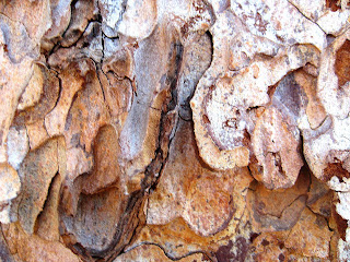
Winter Bark 15"x19"


When we were in the mountains on our way home from Reno this week I took several close-up photos of pine needles, pinecones and redwood tree bark. I was delighted to see the challenge when I got home last night. My series is shapes, and this photo of the rugged bark is full of shapes for sure!


I used several different fabrics, including silk hankie There is actually not a single piece of all cotton in the whole thing...LOL

I've never done a close-up like this before and it was really a stretch for me but it was fun. At least I made it under the wire :)


Your comments are gratefully received as always...Cherie

Friday, December 05, 2008

Waiting for the Storm by Pam Harris


Waiting for the Storm is 9.5 x 20 inches and made from commercial fabrics. It is fused and the raw edges are covered with purchased bias tape. The dark gray is the back side of a print so a few spots of black show through which gives a touch of texture. A friend reminded me that I own both sides of the fabric and should use the backside more often.

The design is taken from a peacock feather motif in the hallway carpet at the Palmer House in Chicago. You can see a bit of the “eye” of the feather. As the project progressed, it reminded me of a storm front on a weather map. I believe we have one headed our way which promises snow/freezing rain. Can only hope the weather guessers are wrong.

My series is shapes/time.

I thoroughly enjoyed this project as it gave me an opportunity to learn a bit more about my camera and using value. I discovered the sepia option very useful as a tool for value and balance as it showed value in different tones.

While doing my final ironing, I realized I should have used the smoky invisible thread as the clear does show on the black and gives off a sheen. Oh well, another lesson learned. I was concentrating on the looming deadline instead of my project.

Sea Shell Trail


Wow, this one was difficult to get off the ground. I am starting a new series, focusing on using photo’s printed on fabric in my quilt. I found this wonderful sea shell photo and decided to pull the colors from it and use it all in a composition. It is most likely a split complementary color palette . Contrast in value was attempted by using a very dark purple and a fairly light pink/peach tone. The shell is a close up, so I hope this meets the challenge guidelines. I’m not entirely pleased with my quilting on this one, as I don’t think it really helps the piece, so any suggestions on what I could have done would really be appreciated. I am happy that I was able to get some time in the studio during this already hectic holiday season. Comments are welcome.

Rhoda Ch#27


The Basket Weaver
Continuing with my Women at Work series I've chosen to do a close up. The close up is of a basket weaver. I found it difficult to portray the subject at such close range, it was a great exercise for me.
I worked hard with the value part of this challenge but am not sure that I totally achieved it, it seems that I don't have enough really light spots?
The piece is 13x16".
I look forward to your critique.

Thanks Linda for a wonderful challenge that has really stretched my creativity.
REWORKED
Thanks for the critique of this work, I've reworked it a bit. I now realize the laying down of the plaid fabric was not the way to go. Since it was already sandwiched and quilted I've used some paint. I think it looks a bit better, however I'm not getting rid of her foot :)

Dragon Claw

Here is my study of a dragon claw...attempting a close up and trying to ensure there is value to create depth, etc.

I am very pleased with it! I did a sketch first, and then used the sketch as a guide to where I should have lighter and darker threads. At first, even though I had two layers of stabeliser, all the stitching really puckered the fabric. But I layered wadding and quilted it into submission.

The first ring on the claw has a crystal bead "gem". The second ring when seen closer is a "band of stones" made of red fabric. The third ring is stitched with metallic and then a small pearl sewn on. The last ring is just metallics.

Here is the dragon story.
This dragon has a bracelet with what looks like a charm. It is really a scale from another dragon. Some Dragons exhange shed scales - usually small ones from the sensitive area near the ear - with other dragons as a token of friendship. However, what is not commonly known is that if a dragon is in need of aid, any damage to the scale will summon the other dragon. Each of the scales have a special ability, which works in a similar way to GPS (global positioning system) and helps a dragon know how to locate his friend.

The reason why more dragons have not been observed coming to the aid of another, (and indeed why there has been such a decline in dragon population), is due to the fierce independant nature of dragons. It is rare for one dragon to actually use the scale in order to summon the other's aid. Many dragons, knowing they are facing danger, will actually leave the token at home. On the other hand, this action could be interpreted as evidence of a dragon's concern about bringing close friends into danger.

A word of WARNING: If a dragon should offer you a token scale, DO NOT...I repeat, Do Not refuse. It is highly offensive. You may wish to give a lock of your hair in exchange. Although it may seem unlikely that you could come to a dragon's aid, it has happened on notable occasions.

Drought


Continuing on my Branching Out Theme.

So I decided to do far since I'm branching out and focusing less on leaves - so I did my piece Drought - the reason it's named this is because when I was sketching my husband thought the brown was to be a lake - humm - too bad he didn't tell me that sooner.

In order to test the value - I took a picture and printed it out in black and white - so I tossed some fabrics that were too light.

Final size is 13 1/2 x 11 1/2.

Lisa
In Sunny Seattle

Thursday, December 04, 2008

Untitled Experiment #1


About 5-1/2 inches square........A new direction for me. This is my first attempt at machine applique and machine free-motion quilting. Also a huge departure for me from realism to abstraction. I know the technique needs work but I had a lot of fun. I'll definitely be doing more like this in the future. Thanks for the push....I needed it.

Wednesday, December 03, 2008

The Last Leaf


18 1/4" x 16 1/2"
Home Dec fabrics, corduroy

Since my usual commercial fabrics didn't seem to suit this challenge, I used pieces from a home dec fabric sample book, having bought several when my favorite fabric store was going out of business. One set in particular had mostly solid colors with nice textures. I actually settled first on the shape, though with the idea of the close-up leaf and the more distant tree in mind. I wanted the border to be brown, and finally found some corduroy which fit (can't run out and just buy what I need any more!). The veins on the leaf are a combination of thread painting and white Tsukineko ink, which I also used on the tree trunk to try to give it a bit more dimension.

In hindsight, I'm not sure I should have had the tree root come outside the border, as that takes it more into the foreground than it should be.

Flower Burst

My second attempt:

14" x 18"
Commercial fabrics.

After our monochromatic challenge, I had in mind to picture the heart of a flower in analogous colors. So Linda's challenge was just what I needed to get moving. I don't particularly like the finished piece because my choice of colors, particularly for the background, doesn't hit me just right.

I used a photo of a peony and cropped it to exclude the perimeter of the flower. I can see that I could have cropped it a lot more and had more of an abstract look but I sort of like this cross between representational and abstract.

I had a good time free-motion quilting this piece. I tried using light colored thread in an attempt to mellow out the background but it didn't work.

As always, any comments or suggestions are greatly appreciated.
Addendum: I have taken Linda Cline's suggestion and make the background purple. I painted lightly over the rusty orange with purple watercolor dye. It worked very well and has the added bonus of emphasizing the quilting. Thanks Linda!