Saturday, January 31, 2009
Breezy Day
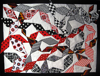
I think it's an analogous color scheme - but I'm not quite sure if it actually fits - violet to red. It kind of falls into the movement category - but not really rhythm.
Anyway I continued in my branching out series - showing a very abstract tree with the abstract leaves tumbling in the breeze. Final size is 12 x 19.
Lisa
In Sunny Cold Seattle
The Start of An Upward Journey
I'm uncertain whether the colours are analagous; I'm using blue, purple and pink. As to whether it depicts any movement whatsoever, please tell me what you think.
It still needs to be bound and quilted but i'm leaving that for cooler times. At present all i seem capable of doing is lying around like a dead duck.
Anna K.
Friday, January 30, 2009
Moonlit Canyon
Moon # 5 in this series.
The January moon was as big and as close as the December one, however, it was so White, so Bright.... it was so beautiful.
So, that was my inspiration, the white of this moon was accomplished by using the stuffing that comes in my bottle of vitamins. Absolutely the right 'color' [or lack of it] and texture. I overlaid some crystal organza and used my needle felting machine to scrunch and texturize. It went from there. I have used the backside of a piece of lurex lame, a remainder of scrim from another project, snippets and stitches to depict the breezy canyon. A ton of hand stitches in floss... my I think I could be hooked, the texture and 'hand' are so unique to anything experienced by machine. The edge treatment on this one is something I have never done and dreamed up about 4 hours ago. I have some kimono silk, so I cut lengths, put one edge on the front, turned the remainder to the back and stitched... all this is raw edge...then I went around it again with floss, on the angle to make that scalloped edge. I have this stitch on my machine and have only ever used it on a sleeve edge. Do you like it?
I really look forward to and appreciate your comments.
Carole
Six Suns
I'm afraid Inuksuk is becoming 'way too human, but it's fun to use the shape, anyway.
FFFC-29 Pipe Dreams
Guardian
Here is a detail shot. let me know what you think.
Thursday, January 29, 2009
Second Spring_Rhoda
In the Chinese culture, phases of a woman's life are celebrated. Menopause is referred to as 'second spring', so my choice for this challenge. I chose the analogous colors of blue/blue violet. As I was working on the piece it was mentioned on the list that we could go further than just two colors beside each other, therefore I added some hues from violet,red/violet and red. The chinese lettering on the right is 'second spring'.
I choose the cool colors to suggest a calming period in a woman's life, the years of child bearing are over, chaos turns to calm. Less clutter, note her room is free of clutter, just a pot of lovely flowers :) And she now has time to tend to the flower box out the window. Perhaps we need to give in to this time of our lives and enjoy it more. Or is this just my fantasy! You can tell her age by the sagging breasts :0
The right side wall is a deep purple, however in the picture it almost looks black. I tried adjusting the color and got orange for the pinks...so finally left it as it is.
I definitely did this piece in Pamela Allen's style, with lot's of hand stitching.
I look forward to your critique.
Thanks for the challenge Ren, it was fun for me.
Wednesday, January 28, 2009
Red Sky in Morning
Pat Havey
Tuesday, January 27, 2009
BEAUTY AND THE BEAST
Sunday, January 25, 2009
Magma in Motion
Magma in Motion
20 X 21
I had fun with this challenge and did as instructed. I went to my stash and picked out a crate of fabric. I should have picked blue as I have trouble using that color.
I had found an article by Karen Eckmeier on Free-Form Curves that had been set aside as "something to try someday". Since my goal was to show movement, I thought this a great technique to try. I had no preconceived idea of the finished product as I started cutting and piecing. I liked the way she had the curves going in several different directions.
My husband, who is a geologist, thought it looked like a magma flow. I think he has Hawaii on his brain as we are getting ready to escape the cold and darkness of an Alaskan winter.
My series is shapes/time but I didn't factor that into this project. The goal was to experiment. I did try some free motion quilting but my machine and I were not getting along at the time so I just did lines and varied the thread colors. I should have used more contrasting thread from the start as I like the effect. Every project is a learning experience, especially if one neglects to read all the directions.
Thank you to all you take the time to comment on all the quilts.
Pam
Your Rhythm, My Blues
Saturday, January 24, 2009
Challenge 26
Better late than never. I finally completed challenge 26. Continuing with my series of working from my watercolor paintings, I selected a bean pot/onion/spoon composition. I've posted both the watercolor and the fabric piece. Doing this in a monochromatic color scheme was a challenge because in the watercolor I can purples and blues to get the contrast.
Thursday, January 22, 2009
Challenge 29
Guest hostess: Ren Vasiliev
Working in Series: As desired
Color Concept: Analogous Colors
Composition concept: Rhythm/Movement or Tension/Energy
Ready for some fun stuff?! Get out that color wheel and your kinetic self and let's go somewhere interesting! This challenge uses analogous colors and the concepts of Rhythm/Movement and/or Tension/Energy.
Analogous colors are those three or four that are next to each other on the color wheel and their various shades and tones.
Rhythm/Movement refers to repeated elements going somewhere.
Tension/Energy can be developed through rhythm and movement, but can also be evoked through the use of foreground/background differences, or the interplay of positive and negative space, among other methods. Tension can give a sense of drama, anticipation, conflict, excitement, chaos or contradiction.
So go out there and have some fun. Don't think too hard, just pull out the stash and make it move!
Enjoy!
Ren
Tuesday, January 20, 2009
Inuksuk meets Snowlady
Inuksuk meets snowlady, and love blooms. The quilt is about 10" by 12 1/2."
I needed a hat for snowlady, and DH suggested Aretha's Hat, so I had to use it, after browsing the websites that show Aretha's hat on everybody and their dog.
Anticipation
This is a dragon egg about to hatch open. Bits of the shell have fallen to the sand. Drawn to the spot by the magic swirling through the air, The Finder waits in awe and wonder to see the newest dragon emerge from the shell.
The "egg fabric" is a wonderful blue/black white cracked patterned fabric I have. I love it so much I made a skirt from it! I cut open some of the white spaces and laid a bright hand-dyed yellow orange silk behind it. this is the zinger and also what causes the mood of anticipation. I coloured most of the other white spaces with a sharpie of the same colour. The swirly blue sky fabric shows the magic in the air. a little square of mottled brown fabric from a swatch was just enough for the sand. I tried to do a border, even putting one edge under the side of the egg on the left, but it was too blunt. So, I satin stitched with colours that blended with the sky and sand.
Monday, January 19, 2009
JUBILATION
Monday, January 12, 2009
Zinger Quilt
I finally finished tonight after being snowed in from a fierce blizzard. I'd intended to actually finish a quilt and on time until my sewing machine went in for an extended tune-up and ended up staying because I couldn't get back to retrieve it due to weather conditions.
Birds have always been a favorite of mine but I've only used them in one previous quilt. The Black-capped Chickadee is my all time favorite so I chose to put him as the focal point on a cold winter day. I chose to use Bittersweet as the 'zinger' color. The branch the Chickadee is perched upon is a bit large and I tried to tone it down a bit with some fabric paint. I also used pen lines to delineate some of the feather lines on his tail and wings.
Jan Johnson
Succulent III
My first idea of flower stalks reaching upwards to depict joy was abandoned, since the only flowers blooming on my succulents right now seem to be the sorts that bend downwards. And the stalks all seem to be at awkward angles. I was having trouble getting a composition I liked. So I settled for leaves reaching upwards. Is it joyful? Maybe.
The original intent was to edge the larger leaves with bright red the way it is in my garden. It was to be my “zinger” color to fit the theme of the challenge. But now I think I should leave well enough alone. I don’t think it needs the red, and I’m afraid to overwork it now that it seems done.
The original photo was backlit with strong light along the edges of the back leaves. I may go back and soften some of the white edges and make the white blend into the green more.
Pine Grosbeaks
Sunday, January 11, 2009
"(Too Much) JUBILATION"
Thursday, January 08, 2009
Augie and Max's new home: Family Connections
My Theme is Connections. This is called Family Connections: Sugie and Max's home.
I spent three weeks with Aguie (4) and Max (3) in their new home in Sunapee, New Hampshire. This is their new house. It was cold and snowy, hence the back and white pictorial with the zingers of colors suggesting the possibility of spring, summer and fall. You can see the boys peering out the windows.
Comments are really welcome.
Hope (5" x 8.5")
Better late than never. Still experimenting with machine quilting. New for me this time........fusible web! I enjoyed this process and will try more with the web. I still feel uneasy leaving the edges unsecured so I did some zig-zagging. I liked that process, too. I have a yen to do more word art pieces so I think that will be my series theme. All this is so out of my comfort zone....but in the end, it was fun.
Saturday, January 03, 2009
"Trepidation" (20" x 38")
People Series, challenge 28
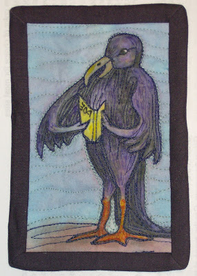
Just adding a new photo. Punched up the color a bit with some ink pens I got Monday. I also touched up the book a bit. Added the title. What else would a Raven be reading but Poe. I also photographed it with no flash.
Quoth the Raven by Ann E. Ruthsdottir
I had a hard time understanding the color concepts for this challenge. Finally I just decided to do it; then learn from the comments. I got some inks for Christmas, so I was anxious to try them out.
My first idea was to do a portrait of my daughter, maybe 24x30. Luckily, someone on QA suggested doing Raven post cards. Much better to paint smaller, especially since I haven't a clue how to use these inks. I really wanted to paint with them. However they ran and bleed so I'm glad I decided to work small.
I ended up using some colored pencils to add darker colors. Although this is NOT strictly a 'people', I think this Raven has enough human characteristics to quality. I think the background is the zinger that lets the Raven capture the stage. Of course the orange form fitting leggings also might qualify. I realize the colors are NOT that of a real Raven, I just thought they were FUN. I view this as a cartoon, so it should look like fun. It is totally different from anything I have ever done before. That really excited me. I have a hard time drawing small [or actually working small at all], so I drew typing paper size then shrunk it down with a scanner I got from Freecycle. It was all fun except the binding. That took hours and is still lumpy.
Friday, January 02, 2009
Time to Celebrate
This is not only a celebration of the New Year but my mother’s 80th birthday on December 28. I am flying to
This piece is 11” X 17” and made from hand dyed fabrics. Mom’s favorite colors are pink, purple and orange. One of the fabrics was dye painted, discharged and then the yellow dots painted to add the zing. The second fabric was a variegated red/orange blend. After slicing and arranging, the variegated fabric didn’t seem to add to the composition so I fused some circles from the scraps and added additional purple strips. I also quilted in some circles to add color and texture. I don’t have much experience with free motion quilting so this was good practice.
My series is shapes/time.
I would like to thank everyone who has taken time to comment on my quilts as well as others as it’s always good to see through someone else’s eyes.
Happy New Year,
Pam Harris
Hunter Moon over Lasqueti Island
MOON SERIES #4
Ok, I know you are saying 'Lasqueti Island?" It is an Island across from our house when we lived in Parksville on Vancouver Island, B.C. back in the early 90's. What we used to see from our house over on and toward that Island was always so intriguing. Kept my binoculars on the front foyer hall table next to the telescope for star-watching.
So, this is it! My December Moon. I loved doing this one [I think I love doing them all.....] albeit a scramble for how-to.... but I am coming along with the 'hand' side of the work.
For this one I used chiffon.....if you never have... try it! Wow it is so easy to manipulate. And this had the colors I needed. For the sky above the Island mountain range, I used dryer lint. I had washed a blue sweater and I think half my sweater ended up in the lint catcher, so.... having paid for the whole sweater, I decided to use what I couldn't wear! Again, I used the needle felting machine to hold those
fibers down and provide some texture to the chiffon. Then I just got out my embroidery threads. I used my last Saturdays Michael's 50% off coupon and got 105 skeins for 7 or so dollars!
[My husband says I am Ebenezer Scrooge!haha].
I used Shiva Sticks to color the moon... using a grid underneath the fabric, used turquoise stick and some gold on other fabric for the highlights. On the water, to depict the break on the waves in a rising tide I used crystal chiffon.... it just shreds so beautifully under those barbed needles. [Wouldn't be hard to do by hand for accents].
I hope you like it, I hope I met the challenge and I hope I am inspiring some of you to try some of these 'odd-ball' techniques!
Since this was Tobi's challenge, I honored her in the shape of my piece.
Keeping that lint on was a challenge in itself and the chiffon pulled in a little more than I thought it would,so in order to keep to my Journal Size for this series, I just finished it the way it was covered. that, too was fun....
Comments are always welcome.......and appreciated.
Carole
Celebration ' Tapas y Vino"
Rhoda Ch#28 Blissful Betty
Blissful Betty is in heaven, licking the cupcakes delectable icing from her finger. Amongst the chaos and pandemonium she is blissfully happy, enjoying her scrumptious treat.
This was a lot of fun to make, and I have two emotions going on. At first Betty was going to be frustrated by knitting, then I decided I just needed to add some happiness to the chaos I had created. Red is my zinger along with some gold.
Lot's of bling on the flower, ear rings and her ring.
I look forward to your comments.
Thank you Tobi for a great challenge.
Zingers.... untitled, probably unfinished....
But I decided just to run with the ideas of zingers and start chunking stuff together..... the kernel of my idea was hope and renewal with the new year, new administration, and the gratitude that things are turning around in many aspects of our lives. So black/grey/lights with zingers of yellow were the basis for the project.
First attempt as our record snowfall was ending and the sun was peaking out.
It somehow doesn't feel finished but I'm at a loss for what to add to it.....
Second attempt was yesterday with the top background foundation pieced to the back ground. The ends of the pieces formed an interesting pattern which was then echoed in the yellow (left overs from a border).....
Again, I'm not thrilled with it, but its done. As I looked at it, It almost looks like a ship sailing into darkness which is certainly not the image I wanted to project.
Critiques, of course, are welcome.....
And I'll be continuing with my personal challenge of only using things out of my stash for the FFCs..... and now off to the gym to start working off some of the holiday calories!
Challenge 28, Gala
My challenge piece is called "Gala", as it is made of satins and brocades that one would wear to a ball, and is decorated with bling (old buttons & beads). To me it represents happy times. The zing is a white bridal satin, covered by red or black floral netting. Size is 14 x 14 inches.
Your comments are welcomed. (I see the heart shaped button is a little off center, and will reattach that). While it doesn't show up well in this photo the light pink hexagon is a folded fabric design, as she is the bell of the ball.
This is a departure from my garden series, as I couldn't resist using these great scraps of beautiful fabrics - most were leftovers from Shakespearean costumes.
LindaMac in Wyo
Thursday, January 01, 2009
Challenge 28
Still working in the series "trees", I looked out my door one day to see a Cardinal sitting in the Rose of Sharon branches. I was struck by the fact it was the only noticeable color in sight and it looked both lonely and content. When "zinger" came up, I immediately thought of this song bird.
Detail:
No name for this piece, yet, suggestions welcome. Size is 13" square, fusible, inks, yarn edged. No sleeve, I'll mount this on a hidden canvas to hang on the wall after I paint a canvas to blend.
Judy Whitehead
Connections
23" x 14"
Left: revised, red metallic Lumiere paint added over the gold, plus some pewter Lumiere dabbed here and there for more variation, and fringe a bit trimmed.
Right: original
=====
This actually seems to fit in a series with the piece I produced for the other challenge that I hosted, but not at all intentionally! When I started, my three sons plus one fiance and one girlfriend were visiting, and I wanted to capture the idea of family connectedness and love.
I began with a piece of material with a pattern of white-on-white circles, then overlaid it with a piece of black gauze. I cut some thin wavy strips from the gauze and overlaid them, then tucked in the three ribbon florets and began sewing the strips down with various fancy stitches, and added a narrow maroon ribbon. I then cut the shield shape out of foam core and hand-sewed the edges, leaving the gauze to hang down, and put just a bit of gold leaf around to pull the edges in, and a bit of hand-stitching with a few little beads.
At this point, though, neither I nor any of the enlarged household really thought this was all that great. It took youngest son's suggestion of an overlay to lead me to pull out a piece of orange mesh, the sort that may have come from a bag of oranges, and put that on top, cutting out just enough to let the ribbon florets through to the top, which may not be as obvious unless you see it close up.
This actually took quite a different direction than I had anticipated!