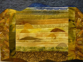
I changed the blue stripe on the top to a differnet color and gave it a cirvy shape like the other borders so it wouldn't be s0 jarring. Let me know what you think
Pat Havey
A gallery of the quilts created for the Fast Friday Fabric Challenges. The quilt artists display their work here to give and receive constructive critiques. Only blog members may comment.
2. Explain what the piece communicates to you.
3. Give a 'what if' statement(What if you had used blue instead of red?)
6 comments:
This is much better. The grayed blue fits much better with the shades of green below and doesn't distract the viewer from the lovely lower portion. I also like the wavy sky effect that drops down and becomes a part of the piece below.
Much better. Isn't it amazing how one small change makes such a difference?
Much better. Isn't it amazing how one small change makes such a difference?
Thank you everyone for your help
Pat Havey
Ah yes, this is really good! So restful...Love the colors and the dimension created by the dunes rising out of the pleated sand. Nice work!
Cherie
A great improvement! The blue makes more sense now. Nice Job!
Post a Comment