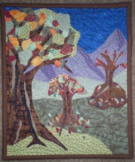
11 1/2" tall x 9" wide
Fused applique with heavy machine quilting
This quilt was designed to show the transitions of Autumn. The first tree represents early Fall with mostly green leaves that are starting to turn red, yellow, and orange. The second tree is mid Fall, with mostly brown leaves with highlights of the other colors, some leaves on the ground. The tree in the background represents late fall with its nearly barren branches, brown, green, and orange leaves at its base.
I have added the dimension to the quilt by showing the depth of the scene. I used 3 different greens to create rolling hills and added purple mountains in the background.
Things I would change~ I didn't have enough time to machine satin stitch the appliques like I would have liked to. It would be a better quilt with finished applique pieces.
Also, my binding is not even around all the edges.
To my critique-ers~ I love the nice "that is pretty" comments, but please do suggest a couple things that would improve the piece! I have tough skin and can take it.
Thanks for looking!
Julie of Calicodaydreams


3 comments:
Hi Julie,
I like the way the trees decrease in size as they go into the distance. I also like the shaping on the mountains. What I do notice is that the the lighter green just before the mountains pops out visually, thus disrupting the sense of depth. I would like to see that green be a darker green, which might also require the mountains to be darker as they should be a bit darker than any of the greens. Hope this is the kind of comment you were looking for!
LizC
Yes, you are right. I didn't notice that. A darker green would let it gently roll off into the distance better.
Thank you for your observation!
Hi Julie, I absolutely love the tree trunk on the first tree. Great rough texture and interesting shading, it really pulls your eye to it than travels up to the colorful leaves. I think the depth was successful with the different grounds and placement of the trees with the mountains in the background with good shading. The only suggestion I see is maybe to have more value and/or color contrast between the ground and the base of the trees on the 2 trees that are further away.
Cynthia
Post a Comment