This is my maiden voyage with this group (having just gotten back
 from a trip AND starting a new job last month!).
The poem really had me going. I read it about 20 times before it started making any sense at all, and that understanding was marginal at best.
What IS hiding behind the words? What was Carroll thinking (or smoking!?!) when he wrote it?
My first thought was a Kilroy-was-here type image, at least the eyes, and nose :-) with the words of the poem cascading over an open umbrella. I guess I felt pretty overwhelmed by all the nonsense words.
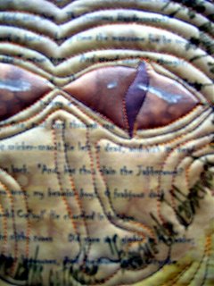
I wanted to play with image transfer, specifically words, and began with the poem on a gold batik. Then I played with the text in a textart program, creating the circle, and printed it on organza. The rest just sort of happened and the Kilroy idea was gone!
The eyes are fused to the batik and highlighted with chalk and white acrylic paint. Thank goodness there is a website that show you how to draw dragon eyes!
The organza was partially fused and the texture is from the quilting, outlining the eyes and creating a nose (did you notice it's slightly out of joint?) and tree elements in the outer border.
I'm not 100% thrilled with the result, it has an other-worldly character that was a surprise. More alien than Jabberwocky... but then, maybe the Jabberwocky is more alien than we know!
Thanks for looking!
Wendy in Flagstaff
[I had a hard time uploading the photos of this quilt. The upload page says it was completed but for some reason, it didn't upload til the 3rd try.... Thanks for your patience... this is my first go-round with Blogger!]


4 comments:
I love your eyes and the words idea. Evil but not scary. I do agree with Nan about the symmetry of his face. Perhaps a skewed face would show a bit more evil to him?
Jan
I love the idea of using words in the piece. Jabberwocky is also used as a graphic design term when you fill up the space for text in your layout with nonsense.
Great job on the quilting. I like it that the nose is out of joint. I don't know about whether it would make him more or less sinister, but it would add interest to the composition to have more elements of the face askew.
Very effective use of low-contrast between the face and the background. It makes him really seem like he's hiding in there.
Hi Wendy, This is a very clever use of text, and the quilting looks great (is that variegated metallic thread?) The eyes of the being are interesting and mysterious. The face and borders are very symmetrical as others have stated which takes away some of the mystery. I copied your photo into Photoshop and cropped the borders just to see what it looks like not centered and I like it. Try it you might like it too
Very unusual piece and I've enjoyed looking at it and look forward to your next piece
Cynthia
Thanks for all your comments.... Cynthia, the thread is a brownish/beige/reddish Rainbow... and its what was in the machine at the time :-)
I looked at the quilt the other night and decided I might just crop it down with the trusty rotary cutter... make it more asyymetrical and play with a new edge... we'll see when the weekend comes! I've been too busy to sew this week!
Post a Comment