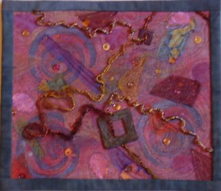
 Here in Northwest Florida, Fall is still pretty green. But in my mind I remembered all the spectacular colors of the season from the few years I spent in Connecticut. So I had vision of a swirl of color and tried to create that memory.
I started with silk, which I painted in shades of oranges, with some green and purple thrown in. The colors looked appropriate for a pumpkin. I then stamped the silk, added a little Angelina fibers, and some paper leaves. So to soften it I covered the silk with two layers of organza. The first one was an old yellow scarf and I was not happy with the results, so I added another layer of a different color. I then quilted it, burned away a few layers in places, and stitched on various strips of organza. To give it dimension, I embellished it with fibers, beads, sequins, and parts of an old earring.
This was a fun challenge; I look forward to the next.


3 comments:
Hi Mary,
I think you portrayed your intention very well...it does indeed look like a swirl of pretty colors. The background itself has a feeling of depth with the spirals and various shading. The square metal piece is a good focal point and a good contrast to the spiral shapes in the background. Repeating that square shape several times in varying sizes and with more value contrast to the background would unify the piece a bit more. There are so many different shapes in the piece, it's just a bit confusing. You're obviously skilled in many techniques! I look forward to seeing your next piece.
Cynthia
Lovely colors! This is one of those pieces that you need to see in person to really appreciate: photos don't capture the full beauty of the silk and Angelina.
The couched fibers move the eye nicely through the piece. I like the way you beaded them, it adds interest and texture.
There's so much to look at (in a good way), it's like a crazy quilt in that you want to make sure you see each detail.
It could use more light colors to increase the contrast. (If you squint your eyes you will notice the three pink leaves and the gold sequins standing out for the light values and the burgundy shapes, the squares, and the darker fibers stand out for the dark values). Just a touch though, and not too bright, you don't want to take away from the soft effect you were after.
Hi Mary - I like the way you have pulled together a variety of techniques and come up with a whole that is so stimulating. My eye jumps from area to area but always comes back to the square. I'm envious because I couldn't come up with this in a million years.
Roberta
Post a Comment