Friday, November 30, 2007

Old Fence Posts


This old corner fence post across the road from my farm house has always fascinated me. I've taken countless photos of it and decided to use one in a quilt for Challenge 15. The fence post is formost with the old barbed wire wrapped around. They catch the drifts of the winter snows which pile in front of them. In the distance there is another fence row moving horizontally just below the horizon line and a grove of trees beyond that. The stormy sky looms overhead. I machine stitched the barbed wire roll and the weeds growing around the posts and below them and closer yet to the viewer. I also used prismacolor pencils to shade the drifts of snow.


Jan Johnson

The photo I used for this challenge is an old one I took in 1981. I have kept it all these years because the angles of the cactus against the old mission have always intrigued me. When Cynthia asked that I hostess one of our challenges I immediately knew that it would involve this picture. So now that I had the chance to use it, it presented a few challenges for me as well as everyone else! Finding the correct angles of the door and windows kept me busy, and figuring out how to represent the ornamentation above them was fun. I ended up dissecting an old crocheted doily for that. This is just the top and needs to be backed and quilted. I am thinking of beading the cactus a little bit to give it more detail.

Thursday, November 29, 2007

Santa's Coming!


Santa detail


.Santa is appliquéd, I used velvet, felt , a smidge of satin for the boots, batting for his beard, and cotton fabrics.
The snow is painted using fabric paint, *sparkly silver* mixed with white, the sky is also hand painted, it is a bit bluer in person, with white and grey highlights for cloudiness , doesn't show too well. The tree trunks were done with Tsukinek inks, as were the shadows. I made the foliage with fabric paints and a stencil brush by pouncing and then drew additional branches with the inks.
The cabin was hand drawn on a pice of fabric and then detailed using pigma pens and fabric crayons, originally Santa was going to be much larger, but my daughter said he was WAY too big for the scene so I changed him. The smoke coming from the cabin's chimney is batting.
I'm not quite sure if this met the challenge or not, but I had fun making it and experimenting with different things ,of course I realized after that the sky should have been a night one, but oh well! Comments welcome...

Wednesday, November 28, 2007

Challenge 15 'She Dances Alone'


The inspiration for this piece comes from the women in South Africa who spend their lives providing for their families sans men. So many of them are looking after their children their grandchildren etc. The scene, the moon is shining down on the village and she dances alone. I hope I have achieved scale and proportion with the large size of the dancer and the smallness of the hut. I could have put in a larger moon, but I wanted the light from the moon shining on her as well as the huts.
I used silver thread to luminate the dancer and the huts.
Thanks for the great challenge.

Two Moons in My Window - November Challenge


What a challenge! I've done so many realistic landscapes that I really didn't want to do anything that I've done before.... so on the night of the full moon, I glanced out my kitchen window. The moon was rising in all her fullness over the roof line of my neighbor's home. I saw an interesting play going on as I also saw the driftwood and obsidian wind chime that hangs above the window. It was one of those images that stuck in my head. So I took a pix of it the next day, and then played with the image in a editing program until I got a fun image that resembled a charcoal sketch... and then the true inspiration came... it's all thread painted on muslin. No piecing, no applique, just 5 hours of thread painting, which I finally completed last night. Whew. Threads used include wool, rayon, cotton, and I tried to use a variety of patterns to add texture. I think the sky is a bit bright, altho I was trying to go for a night sky rather than a pale one. And I could have layered the greens more to show the mountains in the distance.
I think I'm going to mount it on stretcher bars rather than bind it.... could be a nice addition to the house!
Critiques of course are welcome!
Wendy in Flagstaff

Chroma-zone


This is a doodle that has been floating around in my brain for a couple of weeks. It has be coming out in my sketchbook, on napkins, and on the back of envelopes and just about anywhere I am hanging around with a pencil or pen in my hand. I thought it might be an example of scale since the basic shape varies in size as it moves along. I sketched this first onto the background fabric, spent a good bit of time adding pastel shading to the "cells" and then added a shiney net-like fabric over the whole design before outlining all my lines with thread. I like the effect of the overlay, but it totally irradicated my shading. I cut away some of the net fabric and exposed the background as the rainbow effect of the net fabric over the whole piece was overwhelming. I enjoyed working on this, totally immersing myself in the project since I had such a short time to get it done. This will probably be just the start of my "chroma-zone" series since I really enjoy drawing these shapes. Any comments would be appreciated.

Just posted my attempt at scale/proportion. In my estimation, it's not
very successful. I decided to work in black/gray/white. I sketched out
the building and tried to eliminate a lot of the detail and stick to
just the shapes. Using a photocopy of the picture, I looked at the
grayscale and cut shapes without using any patterns. The best part is
the lower left corner where you can see some distance through the
curved openings. The rest leaves a lot to be desired.
I learned:
- abstracting from a photo is difficult - I tend to want to put in
more detail
- although I had an idea of what I wanted to do and had thought about
it during the week, I really didn't have enough time to execute it.
But then I'm not sure if I'd had more time, it would have looked any
better.
- this exercise was probably not the best one to do in a monochromatic
color scheme.
- don't attempt this when you're tired!

Kathy Angel Lee

Scale and Proportion


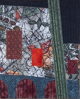
My first thought after reading this challenge was to look at my son's photos because I remembered a great photo of a huge Egyptian temple with large figures carved into the side and tiny humans at the bottom. Then I decided that there was no point in just reproducing an image that I already had. But I put this photo onto the yahoo website so you could see it. So back to the drawing board. I've been wanting to do more abstract, collage pieces and thought this was a perfect place to start. So I did a drawing of the basic outlines of the shapes in Anne's photo of the building and the cactus, then grabbed some fabric that I had used previously in an "ugly" fabric challenge (the white fabric-not really ugly at all!). I had also read on the first link in Anne's challenge that "large scale objects create obvious visual weight. We automatically perceive larger objects as closer and more important than small ones". I was trying to see how true this was by including the bright orange rectangle and using the large white fabric more as a background fabric. Certainly the orange is eye-catching but the large white area still dominates the piece. Over all it's not a top ten piece but I did learn something about abstracting and using different fabrics in one quilt.

Dreamscape - Moonrise

With the full moon earlier this week, it seemed appropriate to use the moon for this challenge.
The moon is large in proportion, it's my attempt to emphasise how the unearthly beauty of the moon affects me.
The colours rather unrealistic, but it is my dreamscape.
Any comments welcome.

Tuesday, November 27, 2007

Hangers On


Scale and porportion..It trully was a Challenge. Most of us really know what that means but when used in 'artistic jargon' we tend to second guess ourselves. Me, too!!
Anyway, with a needle and thread, and my Embellisher I set out to accomplish that which I wasn't sure I could do. Why is no one surprised I used leaves for this? The only thing I brought with me on this trip in the way of something to work with was this leaf imprint. [It would have had to work no matter what the theme!!].
I had a lot of fun shopping for the 'ingredients' and this is what I came up with.

I started with black felt, layered some cheesecloth and texturized with the felting needles.Then I layered some Fun Fur yarn to resemble branches on a HUGE tree. I hand
stitched in a large stitch to mark out the branch lines. Then I felted again. One the leaf, [check the 6th picture in the Misc. photo album] I colored with Prismacolor pencils where the copper paint didn't fill in. Then I added sparkle tulle and felted like crazy to a white felt. I cut it out, hand stitched down the center and texturized the veins with the felting needles, then went around the edge to secure. I hand sewed the smaller leaves and beads on. The top piece of fabric is felted on as well.
It is my intent to leave the fraying parts beyond the felt when I can properly finish it.
I heard there was a new snowfall overnight where I live, so hence the white and those few leaves that 'hang on'. It measures about 8 x 7 or so.

Looking forward to your comments.

Monday, November 26, 2007

Kathy Lichtendahl - Scale

Here is my entry to Challenge 15. I just couldn't resist the play on words. The finished piece is about 10" x 14" and includes beading, hand embroidery, metallic threads, fabric painting and more.

Challenge 15 Autumn Leaves


As many have noted, this challenge was quite, um, challenging! I chose to take the idea of exaggerated scale in the foreground. The background is a photo transfer on silk from a photo I took in NY a few weeks ago. The leaves are fused from some silk I dyed this summer and free motion quilted with gold silk thread.

I think I was heading in the right direction, but I am not totally satisfied with the results. I never know what to do with a photo transfer (as in how to quilt it, etc.). I quilted some texture on the background leaves but left the water alone. I also think the placement or size of the larger leaves is a little off somehow.

But, totally unintended, I think I somewhat captured the effect of backlighting that I have been wanting to portray in a quilt for the longest time! Thanks, Ann, for a great challenge idea! As always I welcome any comments or suggestions.

Brenda Jennings

Mountain Roses


Size: 19.5" x 13.5"

I had been thinking of using this particular photo to make a quilt for some time. I thought it was a good one for this challenge because it had a somewhat exaggerated perspective, with large objects in the foreground. I tried to emphasize the perspective even more. I think the result is an extreme 3-D effect.

original photo

I further challenged myself not to draw things out or use patterns, but just to cut my fabric freehand and use collage techniques. I did use a rotary cutter for the fence posts but no measuring! The pieces were pinned to the batting and backing and I thread painted and quilted at once. This really speeded up the process for me.

All comments and critiques will be very welcome. Susan Brittingham

Sunday, November 25, 2007

King Kitty


Here it is.

Techniques used: photo transfer, raw edge applique, machine blanket stitch, machine embroidery, and free motion machine quilting.

Size 19-1/4" x 18-1/2"

My first idea was a land scape but when I found the fabric with the big kitties everything changed.

It looks more like it should have been done for #6-monochromatic.


ren's falling leaves

After I was done with the first piece (walk in the woods), I realized that I had focused primarily on proportion in it. So I decided to take the leftovers and do something focusing on scale. This is it. Comment are always welcome!

Gimme, Gimme, Gimme


I like to work from my imagination, so instead of starting with the 2 photos which were offered, I tried to imagine a scene where, because of the chosen viewpoint, the scale of the subjects was perverted in some way. The grasping hand that reaches forward is huge in relation to the body behind it. Once I got thinking about seeing things from weird angles, lots of ideas came up. This piece was great fun to create and it went together quickly. It is about 5 x 6 inches and the practical side of my personality is making it into a book to hold my grocery store coupons. The title "Gimme, Gimme, Gimme" seemed entirely appropriate in that context. :)

Challenge 15- Ann Morrell


This challenge was a real challenge for me...I decided that I would take the original photo into Painter 4 and crop it and alter the colors...I eliminated certain features and emphasized other features. Then I printed it out on cloth. I then got out my watercolor crayons and pencils and started adding shadows and colors. I then layered it on batting and did free motioning stitching all over. The piece is the size of a journal quilt.


Here is a close up:


Saturday, November 24, 2007

Hanging out with Van Gogh


I roamed around on one of the poster sites until I came upon "The Sower" by Van Gogh. I love the contrast of the size of the tree and the sun so I made my imitation Van Gogh. My little work (approx. 7" x 9") was fun to put together. After some thread-painting and quilting I added some hints of clouds and the circle around the sun with watercolor crayons. As always, I welcome your comments.

#15: ren's "walk in the woods"


I took the cactus photo's proportions as the starting point and went from there. I was interested in using the Fibonnaci sequence so just about all the measurements started as 1, 2, 3, 5, 8, or 13 inches; then things happened and the end result isn't exactly those, but are what looked good to my eye.

I didn't think too much about scale, however, and have another piece in mind to focus on that. But I was able to work on this and finish it (REALLY finish it, binding and all!) yesterday. So here it is.

Grass is Greenest in Winter


Here is my piece - Grass is Greenest in Winter. In Seattle the grass is greenest in winter - all that rain and mild temperatures makes the grass greenest in the winter. I took the photo with the cactus - I must confess since I don't live in the Southwest - I don't own the landscape so I don't relate to cactus and deserts. I decided to take the proportions of the cactus and put it in a piece with a more northwest background. I found my photo which was taken on December 26 a few years ago and worked with those backgrounds - Puget Sound and the Olympic mountains - I couched the background trees with black yarn - and then couched the foreground tree with gray yarn. The final measurement is about 10x13. I kept two sides wavy and straighted the other two -to add some additional interest.

Lisa
In Sunny and Cold Seattle

Friday, November 23, 2007

Challenge 15

Challenge 15 - Friday, 23 November 2007

Guest Hostess - Ann Turley

Theme or Technique - Work from one of the two supplied photographs. Both are copyright-free and from my own collection. Interpret one or both of the supplied photographs in your chosen style, or you may select any other photo with a similar layout.

Design Concept - Scale and Proportion

A sometimes-misunderstood principle of design, scale and proportion are nonetheless important concepts that help in the creation of believable works of art. Scale is the size of a given element in relation to the overall piece. Proportion refers to the relationship between each individual element in the overall piece. Both are interconnected in overall visual appeal and are what makes your art quilt visually exciting.To maximize the relationship between design elements, proportion and scale are typically used. Scale controls object size while proportion manages size ratio. Both make sure everything is well balanced and ensure a smooth and eye-catching design.

Due - Saturday, Noon EST, 1 December 2007

One final requirement - HAVE FUN WITH THIS!

Thursday, November 22, 2007

Movement


This is a skateboarder. I think it is more like stop-motion than motion, but it was an interesting exercise. I decided to use the background fabric, as it expresses the tension I wanted to convey better than motion lines...Which way will she go now? (tis a she! I looked into female skaters a few years ago for a project I was doing.) I also chose vibrant fabrics to stand out from the background to express a bit of the excitement. I haven't backed it, but would appreciate advice for edge finishing.
Sandy in the UK

Tuesday, November 13, 2007

Withered Rose

10 1/2 x 10 1/2

Have I show motion here? I stopped putting beads on for the stamens, because the shininess seems distracting to me. I think I may take them off in favor of more french knots (like I did the pistils).


Update (November 26, 2007):
I have replaced the beads with french knots. I think I like it much better this way.

Wednesday, November 07, 2007

Windy Day at Nags Head


Size: 14.5" x 10.5"

Susan Brittingham

My husband is a windsurfer, so it was a natural choice to use the image of a windsurfer in order to capture the idea of motion and translate it into visual form.

I found a photo, cropped and enlarged it, then made a line drawing of the image which I printed onto stabilizer. I used mainly batiks and hand-dyes and a few odd scraps to applique the scene. The sail has an overlay of organza to simulate the transparency of a sail.

I used thread painting as my "embellishment". The bridge in the background is rendered in thread, the wake and the waves are also partially thread painted and there is thread work to suggest the marsh grasses in the distance. I used variegated thread to quilt the water and tried to include whitecaps each time the thread changed to a light color. The quilting in the sky is an attempt to suggest the wind.

I welcome any comments or critiques.

Sunday, November 04, 2007

Challenge #14


Cosmic Swirl
18" X 18"

Debbie Krueger

Waukesha, WI


Personally, this challenge was right up my alley--I've been wanting to play with movement for some time, and embellishment is second nature to me.


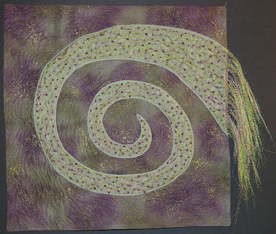
I used commercial fabric for the background and the pillowcase method of "binding" this piece. I used freezer paper to draw my swirl, pressed it to a piece of "unknown" fabric--something fun found in the remnant bin. Then I stitched the swirl down, cut around it, and used a zig zag stitch to secure it. I used fishing "flash" to add sparkle (another on of those things I've wanted to use for a long time) and couched the flash down with amethyst and bronze colored beads.


Here's a close up of the embellishment


<>

Waiting


my entry for the motion challenge, as the storm approaches, this woman stands, looking out to sea, watching and waiting....I used a scrap of fabric from an old dress and a piece of black lace for her shawl, I still need to quilt and bind this one. Right now I am on a creating spree, when I get several done, I quilt and bind them all.

Swirling Oaks

Here is my Challenge #14 piece- Swirling Oaks- 11"x14"

It looks like many others also thought of wind and leaves for this. It was the first thing I thought of when I read it, because fall is really here, and the winds have picked up, and the leaves are swirling all around.

I used sunprints of oak leaves I did this summer, using colors in orange and green with some burgundy. The sunprinted fabric was backed with Wonder Under, then cut apart, and fused to the batting with a gold-flecked ivory fabric between the prints. The edges of the prints are covered with a yarn in the colors of the fabric, couched with clear thread.

I quilted the outlines and veins of the sunprints with a variegated thread, and stitched some wobbly, curved lines with clear thread to show the swirling wind. The "binding" is the same yarn used earlier couched around the edges. The leaves for the embellishment are "silk" leaves pulled from their plastic stems. I attached them by stitching only on the vein lines, so they are loose on their edges.

The first photo is of the piece placed on a 16"x20" pre-stretched canvas which I would like to mount it to.

The second photo also shows it on the canvas, but with a couple more leaves placed on the canvas outside the edge of the quilt.

I am not sure if I like the canvas left white, or if a color would be better, or if I shoud add the extra leaves, or leave it alone.
If anyone has any ideas, I'm very open for suggestions.

Colorful Chaos - ~20" x 25"


Despite having issued the challenge, not a single advance idea of this piece came to me until Wednesday after it was posted!

I started off by going wild with the shape, then machine appliquéing a couple pieces with plenty of motion of their own. Then I dove into my stash of ribbons and trim, and twisted them around; they got sewn in with beads. This has to be the wildest piece I have ever made!

Saturday, November 03, 2007

Beauty Vs. Imperfection


This quilt was meant to be a journery of healing for me. Almost eight years ago I had a mastectomy. Because of the many surgeries I went through that year I chose to not undergo reconstruction, so I have scars on my chest. I am reminded daily of that ordeal - the scars aren't pretty. But I do not wallow in self-pity. The scars remind me that I am a survivor! The quilt is embellished with a descontructed cooper pot scrubber and gold acrylic paint. The triangles are a loosely hand woven fabric that is somewhat frayed around the edges, demonstrating my journey, and that all is not as it seems. I plan on doing a bit of beading in amongst the copper after I have this quilted. It is not finished in that it needs to be backed and bound.

Ann in Walnut, CA

Second attempt at leaves

Here is a second attempt at fusing real oak leaves onto quilted fabric. Now I'm out of oak leaves... This shows more movement, I think, but I can't decide whether I'm looking up at the sky, which I intended, or down into water. The blue hand-dye is by Robbi Joy Eklow.


MINESHAFT


There are many old abandoned mines in deserts and mountains. Sometimes when you stumble across one, it looks like a bottomless pit (it often is!) surrounded by plant overgrowth and rocks. Careful, or you might fall in! One slip of the foot sends rocks and sand tumbling down into the shaft.

Moonlit Swamp

Successive layers of tree appliques in cotton and overlaid with sparkle tulle. The movement is the slow play of moonlight across the water. Embellishments are the twisted bugle beads in a dark, tarnished green/black color and the furry yarn in the tree top on the right. Free-motion quilted, faced, 33x28.

Skippers


Started right away. Worked hard. Didn't finish. In my defense, we had a family emergency. This piece is about 15" x 18", raw edge applique and hand embroidery. I enjoyed all the articles about what creates the illusion of motion in art and I tried to freeze motion. I don't think it works as well as it did in my sketch. Maybe when the rest of the embroidery and the quilting are added.

Through Hail and Ice


I tried to achieve movement through silence.

I drew a duck in flight then fused it in segments to a background which i painted with some metallic paint. I appliqued around the duck with satin stitch.

Free motion quilting with silver holographic thread was used as an embellishment.

Metallic paint for the feet and beak; with shading with fabric crayons to achieve greater definition of the duck and the movement of the wings.

I don't know whether i succeeded with the theme of movement.

I will appreciate any comments.

Anna.

Friday, November 02, 2007

Flight of the Dragonfly

The finished measurement is 13x17. I named if Flight of the Dragonfly - it reminded me of the Flight of the Bumblebee. The background is pieced with various scraps of fabric. The leaves and cattails are appliquéd down with the quilting. The cattail stems are couched yarn. The cattails have a little bit of stuffing to represent going to seed. The flight is beaded dancing in and out of the cattails. Finally a little blue beaded dragonfly to finish it off. As always I did have fun.

Lisa
In Sunny Seattle

Swirls by Lisa Konkel


This is the first challenge I've completed for this group. My challenge 13 quilt isn't finished yet.

When I read the rules, I kept thinking of swirling lines. I wasn't sure what I wanted to do, so I sat down and did a series of sketches. I came up with two I really liked, and started with this one of swirling ribbons. (I'd still like to do the other one too, when I have a bit more time.)

I used sheer fabric and red lame, fusing them down to form the ribbons. This is the only embellishment I have. I have thought about adding beads to form additional ribbons. The ribbons are satin stitched to the quilt front, then the quilt was layered and quilted along the lines of the ribbons. I quilted to the edges of the fabric and then went back to add the borders, which is why those aren't quilted. I like the difference in texture of adding the borders after quilting--it looks more like a frame.

This is really a departure from other things I've made. I'm not sure if I really like it or not, but it was the quilt that was needing to be made for this challenge. I really enjoyed the challenge, especially the idea of trying sketches and then picking one to make.

Challenge 14 - The Wave by Cynthia Ann Morgan


My 17 x 13" piece is based on a 19th century vintage japanese woodcut print, called the "Great Wave off Kanagawa" by Hokusai which depicts an enormous wave threatening fishing boats with Mount Fuji in the background. Mine's not about Mt Fuji or fishing boats...just the motion of the giant wave and all that curling foam. I used hand dyed fabrics, fused applique and trapunto on some parts to give it more dimension. The embellishment part of the challenge is small...just some slivers of foil here and there.


This was a good challenge for me...I looked at alot of art to see what creates the feeling of motion. It really livens up a piece to have some movement and/or rhythm.


Comments welcome!

Cynthia

Storm watch


What fun, I really had to think when the Challenge was posted. Waterand wind kept coming to my mind. So, this is what I ended up with. Ihope I captured the essence of the challenge. I did use embellishmntsto help move the eye around the piece.Thank you for thinking of this as a challenge.


I used a lot of teqniques and embellishments in this piece.

I used my embellisher to texturize the water. Then with cellophane, tyvek, sparkle paint, angelina [from the sheets] ,paint, cotton balls, tuille, hand dyed and painted fabric, it all came together.The water started as a shimmer polyester. Hot fix embellishments and quilting lines move the eye around the piece as we" watch the storm"coming in.


I did something I had never done before and that was to fuse the pieces that make the four wind'y blocks on the left side. I always wanted o do this. But, I wouldn't again. Much easier to piece, even if it was by hand.


I look forward to your comments

Thursday, November 01, 2007

Eddy


This is my attempt at showing movement. I began with a piece of hand dyed fabric from Alice Cruz, Della Jane Hand Dyes. The gold lines are Radiance, Copper, "Frize" type yarn. I used my new free-motion couching foot to apply the curvy lines. Then I quilted in gold within the lines, and green outside. This is hard to see. The leaves are real oak leaves that I collected from Cave Hill Cemetery in Louisville, KY last week. I used Heat 'n Bond Lite and fused them to the quilt.
Then I looked at all your other quilts. Wow! I should have quilted echo lines, which would have emphasized the movement. and, I fused the leaves too close to the edge and they are caught in the binding.

Fire Storm


I finally finished a challenge! It's been awhile. I chose to do a wild fire not only because of the most recent California blazes, but because my niece and her significant other both work for the National Fire Service and fight these terrible fire storms. I plan to give this to them for Christmas.

It didn't turn out quite as I'd hoped but I think gets the message across. I used all scrap pieces and fused them to the fabric using a circular pieces to get the swirling motion of the fire engulfing everything in its path and leaving only tinder behind. I then attempted to add 'smoke' by fusing separated yarn to the sky with fusible, too. Therein lies the problem. The fusible backing shows through in some spots more than others and also fuses the yarn down too flat to get much of a wispy effect. Any suggestions?