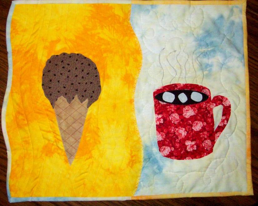
Something a little different :-) It seemed that every idea I had was done so I played the little word association game. And came up with fire=hot=cool=ice cream and then I got ice=cold=heat=hot chocolate...yes you guessed it, chocolate is my addiction! Anyways, I put the cocoa on the cold side with the binding being the warm color to show that it warms up cold days a little , quilted that side swirly for cold winds. The ice cream was opposite, on hot fabric, bordered with cold, to show it cools it down, that side is quilted to suggest the wavy lines you see in the distance on hot days. Hope you like my little quilt!
Monday, January 14, 2008
Subscribe to:
Post Comments (Atom)


5 comments:
How about "The Joys of Life" as a name. It makes me want to go get a snack.
Betty
what a fun idea! I know what you mean about trying to find something other people hadn't tried yet! you did well to being out both concepts in one quilt.
I think you accomplished your hot and cold contrast, and borders well.
I was thinking, what if you could find some sort of yarn or trim that has yellow and blue combined to couch over the "join" in the centre of the quilt. Perhaps something like that would help to make the transition between the two a little softer. What do you think?
Sandy in the UK
I was thinking of doing something like that Sandy, I had thought a vibrant fiery orange, but didnt like it, then I tried a blue and didn't like that..I think you have hit the nail on the head! Am going to see what I have :-)
Cathy, this is just plain fun.... I love that you took the words to another level. I agree with the others that the transition could be softened... and I'd personally love to see it cropped a bit... there seems to be a lot of negative space (a concept I'm also working on!). What if the borders were smaller? This feels like it could be the start of a fun series!
Wendy
Hi Cathy, you always do such fun stuff! This looks very well constructed, good colors, and the quilting enhances the piece. A couple thoughts I had: usually a composition is more interesting if the number of elements are an odd number...like 3 instead of 2, 5 instead of 4. And off-centering/non-alignment of the elements adds more interest, too. Wendy's cropping idea could help the composition too.
Cathy, I'm so glad you're back for a second year. I enjoy your work and have seen a lot of progression in your work. You have such a fun attitude that shows up in your work. I think the thing that will take your work to the next level, is working on the composition...such things as unity, balance, rhythm...to add more interest and make it a compelling piece of art. You have a such a good handle on technique, visual impact, contrasts and color...I would personally love to see what you could do by more experimentation with the composition.
Cynthia
Post a Comment