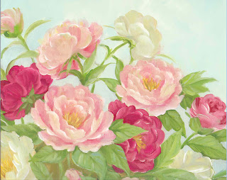

This was a challenge for me. That is a good thing because I'm too hung up on realism. My picture was from a calendar. I'm not sure I met the challenge but here it is anyway.
The size is 11-1/2" x 7-1/2"
A gallery of the quilts created for the Fast Friday Fabric Challenges. The quilt artists display their work here to give and receive constructive critiques. Only blog members may comment.
2. Explain what the piece communicates to you.
3. Give a 'what if' statement(What if you had used blue instead of red?)
7 comments:
Betty this is a very nice calming piece. The stems and leaves have a nice contrast.
What if you would have used a bit more contrast in colors for the roses? Perhaps you would have got a bit more movement?
Just some thoughts.
So soft, looks as though it could float. Nice that you were able to break away from the very 'realistic' aspect of the calendar.
Kudos to you for going just a bit more abstract. You have stepped it down one rung of realism with the soft shape of the flowers.
I like the soft look of the raw edge appliqué and the colors you chose; the little bit of sparkle and the places where the appliqué goes past the border.
You have achieved a degree of abstraction too.
Penny Irwin
Hi Betty, Yes, you definitely met the challenge with your abstracted/stylized flowers and leaves. I really like the contrast between the round shapes of the flowers and the angular shapes of the leaves. It might be fun to put a little dark color in the stamen area of a few of the lighter flowers.
Great job!
Cynthia
It seems abstract to me. What if you add a bit more green (especially the dark one) for contrast?
Cherie
Betty,
great job on the abstracted roses.
Anna
Post a Comment