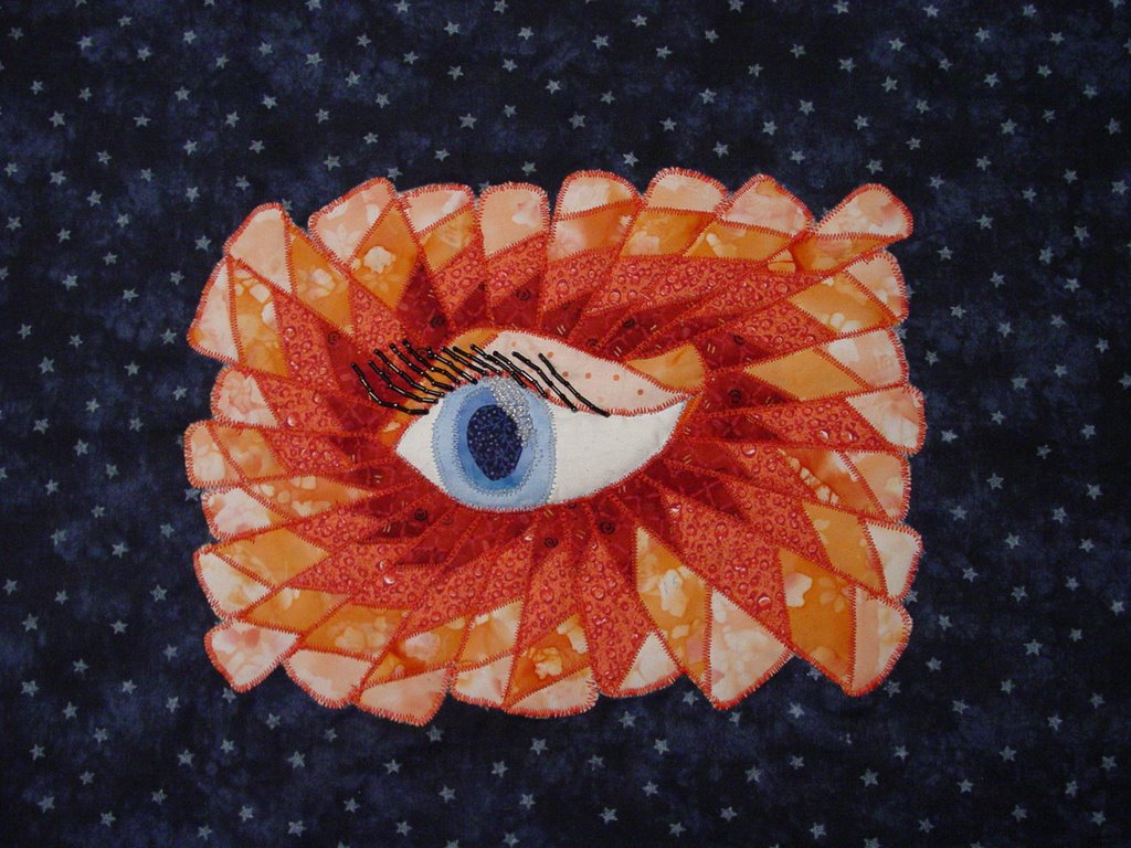

Book: What Mrs. McGillicuddy Saw by Agatha Christie, last line: "And she twinkled at him!" Size of image: 81/2x11, with blue background - 16x20. The quilted eye is attached to the blue background. I haven't decided if I want to quilt the blue background or put this in a frame as is. The eye and rays were cut out and fused to plain muslin then zig-zagged down. The "twinkle" in the eye was added. Then, I quilted this down to the blue background fabric - quilting around the eye, the brow, and then between each ray over the zigzag. I added a little extra batting to the eye so it puffs out a bit - not much. Last, I added the eyelashes which I re-did three times before getting them in the right direction (needed help from my artist husband to figure out which direction they should go!). Value is a hard one for me so I really worked at getting different values of the two colors used. In my preliminary drawing, the change was not as drastic between values and so I wasn't sure how to portray that in fabric. I have not used fusing either in a piece or done much in the way of zig-zag stitching. Also, I haven't used beading before so I just wasn't sure how this piece would end up BUT, I am really pleased with it. I did learn that I shouldn't use black sharpies to mark things when using wonder under! And, that zig-zagging can cover up a lot of "sins". Also, that when you work with a fused piece alot it comes "unfused" easily - maybe that's due to my fusing job? Anyway - critique away!


6 comments:
Wow! This is really neat.
Betty
How beautiful! Your colors are so dynamic, and the contrast is wonderful. I absolutely love it!
Cherie
Wonderful job! You have chosen a great range of values and variety of print character. Also the complementary color palette brings out more contrast.
The eyelashes look great, and so does the eyelid! I would like to see the beads on the twinkle stand out more. Maybe it's the pearly finish or maybe its the photograph, but the beads' value looks very close to the blue of the eye on the right.
It's fun seeing fabrics I have in my stash in other people's work and how they use them. I have that dark blue star print also, somewhere ...
laura
Hi Pat - Your idea of the "rays" of the eyes is so well realized. What an interesting interpretation of an eye - as you can tell, I really like it. I think you did well with your gradations of value leading the viewer into the eye. The beading is a nice addition although I didn't see the "twinkle" until I looked at a close up of the second picture. I have some fabric glitter that would work well in this piece - I've never found a use for it in my own work yet so this shows me that I might eventually find a place for it. Thanks for sharing this interesting work.
Roberta
Hi Pat, Gosh, this eye really does twinkle! Great job! The color and fabric choices are very effective in creating dramatic contrast, texture and movement. And your judicious use of beading is just right to add sparkle but not overpower the eye.
My only comment is the placement. Would it look more interesting to offset to the side or up or down than to have it perfectly centered? If you have photo editing software, try cropping it different ways and you'll see what I mean.
I look forward to seeing more of your work
Cynthia
Thanks so much for the comments (and compliments!-much appreciated). TWINKLE Comment: the blue pupil is the second one (the first is hidden under this one). The twinkle showed up better with the first pupil but the fabric was fraying so bad I redid it. With the first, I cut out the light and medium fabrics in a ring with a white fabric area that was the twinkle with beading on top of the white. Like I said these small, narrow rings of fabric were fraying so bad that I redid the pupil so that each color is a circle on top of the next one - fused in three layers. Then I beaded the twinkle in. The beading did show up better over the white and I think I would have preferred that.
PLACEMENT Comment: I understand what you are saying - that did bother me a bit, also BUT, because the blue pupil is off center and the rays a not symmetrical, I tho't it should be okay. I think I'm going to try this ray pattern again but make 3 off set from each other with a flower in the middle of each. I'll move the placement around and see what happens.
THANKS!
Post a Comment