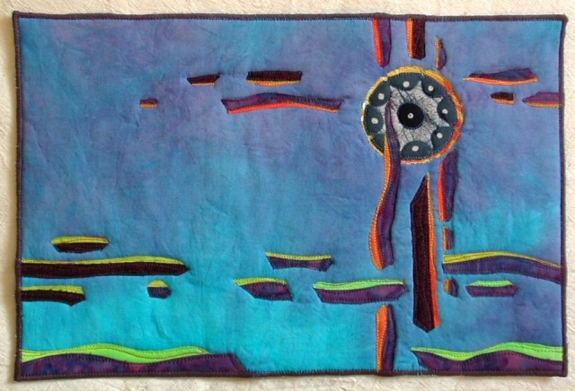
9 x 13, raw edge fused appliqué.
“It was a quiet morning, the town covered over with darkness and at ease in bed.”
– Ray Bradbury, Dandelion Wine
What happened? This looks nothing like the quilt I had in my mind, except maybe the colors. I had planned on abstracted buildings with a cupola near the top, looking down on the trees and other houses below. I didn’t like how my abstracted rectangle houses looked on the background, and decided to go more abstract. I replaced the cupola with a circle cut from a batik fabric, and used fused scraps and intuition to create the rest.
I read the first chapter again after I created the quilt to help decide on a title. Perhaps this quote from the first chapter (Chapter one is here: http://www.raybradbury.com/books/dandelionwine-hc.html) is more what the quilt is about:
“Douglas, conducting an orchestra, pointed to the eastern sky.
The sun began to rise.”
I usually love dense quilting on the backgrounds of my quilts, but I didn't want to interrupt the smoothness of the background on this quilt.
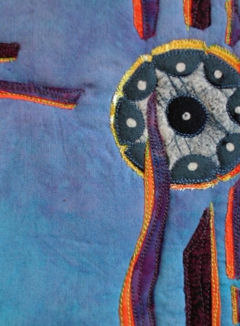
I used this circle batik to cut a circle for the focal point. It has a completely different effect on the quilt, than it did as part of the fabric. More Southwestern or Native American on the quilt.


6 comments:
I love your abstracted abstract! It is all so peaceful like the beginning of a new day with the moon going to sleep and the sun seeming to wake up everything else around it. Great contrast of colors. Change nothing!
Hi Linda,
Very soothing. I love the simplicity of it and the "white space" (that's a graphic design term for the parts of the page not filled with text or images. It gives the eye a place to rest. I'm always fighting to save white space in my layouts from people who want to add more, more, more.)
Your elements have a great deal of movement and dimension. It could almost be an abstraction of a fish tank.
The composition is also very pleasing. It fits the classic rule of thirds, where a picture's subject is placed at one of the intersections of an imaginary tic-tac-toe board, not in the center of the image. Yours almost depicts the tic-tac-toe board, except for the left hand vertical line.
All those things: the "white space" the composition in thirds, plus the cool palette, make it so quilt and peaceful.
Isn't it great when the pieces surprise us and come out completely different than we'd planned? Yours looks great!
laura
Hi Linda - Your piece has such a dreamy feeling - it does evoke the feeling of quiet and early morning. I think it is interesting how it turned out so differently than you had planned - If you had used the rectangular shapes for houses the piece wouldn't have the serenity it has now. I particularly like the subtle gradation in color of your background fabric and not breaking it up with quilting. I don't always "get" abstract pieces but this one speaks quite nicely.
Roberta
I love this quilt! The gradation of the blues in the background and the fact that you left it unquilted moves the eye back to the subject. When I look at this piece the first thing I see is the Zia Sun Symbol...looks like you know New Mexico. So even as an abstract, I see the sun on an early morning sky; good depiction of your theme. The composition is perfectly balanced and the colors are lovely complements. Bravo!
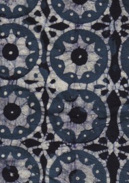
I've had other comments about it looking Southwestern or Indian. I hadn't planned it that way, and I haven't been to New Mexico. I think it's the circular design and the bright colors that make it look Southwestern. I thought the original fabric looked Asian. I've added the picture of the fabric I used to this post.
Hi Linda, your wonderful sense of color and depth is showing again. I like the open space and the concentration of elements near the medallion. It still feels balanced even with that concentration...I think because of the longer, darker "floaters" in the lower left and possibly the color shift in that area. The lack of quilting is using a bit of wrinkling I see. Another possible way to achieve that blankness you got with no background quilting could be with a very fine stipple in a lightweight thread, like silk. It might not be as effective visually though. It's a wonderful piece.
Cynthia
Post a Comment