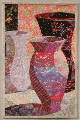
10 x 15, fused appliqué.
I turned a photo of my still life set-up into a greyscale image so I could concentrate on value instead of color. I was disappointed that the shading didn’t show up good in my photo. Too many reflections that I didn’t want to deal with. So the shading on each vase was done intuitively.
Choosing the fabrics was great fun. I completed the vases one at a time and chose fabrics as I went. I began with the red and purple batik which has been in my stash just about forever. I had no idea what the color scheme would be until I was done. I chose the shadow fabric, because it had some dark areas and I needed the dark lower corner to balance the dark vase on the right.

I was originally planning to crop the top a couple of inches lower, but the dark vase didn’t look like a vase. So I added more background fabric on top, and put a top on the vase.
Do you see the birds on the vase? One looks like he’s looking into the front vase. He was a happy accident.
I might have to try this again and try to more closely interpret the colors and reflections in the photo. I might posterize my photo for a guide, like many of you did for your quilts.


6 comments:
I love these vases. Good move converting to black and white, because you definitely did a great job illustrating values! It's really very pretty. Kudos. Valerie
Nice work, Linda. I think you did a very credible job of shadows. I love your fabric choices, too. A very pleasing quilt. You should be proud!
Marlene
Hi Linda--
This was a great challenge. Thank you.
Your vases really look dimensional. I like them very much.
Betty
Hi Linda, you are a master at combining prints...this is lovely! It has an oriental feel to me. Shadows are dramatic and effective. I wouldn't change a thing except it's home address!
Cynthia
This piece is really lovely. Great job.
Brenda
Linda,
Great fabric choices--you must have an exquisite stash! The value changes show good dimension, and they also create wonderful wavy lines flowing from top to bottom. This gives your still life, which would usually be very still, a sense of movement. I like how the red piece in the front has white parts in the design and that gives the sense of small bright highlights.
Post a Comment