Sunday, December 31, 2006
A Yellow Kind of Day

Infinity

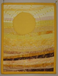
Infinity is based on the last line from Stephen King's book, The Stand: "And it always, at the end, came round to the same place again."
This is a stabilized 10 degree wedge ruler project using a striped commercial fabric, offset one step, and measures 26.5x41.5". It's actually 2 circles that connect and overlap. Yes, those are holes in the center of each circle. One binding is lime green and the other is a dark purple.
It hangs very straight, even though it's just pinned to my curtains right now. The holes in the center measure 3" diameter, and applying bias binding on that small sized inside curve wasn't fun. It's machine pieced, machine quilted in the ditch, with the binding turned by hand.
This is a very simplified version of a quilt by Nancy Ota that won a prize in Paducah last spring. Mine will be used as a sample for a class that I teach, although my son has already claimed it for later.
Any critiques or comments would be appreciated.
Marilyn Rose
The Time Traveler's Wife
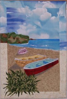
The first line from this book is "Clare: It's hard being left behind". I read it cover-to-cover on a Panama Canal cruise with my mother in February 2003. I tried to create a mood of loneliness and abandonment, which is how Clare felt everytime her husband left her. She never knew when he would return, nor at what age she would see him. (If you haven't read this book that last statement probably made no sense!) Anyway, I like the feeling the quilt has, but it needs some help. The lower right corner looks empty. Does anyone have any thought son this?
Ann
Saturday, December 30, 2006
Goodnight, Moon
 The book I chose was "Goodnight, Moon" by Margaret Wise Brown.
First line: "In the great green room there was a telephone..."
By Laura West Kong, size: 8 5/8" x 8 3/4", pieced and appliqued.
My mind was mush after the holiday rush so I chose something simple and fun. My inspiration was the stylish old telephone on the nightstand in the book, and the quilt project "Oak Leaves" in American Quilter, Winter 2006.
I changed the block from rectangle to square and replaced the leaf with the phone. Then I mixed up the squares to be random rather than in diagonal rows. I chose warm greens for the front because I thought they would contrast better with the black than cool greens. I wanted the fabric mostly to have good contrast, but with a little low contrast thrown in (the two darker value greens). In the book everything is all shadowy and moonlit. The lighter green star print is actually very similar to Clement Hurd's illustrations.
 Everything is from my stash. I originally wanted to tilt the squares at an angle to add interest, but that was way too much math for my tired brain, so I offset the phone instead.
I tried out a variety of borders, but they all competed with the focal point so I opted for a fused black binding instead. I was also considering ways to include that fun curly telephone cord, but in the end chose to leave it off for simplicity's sake.
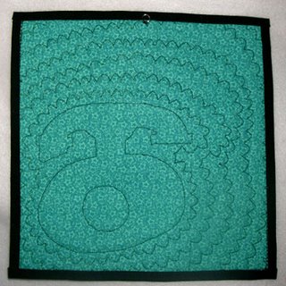 The quilting is done with my machine scallop stitch echoed around the phone. It is meant to be reminiscent of those curly telephone cords, as well as suggestive of a ringing phone. For the hanger I sewed a large jump ring to the back.
Friday, December 29, 2006
Miss Jane
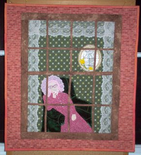 This was fun. The first line of Agatha Christie's "The Mirror Crack'd" is "Miss Jane Marple was sitting by her window".
The blue line in the mirror is the crack. I had my husband sit so that I could take his picture to use as a guide. The size is 18-1/2" x 20-1/2". Miss Jane and the chair were hand appliqued. The mirror was machine embroidered.
Thursday, December 28, 2006
Igraine of Tintagel


"Even in high summer, Tintagel was a haunted place; Igraine, Lady Duke of Gorlois, looked out over the sea from the headland."
Mysts of Avalon; Marion Bradley Zimmer
One of my all time series of books.
Fused and machine and hand applique. All fabrics were either dyed or painted (the dress) by me. Machine quilted.
I would appreciate your ideas, they're always so helpful.
Cherie
There is a hole....
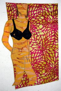
"There is a hole the size of a golf ball in the right side of Katherine Givin's black Bali bra." from Annie Freeman's Fabulous Traveling Funeral by Kris Radish. This is totally chick lit, but I love the way Radish speaks to the bonds of women in this and her other books.
The figure is hand-drawn and then fused as applique. I wanted the bra to be the focal point and the body to blend into the background. Variegated threads were used for the highlights of the body shadows. And yes, the arm is a cutout, edged with satin stitch.
I have a collection of female nudes that I've used to decorate my bathroom, this will fit right in with the new paint! The biggest challenge was finding a first line that piqued my interest!
Friday, December 22, 2006
Challenge # 4
Theme - First or Last Line of Your Favorite Book
Design Element – Value/Contrast
--- Design and complete a small work using your interpretation of either the first line or the last line of one of your favorite books. The line itself (not the entire book) is the spark for your piece. What pops into your head when you read the line…can you express that in your piece?
---Value refers to the lightness or darkness of a color. Contrast of values is how the value looks compared to the surrounding values. Try to use strong contrast of values to direct the eye to where you want it to go.
Monday, December 04, 2006
The Clown

18½" x 13" x 5"
Since I regularly make pieces with an odd shape, I had to go more 3-dimentional for this challenge, hence this piece, stuffed so it is basically the front half of an oversized clown head.The head started with a plastic bag stuffed with Polyfil, then muslin sewn to create a starting shape, and then white cloth with a pattern of white stars on it. The lips and nose are red satin, the hair a mix of purple and green curly fake fur. The little hat is from scraps of fleece, with a cockatiel feather that our bird provided. The ruff was actually added a bit after the deadline, but that was what made it feel complete.
Sunday, December 03, 2006
Birch View
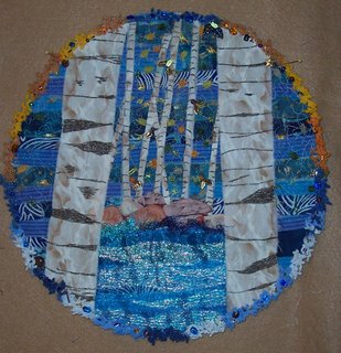
Now that I have finally figured out this blog thing, I can post an image! This round quilt started out to be a porthole with fish swimming around in it but as you can see, it wanted to be a forest scene instead. The background is contructed on a heavyweight fusible interfacing with random width blue strips - frayed edges and all. The strips are fused down and free-motion stitched with a few snips of tulle thrown in for good measure. It took a while to decide on fabric for the trees until I rememberd some neutral sky stuff I had. Turned sideways it was perfect! The stitched details added dimension to the trees. Novelty yarn made great falling leaves. More novelty yarn for the border. Finally, I hid beads and charms in the border. The diameter is 11" - the size of the pizza pan I used as a template.
Any comments or suggestions would be greatly appreciated.
Ann
snowflakes
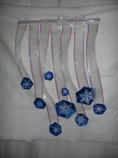
i made a little quilt with falling snowflakes last year and it popped into my mind when i read the challenge. i wanted the flakes to sway and twist in the wind. (note to self - don't use wired ribbon no matter how sparkling it is. it doesn't sway). i cut the flakes out of a piece of fabric i've had for several years and never knew what to do with. i backed them with white fabric and quilted them with sparkling thread, sewed them on to the ribbon and suppended them all from a dowel. then the fun began. the little suckers would not stay put. they all followed the bend in the ribbon. i finally had to pin the flakes to the backing to get them all to stay still enough for the photo. i wish i could have come up with a more elegant way to suspend them from the dowel. my original idea was to suspend them from an embroidery hoop, the thought being that the circle would add movement. (note to self - find embroidery hoop).
let it snow!
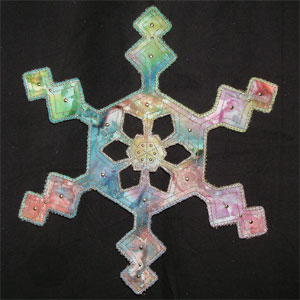 Friday night I chose sleep over finishing my challenge on time. Last night I chose the challenge over sleep.
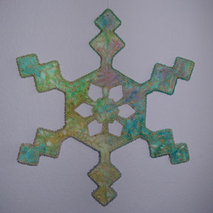 My quilt was inspired by the digital photography of Kenneth Libbrecht, whose work appears on the 2006 U.S. holiday postage stamps. I used elements of real snowflakes combined with elements from my imagination to sketch a snowflake of my own that could be real, and most importantly, could be realistically made into a quilt.
 I chose two batiks, one for the front and one for the back so I could see what it would look like in different fabrics. As a bonus, that made it reversible! The batiks are fused to Timtex interfacing for the batting, and I used gold metallic thread for the edging and quilting.
 First I applied yarn around the outer edges and used a machine overlock stitch on top, which turned out rather decoratively like that loopy-edged kind of ribbon. Then I echo-quilted the snowflake before cutting out the center windows with an X-acto blade. Next I zig-zagged around the windows, and finally added the hot-fix gold brads on the front. All in all, a very quick project!
I used fishing line to hang the quilt. The front is photographed in front of a black piece of fabric and the back in front of a purple-painted wall. Currently it's hanging from my kitchen light fixture as part of my Christmas décor. I like the way it gently turns round and round with the air currents. (I would have taken a picture, but it wouldn't have the same effect unless I figured out the video capabilities on my digital camera so you could see it rotating.) I am quite pleased with the way it turned out. Maybe I'll make one snowflake each winter and eventually have quite a collection.
Sun Spots
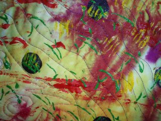

The fabric is my own hand dyed from last summer. I started with a circle added spokes folded, twisted, and turned it to try to make some flowers and didn't like it that way so I laid it back down in a heap it didn't look too bad that way : ). We had an ice storm and lost power Thursday through Friday night I still didn't like it when the lights came on so yesterday morning I painted it with acrylic and gel meduium using a wine cork for the dark spots, I used the side of a wooden honey server to print the yellow marks ,and twisted up floral wire to stamp the green marks.
I quilted the heck out of it.I am still not crazy about it but I like it better now that it is painted. I may add some more spikes at a later date.
Not sure how I'll hang it but I can hang anything with my log walls without worry.
It measures about 3 feet by 3 feet.
Jacque

Saturday, December 02, 2006
Sargeant's Art Quilt
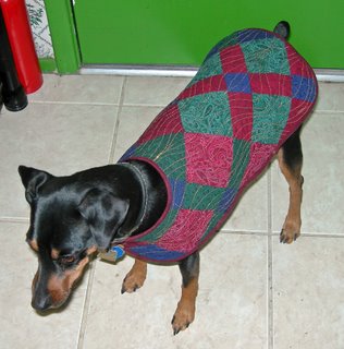
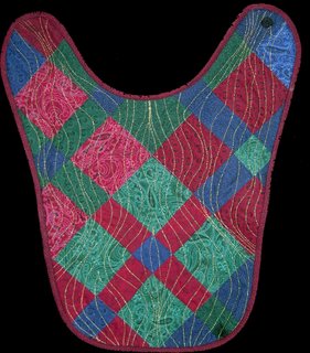 15 x 18
Pieced cotton on flannel (UFO)
Triple stretch stitch in gold (faux embroidery)
Traditional binding
Velcro closures
My inspiration for this quilt was the cold snap we were having in Tucson, Arizona. While others will surely call us wimps, when the temperatures get below freezing we FREEZE! (Considering I spent more than 30 years in cold country I'm happy to be a wimp today!)
I had a piece of UFO fabric created several years ago in a jacket class. After creating a panel, I decided I didn't like the project so left the class but kept the panel tucked away in the bottom of a stash closet.
I've been experimenting with using my machine's triple stretch stitch to represent a faux embroidery stitch. This is a technique described by J. Michelle Watts during a Tucson Quilters Guild lecture. This isn't quite free motion as I used a clear applique foot and marked design lines. It did give me needed practice in manipulating the fabric.
The result is an interesting art quilt coat for my Miniature Pinscher, Sargeant TopGun!
Additional photos and information is available here.
While I was creating this challenge there was a discussion on QuiltArt commenting that people wouldn't be willing to pay art quilt prices for dog quilts+.
3. I beg to differ. I posted a photo on my favorite MinPin list. Within hours I'd received several inquiries about purchasing coats and one person was interesting in marketing my coat. I declined all offers, but I do believe it's entirely possible to sell small dog coats/art quilts for $100 per square foot (or more). Perhaps something for retirement income!
Your comments are most appreciated.
Petroglyph
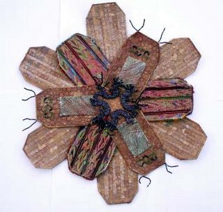
I hope I got it finished in time. My source for this piece was a petroglyph - Kokopelli. I have used a variety of techniques. The base for each individual section is Fast2Fuse. I covered each piece, both back and front, with batik - a different colour for each layer. The base is a hexagon with each outer section stitched to the perimeter of the hexagon.
The outer section - 6 pieces - was covered with painted newspaper. I then stitched the word "petroglyph", which I did using the Pfaff 1475 which I programmed with the letters, all over each section. Once the stitching was complete I wet the painted newspaper and distressed it to make it rough. The outside edge has copper wire enclosed in satin stitch. The long ends have beads threaded into them.
The middle section - 3 pieces - was covered in a dark brown batik on top of which I added irridescent tissue paper which I free machine stitched in place. I couched some variegated ribbon on top and also applied some thicker threads in between the ribbon working upside down with the thicker thread in the bobbin. I couched some silk yarns around the edges using a zigzag stitch.
The inner section - 3 pieces - were covered in batik and then I applied painted Lutrador on top using free motion stitching and a variegated thread. I shaped copper wire into heart shapes and threaded some beads onto them and stitched them in place. I cut little rectangles of aluminium shim which I had painted with fabric paint mixed with Pearl-ex powders to which I added some Heat it up! embossing powder. I heated it with a heat gun. I stitched the copper using free motion stitching.
The centre of the piece is a kokopelli design which I took into Paintshop Pro and created the circular design. I printed off the design and traced it onto Romeo water soluble. I then free motion stitched the design using a glittery variegated thread in the needle with Bottom Line in the bobbin.
I haven't had time to think how I might hang this piece. Since it is fairly sturdy it shouldn't pose a problem but I would like something a little different to hang it with. Any suggestions?
Friday, December 01, 2006
The Shape of You, The Shape of Me

17 x 14, fused appliqué, free motion quilting, edge finished with free motion satin stitch.
The idea was inspired by "The Shape of Me and Other Stuff" by Dr. Seuss, and the title is a quote from the book. I traced photos of my family to create the composition for this quilt. I used Robbi Joy Eklow’s “Puzzle Quilt” technique to construct the quilt. The white areas are holes that have been cut out. Both the top and the back have been fused to the batting with wonder under. I think this helped with keeping the edges where they should be when I finished the edges, and it made it stiff enough that I won’t worry about it sagging. I will have to get a narrower bar for hanging than I usually use, so it won’t be visible behind the top border.
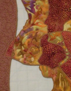
I like this quilt for the subject and the interesting way I have interpreted it, but haven’t been able to form any objective opinions. So let me pose some questions. What was your first impression? Did you recognize the subject at first glance, or did you do a double take when you saw the faces? Did you like it less before you realized the subject? I like it for the subject, but apart from the subject does the composition have any merit? Is the fragmenting of each face interesting or distracting? Any other comments or suggestions?
Challenge #3
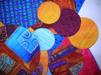


Challenge #3 (approx 16"x24")
I started this one thinking I would make a bunch of individual circles, quilt them, and somehow tie them together (no design drawn up ahead which is a real challenge for me). I did that (bottom photo), and although I liked the openings between the circles, I didn't like the overall effect of the piece (looked too "rectangular" to me). So, I decided to create a backdrop for the piece. As usual, when I try to do something simple I make it complicated. Anyway, I created the backdrop by fusing onto 2 layers of pellon, quilted it with metallic thread, and then completed the edge with satin stitch. I then added the original piece to the backdrop piece, leaving some of the overlaying edges free. In retrospect, I wish I had left more edges free, or maybe hand stitched them so they wouldn't "smoosh" down so much, but anyone who knows me knows I avoid hand work like the plague. Middle photo: end result; first photo: detail. I have not put the hanging sleeve on yet, as I'm still not sure which way I like it best; originally I thought I would hang it vertically. This was a lot of fun, but I definitely have trouble with the "fast" part of the challenges.
Brenda Jennings
Green is Good

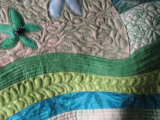
Green is Good
20" x 15"
Ecology in flag form.
I used a distorted rectangle shape for this piece resembling the American flag. Commerical and hand dyed cotton fabrics, curved piecing, fused applique, machine quilting with cotton thread, quilt edge is zigzag stitched twice around, a few glass beads added, then painted the back of the quilt with a glue/water solution and formed curves and let dry. I hung it using Command Strips (removable zelcro type picture hangers)
This was quick and fun. I'm not very political, so I was surprised this came out of me. I do care about the environment, recycling, global warming, etc. I guess that's what it's about!
I'm interested in your comments, suggestions, questions or just a hello!
Cynthia
Wednesday, November 29, 2006
Merry X-mas 2006
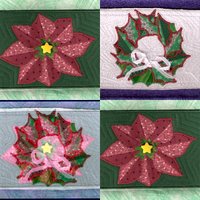
These are fabric postcards that I made earlier this week. Unfortunately, the 3-D cardholder that was supposed to be my challenge entry has had a fatal mishap, & it is
beyond repair for the time frame of the challenge. I'm just glad the rotary cutter made contact with my work, & not my fingers. It was to be hung on the wall & ready to hold the tiny works of art I will be receiving from 2 challenge swaps that I am participating in for X-mas.
I hope you like the cards I made, I have more that I painted, stenciled, stamped, & glitzed, but they aren't dry yet. The ones in the photo are machine satin stitched, & echo quilted. My construction & edge finishing skills have greatly improved since my 1st donation of cards to FAFC, & I really enjoy making them. Here's wishing you all a very Happy Holiday Season, & thanks for the kindness you have shown to me on this new adventure of non-traditional works.
Tuesday, November 28, 2006
No Bake Biscuits

This is a piece I've been thinking about for awhile . It is 18" x 16"
They are fabric biscuits attached to the green strips with beads.
To keep it hanging straight 1/4" dowels are sewn in the strips. The gold stars were added to give it a little pizzaz.
Poinsettia Wreath
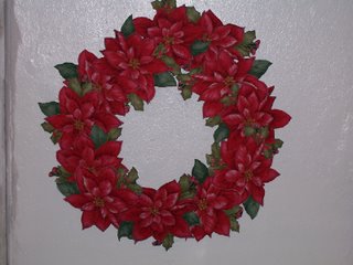
 This wreath is made of 8 fussy cut poinsettias which I quilted individually and zigzagged the edges..I then joined them in a circle and sewed them together where they overlapped. It is a 21" circle, it doesnt lay flat against the wall but bows out a bit, like an upside down bowl which adds shadows and "depth" to it. Hanging was easy, a little plastic ring at the top! I may still put gold beads in the middle areas and maybe some other Christmasy type embellishments and a bow for the bottom, but havent decided yet.
Sunday, November 26, 2006
Swamp Constellation

I have posted my completed piece Swamp Constellation measuring about 11 by 12 inches.
I'm taking a design class and am working on lily pads this month so figured I'd go ahead and use them for this challenge as well.
Each lily pad is sewn together with batting - then quilted with a dark green thread. They are attached by beads to represent the rhizomes. The entire piece is hung by a chop stick.
Over all interesting challenge - I wouldn't have actually thought to go this way. I debated on adding additional rhizomes but decided to keep the piece as is. I also considered letting it sit for a few days to see if anything else was needed - but figured I'd call it done and move on. I will keep in mind some more unique quilt shapes.
Lisa - In Seattle
Saturday, November 25, 2006
La Mariposa

approx. 18"x21"
This is my favorite challenge yet! I had a great time with this little quilt from the initial sketch to the last stitch in the sleeve. The wings of the butterfly are 3 separate quiltlets, composed of backing, 4 layers of aluminum foil, batting, and top. the back wings are hand dyed cotton, the front wings are my hand dyed silk. The pieces were all completed, then stitched to the body, which is velvet with gold metallic lined with batting, then rolled around a core of aluminum foil twisted for extra strength. I then stitched it and wrapped a metal cording around it to create segments. The foil made it easy to shape and hold it's shape. The antennae are Swarovski crystals strung on wire.
It has a sleeve made from 2" wide ribbon across the middle of the wings, allowing the wings to remain mostly free of each other, and the foil keeps the wings upright with no sagging.
I would love any comments, suggestions, questions etc.
Cherie in Del Mar
CHALLENGE #3
Challenge Hostess – Gena Flatley
Theme - Maker’s Choice for color, fabric, and theme
Design Element – Non-traditional shape or odd-shaped quilt
Design and complete a small work that is a “non-traditional shape” or odd-shape quilt. The interpretations for this element are unlimited. The quilt might be round, oval or hexagonal, for example. It might be a rectangle that has out-jutting parts, or a square quilt that has the center cut out. Or a long snake of a piece, 6 inches x 6 feet, or a free-standing sculptural quilt. Or several separate quilts attached together some way. Another interpretation might be a quilt with a large 3-D shape attached to it (think pregnant belly protrusion, or Mick Jagger sticking his tongue out). The quilt might be many parts hung together with some type of scaffolding system.
Due - Saturday, Noon EST, 2 Dec 06.
One final requirement - HAVE FUN WITH THIS!
Friday, November 24, 2006
Jabberwock
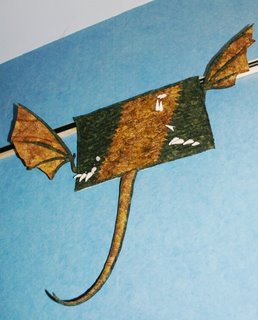
Better late than never apparently, here is my offering. It did take a lot longer than I expected and it has been a very difficult month, so I am just glad to have it done at all. The texture is in the scales. All the side scales are individual pieces fused to the wadding then held in place permanently by the quilting. The quilting I did on the longarm flicking the overlapping scales out of my way as I went. I loved doing the quilting because it went quickly and I could see the texture building as I went. The binding is also made of many single scales overlapping.
The first part I made was the tail. It's curve is entirely due to being cut on the bias and then stretched as I stuffed it. The stuffing was inherited and so very important to me. It was great when people visited and picked up the tail, they were all keen to see the rest of the beast. The time consuming part was the wings. Stitching turning and stuffing the bones took over 5 hours per wing. I hadn't appreciated how fiddly they were going to be. To give you an idea of scale the rectangular part is about A3, twice journal size.
My idea was to show how the brain fills in details you can no longer see. The rectangle is what you can really see, just up close scales, but you know there were teeth, claws, tail and wings in there somewhere. For me this is a very abstract piece, but as I had so much fun with it I bet I will try more abstract pieces in future. There are more pictures and words on my blog.
Vorpality

23½" x 20" Satin, polyester, cotton, Angelina fiber
This poem happens to be a favorite of mine, memorized long ago; I was thrilled to dive into this project! I chose the phrase "vorpal sword", the weapon which the hero used to slay the Jabberwock. The sword itself is made from Angelina® fiber, and when my husband asked what the colorful swirling of dots around the sword was, my answer was the "vorpality" of the sword, hence the name of this piece.
I modeled the hand after my own, and finally found a use for the silver-swirled blue fabric as the cuff. Black satin frames the picture, with black tassels hanging from the corners, a bit of pewter Lumiere® paint emerging as a brillig touch for Jabberwock blood!
Friday, November 10, 2006
Mimsy Borogroves and Co.
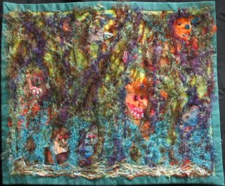
I tried to give the idea that it was a child's drawing of the experience. It needed to be much bigger than 8 1/2 x 11 inches, so it is more like 20 x 16 1/2. I don't normally work that big.
The background was a hand-dyed piece from Val Bennett, that was green and yellow, the yellow having 3 mandelas. I quilted it first, which I seldom do. This piece was quilted in a sort of child's picture of yellow daisy-like flowers in the grass. This set the scene even though the forest covers it. Sort of like the bit of the story when Alice is small, so it is a bit like "honey I shrunk the kids".
I used strange yarns to make a scary forest. They were made by sandwiching between layers of water soluble. But the creatures are also mixed in. They are cut from a hand dyed piece that is sort of an art cloth from Marion Barnett. I saw the koala and the wombat shaped creatures(on the right) in the cloth, and so started looking for other shapes that could be the other creatures. So, they were layered in with the yarns as if they were peeking between the branches. I stitched vine patterns from my machine using several colours, to hold it all together. It took me 3 goes to wash out the soluble, and finally I put the piece in the drier to get the fluffy feel back to the yarn. The creatures all have raw edges.
I laid this forest piece down on the background pinned it in place and then set up the faces for the creatures. They were a bit too nice, but when I started trying to work out how to do the faces with semiprecious stone chips, they got rather scary. I could tell when they were just right, because they just made you say ROAR with a big feral grin! After I sewed the face features on, I did the binding, and sleeve, before I caught down the rest of the forest layer with beads. The reason I did this, was that I wanted the forest to sort of come out of the picture by overflowing the border. you can only really see the beads when it is close, as they catch the light, but they are similar colours to the background and some of the creatures, and thus serve to pull all the colours together.
So this all was quite a bit different to how I usually work...the quilting, the binding/sleeve bit, the size, and even using all those yarns. I think it is a bit fuzzy, but I think I managed to get the look and feel that I wanted. I haven't got a clue what I will do with it, but it has been an interesting experiment.
Sandy
Tuesday, November 07, 2006
Who Shall Slay The King?
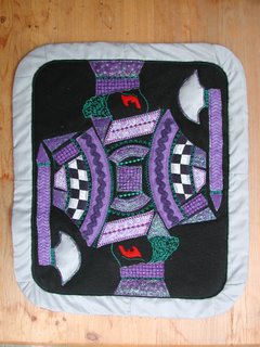
18.5" x 21.5"
Techniques include trapunto, fusing, machine piecing, applique and quilting, pillowcase-style finish
I chose purple and black as base colors because I think of the poem as dark and as taking place in Medieval times which I equate to kings, castles, and royalty. The choice to depict a playing card comes partially from Alice in Wonderland and partially as a means to draw a king. I have made my king the Jabberwock himself. He carries a silver hatchet, (the blade is trapunto) as either to slay or be slain. Texture is incorporated by the use of glitter paint, chenille rick-rack, and felt. Each section was glue-tacked to the black and then machine appliqued using numerous decorative stitches. Even more stitches were added with green thread serving double duty as decor and quilting. Disclaimer: Any political associations derived by the reader assuming the ruler of our country is depicted as evil are purely coincidental and cannot be attributed to the artist. Thanks.
Tove Dance
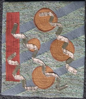 10 x 11.5
I was trying to create the sort of evening/melancholy mood I get from the poem, using the images from the first two lines. When I thought about the use of various textures, the burlap for the tove holes seemed logical. Finding something "slithy" for the toves was more difficult. This is sort of an organza, with metal threads, folded over on itself to make it more opaque. It's not quite as shiny as the picture, more of a gray/green slithery look. I used fabric markers on the background fabric to give it a darker look.
The hard part of abstract for me is knowing how concrete to be in showing what I'm trying to represent. I have "gimlet" holes, corkscrew toves, long evening shadows and a column that's supposed to represent the sundial. Should any of these have been more/less realistic?
Will appreciate any and all comments.
Sunday, November 05, 2006
Jubjub Bird in the Tumtum Tree


19 3/4"w x 17 1/2"l
Made from cottons (some with touch of copper or gold. Quilted with copper thread, black & copper thread, and invisible thread. Two beads for the eye.
I realize that this is NOT necesssarily abstract---but---the poetry had its way with me and told me what to do. I just couldn't help it. I love the sound of non-sensical verse. The piece seemed to just flow together. I wish the poetry could have helped me with the quilting---I thought I'd never finish. There must be a mile or more of thread there.
Mimsical
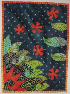 I learned my lesson on the first challenge and deliberately worked small this time (9 x 12, shrank down to 8 5/8 x 11 5/8 inches from all the quilting). When I began I had just finished "slaying" my DD's halloween costume, and this piece was meant to be in celebration of that accomplishment. I wanted it to be all happiness and light, ala Disney's version of Alice in Wonderland (just returned from a trip to Disneyland last week, so my head was full of bright, whimsical imagery).
As you can see, however, the fabrics I ended up choosing are anything but bright and cheery. I was rather surprised by how dark and menacing it came out. I don't usually work that way. I guess I've been more stressed out than I realized. I forgot the part about the textural element, and was relieved that my choices turned out to be very textural-looking patterns. That meant I didn't have to add anything more and could finish on time.
There is no special meaning to my images. I started with the dark curvy part at the bottom left. It is supposed to be a stylized sea. The orange and green parts are flowers and leaves in reference to the tree that was mentioned. Everything else in the poem I ignored, except the slaying part mentioned earlier.
Free-motion quilting finally clicked for me. When I pay attention to the rhythm of of the machine, kind of a tick-tock where the feed dogs would usually move the fabric forward, I move the fabric along with it. Fast or slow, this turns out right. The moment my mind starts wandering is when the stitching goes awry. I was very pleased with the jerky nature of the quilting around the appliques. It seemed to fit the mood of the piece, although would not go well in everything I do.
The binding is fused and machine stitched, 1/2 inch strips folded in half and ironed down to make approximately 1/4 inch binding. The mitering is cut. I did not sew or fold the miters.
I am anxious to hear any and all comments and critiques about the design, workmanship, what the imagery reminds you of, etc. I love to hear new viewpoints that I'd never thought of and you won't hurt my feelings in the least.
No matter how many times I tried to upload the detail image, I couldn't do it, so here is the Yahoo link to it: http://ph.groups.yahoo.com/group/fastfridayfabricchallenge/photos/view/9f0f?b=54.
Saturday, November 04, 2006
Beneath the Tumtum Tree
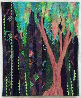
The Tumtum tree is a pleasant place in or near the tulgey wood where you can rest a bit while you contemplate facing your fears. And so I have contrasted the Tumtum tree with the dark tulgey wood. I was going for a fairytale likeness when choosing my colors.
I was going to depict the Jabberwock with curvey bits of a serpent like creature with prairie point scales partially visible through the trees, but this wasn’t possible with a small scale. The prairie points stayed to allude to the Jabberwock, and I decided rick rack would compliment them on a smaller scale.

Friday, November 03, 2006
Jaws and Claws
This is my challenge 2 piece "Jaws and Claws" inspired by the lines in the Jabberwocky poem. It measures 15 x 12.5 inches. Techniques used were foundation paper piecing, bobbin work with Razzle Dazzle, sheer fabric overlay, heavy quilting to define certain areas, and couching yarn. The "binding" is also couched yarn. This was a stretch for me, interpreting a poem into abstract, but a good learning lesson. I made several other sketches that I might develop in the future. Feedback is welcome!
--Elizabeth in NM
Beware the Jabberwock!

My piece is 16" x 22". Nothing really tricky (unless you call using 30+different fabrics) tricky. Bleeding on the fabric was unintentional butit added to the mood.


