Taking into serious consideration the critiquing of these works, I decided to do what I could with my coleus today to see if I couldn't get a little more ' Chiaroscuro' happening. Auditioning AGAIN in Photoshop I can see a bigger difference compared to the one below.... it is now faced, and having done that, I agree...I sure would appreciate any comments on this one, if you have the time...
 |
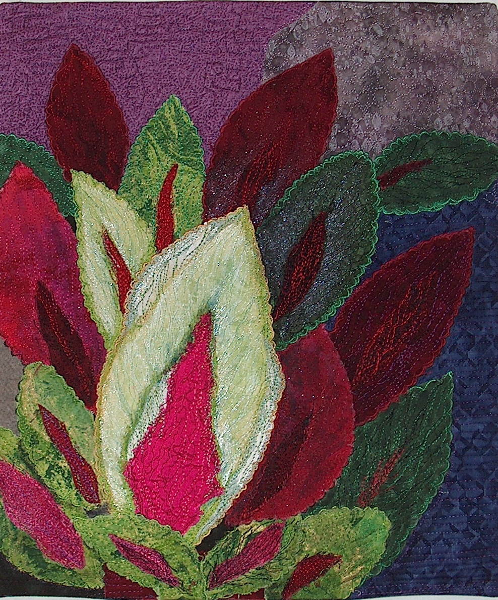
| Coleus |
I struggle with contrast... and the word, together with the links that directed us to work, seemed to me that some part should be quite light, so I hope I have achieved this. I used 16 different fabrics, including 2 dupioni silk, I loved the fraying for the center coloration of the main leaf. I used 10 different threads for the thread-painting. It measure 15 x 13..... but I may crop it to a 12 x 12.
[click on the photo for a larger view]
I think I will put a 3/16" binding on it. I thought of facing it, but because it is so bold, it seems, to me.. to need a sense of confinement..... your thoughts?
I encourage any and all comments.


9 comments:
Hi Carol, I like what you've done with this. I wouldn't put a binding on the piece. Since this piece is a part of nature I feel the binding would close it in too much. Just my opinion.
Marilyn in SC
HiCarole, This is lovely...good job! The idea is to use very light next to very dark to get the dramatic effect. I think you mostly achieved that with your light green next to the dark red. I would face it also rather than bind it ...let that boldness shine!
Cynthia
No binding. I like the openness of it just faced. Good quilting. It really enhances the piece.
Pat Havey
Hi Carol,
This is lovely piece. I see a great study in complementary colors but don't see a dramatic light/dark contrast. When I desaturated this in Photoshop I see mostly mid-tones, with dark primarily on the lower right side. The light touches on the large leaf are essentially surrounded by mid tones so they don't give as dramatic a contrast as they might if they were juxtaposed with the darker shapes. But it is still a lovely piece.
I agree, your stitching is wonderful. I also think facing it is a good suggestion since they eye wants to follow the leaves off the quilt.
Wow, Carole, whatever you did certainly made the coleus pop. Did you use thread to increase the contrast? Would love for you to fill us in on your process.
I teach a class called Art Quilts 101: Strong Compositions. One of the recurring issues that comes up is contrast within a quilt. I have noticed that the fabrics students bring to the class (their favorites of course) are almost exclusively in the mid-range. They are the prettiest fabrics and that is what the quilt shops stock the most of because it is eye candy. It can be a challenge to have a full range of gradations in any color. Using thread, tulle or tulle overlays, paint, etc. can help.
Your pieces is wonderful. It catches the magic of the garden and I'm so glad you decided to face it rather than bind it.
Your thread work as added an extra dimension that wasn't there. Great use of complimentary colors. This piece is well done.
Hi again, Yes, with whatever you did, you did improve the contrast and the piece is definitely more dramatic. Great job!
Cynthia
WOW!! What a difference that made to the piece. I hope you face it so there is no distraction to the piece.
Hi Carole,
I like the balance of rich reds and greens.
Also really like edgings you put around each leaf. Nice touch.
You might tack an edging to this just to see how you like it. I think it looks fine as-is but you wont know until you try.
Post a Comment