Wednesday, February 28, 2007

Blue Moon


A challenge that I managed to get done on time. I am so thrilled. As soon as I I started reading the challenge I knew what I wanted to do. I have been planning a moon (in fact several) for over a year, and this seemed the perfect time to get started. I feel my choice of song might be a little cheesy but who cares. I have really enjoyed working on this.

I used to be an Astrophysicist so images of moons and planets are pretty inspiring. They are all so different and beautiful. This has 4 shades of blue fabric to make the moon and a very dark blue as the background. My accent colour, if you can call it that, is the black binding. It doesn't show up too well in the picture but in real life it sets it off nicely. The quilting is done with three shades of thread. I love using the very fine thread on the longarm as I can change colour just by tying on and pulling the thread through, even through the needle!

There are bigger pictures on my blog if you want to see more detail.

Tuesday, February 27, 2007

Blue Moon

14" x 10"

"Blue moon,
You saw me standing alone
Without a dream in my heart
Without a love on my own. . ."

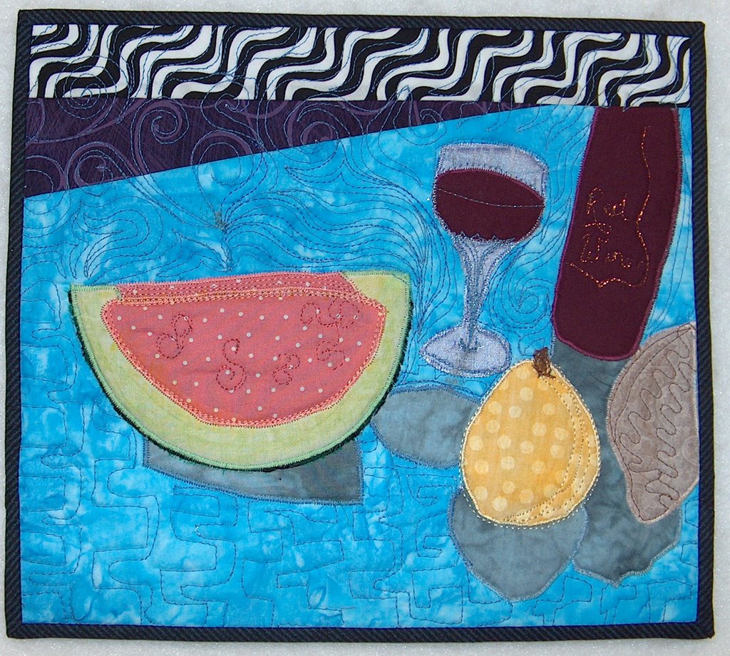
My initial thought was to do branches across a full moon. I have tossed that idea in favor of continuing the vases series. I think this will also be more interesting as it’s not the first image that comes to mind with the song. I began with a sketch, and tried to keep the spontaneous look that I achieved with Vases III. The table seemed the wrong color, so I added transparent fabric paint to the table and shadow.

Monday, February 26, 2007

Blue Swans of winter


I did this from the Goldenboy Blue Swans Orchestra.

I only used blue....
very small complementary.
Not sure I got the shading of the reflection in the water quilte the right hue. Worked on paper, but now that it is finished it looks a little too strong. Also the stream behing the moving bird is quite definite. I may use some paint to lighten it up.
Critiques and suggestions alays welcome. It is how I learn.
Carole

Deep Purple


When the deep purple falls over sleepy garden walls
And the stars begin to twinkle in the sky...
I had such fun making this little quilt. I really only had a vague idea of what direction I was going, but the quilt took over and dictated to me as we went along...LOL
As always, I welcome your comments and critiques. I always learn so much from all of you...
Cherie

Sunday, February 25, 2007

Tie A Yellow Ribbon Round the Old Oak Tree


If you read the messages you know I'm not happy about the way the picture washed out most of the yellows. Also I feel there should be something more but I don't know what.

Friday, February 23, 2007

Blue Christmas


My song is by Elvis..
Satin for the curtains, gold lame for the tree garland and gift ribbon, navy flannel for window panes. Not sure if I am happy with this yet, so haven't "fine tuned" or quilted it yet. The gold would be my accent color but I took a little "poetic license" and added the wreath over the window.

Purple Haze by Jimmy Hendrix


This is my Purple Haze quilt based on the song by Jimmy Hendrix. The song is about how he is in a purple haze because of a woman - so i did the woman in purples, and the background is a really dark purple. My accent is my fave shade of blue - to outline her curves. Machine quilted. Critique welcome!
Tina Marie Rey
tmrey@echoes.net

Challenge #6 ~ Monochromatic Color Study

Challenge #6 - Friday, February 23 2007 - Due Saturday, March 3rd

Hostess - Cherie Brown

Theme - Monochromatic Color Study

Design Element- Create dimension using one main color, and one accent color
Accent color is defined as 10% or less of the quilt.


Choose a song with a color in the title or the lyrics (such as “The Yellow Rose of Texas”).

Using that color / song as your inspiration, design your quilt using various shades, hues, values, tints and tones as your emphasis. You may use one complimentary or analogous color as an accent.

You may use any techniques, mediums etc. desired.

Design may be representational or abstract.


Discussion- The following is included for informational purposes only:

Monochromatic Color: One color used in varied values and intensities
The primary key to successful monochromatic quilts is value contrast.


The following web sites have some good examples of monochromatic color studies:

http://www.twistedtreephoto.com/light%20and%20color%201.html

http://www.worqx.com/color/studies.htm

http://www.brigantine.atlnet.org/GigapaletteGALLERY/websites/ARTiculationFinal/MainPages/ColorMain.htm

http://daphne.palomar.edu/design/color.html

Suggested song titles:
Mellow Yellow Yellow Polka Dot Bikini
Blue Moon Whiter Shade of Pale
Greensleeves Blue Velvet
Goldfinger Old Black Magic
Ebony and Ivory Raining Violets
Flying Purple People Eater Lavender Blue Dilly Dilly
Lady in Red Deep Purple
Red Roses for a Blue Lady White Christmas
Yellow Submarine Beautiful Brown Eyes

Wednesday, February 21, 2007

Vases III


14 x 9

I have jumped way out of my comfort zone and created the abstract version of “Vases”. Haven’t decided yet, if I have jumped in the right direction, but it was fun working this way. It could be a style worth exploring. What do you think?

Saturday, February 17, 2007

Vases II

15 x 10

I made Vases II to try some different techniques, and to challenge myself to free-hand cutting without marking or templates. I used Setacolor fabric paints to do the shading on the vases, and edge stitched with embroidery floss.

The shading is giving dimension, while the edge stitching is making it look flat, and I don’t think the two work well together. I like the effect I got in the background by combining both hand and machine stitching.

I don't know about the color of that left vase. It kind of disappears into the background.

Wednesday, February 07, 2007

Vases


10 x 15, fused appliqué.

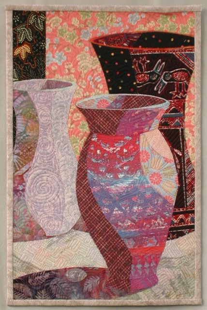
I turned a photo of my still life set-up into a greyscale image so I could concentrate on value instead of color. I was disappointed that the shading didn’t show up good in my photo. Too many reflections that I didn’t want to deal with. So the shading on each vase was done intuitively.

Choosing the fabrics was great fun. I completed the vases one at a time and chose fabrics as I went. I began with the red and purple batik which has been in my stash just about forever. I had no idea what the color scheme would be until I was done. I chose the shadow fabric, because it had some dark areas and I needed the dark lower corner to balance the dark vase on the right.


I was originally planning to crop the top a couple of inches lower, but the dark vase didn’t look like a vase. So I added more background fabric on top, and put a top on the vase.

Do you see the birds on the vase? One looks like he’s looking into the front vase. He was a happy accident.

I might have to try this again and try to more closely interpret the colors and reflections in the photo. I might posterize my photo for a guide, like many of you did for your quilts.

Tuesday, February 06, 2007

Sunflowers


10" x 12"

I didn't think I would have time to participate this month...but in the middle of the night I remembered I had started a still life of sunflowers in a vase some time ago. I immediately got up, found it and cropped it within an inch of its life. Great fun! A little thread painting for shadows and some quilting the next day and it was done.

Monday, February 05, 2007

Dinner at Nine

This piece measures 10 1/4 x 11 1/2.
I used a photo to be guided by.

I am looking forward to any comments.
Carole

Maters & Peppers


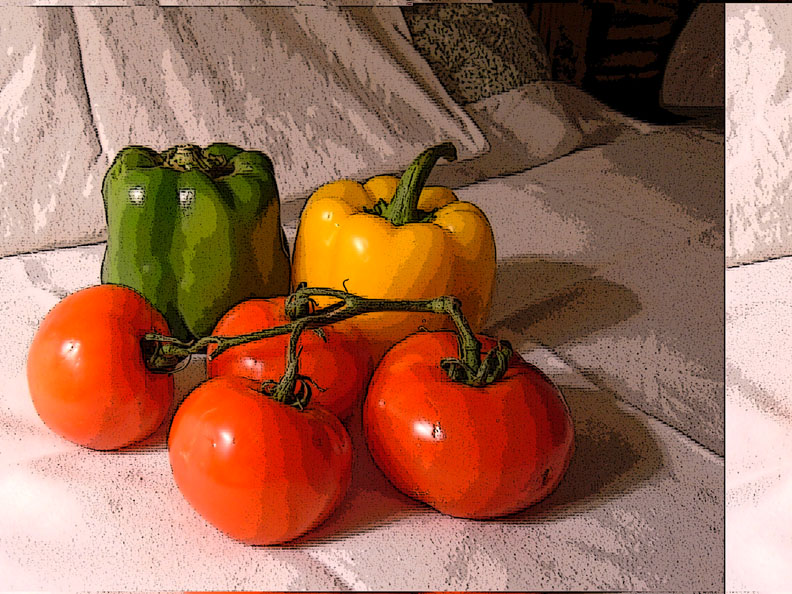
The first image is the posterized digital pic of my piece. The finished work is the other one. All comments appreciated. Sorry about the earlier problem - it seems that the problem may be with my other ISP.

Finished and only a day late. Maters & Peppers measures 10.5x7'5" and is raw edge fabric under a layer of illusion with minimal quilting (outlines of fruit and indentations in the peppers).

This was actually my second attempt at this piece. The original version had some design flaws and wasn't working well, so at noon yesterday, I decided to make another complete version. I'll keep the other one to use as a "what not to do" reference for the future.

The vines on my piece are heavy twine. The shadows are fused chiffon, which allowed the woodgrain table to show through. It's 1/2" shorter than I planned due to an ironing mishap (Note to self: irons and illusion do NOT mix). The entire piece was pillowcased and turned so that binding would not be needed. It will probably go in a frame under glass similar to Rhonda's coffee cup.

This was definitely a shift in style for me, and a challenge to complete.

A Bowl of Flowers


I tried creating dimension by depicting a corner, as where a hall might lead off from a room, and made the shape and shading to indicate that turn-off. The material for the flowers were scraps that I was given during a recent stay in a Mayan village in Belize; I later found one more piece that I had cut to fill part of the upper right of the arrangement, but since the whole piece is already mounted on foamcore, I will leave it off. I did think of maybe making a backing for it, stiff enough so I could tack it on so it would come out of the picture a bit.

Going with the directive to crop the picture, I originally had some of the flowers at the top and left being cut off by the border, and that just felt wrong. So the background gets cropped; I'd rather violate one of the guidelines than the integrity of the piece.

Sunday, February 04, 2007

Brenda's Still Life


I decided to redo a still life I did for my September journal of some pots up above my foyer. I tried to add shading to the pots with Neocolor II pastels (worked better on some than others), and then by thread painting. The yellow wall is shaded with a layer of gold tulle. I admit I misunderstood the guidelines about cropping on three sides (a case of jumping in before carefully studying the rules:), so I really only cropped the right side slightly. I'm also not totally thrilled with the way I have the fabric coming out of the pot, but I'm not sure I want to rip out the stitching and try to fix it either. This was a great challenge! Now that I've seen what everyone has done with the cropping technique, I plan to try this again.

A penny for a spool of thread I


9.5"x9.5"

I had fun bringing out all my old black and white prints. I especially liked the part about the cropping; it was a challenge at first, but I will be sure to explore closely cropped images again. I like the way it gives a little sense of mystery. My original intentions were to make the still life more abstract, but in the end I decided realistic would be quicker since I wouldn't have to do so much trial and error to get the shapes, shadows, and everything right. A bad batch of Wonder Under caused the pieces to start falling apart, so I called it done at one border. The applique is raw edge, my first time not completely covering all the edges. I don't want to add a sleeve because that would cover up the picture (the border's only 3/4"). Any suggestions on how to hang it? If you want to see the top before the quilting, it's here on my blog.

Saturday, February 03, 2007

Time to Mend


7 1/4" x 6 7/8"

cottons, tissue lame, wrong side of satin
cotton/rayon/metallic thread

This is definitely the smallest quilt I've ever done! Also this was the most difficult challenge so far for me to do. I have quite limited experience with drawing; I chose some difficult ffabrics to work with; this was my first attempt at building a picture with Wonder-Undered pieces onto a pattern; and my first cropping. The edges are finished with satin stitch.

I certainly learned a lot and am happy with the results.

Sally Field

Friday, February 02, 2007

Dreaming of Summer


This was fun, I have been wanting to try a mug of beer for awhile and this was the perfect opportunity. I used a real silk flower, and a piece of plaid fabric folded and draped to resemble the napkin. The beer mug is yellow fabric with iron on vinyl on it, the vinyl also covers and inch or so of the head, the rest of the head is poly fiberfill attached on top of the vinyl, covered with tulle and free motioned over. I added some highlights to the mug and the table near the napkin with fabric crayons. I couldn't think of a way to make the drops on the mug...well I thought of using drops of super glue or clear nail polis but dont have either...any suggestions to make my mug look frosty?

Thursday, February 01, 2007

Still Life - revised


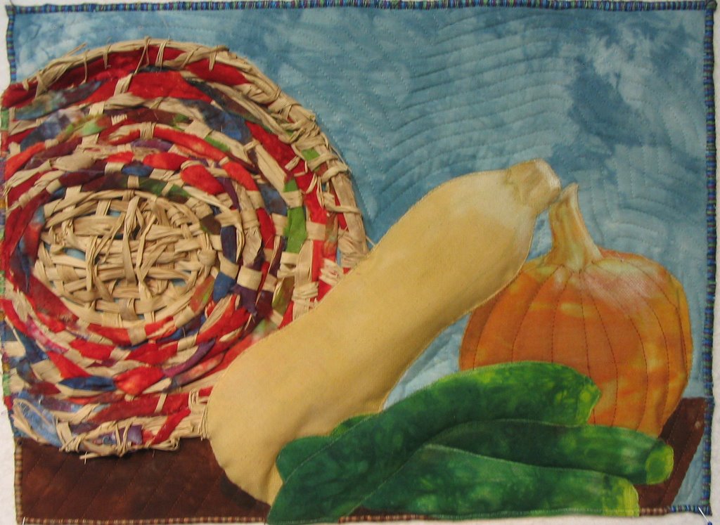
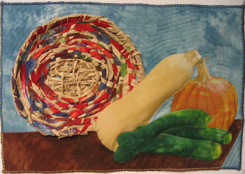
You people are awesome! I absolutely see what you mean, and I hope this is better, because the pieces are whacked!..LOL I really do like it better this way, but now my problem is keeping the left edge straight. The basket is just too unruly and wants to bulge! I will probably frame this piece, so that shouldn't be a big problem.

So...what do you think...did I get it right this time? I am learning so much from you pros.......

Still Life


I posed the veggies with a basket and took a photo to work from. I wove the basket using raffia and strips of fabric twisted together. The veggies were all stuffed trapunto style before the quilting was done. I used my hand dyed fabrics augmented with Prismacolor pencils to add shadows and contours.
I wasn't really sure what was meant by 'crop three sides'. Did I get it right?

I would love your great suggestions...

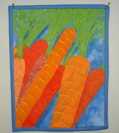
Carrot Soup


That hardest part was thinking of a subject. I had set up the still life ages ago and took some photos. I used a crop photo to work from. I did a blue background to complement the orange carrots - if I redid it I would have used a different background. I used pastels for shadows - which would have been better had the background been lighter. Yarn for the leaf tops couched down at random. Quilting on the carrots to add some dimension.

Finished size 8 1/2 x 11.

This by far ranks as the hardest challenge - a little too realistic. I think I'd like to go back and do an abstract still life. Good to think of shading next time I would have looked at my pastels before I picked the fabric. I used only what is on hand - scraps only.

Lisa - In Sunny Seattle

Breakfast Table Still Life


8 X 10
Raw edge applique
Shiva Paintstiks
Free motion quilting

This challenge was fun. The hardest part was deciding what items were going into my picture. I finally gave up and photographed what was already sitting on the breakfast table. I enjoyed using the Paintstiks except I forgot they had to dry for a while and made the mistake of pressing the little quilt. Just a bit of a mess. I also want to announce that I finished the edges with a satin stitch - I always put on a tidy little binding so wah hah I've gone wild.

Any comments or suggestions you share will be appreciated. Thanks, Roberta

Tuesday, January 30, 2007

Tina's Cropped Still Life


This is my cropped still life. I used all commercial fabrics, but to get the shadowing I used neocolor II watercolor crayons. I think it worked great! I also used a zig zag stitch around the edge to catch a brown and green yarn for some interest instead of a traditional binding. Would love comments. tmrey@echoes.net

Tina
:-)

Sunday, January 28, 2007

Justa Cuppa


The shading and color shifts of the coffee cup were done by fussy cutting a single piece of commercial hand-dyed/tie-dyed looking stuff. The background is a second piece of fabric. I used a fabric collage technique with a layer of purple tulle over it. There are approximately 25+ individual pieces of fabric for the collage and it is quilted along the lines of the cup and saucer. The quilt itself is 5.5x8 and the green backing (not a part of the quilt) and frame are 8.5x11.

Threads and Stuff

I don't know what to say except this was fun. I love these challenges. They make me do things I would never think about or get around to doing otherwise. I took a picture and went from there.

This was fused and machine appliqued and quilted with invisibile thread. The size is 22-3/4" x 12-3/4".

Challenge #5 ~ Cropped Still Life

Challenge # 5 – Friday, 26 January 2007

Challenge # 5 Hostess – Linda Cline

Theme – Cropped Still Life

Design Element – Form (adding the illusion of dimension to flat shapes)

--- Design and complete a small work based on a still life. Subject matter is your choice. You may work very straightforwardly and realistically, or you may interpret your still life in a more abstract manner. Don’t forget to pay attention to form if you choose to work more abstractly.

--- Crop your composition so at least three sides of your still life extend to the border or edge of your quilt. You may count cropping a shadow as one of the sides that have been cropped (shadows are part of your composition).

--- Give attention to light and shadow, so you can make the objects in your still life look dimensional. Shade objects and create cast shadows using whatever method you would like.

Discussion - The following is included for informational purposes only:

You may create a typical still life of fruit or flowers. Or you may create something with less traditional objects. Gather up anything you have lying about. Or “find” a still life (a pile of books, the dishes in your cupboard, abandoned flower pots. . .). Objects depicted in quilts are often very flat looking. This challenge will help us put the illusion of dimension into our quilts. I'm sure we will come up with a wonderful variety of ways to accomplish this. You could construct each object from multiple shades of a similar color fabric. Or you could cut each object from one fabric, and use paint or other surface design technique to shade your objects. Don’t forget cast shadows. They will “ground” your objects so they don’t appear to float. Make your shadows as interesting as the rest of your composition.

Cropping our still lifes will force us to think about the best placement of objects in our quilt. I like what Pamela Allen expressed about cropping in her November 1st email to this group: “. . . exactly what I urge students to do instead of trying to confine the image inside the rectangle. There's life OUTSIDE too and the viewer's eyes go there! . . .” Preliminary sketches or digital photos will let you experiment with various compositions before beginning.

Some suggestions for setting up a still life: http://drawsketch.about.com/cs/howtoindex/ht/still_life.htm

A discussion of cast shadows and form shadows: http://painting.about.com/cs/paintingknowhow/a/shadows.htm

An article about finding form:
http://www.painterskeys.com/clickbacks/finding-form.asp

More than a few examples of quilt artists who create still lifes, but each artist approaches the subject her own unique way. Take whatever inspiration you want from any of these examples:

Lisabeth Gutierrez:
http://www.lisabethgutierrez.com/StillLife.htm
Lisabeth outlines objects in her quilts with dark fabric. I’m sure I have read somewhere that outlining things will make them appear flat. But Lisabeth seems to have outlines and dimension at the same time.

Terry Grant:
http://andsewitgoes.blogspot.com/ (blog)
http://the-portfolio.blogspot.com/ (portfolio)
Terry is another artist who uses outlines with success. She has a tutorial on her blog that shows how she uses colored pencil to add dimension to her shapes. http://andsewitgoes.blogspot.com/2006/04/my-fusing-method.html

Ellen Lindner:
http://www.adventurequilts.com
Ellen has still lifes in her “Pictorial” gallery. Be sure to look at how she made her apple quilt on this page http://www.adventurequilts.com/making_of_apple_still_life.htm.

Velda Newman:
http://www.veldanewman.com/gallery.html
Now these quilts are really “HUGE” but the same look could translate well small also. She has shown detail shots in her thumbnails that are wonderful compositions in themselves, and are good examples of cropping. But her designs go all the way to the edge even on the large quilts.

Alice Beasley
http://www.alicebeasley.com/stilllifes.html
These look good enough to eat.

Barbara Barrick McKie
http://mckieart.com/Pages/thumnail_pgs/Still_Life_Series.html
Silk painting and disperse dyed polyester.

Dominie Nash
http://www.dominienash.com/stills.html
Much looser style than the other examples, but just as wonderful. Some are very abstract.

Due - Saturday, Noon EST, 3 February 2007

Monday, January 15, 2007

The Party Field at Bag End


This was taken from photos that I took when we went to the filming site for the Hobbitton scenes in the Fellowship of the Ring in Matamata, New Zealand last March. The large tree, seen from a helicopter, was the reason for Peter Jackson to select this area for the site. When filming was over, the crew began to dismantle the hobbit holes and the rest of the set, but a deluge of rain prevented that, and the owner realized what a wonderful tourist site this would be! This tree is different from the tree that is actually there, which is also different from Tolkien's description in the book, but it feels right to me!

The fabric for the grass, sky and pond are color variants of the same pattern, although that is not obvious in this picture. The fabric for the foliage in the front was actually made and purchased in New Zealand. I bleached the black cloth for the window leading to a dark mottled brown.

Sunday, January 14, 2007

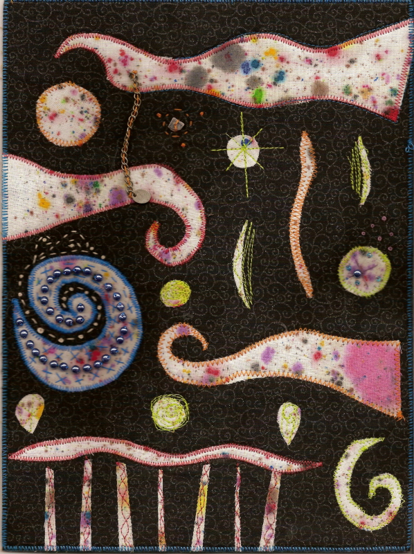
No Possibility


Size: 10 1/4" x 7 3/4"

Inspiration: "There was no possibility of taking a walk that day." The first line to Jane Eyre by Charlotte Bronte.

Artist's Statement: I originally posted this without my statement, but I do think one is needed. I chose the line because due to undiagnosed health issues, there are days I can not walk. (The doctors are running all kinds of tests to figure out why though) My quilt represents many things to me...

Spirals- dizzy spells
Cloud like shapes- confusion
The orbs- floaters in my vision
The stick- a cane which I may have to use one day
The blue orb- the light I see before I have seizures
The railing is what I must hold on to to walk a lot of days

So this quilt is abstract, but is symbolic of my health struggles.

Thank you for all the comments on my quilt thus far! It is wonderful to get feedback from other fiber artist so that I may grow as an artist as well.

Tuesday, January 09, 2007

The Green Sea


This is a reference book titled "Maya Cosmos: Three Thousand Years on the Shaman's Path" by David Freidel, Linda Schele, & Joy Parker. The 1st line reads, "The plains of Yaxuna in northern Yukatan are usually covered with a green sea of waving maize plants and waist-high grasses in the month of July."
It measures 9 x11-1/2, & is constructed with commercial cottons. The background & 2 of the borders were machine pieced diamonds from a bolt end with many different degrees of pattern & color & lack thereof. All of the greens are fused & zig-zagged. I added 2 different dark borders, one to contrast, & the other to ground the piece. The Shaman figure was also fused & raw edge appliqued. I found the placement looked best in the lower left & appears to be looking out at the vast expanse of the plains. It was first machine quilted in a diamond grid with clear nylon, & then over quilted in gentle waves in variegated green to create the motion of the sea of green crops. I did enjoy this challenge, & was grateful to use a book that I had not read before, so it would not influence the outcome of the piece itself. Now to read it, & see what I could have done differently. I still think it's missing a little something.

Shadows


The first line in James Reese horror book the book of shadows is: I vividly remember my mothers blood. I was hooked after reading that line and read all 468 pages in one weekend. would love critique. No, it is not embellished. Didnt need it, or at least it didnt ask for any.
tmrey@echoes.net

Monday, January 08, 2007

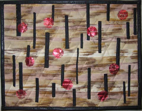
The desert was cruel and hard and dry


My quilt is titled "The desert was cruel and hard and dry...."
the sentence continues "...and these were the people of the desert."
It's from Jews: The Story of the People by Howard Fast, a marvelous chronicle of Jews, their impact on our world and the start of Christianity. It's not a religious book, but a fascinating story.
Of course, my quilt is an abstract interpretation. The background is strip pieced and the shadows of the dunes are made with Shiva paintsticks. I used a photo of the Nevada desert taken by my husband for the idea. The vertical strips are the people, black to show them as in our past. The quilting includes stars of David. The red circles are up to your interpretation.
Now I have to admit that this isn't necessarily my favorite book (I read about 5 a week so it is too hard to have a favorite) but this book did have an impact on me. My husband and I listened to an audio version while traveling many years ago and we still recall it from time to time. While not being Jewish, we found the book a great read and feel richer for having read it.

Marlene

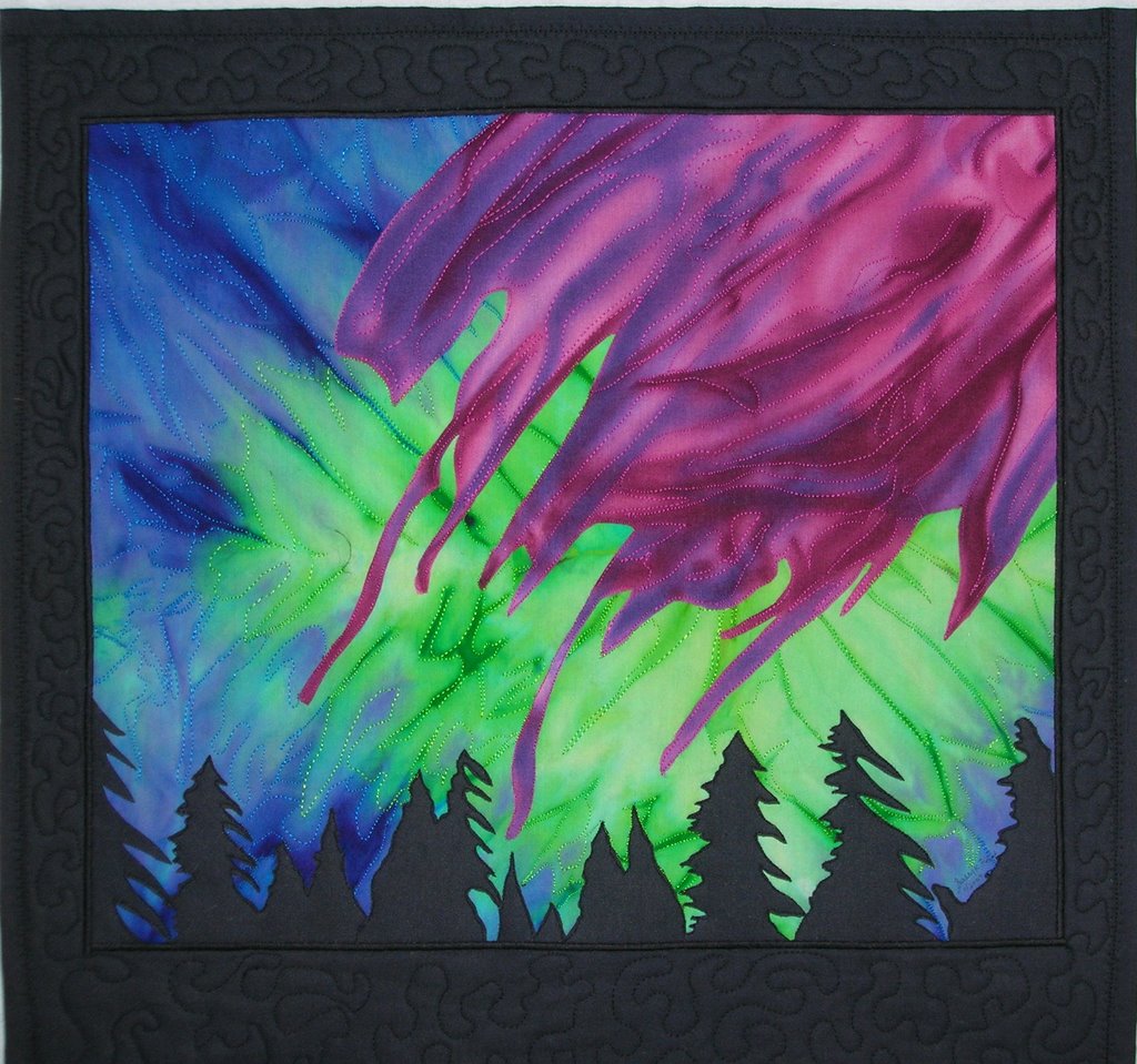
Northern Lights


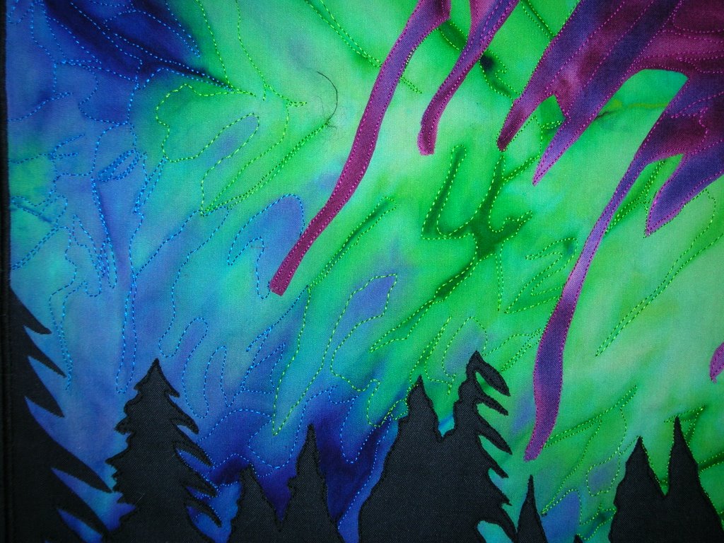
After much searching for a line to use, I chose the last line from Julian May's "Conqueror's Moon". "Bright shimmering curtains, thrusting lances, and slow explosions of red and green and golden radiance stretched from horizon to horizon, whispering about what they might do next."

This was made using just three commercial fabrics and four threads for quilting. I used Wonder Under to attach the pieces and then quilted them securely down. The picture was satin stitched to the border. The backing was turned to the front and secured with a programmed stitch from my machine. It took a lot longer than I had envisioned because of all the starting and stopping and ending of threads.

But--all was worth it. I really like the piece!! By the way---it is 20" x 20".

Sally

Saturday, January 06, 2007

Everybody Has Blue Days


The Blue Day Book
by Bradley Trevor Greive
"Everybody has blue days."

This is a small book that was given to me by my daughter-in-law after my mother died. It has a lot of good thoughts in it! I pulled blue fabrics while wondering how I could express the value/contrast theme and blue days in a quilt.

Then life interrupted. I had to pick up Miz Paws, my kitten who is usually in the middle of my quilting. Instead she was getting "the big snip" to celebrate her coming of age. As I read the post-operative instructions one line sparked the quilt:

"Your cat may hallucinate..."

Everything came together then. I found a perfect cat silhouette in my PrintMaster 16 clip art. My blue stash yielded a great batik that could represent hallucinations. Although they don't show well in the photo, the words "blue" and "days" are quilted throughout the sky. "Everybody has blue days" is quilted on the bottom. Size is 14" x 22".

I'm considering adding some puff paint, beads, glitter, and other embellishments to the hallucinations ... what do you think? Comments are most welcome!

-- Joanna Strohn in Tucson

Friday, January 05, 2007

Stephen King's "IT"


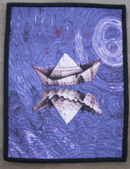
"Paper Boat" 8 1/2" x 11"

The first book that came to my mind when I read the challenge was Stephen King's "IT". I am not sure why since as an avid reader I had many to choose from. Perhaps it was because I am currently reading his latest book.

IT was the very first Stephen King book I read many years ago. I have since read all of his books. My friend Janet introduced me to them when she learned I liked James Herbert books. She said if I liked James Herbert I would love Stephen King - she was right!

The first line of the book reads: "The terror, which would not end for another twenty-eight-years - if it ever did end - began, so far as I know or can tell, with a boat made from a sheet of newspaper floating down a gutter swollen with rain."

I took a photograph of a sketchbook cover I made earlier usin couched threads and xpandaprint into Paint Shop Pro to use as a background. I changed the colour to blue (it was dusky pink) and added a wave filter to give the water effect. I then added a photograph of the paper boat on a second layer, copied, pasted and flipped it onto a further layer. I added the twirl filter to the flipped image of the paper boat to give the impression of a reflection in the water. Once I was happy with the final image I printed it on to EQ Printables fabric using an Epson R1800. The colour quality of this printer is excellent. It used dyes rather than inks.

I layered the quilt using 505 temporary adhesive. I only use this on small quilts as I find the layers move if I use it on larger quilts. Free machine quilted using Robinson & Anton rayon thread.

The Boxcar Children


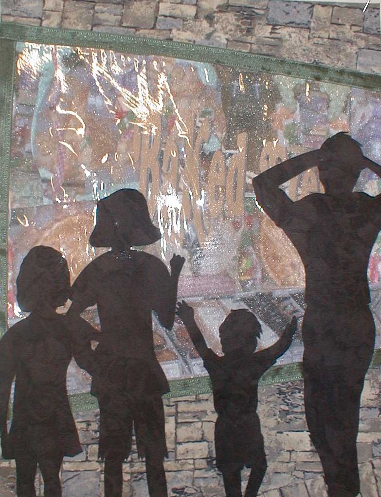
This is my first post to the blog and I have been looking around this morning at others entries as well. It's amazing to see the quality difference between the photos on the yahoo site and this one. The quality of the photos here is much better I think. Anyway, this is my submission for the 4th challenge and although I think there is a good deal to be desired in the "value" area, I think the "contrast" aspect is captured with the silhouettes.
The book I chose is an all time favorite from my childhood called The Boxcar Children by Gertrude Chandler Warner. I purposely used silhouettes in my piece because the illustrator in the book also used silhouettes throughout the book although none showed them in front of a bakery......this is my own design. The first line of the book is, "One warm night four children stood in front of a bakery." (L-R: Violet, Jessie, Benny and Henry).
The bakery window is constructed of pictures of pastries and baked goods taken from the web, printed on fabric and then cut up and fused into a vague suggestion of what might appear in a bakery window. This is then covered in tulle and that is covered with a piece of clear vinyl so as to get a reflection much like you would get in a window.
I sort of missed the "value" aspect of the challenge while concentrating on the contrast aspect. I need to work on value and this challenge shows me just how true that is. I absolutely love these challenges as I learn more each time I do one, not only from my own work, but from the work of all of us together. Thanks in advance for any comments you wish to make on this piece.

Wednesday, January 03, 2007

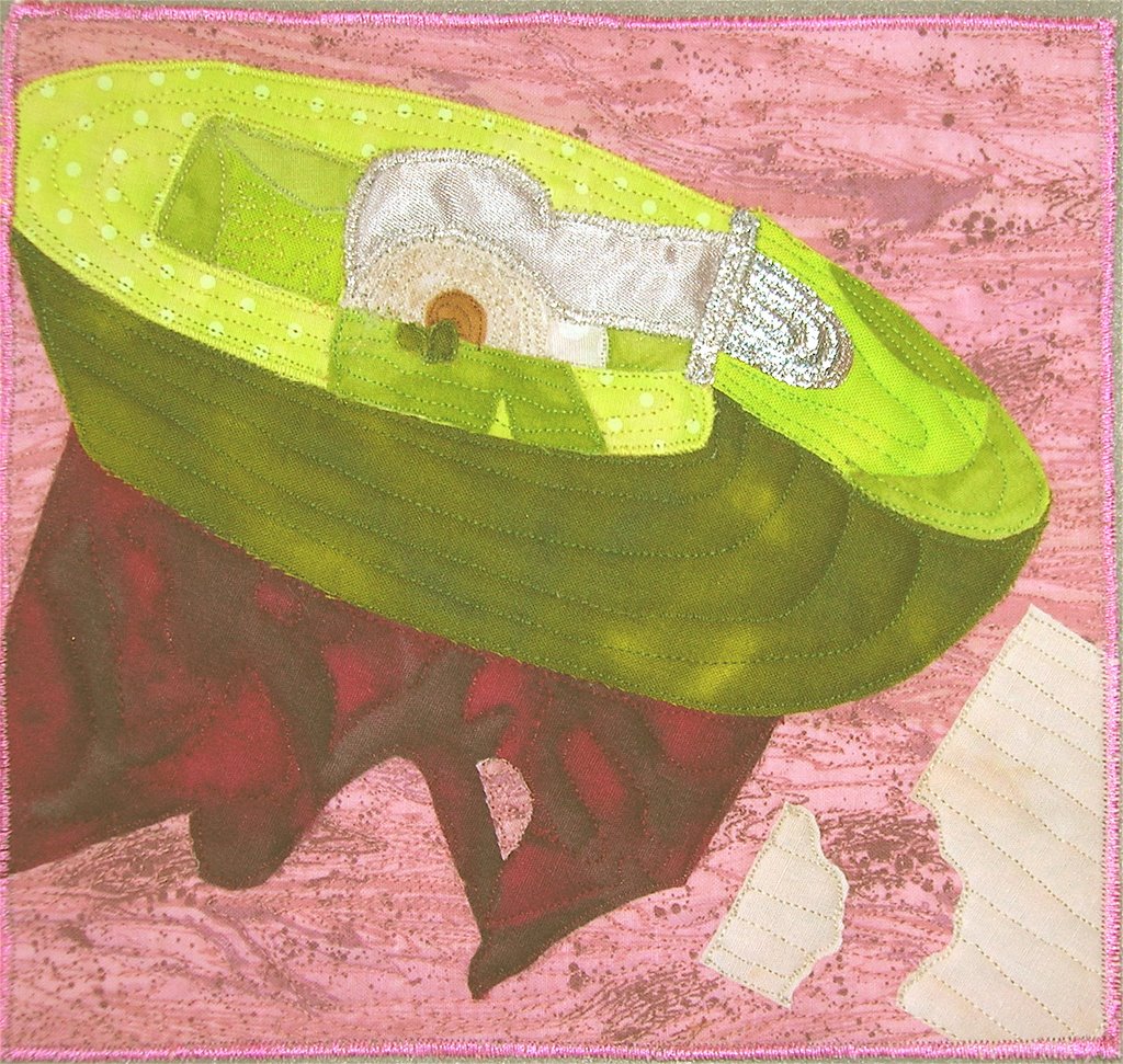
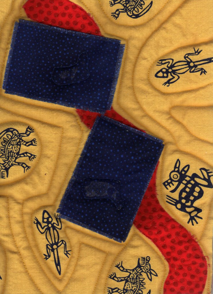
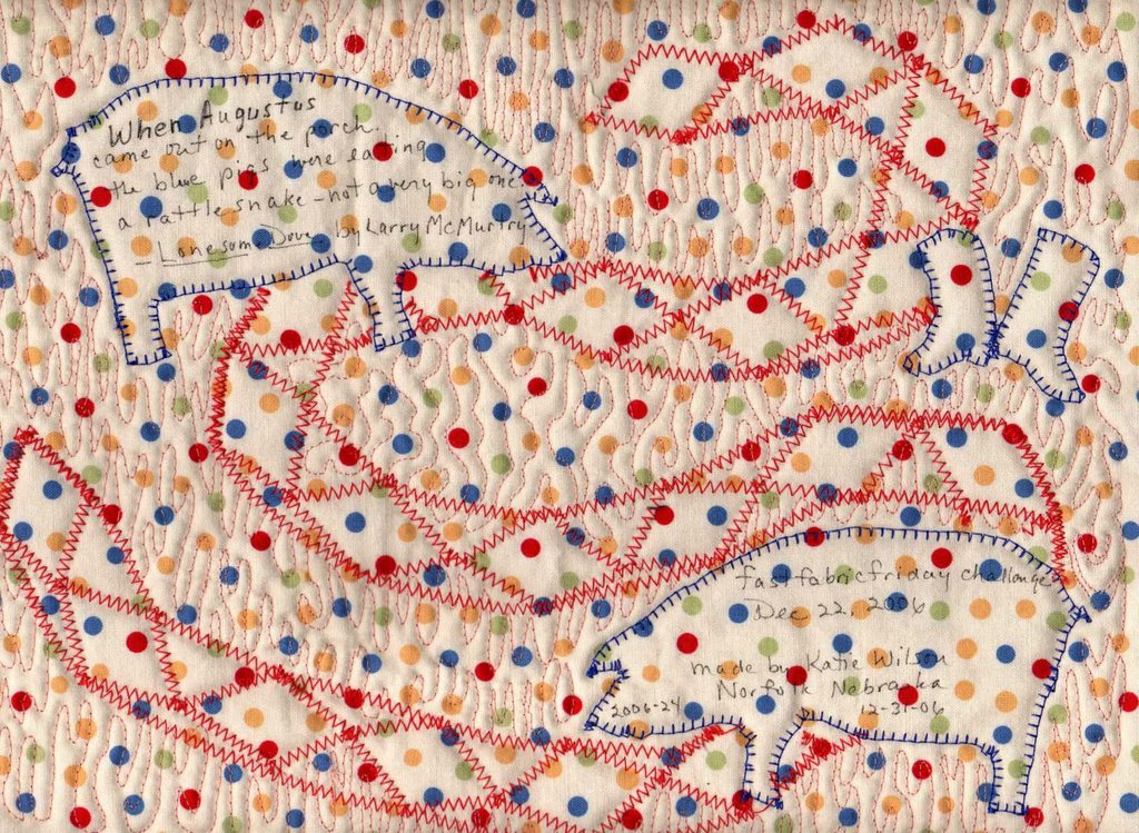
When Augustus came out on the porch the blue pigs were eating a rattlesnake - not a very big one.


The first picture is the first quilt I tried to make totally (or mostly) abstract. Obviously, it didn't work!

The polka dot picture is from the back of the second try, which I'm much happier with. Using real pig shapes and diamonds for the snake, it does what I wanted it to. Contrast is both from color and in the relative sizes of the pigs, the snake, and the cowboy boots. Not much reality, so it must be somewhat abstract.

I've never posted to a blog before, so I'd really like any comments you might have.
Katie Wilson